BTS: Their Album Covers Have More Feelings than Your Ex
Feb 19 2023
Read Article
↓
↓
Hope you enjoy reading our stuff :)
In the realm of music, where sound and vision intertwine to create an immersive experience, the South Korean boy band BTS, in collaboration with the design agency Husky Fox, has set a new benchmark with their album "Love Yourself." This collaboration has birthed more than just album art; it has brought to life one of the most compelling and visually captivating design systems in the music industry. The "Love Yourself" series is not merely a collection of songs but a storytelling odyssey, conveyed not just through melodies but through meticulously crafted visuals that resonate with the themes of the music.
This innovative design system goes beyond the conventional approach of album artwork. It is a comprehensive assembly of custom design assets, including unique typefaces and bespoke illustrations/icons, each tailored to embody the essence of BTS's music. The essence of this project lies in its ability to represent four visual steps on the journey to 'Love Yourself,' making it not just a listening experience but a visual voyage that enhances and amplifies the message BTS aims to convey. Through this visual storytelling, BTS and Husky Fox invite listeners to embark on a journey of self-discovery and self-love, setting a new standard for how music can be experienced through design.
When Album Covers Don't Just Cover, They Uncover
Enter the scene: BTS and Husky Fox, a dynamic duo that decided album covers aren’t just for covering the CD. They’re for uncovering the soul. Together, they’ve crafted not just an album design for "Love Yourself," but a design odyssey that whispers sweet nothings about the music. It’s a visual serenade, folks, and we’re all here for the concert.
It's a rare sight to see a branding system that transcends its commercial purpose to become a piece of art, especially in the context of an album cover. Yet, the "Love Yourself" series achieves this with grace, showcasing that a brand system can be both visually stunning and deeply meaningful. The success of this design system lies in its ability to marry functionality with beauty, proving that visual branding in music can go far beyond a mere marketing tool.

Unpacking the Design Elements
Typeface with Personality
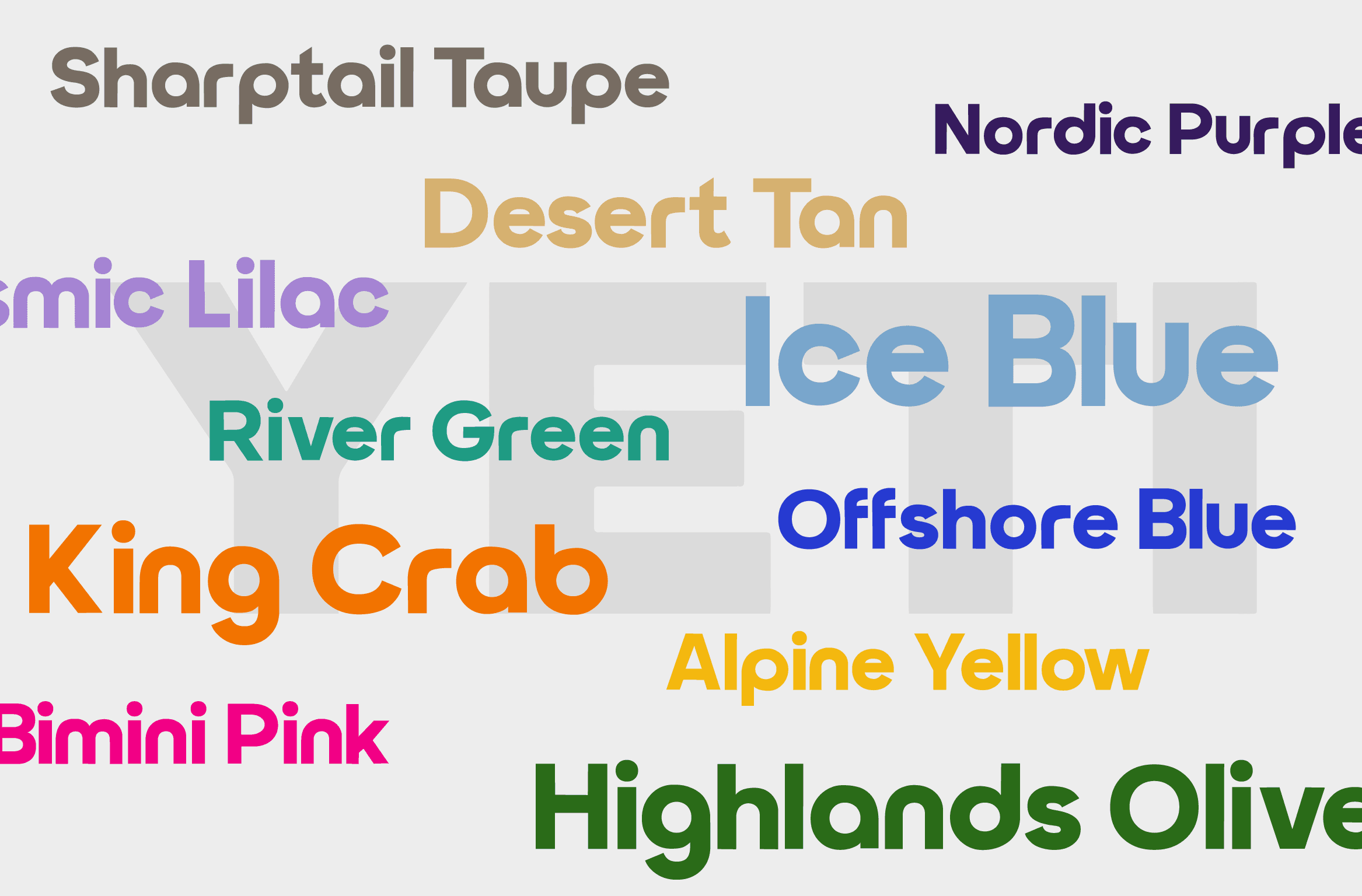
The custom typeface goes from A to Z, but let’s not forget the emotional alphabet in between, where B stands for "Breathtaking" and S for "So beautiful, I’m sobbing." This isn’t your average font; it’s a font with feelings.

The Four Visual Steps: A Love Story
Crush: Illustrated by a bud because nothing says “I kinda like you” like an unopened flower. It’s the visual equivalent of a shy glance across the room.
Fall in Love: A blooming flower, because now we’re in full-on love mode, petals to the metal.
Breakup: Falling petals, because why not visually represent heartbreak with gravity? It’s nature’s way of saying, “This too shall pass—right onto the ground.”
Learn to Love Yourself: The petals form a heart, because what’s a journey without a cheesy, feel-good ending? Plus, it’s a great reminder to hug yourself, even if it’s just because you’re trying to keep the petals in place.

Cohesive Icons: They're Moving!
Not just emotionally, but literally—through animation. Each icon tells a part of the story, fitting everything together so perfectly that you’d think they were made for each other. Spoiler: They were.
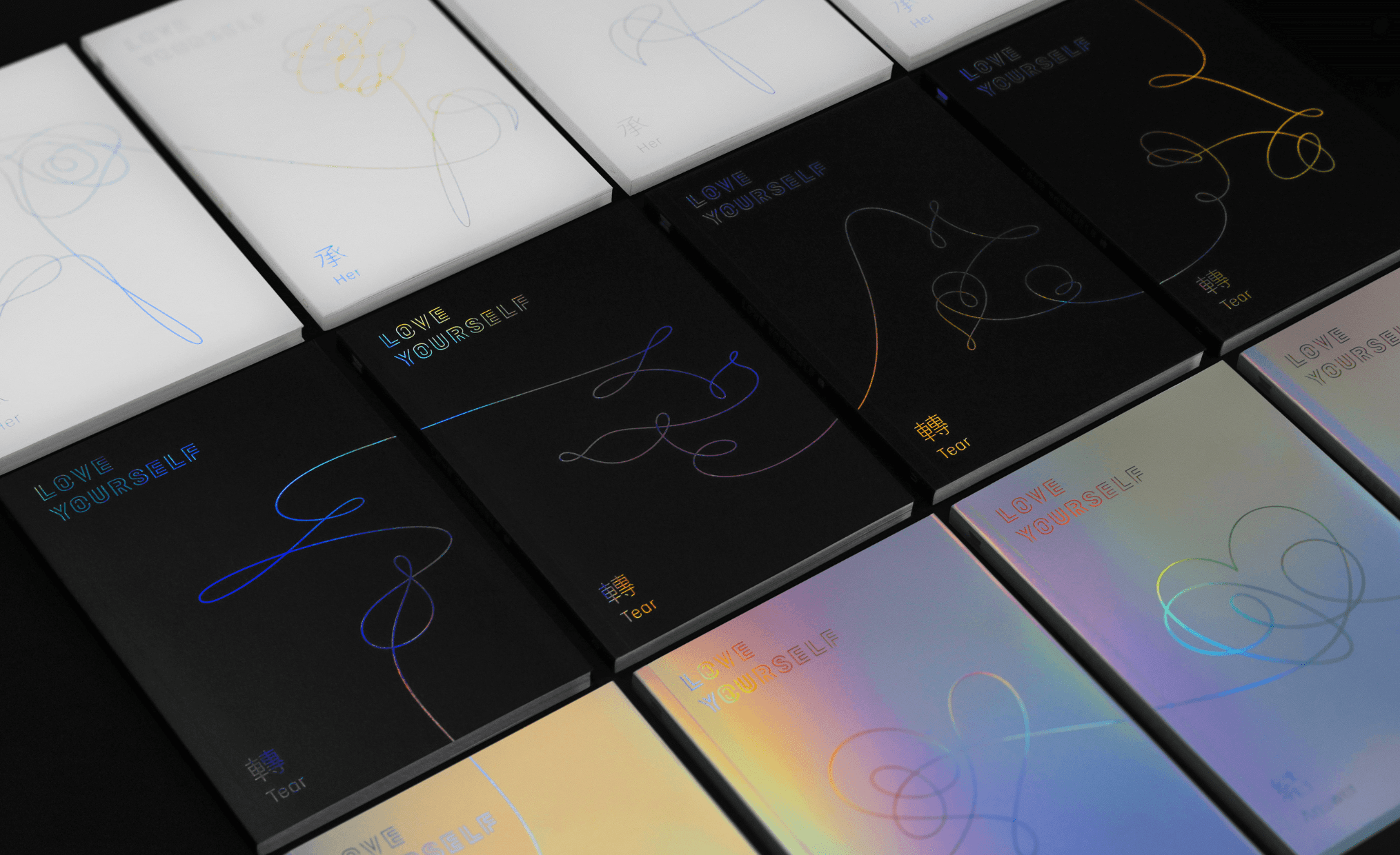
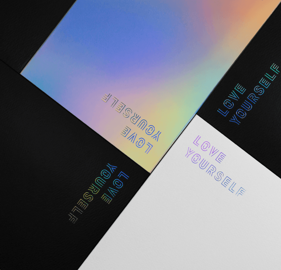
Packaging Design: A Tale of Two Hues
The packaging designes hits amazing, minimalist style but with dashes of color and details that make them super appealing to the eye. There are three versions:
White Versions: Innocence has never looked so chic, especially with a dash of iridescent sparkle. It’s like the first snowfall, if snowflakes were holographic.
Black Versions: For when love’s got you in a dark place, but you’re still stylish about it.
Holographic Versions: Because nothing says “I’ve arrived at self-love” like reflecting every color known to the human eye.
A New Paradigm in Album Design
This project transcends the traditional boundaries of album cover design, venturing far beyond the creation of mere images. It embodies a novel approach to conveying the essence and emotions of music through visual storytelling, setting a new paradigm for artists and designers alike. The significance of this endeavor lies not just in its aesthetic appeal but in its ability to forge a deeper connection between the artist and the listener. The thoughtful integration of custom typefaces, thematic illustrations, and a cohesive color scheme, coupled with the tactile experience of holographic and contrasting packaging, elevates the album from a collection of songs to a multisensory journey. It's a vivid illustration of how visual elements can be harmoniously woven together to amplify the narrative and emotional resonance of music.
Such innovative examples of album design are rare, making the "Love Yourself" series a beacon of creativity and inspiration. It's a reminder that the visual components of music are not mere accessories but powerful storytelling tools in their own right. Husky Fox’s meticulous execution and the visionary approach of BTS have not only enriched the listening experience but have also set a compelling precedent for the industry. Awarding this project a score of 10/10 is an acknowledgment of its flawless execution and its role in charting new territories for album design. It serves as a call to action for other artists and bands to explore the untapped potential of integrating visual art with music. The "Love Yourself" series is a testament to the endless possibilities that arise when music meets design, encouraging a future where albums are not just heard, but also seen and felt, in all their intended glory.
P.D: No one in the office knows a single BTS song but we all know their album design is absolutely fire.
SHARE ARTICLE