Articles
Cheap vs Well-Done Branding: The Difference Is Process, Not Price
Jan 15th 2026
Cheap branding isn’t defined by how much you spend, but by how little thinking goes into it. This guide shows how to spot shortcut branding — and what a real branding process actually feels like.

Cheap vs well-done branding: what are we really talking about?
When people say “cheap branding”, they’re usually talking about price. But price is just the most visible part of the problem — not the real one.
We’ve seen brands that spent very little but made thoughtful, smart decisions. And we’ve seen brands that paid real money and still ended up with something generic, trendy, and forgettable.
The real difference isn’t cost. It’s depth. Cheap branding is branding built on shortcuts. Well-done branding is built on understanding — of the business, the audience, and the context it operates in.
This article isn’t about shaming budgets. It’s about giving you language and criteria to spot when branding work is shallow, even if it looks “fine” at first glance.
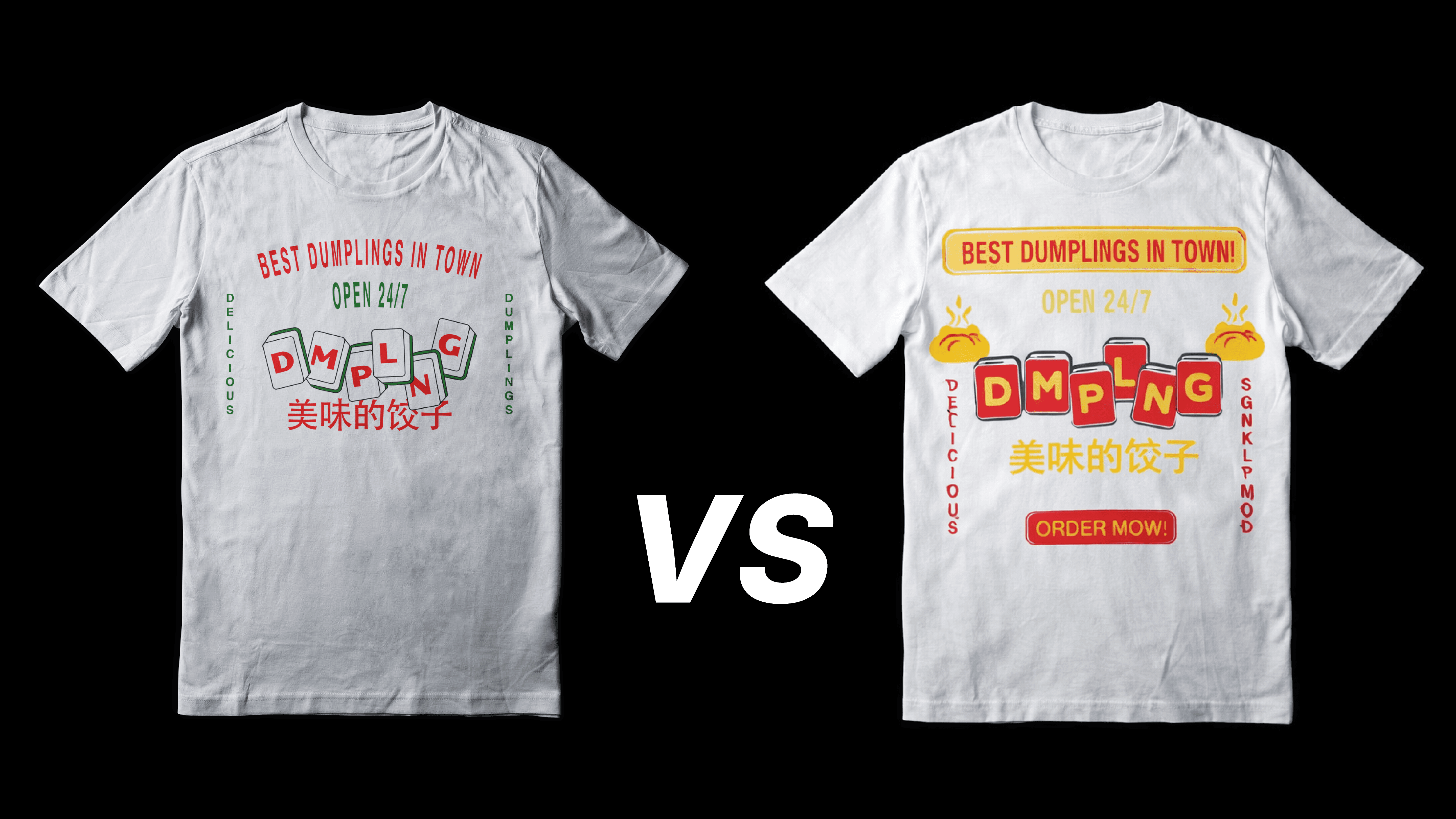
What cheap branding usually looks like in the real world
Cheap branding rarely looks broken. That’s what makes it dangerous.
At first glance, it often looks clean, modern, and passable. But once you scratch the surface, patterns start to repeat.
Visually, cheap branding often shows up as:
Overused layouts and compositions you’ve already seen dozens of times
Trend-driven fonts and color palettes with no link to the category or audience
Logos that only work in one size or one context
Designs that might look good on Instagram but fall apart everywhere else
Strategically, the signs are even clearer:
No clear definition of who the brand is for
No positioning — just vague words like “modern”, “premium”, or “creative”
No system, only isolated assets (a logo, a few colors, maybe a typeface)
The biggest red flag? It could belong to almost anyone.
Cheap branding is generic by nature. It avoids commitment, because commitment requires thinking — and thinking takes time.
The hidden cost of cheap branding (even if you paid very little)
Cheap branding doesn’t fail immediately. It fails slowly. At first, you might feel relieved: you have a logo, colors, something to show. But over time, cracks start to appear.
Cheap branding often leads to:
Inconsistent visuals across platforms
A brand that feels unserious or temporary
Constant redesigns because nothing quite works
Difficulty standing out in a crowded market
And perhaps most importantly, it erodes trust.
People may not consciously analyze your typography or color choices, but they do pick up on coherence. When branding feels improvised or trend-chasing, it signals instability — even if the business itself is solid.
The real cost of cheap branding isn’t what you paid upfront. It’s what you keep paying in fixes, confusion, and missed opportunities.
What well-done branding feels like (and why process matters more than price)
Well-done branding doesn’t scream for attention. It feels calm, intentional, and grounded.
That feeling comes from process — not from whether the work was done by a freelancer or an agency.
Well-done branding usually starts with better questions:
Who is this brand actually for?
What space does it need to occupy?
What should it feel like over time, not just today?
From there, visuals become expressions of strategy, not decoration. Colors, typography, and layouts aren’t chosen because they’re trending, but because they make sense for the business and its audience.

This is where price often gets misunderstood. You’re not paying for prettier designs. You’re paying for:
Time spent understanding your business
Thoughtful iteration instead of first-draft solutions
A system that can grow without breaking
Good branding puts you in the middle of the process, not at the end of it. If all you’re asked to do is “pick a logo you like”, you’re probably not getting real branding.
A quick checklist: how to spot cheap branding before you buy it
Before trusting someone with your branding work, pause and ask yourself a few simple questions:
Was I asked about my audience, goals, and context — or just my preferences?
Am I being shown a system, or just a logo and a color palette?
Does this branding work beyond social media mockups?
Could this brand realistically scale to new products, services, or markets?
Does this feel specific to my business, or comfortably generic?
Is this something that feels copy and pasted from somewhere?
If several answers feel shaky, that’s not a budget problem — that’s a process problem.
Cheap branding isn’t always cheap. And well-done branding isn’t always expensive. The difference is whether the work was built to last — or just built to launch.
Knowing how to spot that difference is what protects your brand long before design ever starts.


