
a fine selection of opinions, hot takes & thoughts on design...
a fine selection of opinions, hot takes & thoughts on design...

What Are Pantone Colors? A Simple Guide for Designers
Education
Learn what Pantone colors are, how they compare to RGB and CMYK, and when they really matter for your brand.

Mar 30th 2026
Why Drake’s Website Feels Bigger Than a Store
Web
There is a reason Drake’s website feels so easy to move through. Once we break it down, the trick is not more design. It is better web decisions.

May 6th 2026
Not All Black Prints the Same
Education
Black should be the safest color in the file. Find out here why not all black prints the same.

Mar 17th 2026
Great Brands Are Built on Better Decisions
Branding
A lot of brands look good enough. The ones that really stand out usually are not built on better aesthetics alone, but on better decisions.

Mar 14th 2026
What Makes a Brand Feel Premium?
Branding
Some brands feel premium almost instantly. Others use all the same visual cues and still fall flat. So what is the difference?

Mar 12th 2026
Brands That Own Colors: What That Really Means
Opinion
Some brands become so tied to a color that it stops feeling neutral and starts feeling untouchable. Here, we unpack why that happens, what it really means legally, and what brands that own colors can teach us about perception, branding, and design.

Mar 10th 2026
Branding for Startups vs Big Brands: The Differences That Really Matter
Branding
The difference between branding a startup and rebranding a larger company is not just scale. It is a different strategic job, with different risks, different constraints, and different definitions of success—and that is where things get interesting.

Mar 8th 2026
CMYK vs RGB: Differences, Uses, and How to Choose the Right One
Education
CMYK and RGB are often treated like basic design terms, but the difference between them affects how color actually behaves in the real world. This guide breaks down what each mode does, where it belongs, and how to use both more confidently.

Mar 7th 2026
10 Branding Mistakes and How to Avoid Them
Branding
Branding mistakes rarely come from one bad logo decision. They usually happen when businesses start without enough clarity, structure, or expertise. In this article, we break down 10 common branding mistakes and how to avoid them.

Mar 3rd 2026
How Long Does Branding Take? What to Expect
Branding
Branding timelines can feel like a black box: one project takes three weeks, another takes three months. Here’s what’s really happening behind the scenes—and how long branding typically takes when the process is set up right.

Feb 26th 2026
What is a brand book? (And what it should include)
Branding
Most brands don’t fall apart in one big moment—they drift through a hundred tiny design decisions. A brand book is how you stop that drift, and we’ll show you exactly what to include.

Feb 24th 2026
How to Choose a Brand Name (Without Making These Mistakes)
Branding
Most naming regret isn’t about taste—it’s about friction: spelling, pronunciation, search, and growth. Here’s how we pressure-test options and choose a name that won’t come back to haunt you.

Feb 20th 2026
How Gerber Modernized a Heritage Brand Without Breaking Recognition
Opinion
Gerber just did the most dangerous thing a legacy brand can do: edit the icon everyone thinks is untouchable. Here’s why it works — and why the backlash is mostly nostalgia.

Feb 18th 2026
Branding for Everyday Products: Harinas La Encarnación’s Sacks as Art
Education
Industrial flour sacks aren’t supposed to be beautiful. But Harinas La Encarnación proves that with the right visual system, even B2B packaging can feel like art—and still work in the real world.

Feb 17th 2026
Branding vs Marketing: What’s the Difference and Why It Matters
Branding
Branding vs marketing — they’re often confused, but they solve different problems. Here’s the real difference and how to know which one your business needs right now.

Feb 16th 2026
Inside Seasoned Website Design: A Playful UX Breakdown
Web
Seasoned website design is a case study in concept-driven UX, where interaction, structure, and metaphor transform a simple resource hub into a memorable web experience.

Feb 13th 2026
You’ve Seen Pixel Street Art in Paris. Here’s What It Really Means...
Education
Those pixel mosaics scattered across Paris aren’t random decoration — they’re part of one of the most coherent visual systems in contemporary street art.

Feb 12th 2026
Design Trends 2026: Intensity, Imperfection and Immersion
Opinion
Design trends 2026 are shifting away from safe minimalism toward intensity, immersion and visible humanity. If you want to know what’s shaping visual culture this year, keep reading.

Feb 10th 2026
Why Branding Is an Investment in Your Company’s Future
Branding
Branding is either building leverage for your company — or quietly limiting it. Most people don’t realize which side they’re on. This article might help you find out...

Feb 9th 2026
Most ecommerce websites are super boring. Here’s why.
Web
Most ecommerce websites aren’t bad. They’re just boring. And it has nothing to do with platforms, tools, or trends...

Feb 6th 2026
You Can’t Brand a Premium Brand Like a Normal One
Branding
Premium branding isn’t about nicer visuals — it’s about a different mindset altogether. In this piece, we unpack what actually changes when a brand needs to signal trust, confidence, and legitimacy.

Feb 5th 2026
Matty Matheson’s World Is Smarter Than any Portfolio of Brands
Opinion
From cookbooks to restaurants to TV and pantry staples, Matty Matheson’s projects don’t compete — they connect. Here’s why his world works.

Feb 4th 2026
Chop Suey Font Isn’t Chinese: A Typographic Plot Twist
Education
Chop suey font looks perfectly “Chinese” — but it isn’t. How did an American display style become the default Chinese takeout look?
Jan 29th 2026
The Strategic Role of Packaging as a Brand Touchpoint
Branding
Packaging does more than protect a product — it sets expectations before anything else happens. Here’s why treating packaging as a strategic brand touchpoint can change how your brand is perceived.

Jan 27th 2026
Why Graza’s Website Is a Masterclass in Good Website Design and UX
Web
Why does Graza’s website work so well when so many others don’t? We unpack the design and UX choices behind it — and what they can teach any brand building online.

Jan 26th 2026
Visual Brand Consistency: Why It Matters More Than You Think
Branding
Your brand might look fine — but still feel wrong. Visual consistency is often the missing piece between good design and brands people actually trust.

Jan 23th 2026
Keith Haring and the Power of Visual Language
Education
Keith Haring’s work feels immediate and playful, but nothing about it is accidental. His design style was built as a clear visual language, made to travel across walls, posters, and products without losing meaning.

Jan 22nd 2026
Everyone Rebranded in 2025. Not Everyone Should Have.
Opinion
After a year flooded with rebrands, a few stood out for the right reasons. Many didn’t. Here are the best and worst rebrands of 2025.
Jan 21st 2026
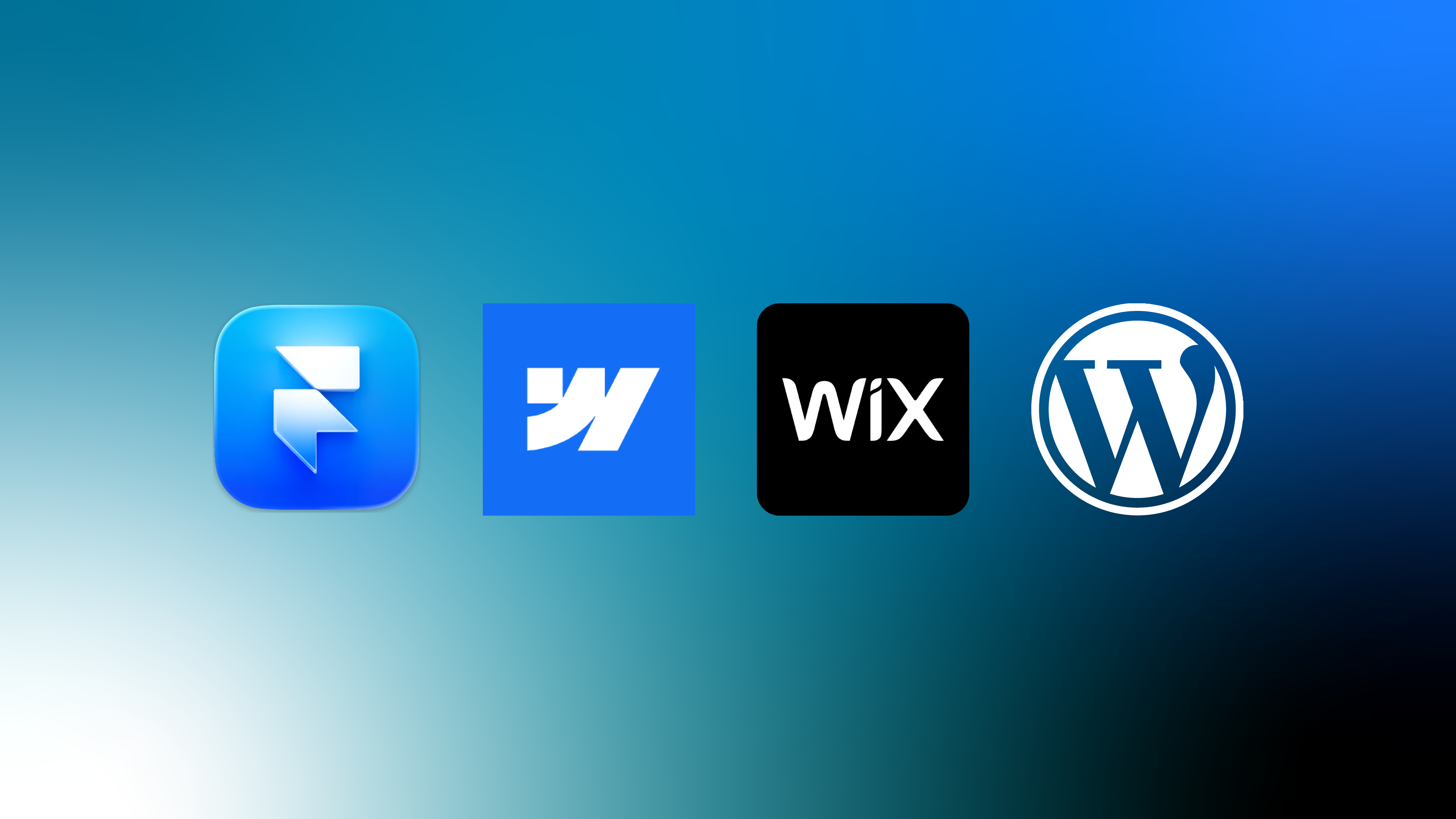
How to Choose a Website Platform — What Actually Matters
Web
Choosing a website platform is easy. Getting real value out of it is not. This article breaks down today’s main platforms and explains what actually matters beyond the tool.
Jan 20th 2026
Do I Need a Rebrand? How to Know When It’s Time (and When It’s Not)
Branding
You don’t wake up wanting a rebrand — you feel something’s off. This guide helps you understand what rebranding really means, the visual signs to look for, and how to tell if it’s actually time to rethink your brand.

Jan 19th 2026
The Typography of New York: Fonts, Lettering, and Voice
Education
Not all iconic typography is about choosing a font. This article breaks down the lettering, typefaces, and systems that shaped New York’s visual voice.

Jan 16th 2026
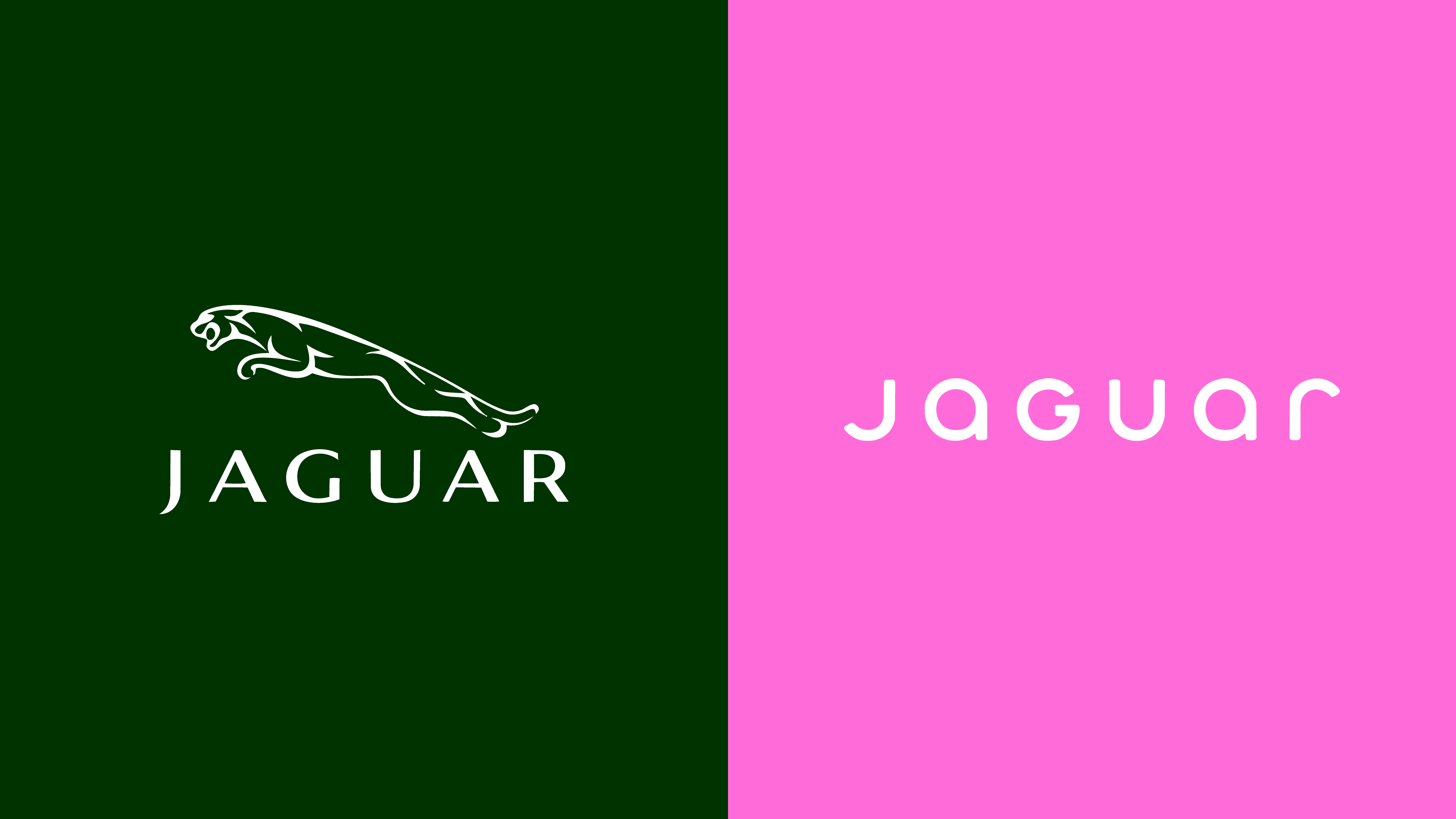
Loewe’s New Logo, Explained: Not a Rebrand, a Precise Edit
Opinion
At first glance, nothing seems different. Look again, and Loewe’s new logo starts to tell a much bigger story about evolution, authorship, and restraint.

Jan 15th 2026
Cheap vs Well-Done Branding: The Difference Is Process, Not Price
Branding
Cheap branding isn’t defined by how much you spend, but by how little thinking goes into it. This guide shows how to spot shortcut branding — and what a real branding process actually feels like.

Jan 14th 2026
What Asahi Super Dry Teaches Us About Custom Typefaces
Education
Custom typefaces are often seen as a luxury. Looking at Asahi Super Dry, we explore why they can actually be one of the most practical and powerful tools in a brand system.

Jan 13th 2026
What to Expect When Working With a Branding Agency
Branding
Working with a branding agency shouldn’t feel like a gamble. Here’s what actually happens, what’s normal, and what you should expect before you hire one.
Dec 13th 2025
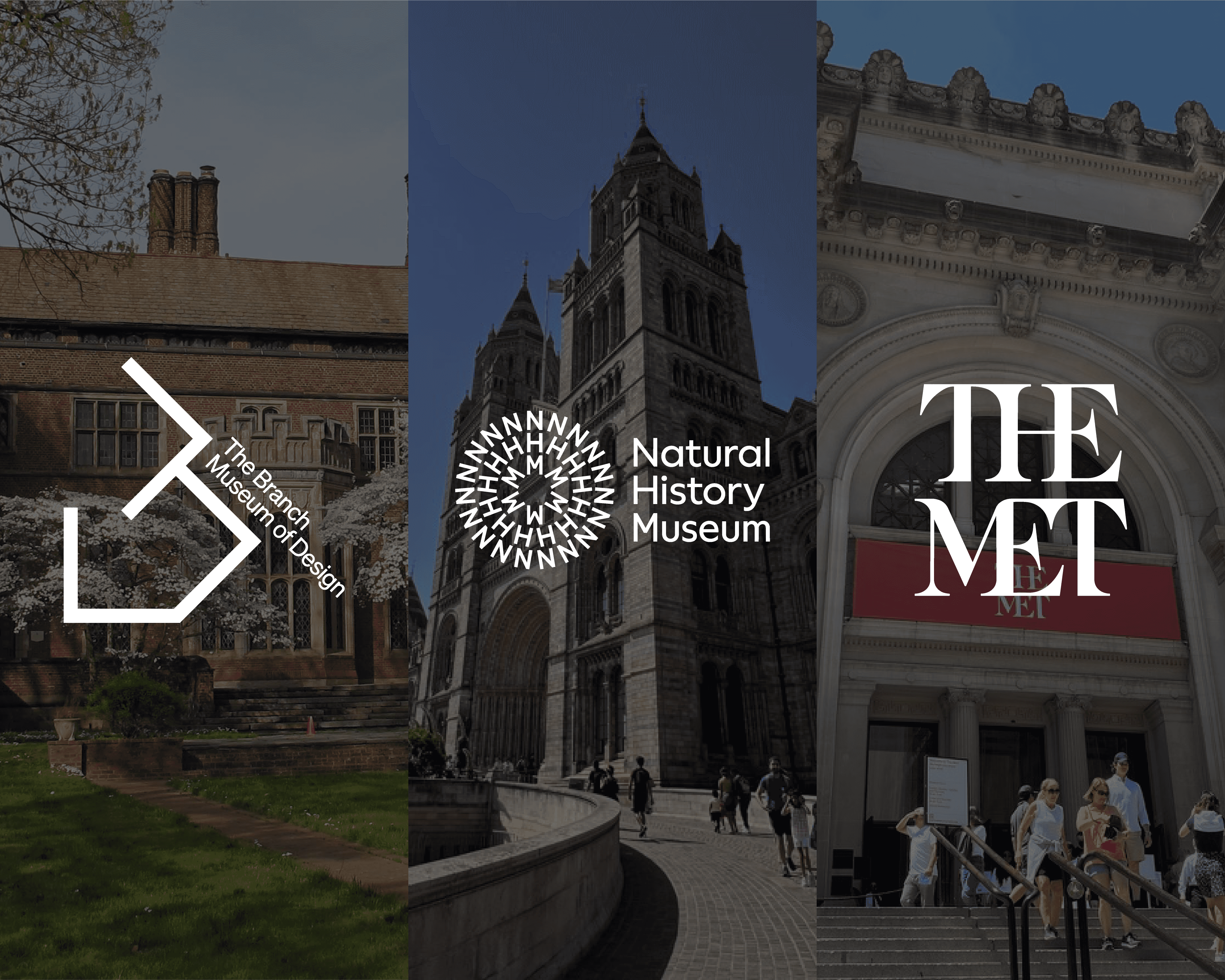
Museum Branding Done Right (and Why It Matters to Your Visit)
Industries
You’re not supposed to notice museum branding. But it’s already telling you where to go, and when to buy the tote.

Dec 9th 2025
Do I Need a Rebrand? 7-Question Brand Checklist
Branding
If you’re asking “do I need a rebrand?”, this simple 7-question checklist will help you see if you’re ready for a full rebrand, a lighter refresh, or if your brand is fine for now.

Dec 5th 20025
Color psychology in branding: how to choose your brand colors
Branding
Color psychology in branding: how to choose brand colors that really match your personality, your audience and your industry

Aug 28th 2025
Michelin Star Branding: The Noma Lesson
Opinion
Three stars, one secret: at Noma, design tells the story long before the dish reaches the table…

Aug 21st 2025
The Celebrity Brand Illusion
Opinion
Kardashian, Chamberlain, Robegrill—a famous name can make anything go viral. But can it make it profitable?

Aug 14th 2025
AI: The Best Intern You’ll Ever Have
Education
AI isn’t here to steal your job—unless you’re just sipping coffee and flirting with your coworker.

Aug 7th 2025
HBO Max Can't Decide Who It Is...
Opinion
When the name changes more than the content, something’s off. Here’s why HBO Max’s branding chaos matters...

Sep 18 2024
Aeromexico’s 2024 Rebranding Crash, From Iconic to Lifeless
Opinion

Aug 1 2023
Monograms: Beyond the Ugly Tracksuit Print
Education

Jul 4 2023
Bottles That Are More Aesthetic Than You, Casa Azul
Opinion

Jun 28 2023
Who Still Uses Paper Invites? Discover The Most Creative Fashion Invites
Opinion

Feb 19 2023
BTS: Their Album Covers Have More Feelings than Your Ex
Opinion

Jan 10 2024
TopoChico: The Not So 'Chico' Billion Dollar Company
Opinion

Jan 2 2024
Caps Lock Off: Avianca's Subtle Shift from 'A' to 'a'
Opinion

Oct 26 2023
Beyond Tumblers: The Colors That Built YETI's Empire
Opinion

Oct 12 2023
Oreo's Brand Strategy of Weird AF Flavors, Why?
Education

Oct 5 2023
AirIndia Departing To: Rebranding
Opinion

Sep 26, 2023
Wobble & Wow: Unveiling Jell-O's New Look
Opinion

Sep 19, 2023
Navigating the City in Style: Aesthetics of Public Transport
Industries

Jul 9, 2023
Mastering the Rebrand: Strategies for a Seamless Transition
Branding

Jul 9, 2023
What the F*ck is 'Lorem Ipsum'
Education

Jun 9, 2023
Pepsis Electrifying Rebrand: A Bold and Alluring Transformation
Opinion

Jun 6, 2023
Burberrys Rebirth: Heritage Meets Modernity
Opinion