Articles
Chop Suey Font Isn’t Chinese: A Typographic Plot Twist
Feb 4th 2026
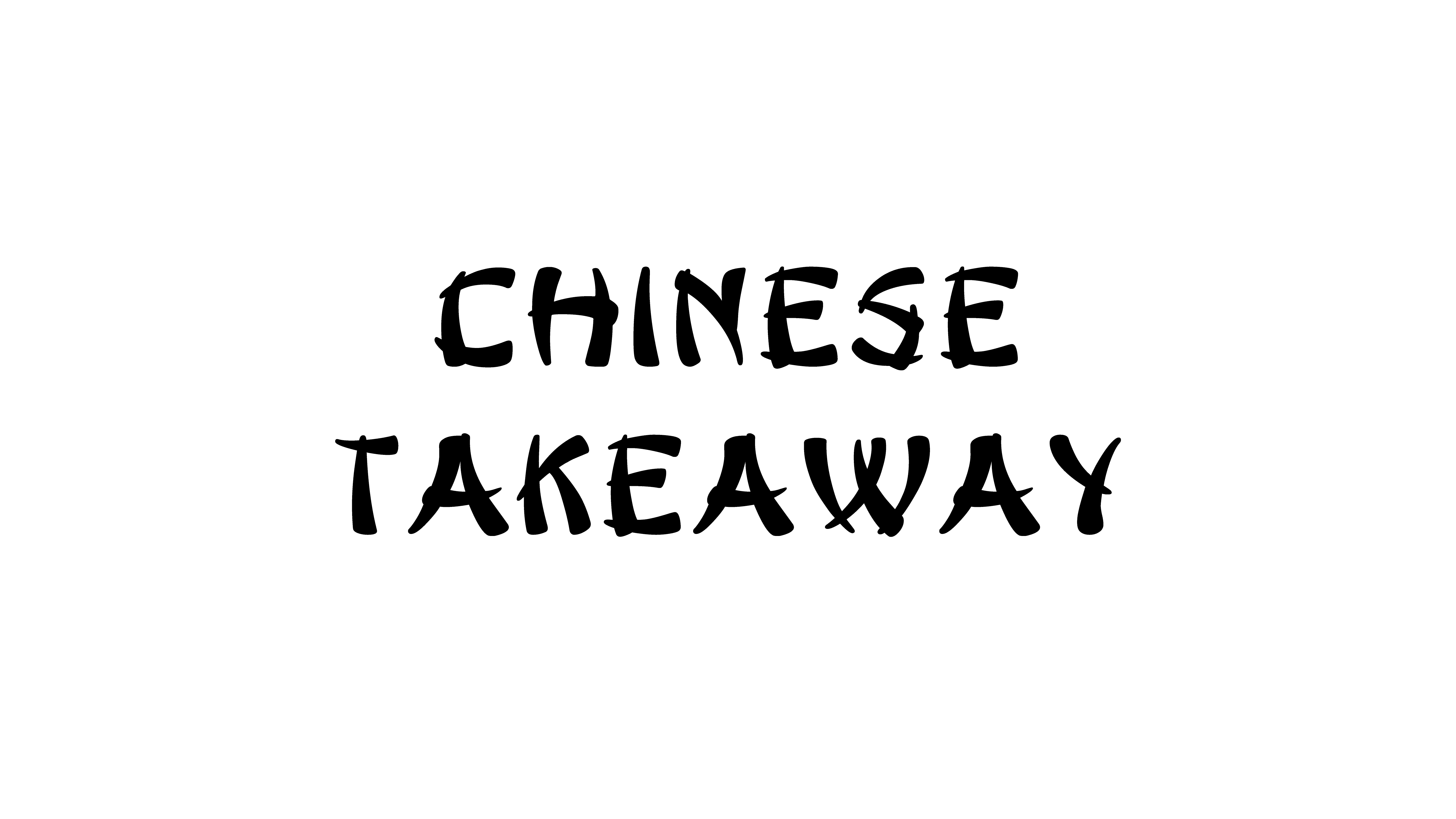
Chop suey font looks perfectly “Chinese” — but it isn’t. How did an American display style become the default Chinese takeout look?
If typography is a voice, chop suey fonts are like someone doing a cartoon accent.
Designers took Latin letters, sharpened the strokes, added brush-like cuts and ornamental spikes, and used them wherever they needed a quick signal: “this is Chinese” (or more vaguely, “this is Asian”). Over time, that look stuck so hard that many of us now treat it as the default Chinese takeout font, even though it was never part of authentic Chinese typographic tradition.
Our goal here isn’t to tell anyone what they should or shouldn’t use. Instead, we want to unpack what this style actually is, where it came from, and how it shaped the way we “see” Asian culture in the West – so we can recognise it, understand it, and use it more consciously.
The Font You Recognise Before You Even Read the Words
Think about these scenes:
a glowing “Chinese food” sign on a rainy street,
a kung-fu film poster from the 80s,
a flyer for “Asian Night” at a club,
a paper takeout box with a pagoda printed in red.
Most of us can predict the letters before we see them: heavy strokes, sharp corners, little notches and spikes that feel vaguely “Oriental”. Before we’ve even read the words, we already know what we’re being sold.

That’s what chop suey fonts do very efficiently: they act as visual shorthand. One style compresses a huge, complex set of cultures into a single code that says “this is Asian” to Western eyes.
In typography, this kind of thing is often grouped under ethnic display typefaces – decorative fonts designed to evoke an entire culture or place in one move. It’s not unique to Chinese references, and it’s not automatically good or bad; it’s just a very blunt tool.
From Display Style to Default “Asian” Script
Originally, this was just one more decorative display style. But repetition is powerful.
Through the 20th century, variations of the chop suey font started appearing on:
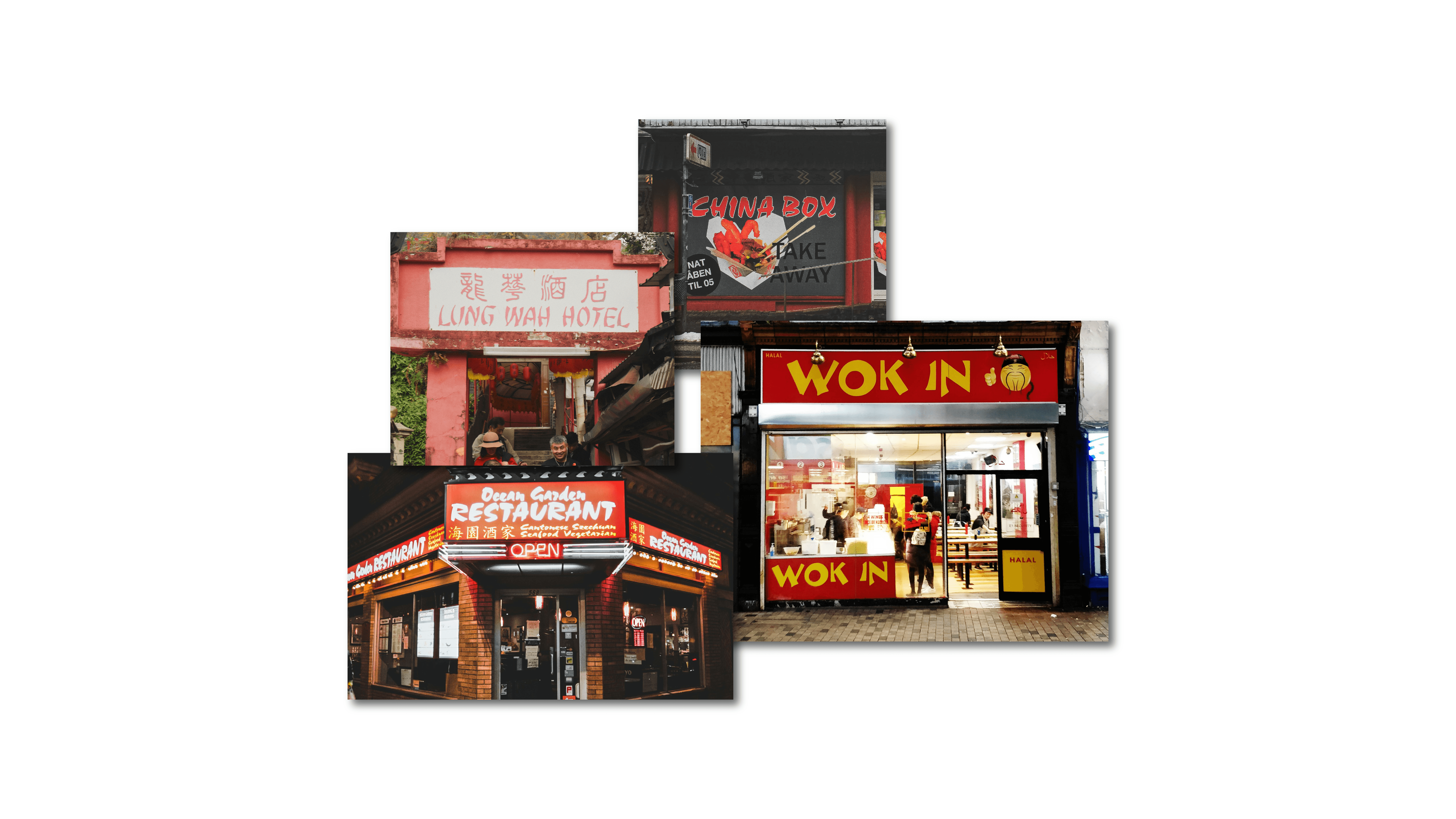
restaurant signs and menus,
theatre and film posters,
supermarket packaging and flyers,
novelty graphics, party posters, political mailers…
Use the same recipe often enough, across enough touchpoints, and it stops feeling like “one option among many”. It becomes the default visual script for a whole idea – in this case, “Chinese” or “Asian” in Western commercial contexts.

Some writers call this stereotypography: type that isn’t just a style, but a cliché. That word already carries judgement, but from a purely analytical point of view it’s useful: it reminds us that some fonts arrive with pre-loaded meaning long before we, as designers, touch them.
This Doesn’t Only Happen With “Chinese” Fonts
Chop suey type is just one instance of a bigger pattern. Designers have seen similar things with other cultures:
“Greek” fonts with dramatic triangular serifs and carved-stone vibes, used for everything from gyros shops to “ancient philosophy” book covers.
“African” fonts with rough, jagged, irregular outlines, used to signal “tribal”, “safari”, “wildlife” or “jungle” in Western advertising.
In all these cases, type is being used as a quick label. Whether we personally like or dislike the result, it’s good to recognise that a specific letter style is doing a lot of cultural work in a single glance.
What “Chop Suey Type” Actually Is in Typographic Terms
First important clarification: there is no single, canonical chop suey font.
When people say “chop suey font”, “Chinese takeout font” or “wonton font”, they’re talking about a cluster of display typefaces that share similar features and are used in similar ways.
If we zoom in and ignore the cultural context for a second, we can describe the style fairly clearly:
Latin skeleton
Underneath all the decoration, these are ordinary Latin letters. An A is still a triangle on two legs, an H is two uprights with a crossbar. The underlying proportions come from Western typography, not from Chinese character structure.
Geometric “brush” effects
Strokes often start or end in chopped diagonals or wedges to suggest brush calligraphy – but in a very vector, geometric way. It’s more like a brush costume than real brush behaviour.
Angular terminals and decorative spurs
Many letters grow spikes, hooks or notched corners. These add surface complexity, echoing the busy rhythm of Chinese characters – at least to someone who doesn’t actually read them.
Bold, signage-first construction
These faces are heavy and chunky, clearly designed as display type for signs, headlines and logos, not for paragraphs. You’d never set a whole page of body text in them.

So in a classification sense, chop suey type sits comfortably in the decorative / display category. The job is not neutral readability; the job is to signal a theme, loudly and immediately.
A Very American Invention
The origin story is surprisingly specific.
In 1883, the Cleveland Type Foundry patented a typeface literally called Chinese. In the 1950s it was re-issued as Mandarin. Many type historians treat it as the archetype for what would become chop suey or wonton fonts: a bold, angular display face for Western alphabets, designed to evoke an imagined “Chinese” look.
This happened in a context of strong Orientalism in Western art and design – a fascination with an exotic, romanticised “East”. Printers and advertisers wanted visual tools that would communicate “foreign”, “Oriental”, “Eastern” to Western audiences quickly.
As the decades went by, more foundries and designers created their own takes on the idea. By the mid-20th century, if you walked through a U.S. Chinatown, you’d easily spot signs set in some variation of this style. Chinese and Chinese-American restaurant owners used these fonts because they worked: they were legible to non-Chinese passersby as “Chinese food here”.
That’s the interesting twist:
The visual language was invented from the outside, by Western designers imagining what “Chinese” should look like.
The everyday use was often by Chinese and Chinese-American businesses who adopted that look strategically, because it was already understood by their customers.
So the chop suey font is both: a projection of Western imagination and a practical tool in the hands of migrants navigating that environment.
Why It Has Almost Nothing To Do With Real Asian Scripts
To see the gap between chop suey type and real East Asian writing, we need a 30-second primer.
Chinese, Japanese and Korean (CJK) writing systems use characters, not an alphabet. Chinese characters, for example, are built from components called radicals, arranged in fixed ways inside an invisible square. Stroke order, direction and composition follow long-established rules. Traditional calligraphy pays close attention to:
stroke direction and pressure,
contrast between thick and thin,
balance inside the square,
rhythm across lines of text.
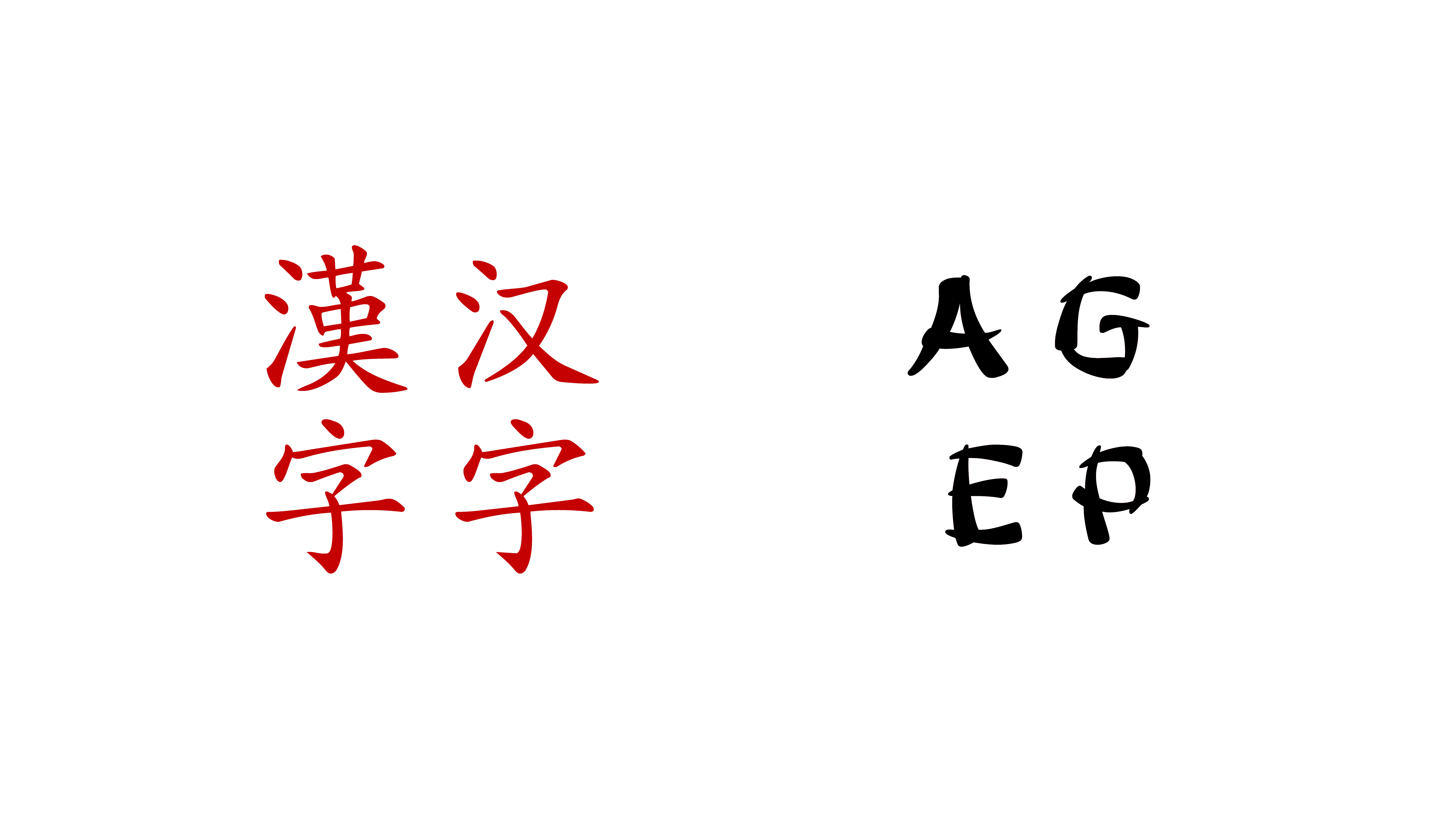
Now put that next to a typical chop suey alphabet:
Structurally, everything is still Latin. The letters sit on a baseline, share an x-height, and follow familiar Western proportions. There are no radicals, no character components.
The brush-like cuts on strokes are stylised markers rather than the consequence of real brush movement. They appear where it’s convenient for the Latin shapes, not where an actual character’s stroke logic would put them.
The text is set with Western spacing and layout: words, kerning, left-to-right lines, Western punctuation.
In other words, chop suey fonts don’t behave like Chinese writing. They reference the idea of “brushy, complex strokes” and map it onto Latin shapes.
You could say: real Chinese typography is the language; chop suey type is a costume.
That doesn’t mean the costume is useless. It just means that when we use it, we’re working with a visual invention about “Asianness”, not with authentic Chinese calligraphic conventions. And that’s valuable to know, because it helps us separate:
Chinese culture as it really is, multiple and diverse,
from “Chinese” as a single graphic cliché, condensed into a spiky display alphabet.
Why This History Matters If You Care About Typography
So where does all of this leave us?
For us, the point of digging into the story of the chop suey font isn’t to cancel a style or declare it off-limits forever. The style is there, it’s part of the visual landscape, and it’s not going away any time soon. What is interesting is what happens once we can see it clearly.
When we know that this “Chinese-looking” alphabet is actually an American invention, built on Orientalist fantasies and then adopted by real Chinese-American businesses, the letters stop being just decoration. They become a little capsule of history: migration, marketing, survival, misunderstanding – all packed into one display style.
That doesn’t mean we have to treat it only as a problem. It means we have more options.
If we’re designing something about American Chinese restaurant culture, leaning into that chop suey look can be a very specific, intentional reference: we’re talking about a particular time, a particular aesthetic, a particular kind of nostalgia. If we’re designing something about contemporary Chinese cities, food or design, we might decide that the chop suey font actually points in the wrong direction – towards how the West imagines “China”, rather than how people there see themselves.
In both cases, the value is the same: we’re not reaching for “the Chinese font” by default. We know where it comes from, and we can decide whether that story is the one we want on the surface of our project.
Maybe that’s the real takeaway. Typography is full of these shortcuts – fonts that promise “Western”, “futuristic”, “luxury”, “cute”, “Asian” in half a second. Behind each shortcut there’s a whole world of culture that can’t actually be reduced to one set of shapes. Learning the history of things like the chop suey font doesn’t magically fix that, but it does give us a better map.
Next time we walk past a glowing red sign set in those familiar spiky letters, we don’t have to just think “Chinese food”. We can also think about the designers, printers, restaurateurs and communities that turned a quirky American display style into the global symbol for a certain idea of “Chinese”. And from there, we can choose how we want our own typography to join – or question – that story.


