Articles
Matty Matheson’s World Is Smarter Than any Portfolio of Brands
Feb 5th 2026
From cookbooks to restaurants to TV and pantry staples, Matty Matheson’s projects don’t compete — they connect. Here’s why his world works.

When personality becomes a world
Most creator-led brands hit the same wall: the moment you expand beyond “the thing people came for,” everything starts to look scattered. A cookbook here, a random merch drop there, a restaurant partnership that feels like a licensing deal, and suddenly the whole thing reads like a busy inbox.
Matty Matheson is the opposite.
He has a loud personality, but a surprisingly coherent brand ecosystem — one that functions more like a connected brand world than a collection of side projects. And that’s what makes his world so interesting to study from a branding and design perspective: it proves that cohesion doesn’t require minimalism, strict rules, or one aesthetic. It requires a point of view you can recognize in different forms.
If you know him from food content, internet chaos, or The Bear, you already know the vibe: intensity, comedy, heart, and a kind of lovable chaos. But the bigger story is how that vibe gets translated into a whole ecosystem you can actually move through.
In this article, we’re breaking down how Matty Matheson has built a real brand ecosystem — not just by launching more things, but by designing a coherent world where restaurants, products, media, and merch all reinforce each other. And more importantly, why this model works so well when so many creator brands fall apart.
Mapping the universe: everything Matty Matheson actually has
Before getting into design, tone, or strategy, it’s worth clearly mapping the scope of Matty Matheson’s brand ecosystemand the brand world he’s built around food, media, and culture. Not interpreting it yet — just seeing how much ground it actually covers.
At its core, the ecosystem spans multiple layers:
Matty operates a network of restaurants across different formats and categories, including Prime Seafood Palace, Rizzo’s House of Parm, Matty’s Patty’s, CÀ PHÊ RANG, Maker Pizza, and Iron Cow Public House.
Alongside physical spaces, there’s a strong publishing layer through his cookbooks (A Cookbook, Home Style Cookery, Soups, Salads, Sandwiches), which act as long-form expressions of his approach to food.
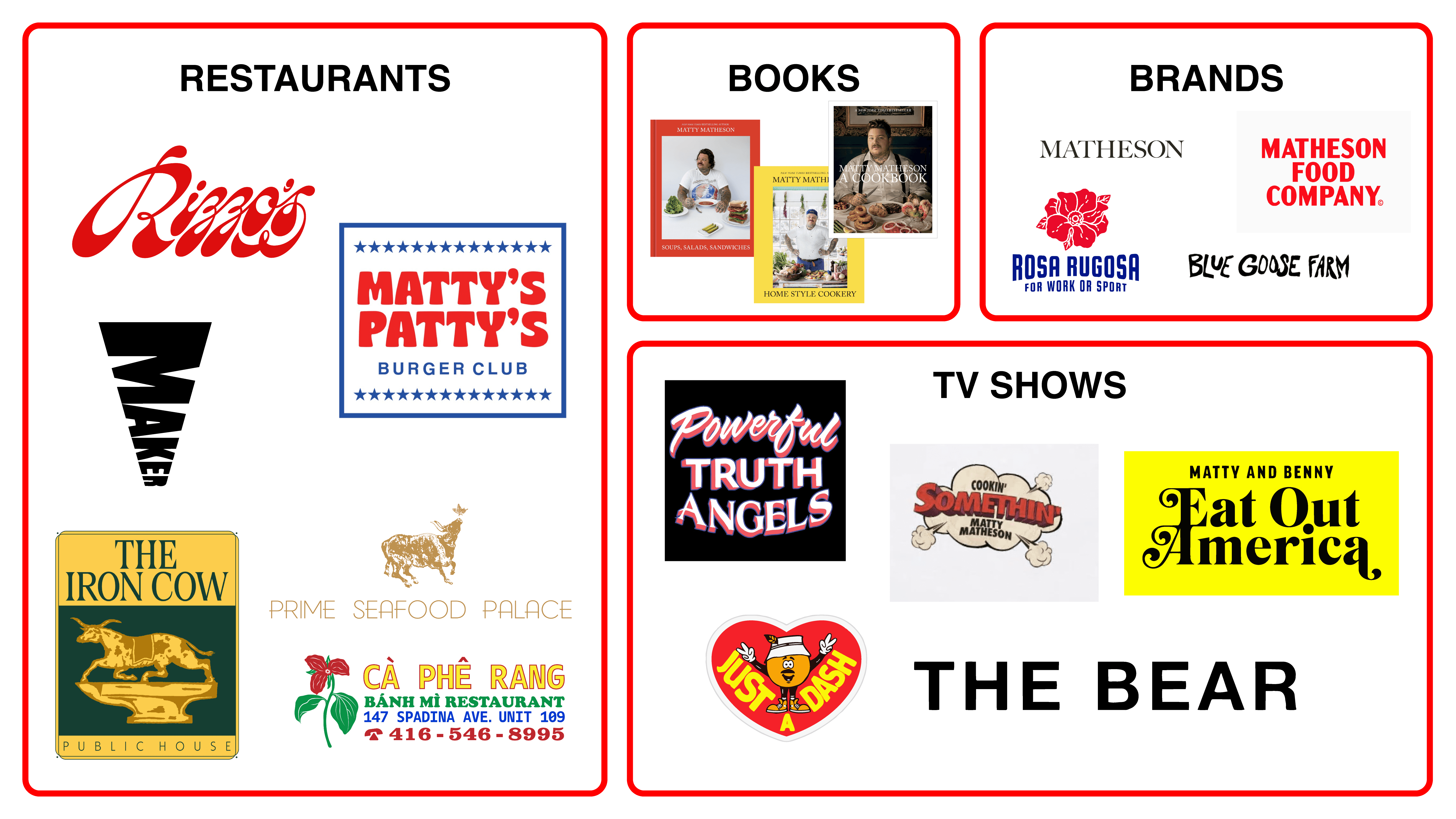
The ecosystem also includes consumer food products under Matheson Food Company, covering pantry staples like seasonings, mac and cheese, salad dressings, and BBQ sauces.
Beyond food itself, the world extends into objects and apparel through Matheson Shop (housewares and cookware) and Rosa Rugosa (utility-driven workwear).
There’s also an expanding media layer, with Matty appearing in and producing shows like The Bear — where he plays Neil Fak, a chaotic but deeply human supporting character — alongside formats such as Cookin’ Somethin’ and Just a Dash, among others. The Bear in particular has become a cultural phenomenon, earning Emmy Awards and widespread critical acclaim.
Finally, there’s Blue Goose Farm, a regenerative farm and community shop focused on slow living, produce, and intentional growth — a quieter but meaningful extension of the same values.
All of this is held together and made legible through Matty’s World, which functions as a real, navigable hub rather than a loose collection of projects. This is the map. The interesting part is what happens when all of these pieces are designed to belong to the same world.
Different aesthetics, same energy
From a design and branding perspective, this is where Matty Matheson’s brand ecosystem becomes especially interesting. What’s holding everything together is not a rigid visual system, but a shared sensibility — one that adapts to context without losing its identity.
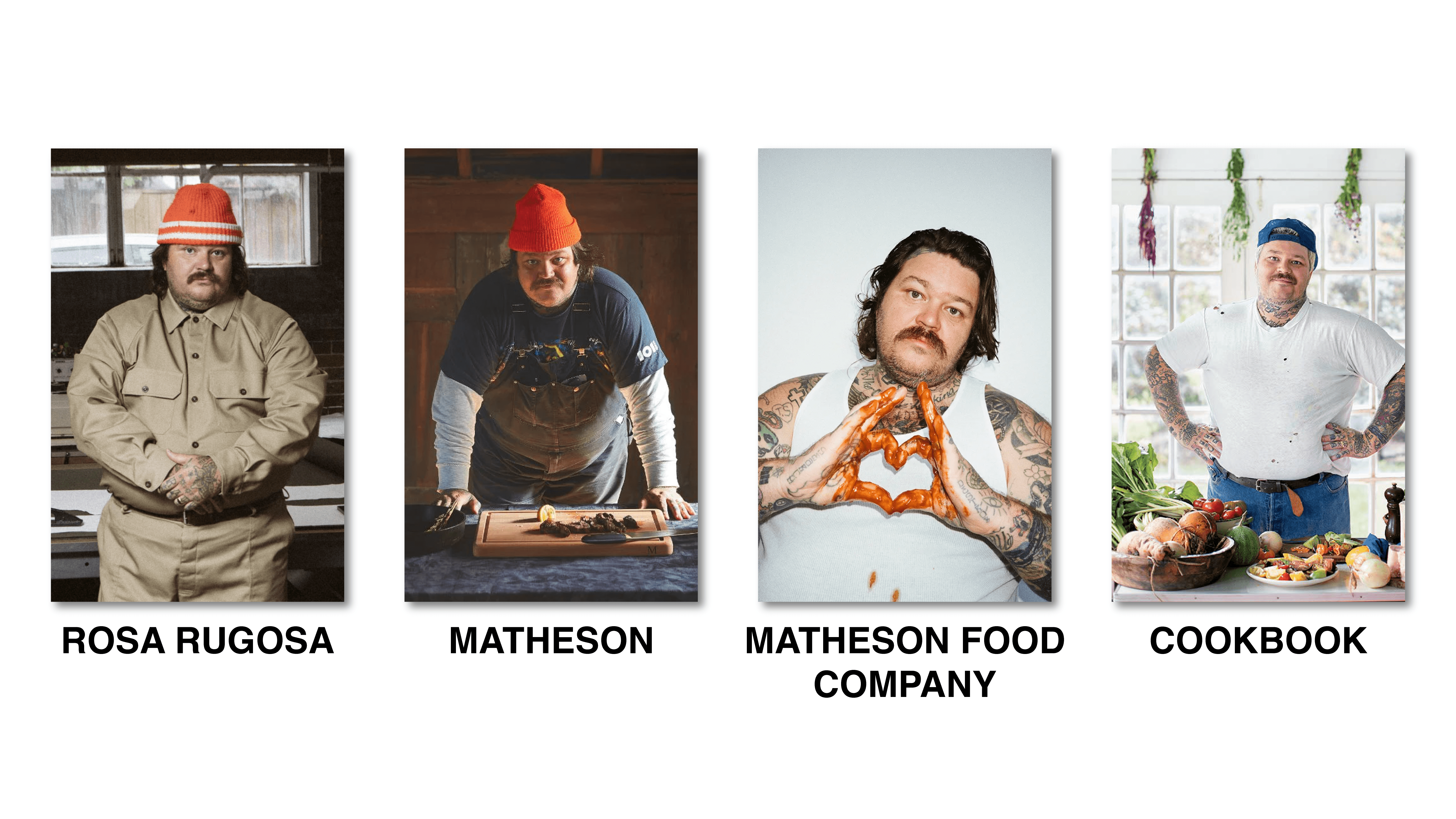
One of the most interesting parts of Matty Matheson’s ecosystem is that it’s not visually uniform.
The cookbooks lean more editorial and classic. The food products are bold and practical. The merch is louder, funnier, and more irreverent. Each category speaks its own visual language.
What holds everything together isn’t matching fonts or colors — it’s emotional consistency. The feeling you get when you encounter any part of Matty’s universe is familiar, even if the visual execution changes completely.

Brand consistency is about repetition: the same logo, the same typography, the same rules applied everywhere. Brand cohesion, on the other hand, is about belonging. It’s about different expressions still feeling like they come from the same place, with the same values and attitude underneath.
Matty’s world proves you can have variety without fragmentation if the intent stays clear. The designs don’t need to match; they need to make sense together. And that distinction is what allows the ecosystem to grow, adapt, and stay recognizable without becoming visually rigid or creatively boxed in.
One world, many doors: why the ecosystem works
At this point, it becomes clear that this isn’t just a collection of brands — it’s a system. But more importantly, it’s a designed system.
What makes Matty Matheson’s brand ecosystem work is not volume, scale, or even popularity. It’s the way each part is intentionally positioned within the same world, playing a distinct role while reinforcing a shared point of view.
From a branding and marketing perspective, this is closer to world-building than classic brand architecture — a brand ecosystem designed around meaning rather than control. Instead of a parent brand dictating rules to sub-brands, we get multiple entry points into the same universe. You don’t need to start at the “main brand” to understand it — you can enter through a cookbook, a burger, a sauce, a TV show, or a hoodie, and the logic still holds.
This is where the design decisions you see across the ecosystem start to matter. The cookbooks operate as the editorial backbone: slower, more considered, typographically calmer, almost timeless. They establish taste and credibility.
Matheson Food Company sits at the opposite end of the spectrum — bold, practical, shelf-forward. Bright colors, heavy sans-serif typography, high contrast, flash photography. The packaging is easy to read, slightly retro, and deliberately imperfect. Matty appears stained, mid-cook, laughing, sweating. The brand embraces real life rather than polishing it away, which makes everyday products like mac and cheese or salad dressing feel honest instead of over-marketed.
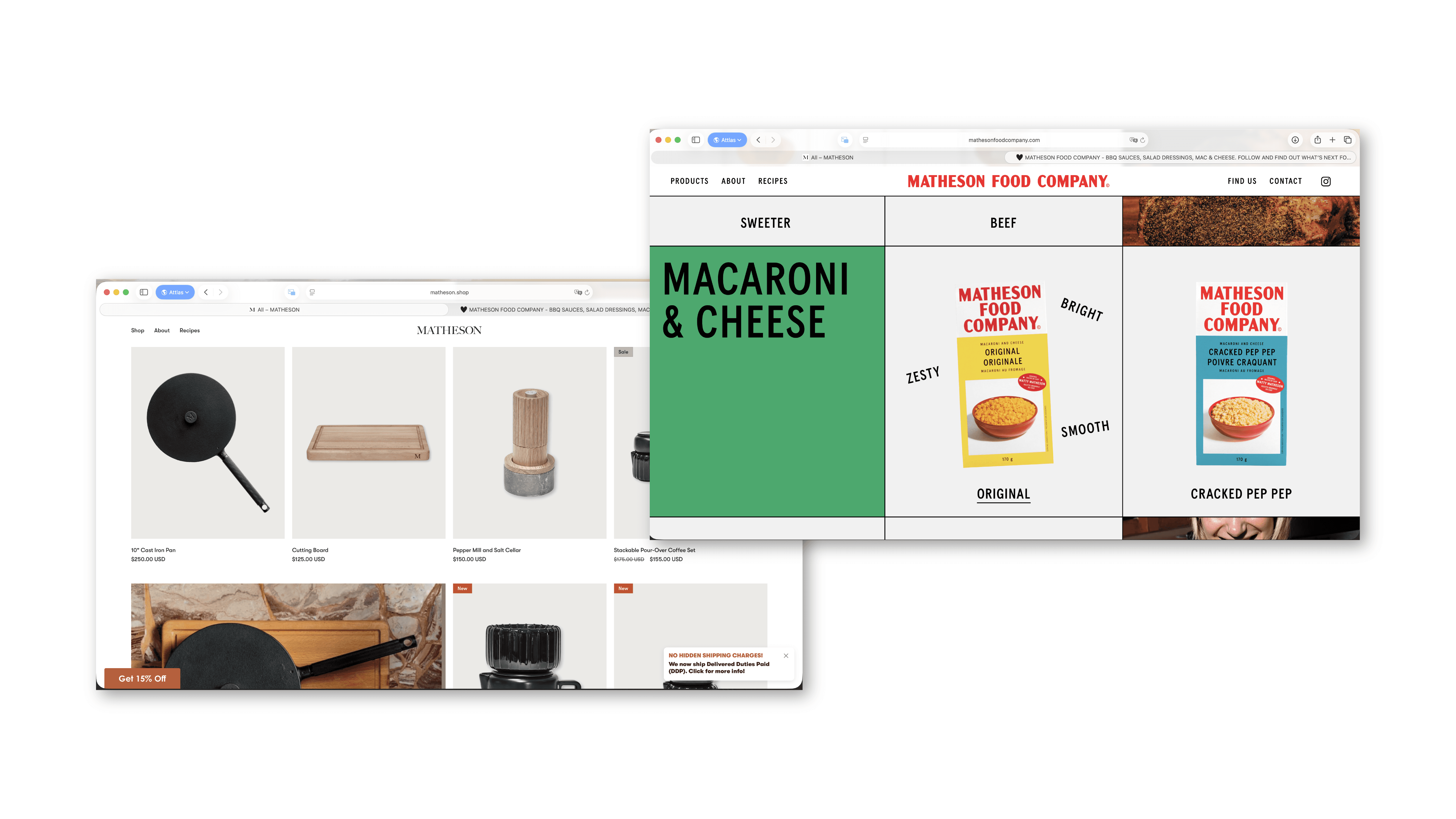
Then there are the quieter expressions. Matheson Shop, developed with Castor Design Studio, lowers the volume completely. The design is calmer, more curated, more domestic. Less flash, more atmosphere. Cookware and tools that blur the line between utility and object, closer to a Williams-Sonoma sensibility than a hype-driven drop culture.
Rosa Rugosa adds yet another register: utility-driven workwear, handmade in Toronto, designed to be worn by any body. No loud branding, no trend chasing — just functional clothing tied to labor, movement, and everyday use. And Blue Goose Farm pushes the world even further outward, translating the same values into agriculture, slow living, and community. Its visual language feels raw and almost childlike — doodly, imperfect, grounded — reinforcing the idea that this world is lived in, not styled.
These expressions don’t compete because they’re not designed to solve the same problem. Each one occupies a distinct emotional and functional role within the system — editorial, everyday utility, domestic ritual, work, culture — while reinforcing the same underlying themes: food as joy, comfort, generosity, and connection.
That’s why expansion feels inevitable instead of opportunistic. New projects don’t register as side hustles or cash-ins; they read as new entry points within an existing structure. The system is flexible enough to evolve across categories and formats, but grounded enough to stay recognizable — not because everything looks the same, but because everything is anchored to the same meaning.
So… what’s the lesson here?
This is where the analysis stops being about Matty Matheson and starts being useful.
The big takeaway here isn’t that everyone should build a massive ecosystem, or launch multiple products, or turn their brand into a world overnight. It’s that coherence matters more than scale.
A lot of brands live perfectly well on consistency alone — clear logos, repeated systems, recognizable patterns applied everywhere. And that’s not a problem. For many brands, especially those that need clarity, efficiency, or tight control, consistency is exactly what the job requires.
What Matty’s case helps clarify is that consistency and building a world are two different ambitions. A full brand world isn’t for everyone, and it doesn’t need to be. But when a brand does have the cultural pull, personality, or narrative depth to sustain it, leaning into that world — and designing for cohesion rather than sameness — unlocks a different level of connection and growth.
What Matty’s world shows is what becomes possible when a brand is able — and willing — to move from consistency into world-building through cohesion. Not by rejecting systems or recognition, but by using them as a foundation. Consistency sets the rules; cohesion gives those rules range.
In this kind of brand world, different expressions, formats, and even aesthetics can coexist without tension. What matters is not visual sameness, but a shared point of view that holds everything together. The pieces don’t need to look alike — they need to feel like natural parts of the same universe.
So if there’s a lesson to take from this ecosystem, it’s not “do more.” It’s this: build a world before you build extensions. Make sure everything you put out can be traced back to the same core idea, the same energy, the same reason for existing.
If you want a simple gut-check, think in terms of worlds rather than assets:
Do the things we put out feel like different expressions of the same point of view?
Are our design and brand decisions helping people understand what we stand for, or just helping them recognize us?
If someone enters our brand through one touchpoint, does the rest of the ecosystem feel like a natural extension of that experience?
That’s the real strength of a brand ecosystem. Not size. Not volume. But the ability to grow without losing yourself.


