January 26, 2026
VISUAL BRAND CONSISTENCY: WHY IT MATTERS MORE THAN YOU THINK
Your brand might look fine — but still feel wrong. Visual consistency is often the missing piece between good design and brands people actually trust.
Most brands don’t fail because they chose the wrong color or the wrong font. They fail because nothing quite adds up.
The website feels serious, the Instagram feels playful, the pitch deck feels generic, and the product feels like it belongs to a different company altogether. Nothing is obviously broken — but nothing feels solid either.
That feeling is visual inconsistency. And whether you’re a business owner or a designer, it’s one of the fastest ways to lose trust without realising it.
In this article, we’ll define what visual brand consistency actually is, why people perceive it more strongly than they can explain, and how it quietly separates brands that feel intentional from those that feel improvised.
What visual brand consistency actually means (and what it doesn’t)
When people hear “visual consistency”, they often imagine a brand frozen in time — the same layout, the same colors, the same moves, over and over again.
That’s not consistency. That’s fear.
At its core, visual brand consistency is about coherence across touchpoints. It’s the feeling that everything a brand puts into the world is clearly coming from the same place, even when formats, platforms, or contexts change.
Consistency isn’t about controlling every outcome. It’s about defining the rules that guide decisions when things dochange.
What consistency is:
What consistency isn’t:
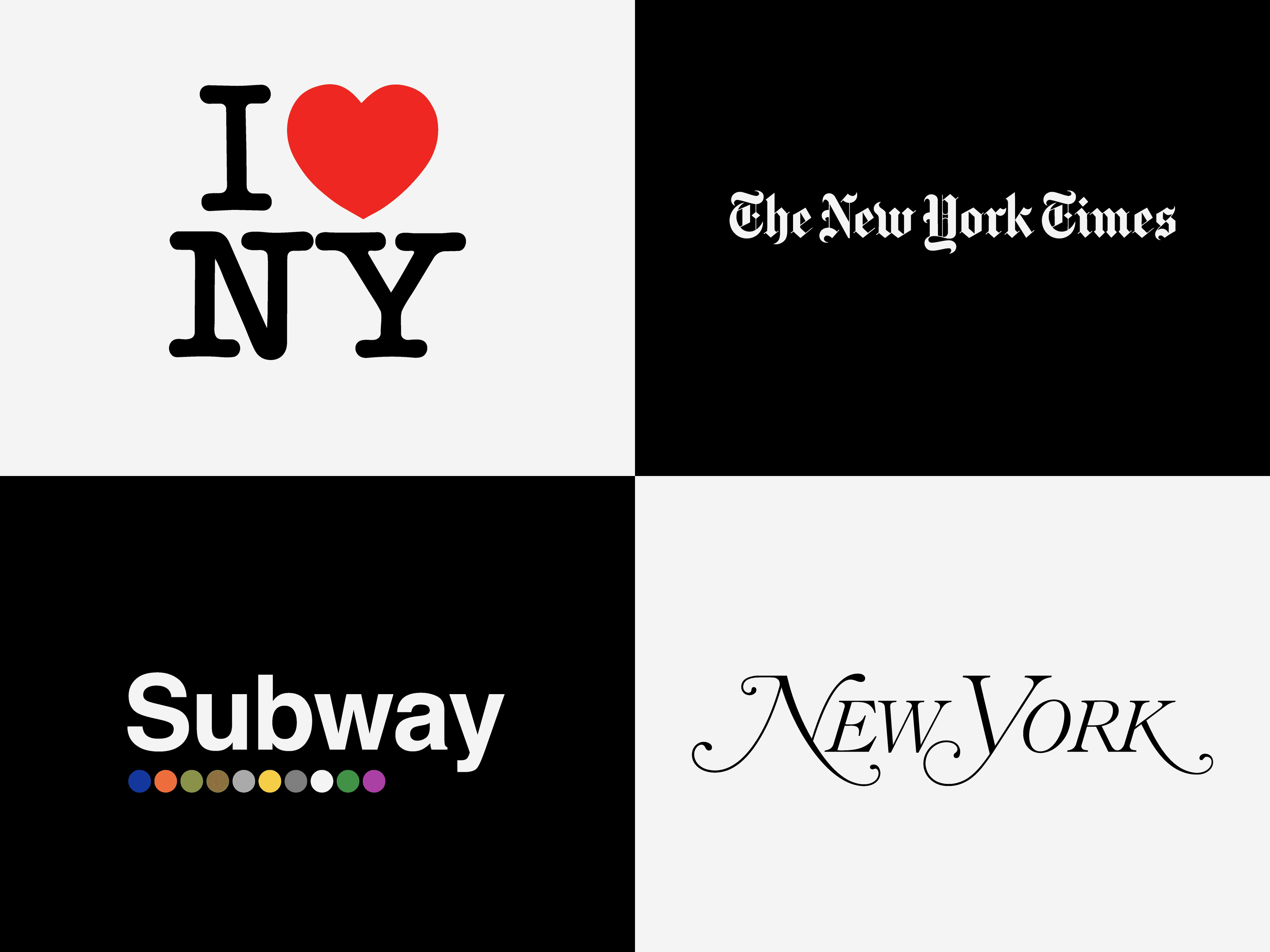
Consistency is about being recognisable before being impressive. When people know it’s you without reading the name, the system is working.
Why consistency shapes perception more than we realise
People don’t experience brands the way designers do.
They don’t zoom into typography choices or debate color contrast. They scan quickly, absorb patterns subconsciously, and move on. This is where consistency becomes powerful.
Our brains are wired to recognise and reward patterns. When visual signals repeat in a coherent way, they become easier to process. That ease creates comfort. Comfort turns into trust.
This is why consistency is rarely praised out loud — but its absence is instantly felt. When things don’t align, the reaction isn’t analytical. It’s visceral: something feels off.
Over time, consistent brands benefit from what we could call visual momentum. Each touchpoint reinforces the last. Recognition gets faster. Confidence grows quietly.
Inconsistent brands don’t feel experimental. They feel unreliable. And reliability is one of the strongest signals of quality a brand can send.
Why most brands struggle with visual consistency
Visual inconsistency is almost never intentional.
It usually starts with reasonable decisions made in isolation: a new campaign, a new hire, a new platform, a new urgency. Each choice makes sense on its own. Together, they slowly dissolve coherence.
Some of the most common causes:
From the owner side, consistency breaks when design is delegated without shared rules. From the designer side, it breaks when we focus on outputs instead of structures.
The tricky part is that inconsistency doesn’t announce itself. It accumulates quietly, until the brand feels diluted — and no one can point to a single moment when it went wrong.
What actually makes a brand visually consistent
This is where most brands get stuck — because they look for consistency in individual elements instead of relationships.
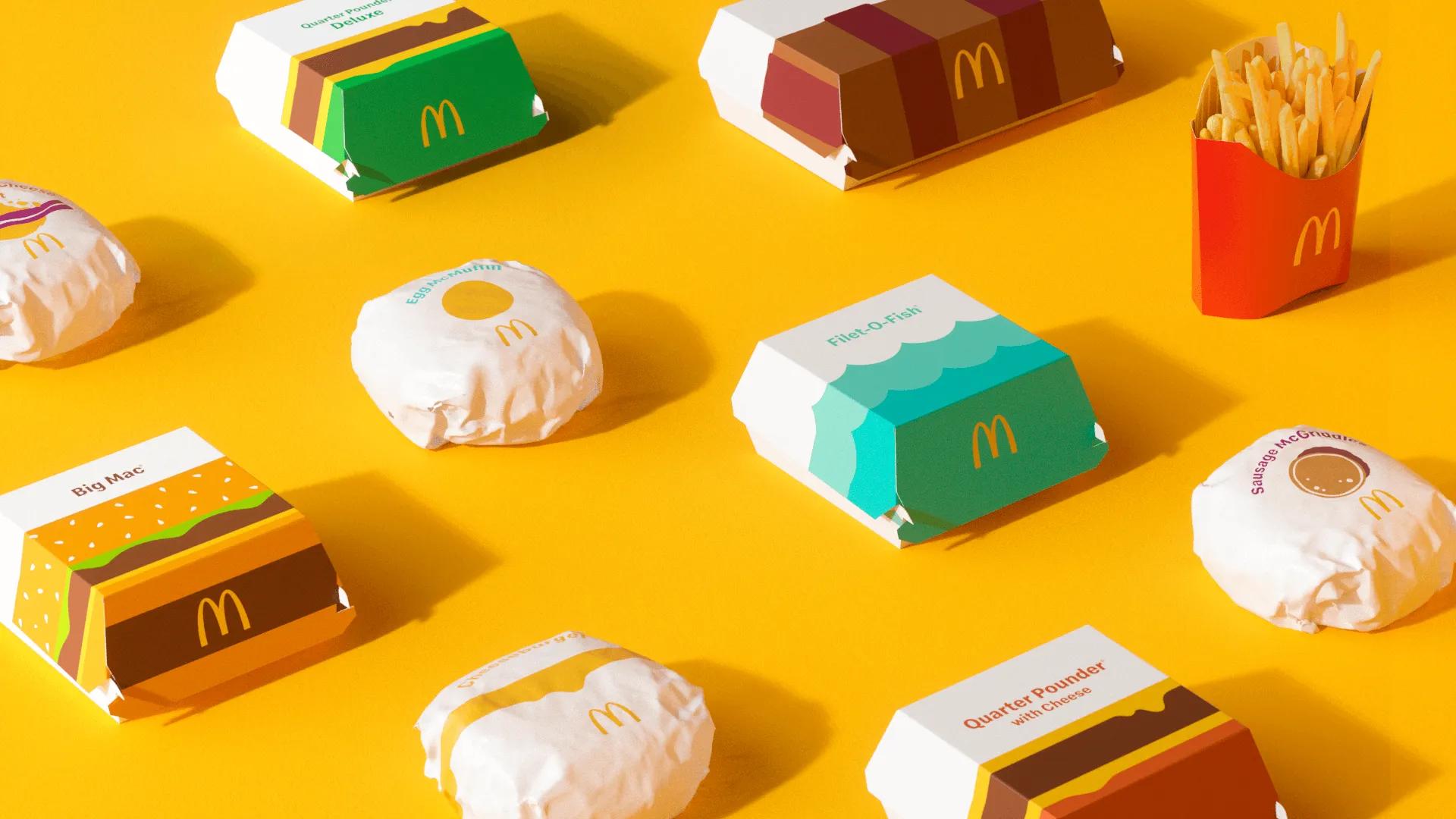
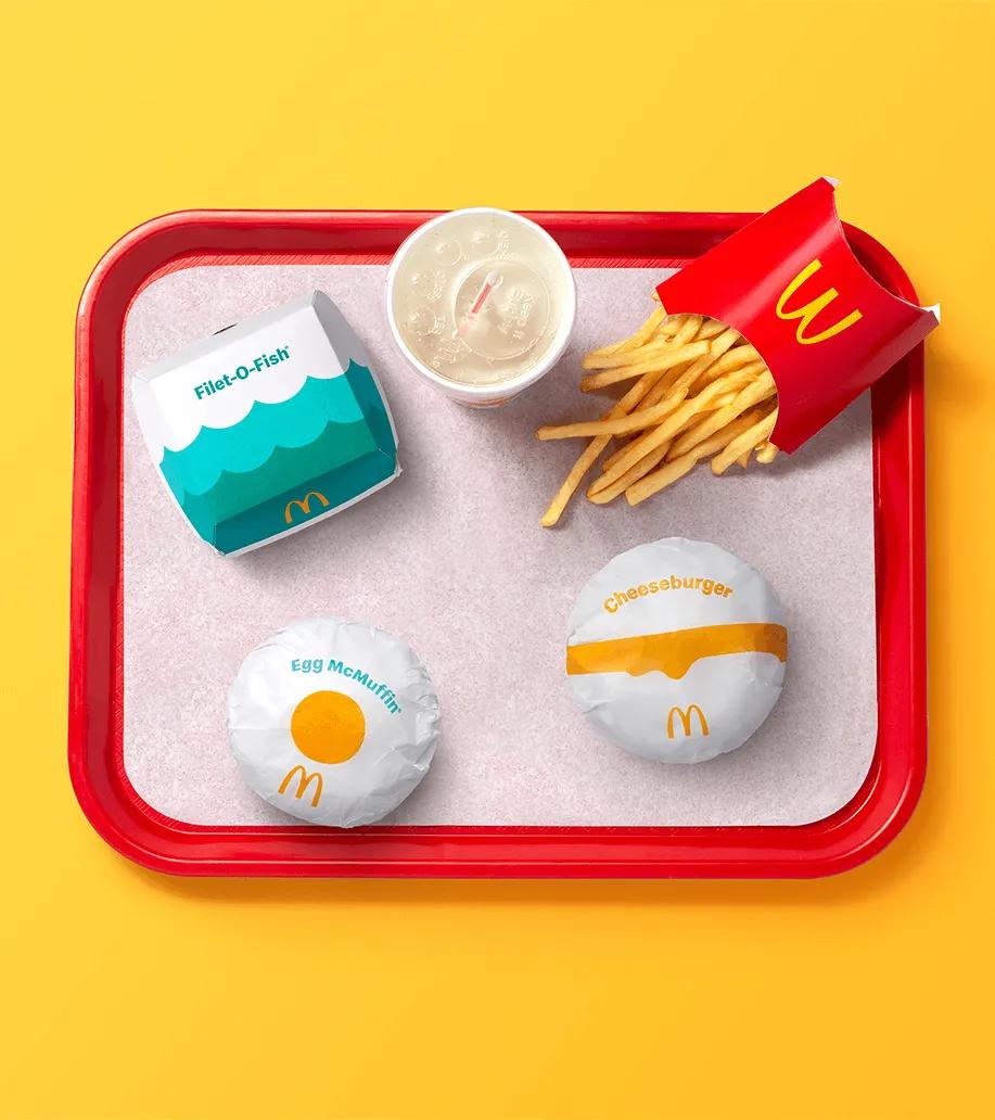
Visual consistency isn’t one decision. It’s the result of multiple elements working together, repeatedly, over time:
The key idea is simple but often missed: consistency lives between elements, not inside them.
A strong logo won’t save a chaotic layout. A beautiful color palette won’t help if it’s used differently every time. Systems create consistency — assets alone don’t.

Consistency doesn’t limit brands — it strengthens them
One of the most persistent myths around consistency is that it kills creativity.
In reality, inconsistency is what limits teams the most. When rules are unclear, every new piece becomes a debate. Decisions slow down. Confidence drops.
Clear constraints do the opposite. They reduce decision fatigue. They help teams move faster and focus their creative energy where it actually matters.
Consistency doesn’t flatten ideas — it amplifies them. Strong concepts become recognisable. Weak ideas stop hiding behind constant change.
Over time, consistency becomes a brand’s quiet advantage. It makes ideas stick longer and land harder, without needing to shout.
How to tell if your brand is actually consistent (and how to fix it)
Instead of starting with your brand guidelines, start with reality.
Look at what your brand has actually produced in the last months — across platforms, formats, and moments. Then ask yourself:
If the answers are fuzzy, the system probably is too. Consistency isn’t proven in documents — it’s proven in outputs.
If you want to strengthen your brand without jumping straight into a rebrand, start with these practical moves:
Visual consistency is often the fastest upgrade a brand can make. And when defining it feels harder than it should, bringing external structure can save months of slow drift.
If you want to strengthen your brand without a full rebrand, start here:
Visual consistency is often the fastest upgrade a brand can make. And when defining it feels harder than it should, bringing external structure can save months of slow drift.
Photographs: Pearlfisher pearlfisher.com