January 23, 2026
KEITH HARING AND THE POWER OF VISUAL LANGUAGE
Keith Haring’s work feels immediate and playful, but nothing about it is accidental. His design style was built as a clear visual language, made to travel across walls, posters, and products without losing meaning.
Some designers chase complexity. Keith Haring did the opposite.
In a visual world already crowded with images, Haring chose reduction: fewer shapes, fewer colors, fewer details — and somehow, more impact. His work spread across subway stations, city walls, posters, galleries, and products, long before “scalability” or “visual systems” were common design terms.
This article isn’t a full art-history deep dive. It’s a design-focused look at how and why Keith Haring’s style works, and what designers can still learn from it today.
Who was Keith Haring (and why designers still care)
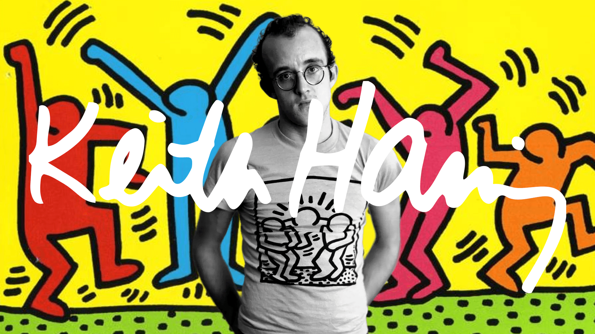
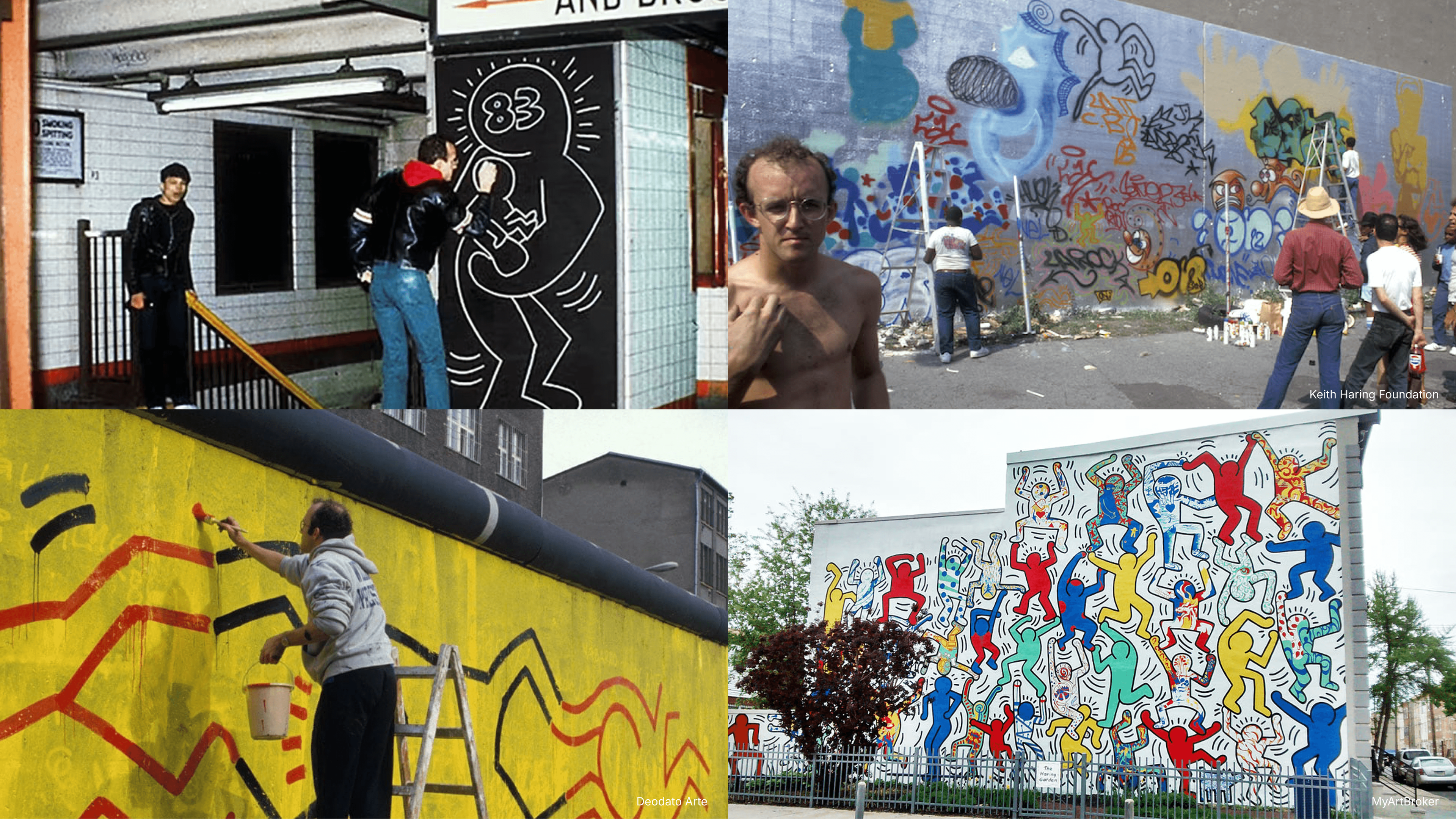
Keith Haring emerged in late-1970s New York, a city defined by graffiti, hip‑hop, club culture, and political tension. He began by drawing with white chalk on empty black advertising panels in subway stations — illegal, temporary, and seen by thousands of people every day.
Those subway drawings weren’t just an entry point into his career; they shaped the way he approached making images altogether. What mattered wasn’t permanence or polish, but immediacy. Haring wasn’t creating precious, isolated artworks meant for quiet contemplation. He was designing images meant to be read fast, remembered instantly, and understood without explanation.
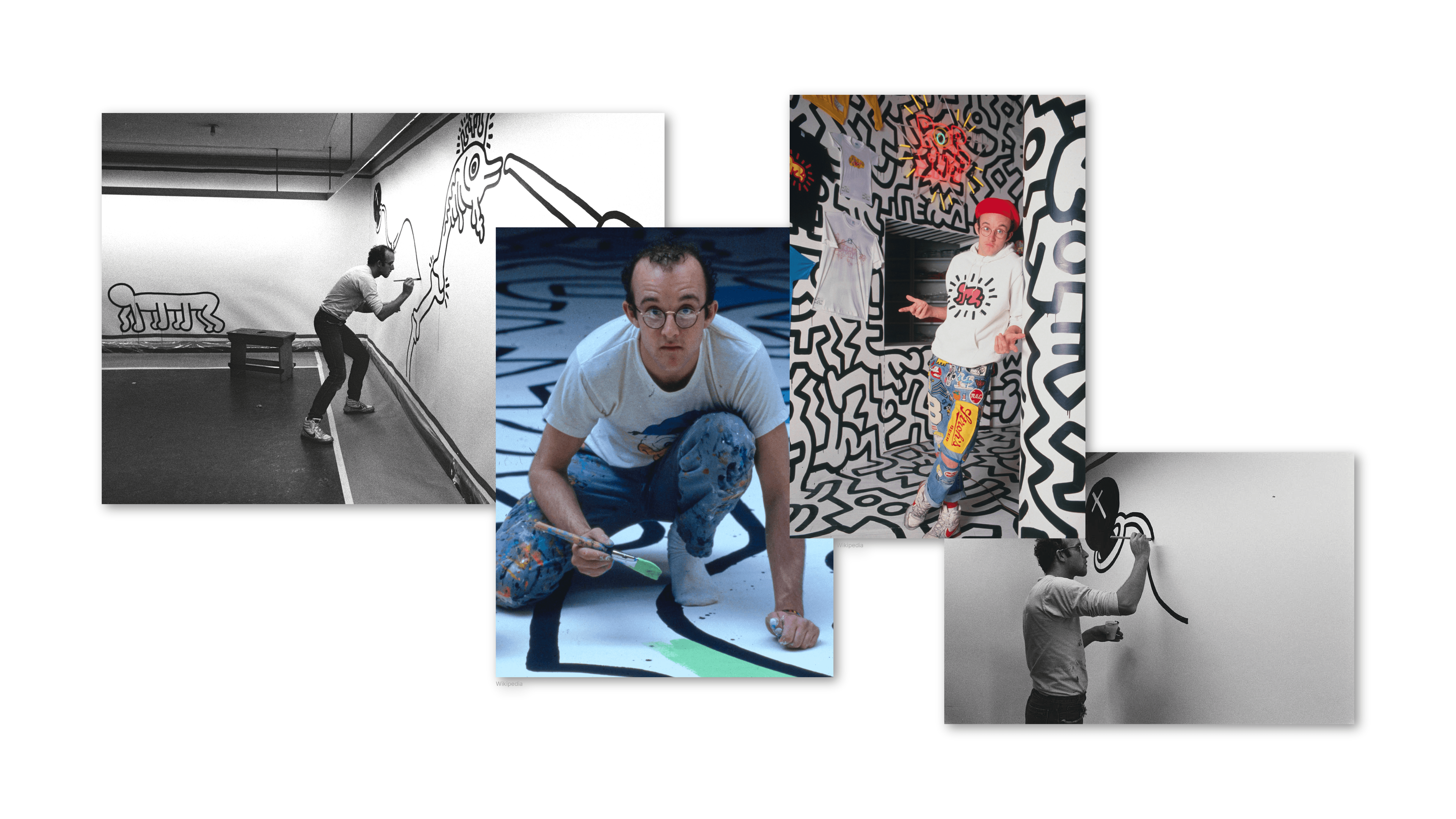
That way of thinking — audience-first, context-aware, and inherently system-oriented — is why designers still reference him decades later. His work sits comfortably between art, graphic design, branding, and public communication, not because it’s vague, but because it was intentionally built to move across all of them.
Designing for the street: speed, clarity, and public space
The subway is a brutal design environment. People are moving, lighting is inconsistent, and attention spans are fragmented by noise, speed, and distraction. You get seconds — sometimes less — to communicate anything at all before the moment is gone.
Haring’s visual language grew directly out of these conditions. Drawing underground meant designing for distance, motion, and partial attention. His figures had to read instantly, even when glimpsed from the corner of an eye or across a crowded platform.
That’s why his style leans so hard on a few non‑negotiables:
His visual language wasn’t decorative — it was functional. Every line, color, and symbol served speed and clarity. That’s also why his work still feels so contemporary today: it solves the same core problems designers face in feeds, billboards, interfaces, and any environment where attention is scarce and time is limited.
The core visual system behind Keith Haring’s style
Haring’s work is often described as playful or spontaneous. But structurally, it’s incredibly consistent.
At the core of his design system:
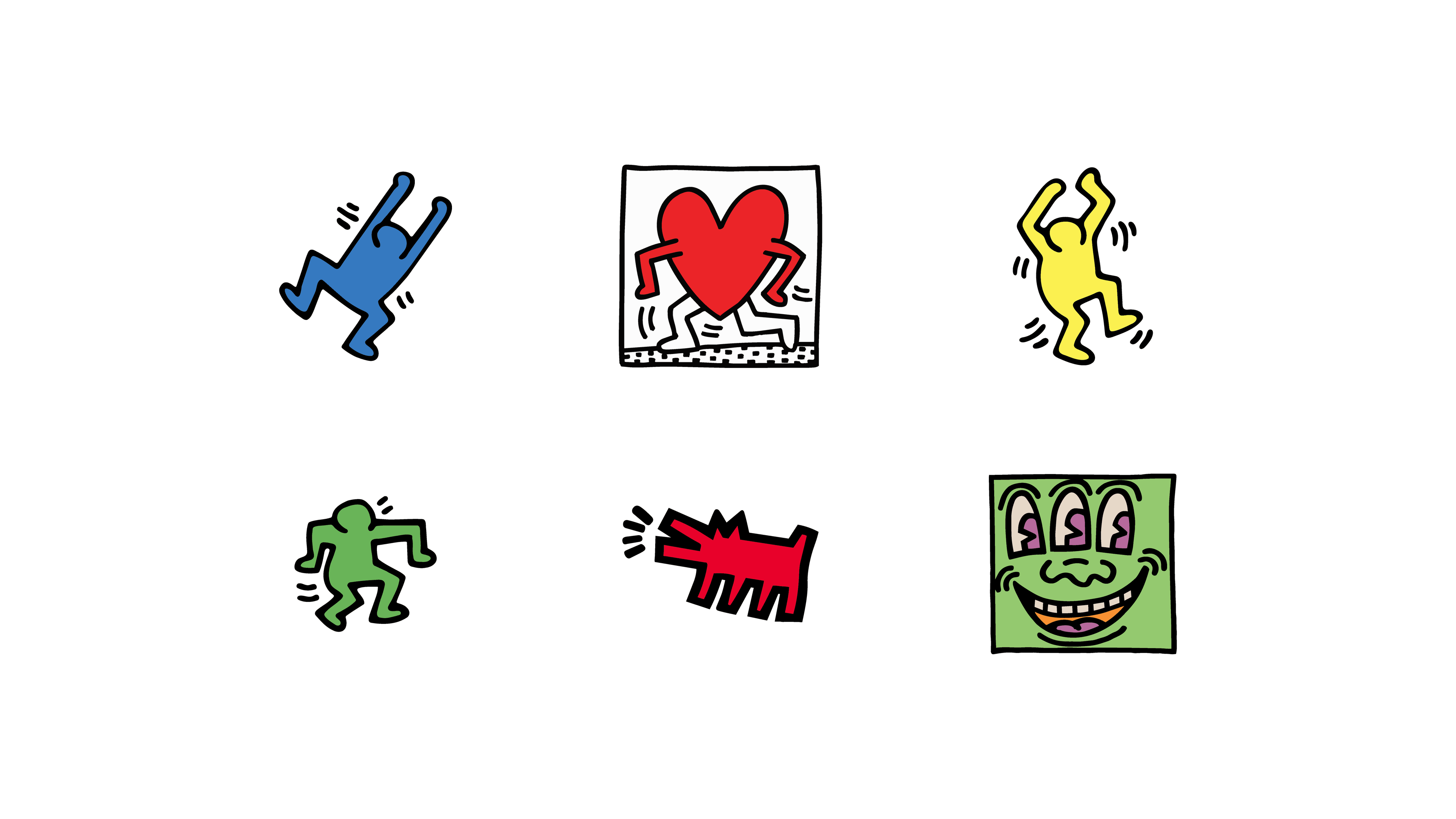
There’s no shading, no depth, and almost no texture. That absence is intentional. By removing volume and surface detail, Haring forces the eye to focus on what really matters: silhouette, movement, and symbol. Each figure reads as a clear shape first, not as a detailed scene to be decoded.
From a design perspective, this reduction is crucial. Shading and texture tend to individualize images; flat shapes do the opposite. They make forms repeatable, adaptable, and easy to reproduce at any scale. Haring wasn’t creating individual illustrations — he was building a reusable visual system. One that could be redrawn quickly, remembered easily, and applied consistently across walls, posters, prints, and objects without losing its identity.
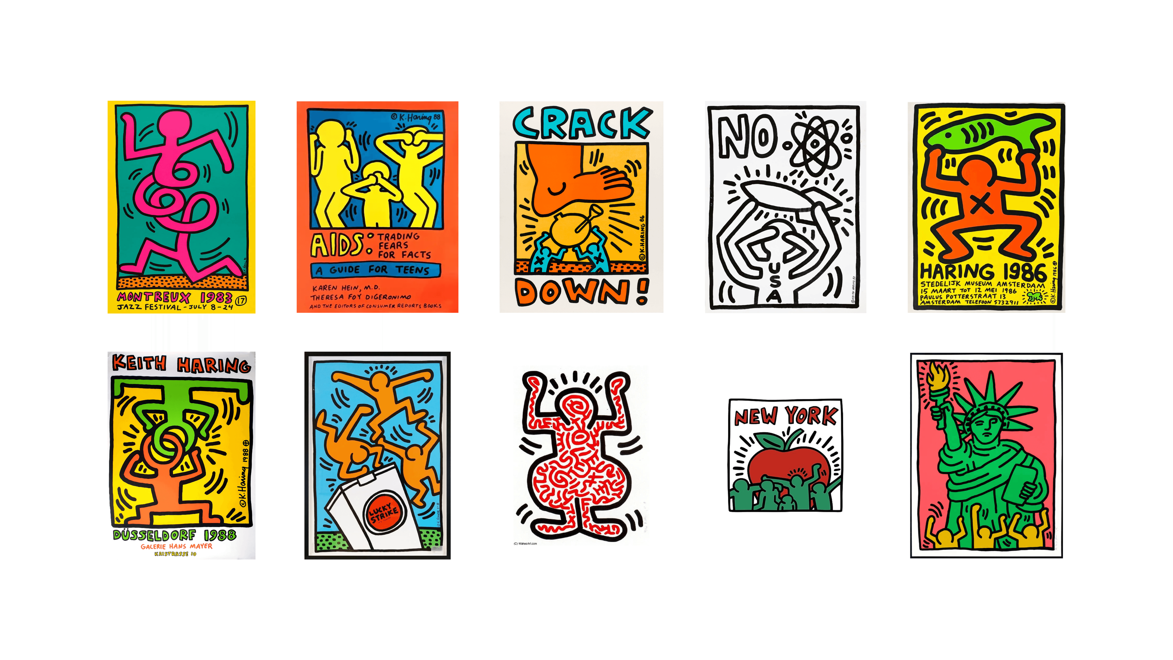
Symbols as a universal visual language
Radiant babies. Barking dogs. Hearts. Televisions. Flying saucers.
At first glance, these symbols can feel almost childlike. But their power lies precisely in that simplicity. Haring returned to the same figures again and again not out of laziness, but strategy. By repeating a limited set of symbols, he trained viewers to recognize them instantly — the way we learn letters, logos, or interface icons through exposure.
Each symbol carried meaning without needing explanation. The Radiant Baby suggested life, hope, and innocence. The barking dog signaled authority, control, or aggression. Hearts evoked connection and empathy, while televisions hinted at mass media, influence, and passivity. Importantly, these meanings were never locked into a single interpretation. They stayed open enough to adapt to different contexts and messages.
This is where semiotics becomes useful for designers. In simple terms, semiotics studies how signs work — how an image can stand for an idea larger than itself. Haring understood that symbols could move faster than words, especially in public space. They bypassed language, literacy, and cultural barriers, allowing his work to speak across ages, backgrounds, and geographies.
From a design systems perspective, this is crucial. Haring wasn’t just drawing recurring characters; he was building a visual vocabulary. A small set of modular symbols, combined and recombined to communicate different ideas while remaining recognizably his.
In many ways, he was designing an early icon system — decades before emojis, brand icon libraries, and interface symbols became everyday tools.
When content shapes form: activism as a design driver
Haring’s clarity wasn’t neutral. It was a deliberate response to the kind of issues he chose to address.
He used his visual language to communicate about AIDS awareness, apartheid, drug addiction, censorship, and nuclear fear — topics that demanded urgency and broad reach. In those contexts, complexity would have slowed the message down or softened its impact. Simplicity made it louder, faster, and harder to ignore.
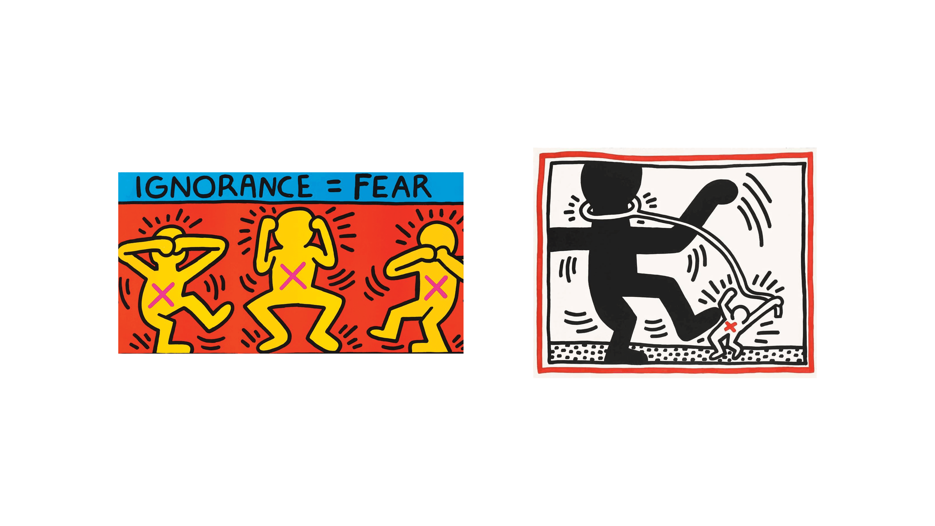
Works like Ignorance = Fear, Silence = Death or the Crack Is Wack mural show how reduced forms can carry heavy meaning without explanation. The visuals don’t ask the viewer to stop and interpret — they hit first, then stay with you.
For designers, the lesson is clear: simplifying a message doesn’t weaken it. When done well, it sharpens intent and amplifies impact.
Scalability before the word existed: murals, posters, products
Haring’s work didn’t live in one place — and that was intentional. From the very beginning, his visual language was designed to travel.
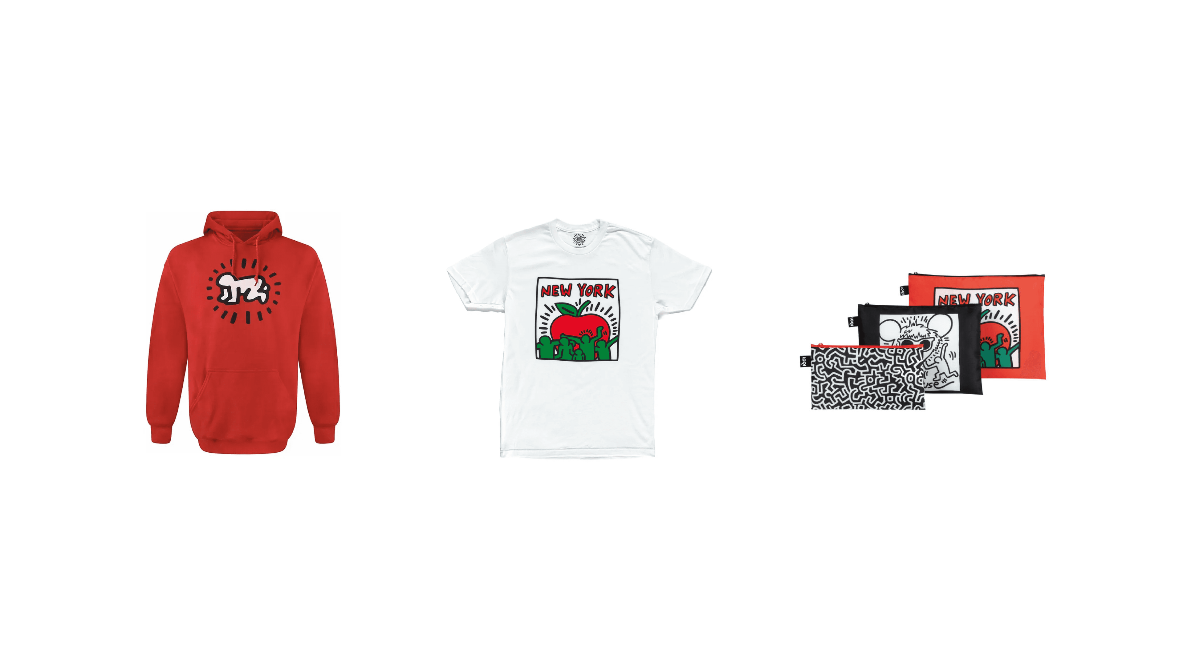
The same symbols and figures appeared on subway walls, large-scale city murals, gallery canvases, political posters, and mass-produced objects. Crucially, these weren’t adaptations or watered-down versions of the work — they were the same system applied to different contexts. The Pop Shop, which sold affordable products featuring his imagery, wasn’t a side project or a commercial detour. It was a deliberate extension of the system itself.
This is where Haring’s thinking feels strikingly contemporary. He understood that meaning isn’t tied to a single medium. When a visual language is clear and coherent enough, it can move across formats without losing its voice.
One language. Many surfaces.
From a branding and identity perspective, this is remarkable. Haring demonstrated that strong visual systems don’t depend on exclusivity or scarcity to maintain value. They depend on consistency, recognizability, and intent. Whether encountered on a wall, a poster, or a T‑shirt, the work remained unmistakably his.
He wasn’t diluting his work — he was distributing it. And in doing so, he anticipated many of the principles that underpin modern brand systems: scalability, repetition, and the ability to stay coherent across radically different uses.
Why Keith Haring still matters to designers today
Haring’s influence shows up everywhere: graphic design, street‑inspired branding, icon sets, visual identities, and even digital interfaces. But what travels forward isn’t just the look — it’s the logic behind it.
Beyond aesthetics, his real legacy is methodological. Haring shows us that strong visual languages are built, not improvised. They emerge from constraints, rely on systems rather than one‑off moments, and treat accessibility not as a compromise, but as a strength.
That’s why his work could move so freely across walls, posters, galleries, and products without losing meaning. The system was doing the heavy lifting.
Understanding Keith Haring isn’t about copying his style. It’s about recognizing how intentional visual language can move through the world — clearly, consistently, and at scale.
If there’s one takeaway, it’s this: great design doesn’t ask for attention. It earns it through clarity, coherence, and the courage to be understood.