January 22, 2026
EVERYONE REBRANDED IN 2025. NOT EVERYONE SHOULD HAVE.
After a year flooded with rebrands, a few stood out for the right reasons. Many didn’t. Here are the best and worst rebrands of 2025.
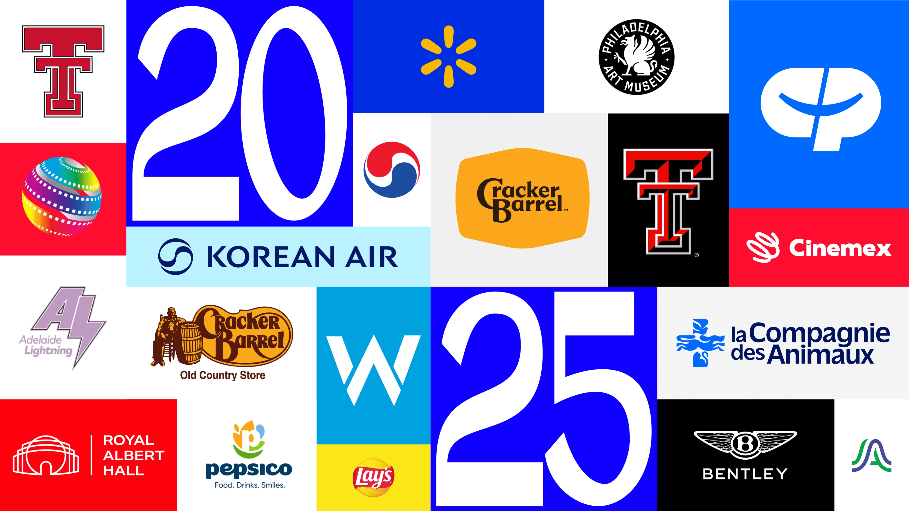
If you were even remotely paying attention to branding in 2025, it probably felt like everyone was rebranding at once. Legacy brands. Institutions. Cities. Airlines. Snack brands. Museums. Racing teams. You name it.
This isn’t a ranking, and it’s definitely not a polite recap. Think of this as a rebranding Wrapped: fast, opinionated, and allergic to corporate politeness — focused on patterns rather than pixel-level critique. We’re not here to dissect kerning. We’re here to talk about decisions.
Because when you look at all these rebrands side by side, one thing becomes painfully clear — and slightly depressing: the brands that won in 2025 modernized with intent, while the brands that lost confused simplification with meaning.
The Winners: Modernization Without Amnesia
The strongest rebrands of 2025 all shared the same quiet confidence — the kind that doesn’t need to scream “NEW LOGO” in 72pt bold. No panic, no trend-chasing, no last-minute "make it more modern" energy. They didn’t panic. They didn’t overcorrect. And most importantly, they didn’t erase what people already recognized.
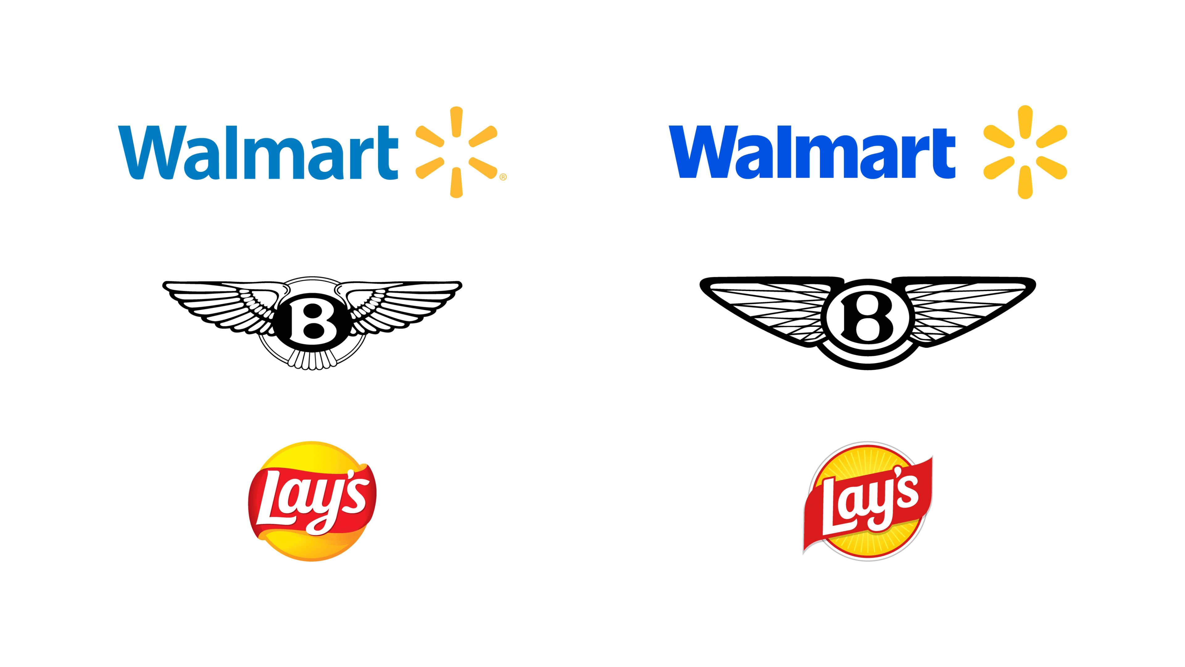
Walmart is a great example of this mindset. The update was simple, modern, and restrained — not because minimalism is trendy, but because the brand already had massive recognition. The work wasn’t about reinvention; it was about tuning. The color palette was pushed into something more vibrant and confident, the typography was thickened and tightened, and even the spark symbol gained more weight. Small tweaks, big payoff: the brand feels stronger, louder, and more contemporary without ever needing to shout — the branding equivalent of lowering your voice and still owning the room.
Bentley pulled off something even harder. Modernizing a luxury brand with more than a century of history is a minefield, yet the result felt inevitable rather than disruptive. The symbol was carefully simplified, but all the cues that matter stayed intact. The wings feel more refined, almost jewel-like, with a diamond-inspired structure that reinforces craftsmanship rather than flattening it. That it’s only their fourth rebrand in over 100 years says a lot about restraint as a strategy — and about not treating heritage like an embarrassing old photo you’re desperate to delete.
Lay’s landed on something many food brands miss: warmth. The redesign went far beyond the logo and into the entire packaging and visual environment, clearly marking a new era for the brand. Gradients were dropped, graphic elements became bolder and more illustrative, and the overall system feels more natural and homey. In a snack aisle increasingly filled with ‘healthy’ competitors, this was a smart repositioning — louder, clearer, and more confident without feeling saturated or desperate.
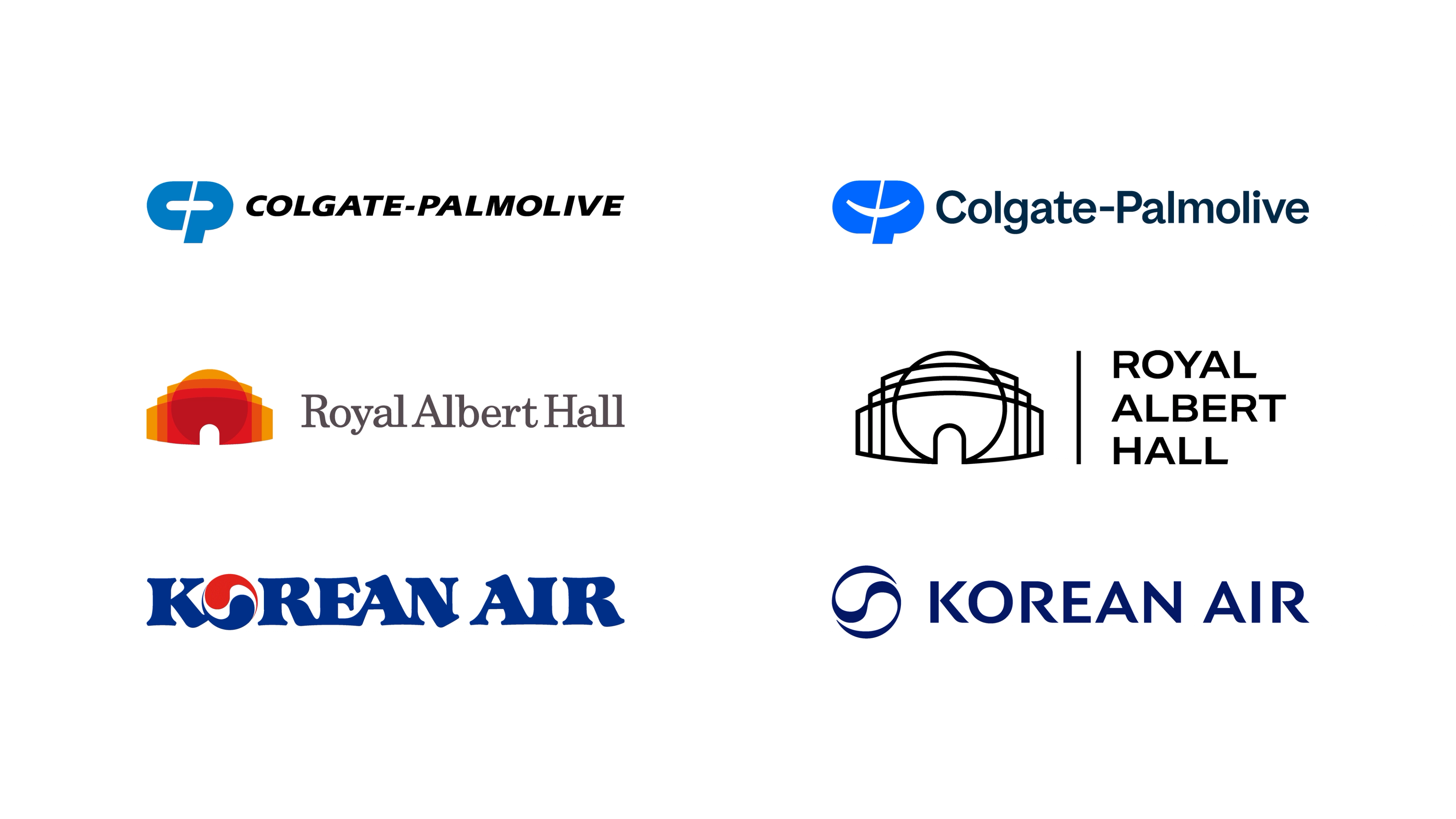
Colgate-Palmolive quietly delivered one of the most disciplined corporate rebrands of the year. The new mark introduces a subtle smile between the C and the P — a small but genuinely human detail. Combined with softer typography and a brighter, more energetic blue, the identity feels more open and more connected. Clear system thinking, strong hierarchy, and a sense that someone actually asked, “How does this feel at scale?” Top-tier, no drama.
On the cultural side, the Royal Albert Hall rebrand stood out for being deeply tied to its purpose. The identity modernizes the venue without abstracting it away, using geometry that directly references the iconic building itself. It’s flexible enough to live across posters, programs, signage, and digital without losing character, and it feels designed for real cultural communication — not just brand guidelines. It didn’t chase trends; it clarified what the institution is and made it more accessible without dumbing it down.
Korean Air struck a similar balance. The update feels dramatically more elegant and far less tacky than before. Typography, symbol, and spacing now lean into flow, restraint, and balance — qualities deeply rooted in Korean design culture. It feels premium without being cold, modern without being generic, and unmistakably Korean without leaning on clichés — no K‑pop gloss, just confidence expressed through restraint, taste, and actually understanding what makes the brand feel premium.
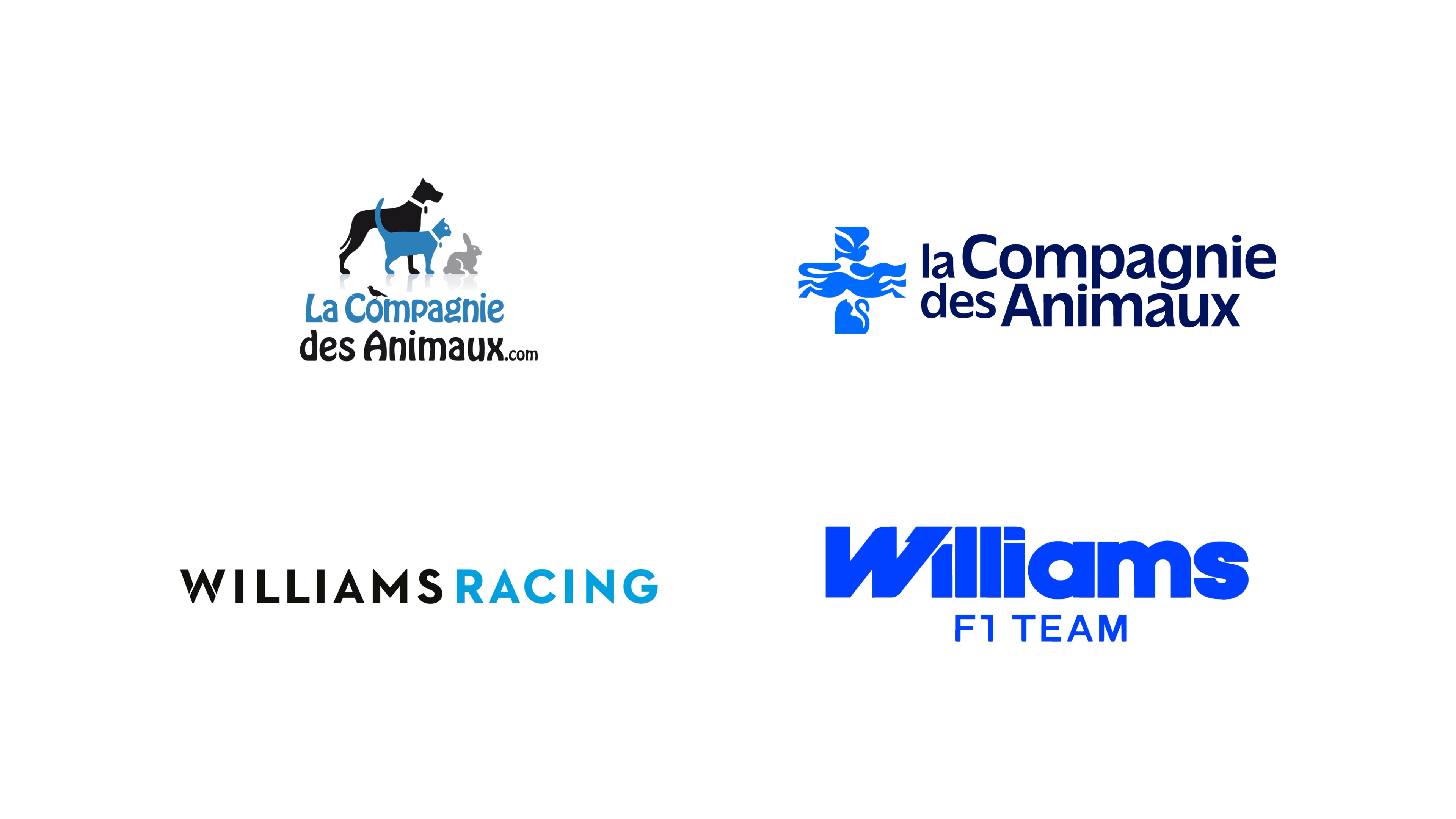
La Compagnie des Animaux deserves a mention for pure satisfaction. The brand moved from a cluttered, dated logo — complete with PowerPoint-style reflections — to a beautifully constructed symbol built from animals forming a cross. The color relationships are calmer, the forms are clearer, and the whole system feels intentional. It’s warm, modern, and incredibly well-resolved — the kind of rebrand that makes designers smile quietly.
And in motorsport, Williams Racing showed how to refresh without losing competitive identity. The new wordmark feels bold, fast, and engineered — more like an F1 car and less like an apparel label. The typography is sharp, confident, and unmistakably connected to the sport. It finally looks like a racing team again, not a lifestyle brand borrowing motorsport aesthetics.
The common thread? These brands treated simplification as a tool, not a goal. They knew exactly what they were simplifying and why. Instead of chasing minimalism for its own sake, they stripped back only what didn’t carry value — and reinforced the signals that already mattered to their audience. Intent came first, visuals followed, and the result felt confident rather than cautious.
The Losers: When Simplification Becomes Self-Sabotage
Now for the painful part. Stretch first.
Some 2025 rebrands didn’t just modernize — they deleted. Ctrl+Alt+Del, straight to brand equity. Not refined, not evolved. Deleted. Identity, character, memory. Gone.
Cracker Barrel is a masterclass in how to misunderstand your own brand. Yes, the colors might be cleaner. Yes, the logo might be more flexible in a deck. But the identity? Completely stripped. Where’s the barrel? Where’s the story? Where’s anything that tells you this is the same place people have been going to for decades? Instead, we get a weird, soft-edged badge that looks like it was pulled from a default icon library. If you didn’t know the brand before, this tells you nothing. And if you did know it, it feels like a quiet betrayal.
Texas Tech somehow managed to take an already complicated logo and turn it into something even more confusing. The old mark was busy, sure — but at least it had presence. The new one feels like a bad optical illusion: daddy T, baby T, stacked like furniture. Is it a carpet? A stamp? A placeholder? The red is oddly bland, the form isn’t intimidating, and when you look at it next to other U.S. universities — TCU, Oklahoma State — it feels shockingly timid. College sports branding doesn’t need to be flashy, but it does need to hit. This one barely taps. It doesn’t intimidate, excite, or scare the opponent — it politely asks if that’s okay.
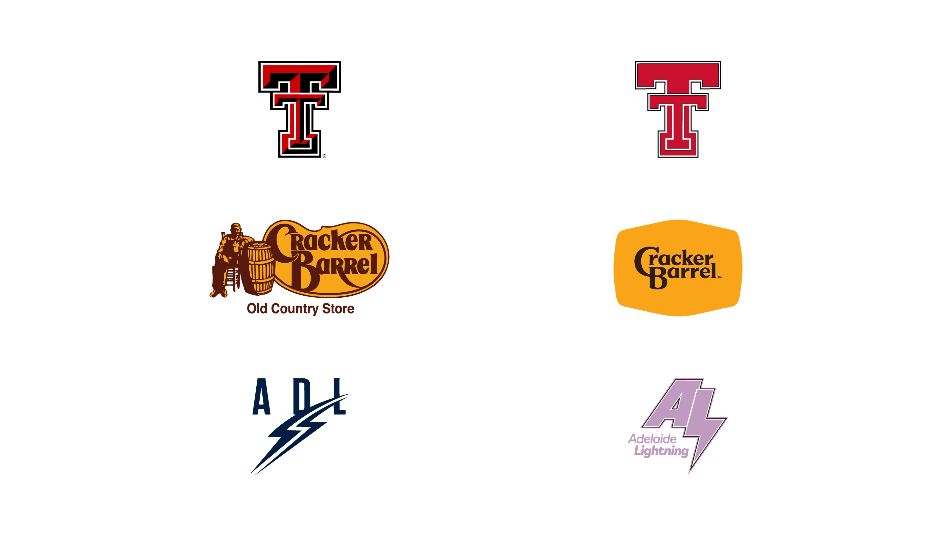
Adelaide Lighting is where the whole thing collapses. The thick outline, the questionable purple, the strange typography mashup — nothing here feels resolved. That awkward white line between the A and the lightning bolt looks accidental, not intentional. And it only gets worse once you see the extended color palette. Purple and orange? Really? We won’t even break it down — just search it yourself and feel the regret. This isn’t bold experimentation; it’s visual noise dressed up as branding.
These weren’t failures of taste — or even talent. They were failures of judgment — rushed decisions, weak conviction, and a clear lack of respect for what made these brands valuable in the first place. This is what happens when fear drives the brief and nobody in the room is brave enough to say no.
The Weird Middle: Technically Fine, Emotionally Empty
Then there’s the uncomfortable middle tier — the rebrands that aren’t disasters, but still leave you staring at the screen thinking, “That’s it?” The branding equivalent of an awkward shrug, “That’s it?”
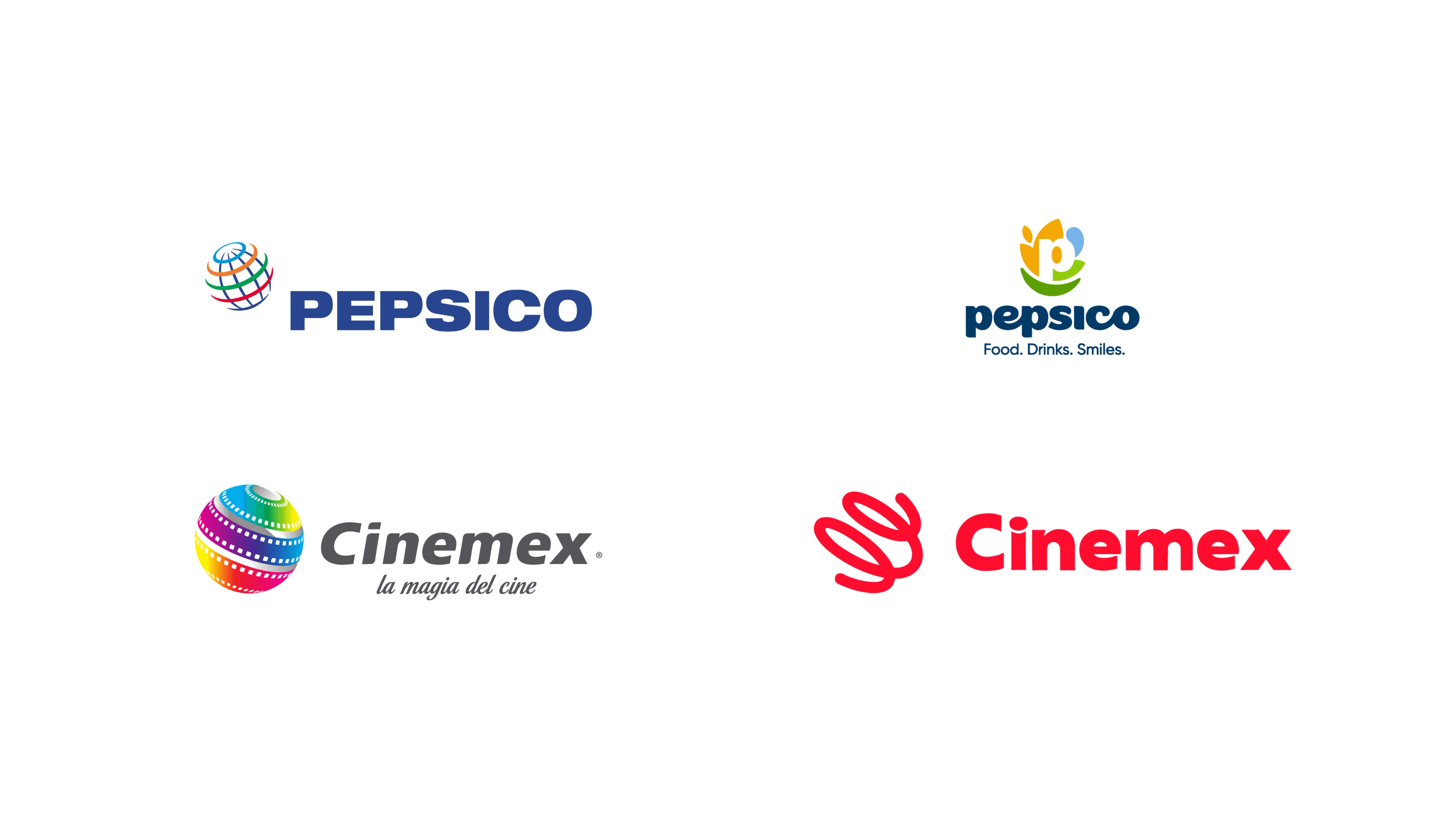
PepsiCo is a case of good intention, weak delivery. On paper, the system makes sense: a more human typeface, a friendlier symbol, and a color palette where every shade has a meaning — grains, smiles, water, positive impact. The problem is presence. The colors are so muted and cautious that they drain all energy from the identity. The symbol is clever, the typography is warmer, but the palette makes the whole thing feel shy. For a global holding company, shyness doesn’t read as refined — it reads as insecure.
Cinemex clearly needed a rebrand, but it gave up its strongest asset in the process: the iconic film-world symbol. What replaces it is a soft, abstract ribbon that tries very hard to be friendly and ends up feeling vague and slightly childish. The typography follows the same logic — nicer, rounder, and less cinematic. It’s not bad, but it’s emotionally flat — like a movie trailer with no music. And if you didn’t know the old identity, that ribbon tells you absolutely nothing.
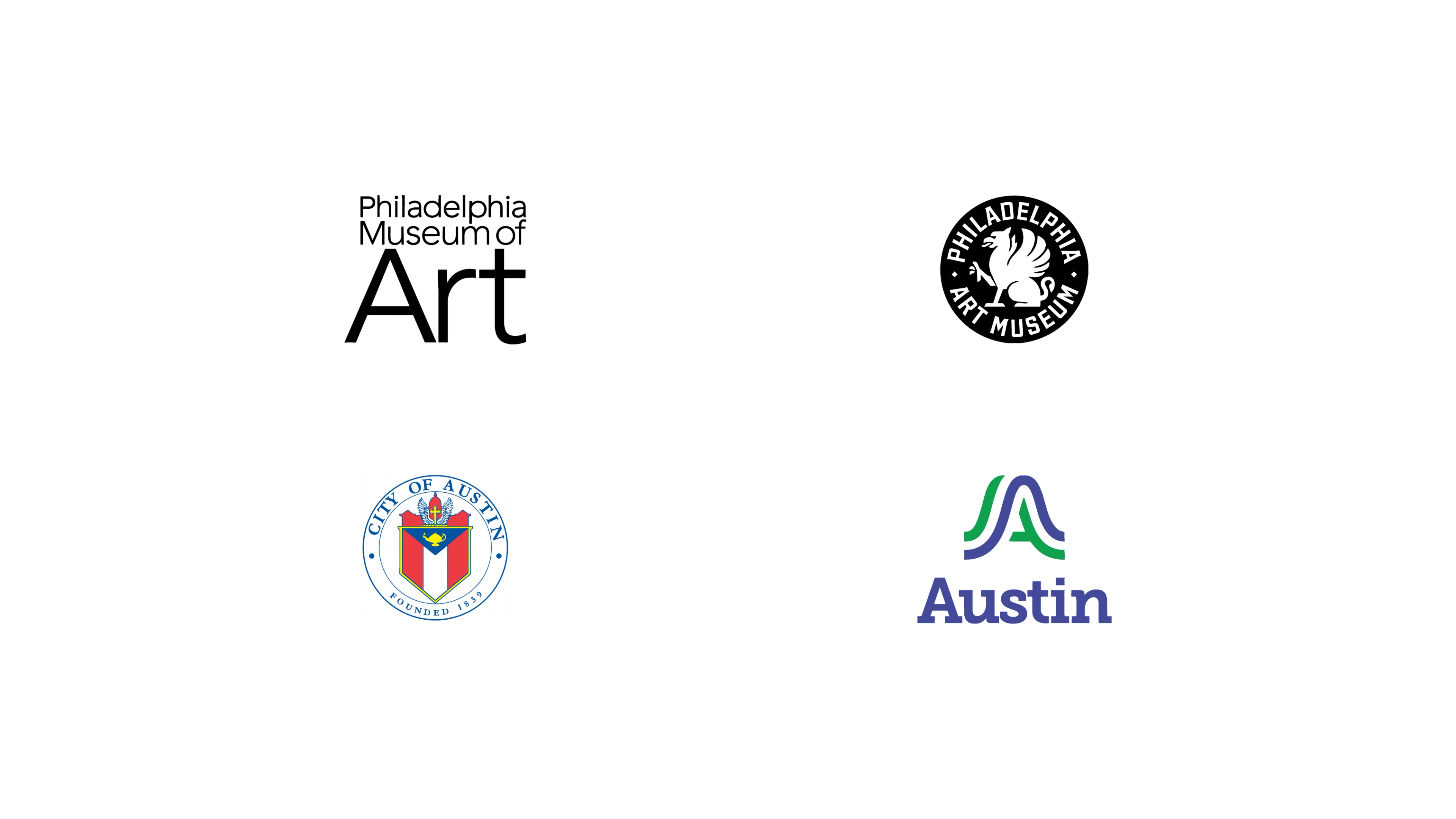
The Philadelphia Art Museum absolutely needed a refresh, but the new identity leans too far into sports-badge territory. The circular layout and heavy containment overpower the work and strip away seriousness. Ironically, the mascot itself is well drawn and expressive — it’s the framing that pushes the whole system into the wrong category for a cultural institution.
Austin’s city rebrand is conceptually solid: modern, flexible, nature-inspired, and system-ready. But the abstraction goes so far that it stops feeling like a city and starts feeling like a concept. Remove the explanation, and there’s very little that emotionally anchors it to Austin itself. Add the reported million-dollar price tag, and the disconnect becomes even harder to ignore.
These brands didn’t fail because they broke the rules. They failed because they mistook good intentions for good execution. The strategy wasn’t wrong — modernize, simplify, systematize — but the translation was weak. They trusted the playbook more than their own context, followed the rules without questioning whether they actually fit, and ended up with work that feels correct on paper but empty in reality. The intent was there. The conviction wasn’t. And branding without conviction is just design theatre for decks, not something real people ever connect with.
What 2025 Rebrands Actually Taught Us
Looking at 2025 as a whole, a few lessons are impossible to ignore — especially if you’re tired of watching brands make the same mistakes, just with bigger budgets and fancier slide decks. — not because they’re new, but because 2025 made them impossible to excuse.
Simplification is not a strategy. Removing detail only works when you’re actively choosing what deserves to survive. The strongest brands didn’t just make things quieter; they clarified what mattered and amplified it. The weakest ones stripped everything back and hoped cleanliness would do the thinking for them.
Brand systems beat logo makeovers. Every successful rebrand this year treated identity as a behavior, not a symbol. How the brand moves, speaks, scales, and adapts mattered far more than the hero logo. When the work stopped at the mark, it showed immediately.
Neutral isn’t modern — it’s evasive. Playing it safe didn’t make brands feel contemporary; it made them feel unsure of themselves. Modern brands take positions. Generic ones hide behind flexibility and call it sophistication.
Continuity is where credibility lives. The winners understood that history isn’t baggage — it’s leverage. They evolved recognizable assets instead of burning them down. The brands that ignored their past didn’t look progressive; they looked disconnected.
If 2025 proved anything, it’s that rebranding without clarity isn’t bold — it’s reckless. And if you’re heading into 2026 with a redesign on the roadmap, this year didn’t just offer inspiration. It issued a warning — if you’re willing to pay attention.