January 29, 2026
THE STRATEGIC ROLE OF PACKAGING AS A BRAND TOUCHPOINT
Packaging does more than protect a product — it sets expectations before anything else happens. Here’s why treating packaging as a strategic brand touchpoint can change how your brand is perceived.
We’ve all had that moment: you pick something up from a shelf, receive a delivery, or open a box at home — and before you touch the product itself, you’ve already formed an opinion.
Is this premium or basic? Thoughtful or careless? Trustworthy or a bit suspicious?
That judgement doesn’t come from the product. It comes from the packaging.
This is why packaging deserves to be treated as a core brand touchpoint, not a decorative afterthought. Especially for physical products, packaging is often the first physical contact with the brand — and in many cases, it carries the brand alone.
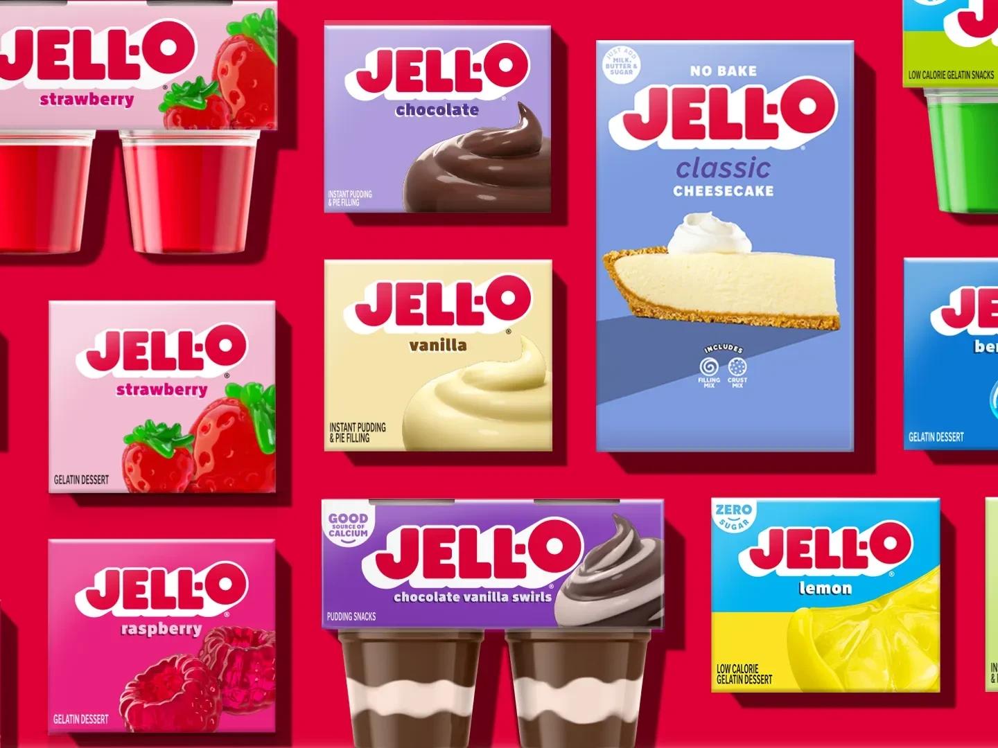
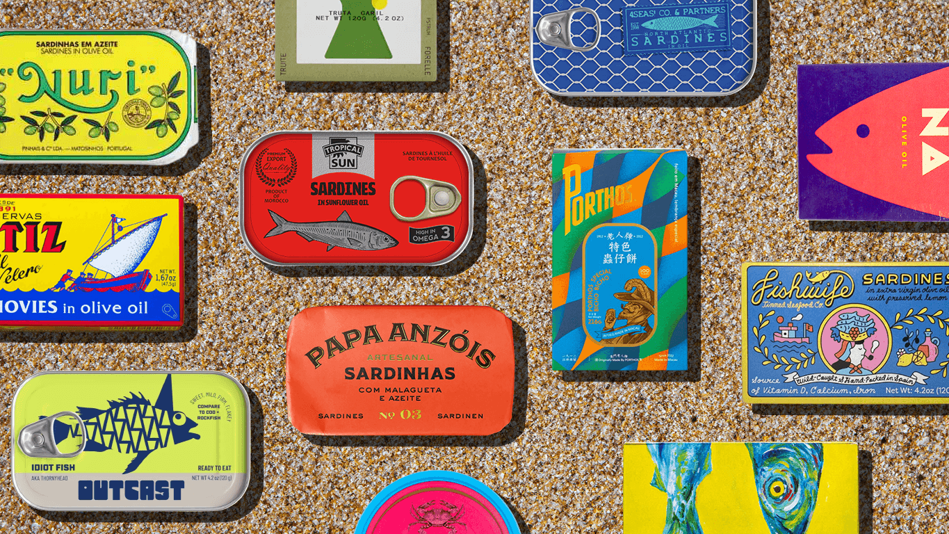
Packaging is often the first brand experience (before the product)
For many products, the brand relationship starts before use.
On a retail shelf, packaging is what competes for attention. In e‑commerce, it’s the box that arrives at your door. In gifting, it’s the object that gets handled, commented on, and shared.
The product hasn’t done anything yet — but expectations are already set.
Packaging creates anticipation. It signals value. It frames what the user is about to experience. When it works, it quietly prepares the ground for the product to succeed. When it doesn’t, the product starts at a disadvantage.
This time order matters. If packaging promises one thing and the product delivers another, trust erodes fast. If packaging feels aligned, the product has room to shine.
Packaging is a design decision, not a decorative one
Good packaging design isn’t about adding graphics to a box. It’s about making deliberate decisions under constraints.
Every choice — format, material, opening mechanism, typography, colour, hierarchy — communicates something. These choices don’t live in isolation; they sit at the intersection of brand strategy, usability, production, and cost.
Packaging is where brand design becomes physical.
That’s why purely aesthetic approaches often fall short. A beautiful pack that’s awkward to open, misleading in scale, or inconsistent with the brand’s tone creates friction instead of value.
Strong packaging design accepts constraints and works with them. It doesn’t fight reality; it translates the brand into it.
When packaging carries the brand on its own
There are many moments where packaging has to do the heavy lifting — moments where it represents the brand almost entirely on its own.
On a crowded retail shelf, packaging has just a few seconds to answer fundamental questions: What is this? Who is it for? Why should I trust it? In e‑commerce, the product often arrives unseen until delivery, making the box and unboxing experience the first tangible brand interaction. With sealed or opaque products, packaging must build confidence without visual proof. And in gifting or social contexts, packaging frequently becomes the object that’s handled, displayed, commented on, and shared.
In all these situations, packaging acts as a proxy for the product.
This is why clarity consistently beats cleverness. When packaging tries too hard to be surprising, ironic, or cryptic, it risks failing at its primary job: being understood quickly and correctly.
Packaging doesn’t need to shout — it needs to be understood.
From a design perspective, this comes down to a few core principles:
When these elements work together, packaging feels obvious in the best possible way. It doesn’t rely on visual tricks or excessive explanation. It feels legible, intentional, and unmistakably “of” the brand — even when stripped down to essentials.
Where packaging goes wrong (and why it hurts the brand)
Most packaging failures aren’t dramatic. They’re subtle — and that’s precisely what makes them dangerous.
They usually come from small misalignments rather than obvious mistakes. A pack might look good in isolation, but something feels off once it’s handled, read, or compared.
Common issues include:
These gaps create cognitive dissonance. The user may not be able to name the problem, but they feel it — and that feeling quietly undermines trust.
Good packaging avoids extremes by holding several forces in balance at the same time:
When these elements are resolved together, packaging stops trying to impress and starts to convince.
Strong packaging isn’t bold for the sake of it — it’s resolved.
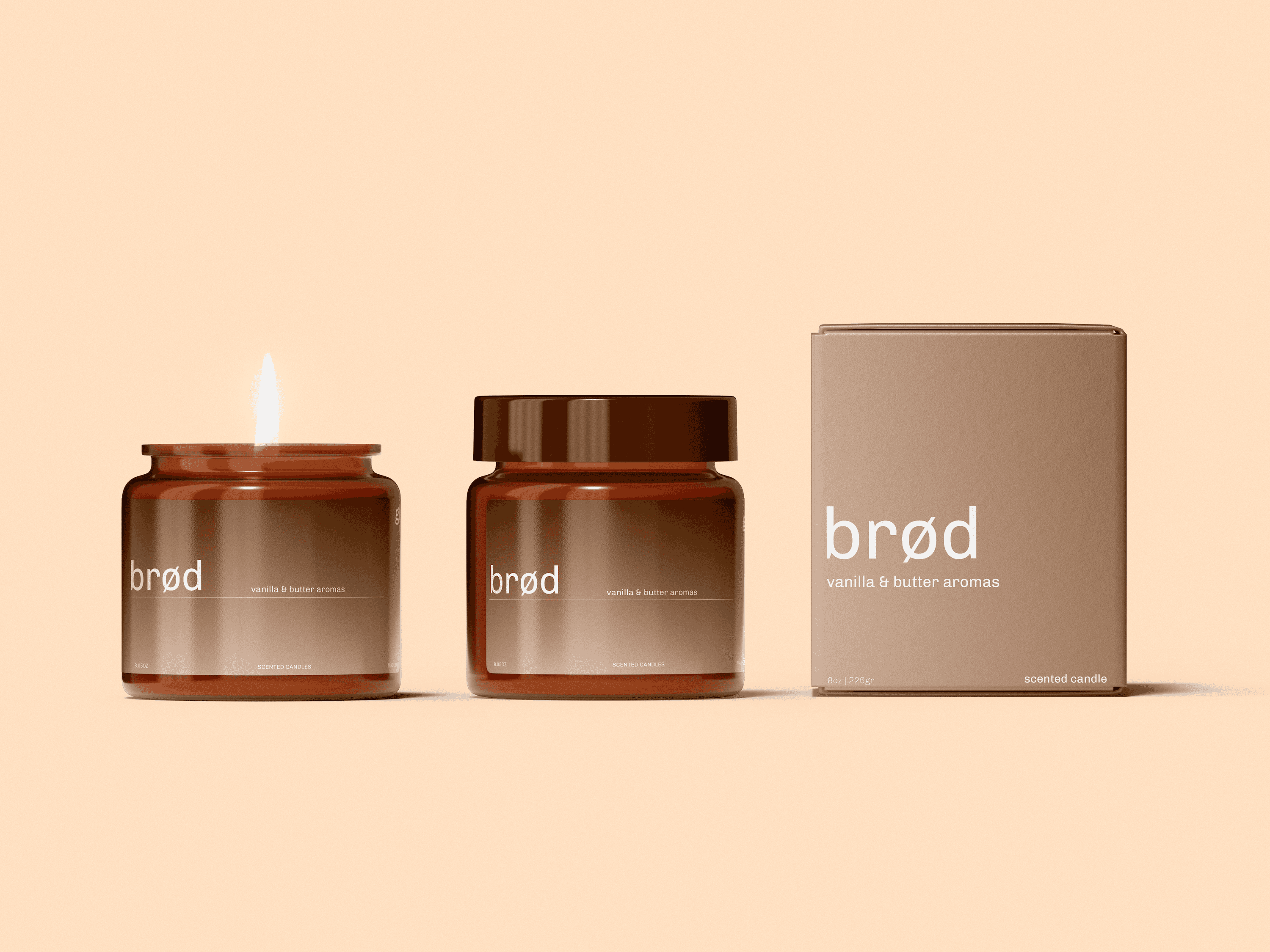
Packaging only works when it’s part of a system
The most convincing packaging rarely feels isolated. It feels inevitable — as if it couldn’t exist in any other form.
That’s because it’s designed as part of a wider brand system, not as a standalone object. It’s connected to visual identity, tone of voice, pricing, and digital experience. The colours make sense because you’ve encountered them elsewhere. The typography feels familiar because it echoes the brand’s wider typographic logic. The level of refinement aligns with what the brand promises across every other touchpoint.
In strong systems, packaging doesn’t have to explain itself. It feels recognisable even before the logo is read, because the brand’s visual language is already doing the work.
When packaging is treated as a one‑off hero — a moment to impress or experiment in isolation — cracks appear quickly. The pack may look interesting on its own, but it feels disconnected once placed next to other products, screens, or brand materials. When packaging is treated as a system component, coherence does the work instead.
Consistency isn’t boring — it’s reassuring. And in physical products, reassurance is often what builds trust, repeat purchase, and long‑term brand equity.
Rethinking packaging as a true brand touchpoint
Seeing packaging as a brand touchpoint changes the questions we ask.
Instead of “does this look nice?”, we start asking:
These aren’t design‑only questions. They’re brand questions.
Packaging is one of the few places where brand strategy becomes something you can physically hold. That makes it powerful — and risky — at the same time.
If there’s one takeaway, it’s this: packaging deserves the same strategic attention as any other major brand touchpoint. Because long before the product performs, packaging has already spoken.
Final thoughts
If you’re working with physical products, packaging isn’t secondary — it’s structural. It plays a decisive role in how a brand is first encountered, how value is perceived, and how trust is established over time. Long before performance, durability, or quality can be evaluated, packaging has already framed the experience and positioned the product in the user’s mind.
Treating packaging seriously therefore requires more than aesthetic refinement. It means stepping back, understanding its role within the broader brand system, and designing it as an integrated touchpoint rather than an isolated surface. When packaging is aligned with brand strategy, visual identity, and product intent, it doesn’t just support perception — it actively shapes it.