Articles
What Asahi Super Dry Teaches Us About Custom Typefaces
Jan 14th 2026
Custom typefaces are often seen as a luxury. Looking at Asahi Super Dry, we explore why they can actually be one of the most practical and powerful tools in a brand system.

When people talk about custom typefaces, the conversation usually jumps straight to cost, originality, or visual flair. Is it worth it? Isn’t a good commercial font enough? Isn’t this something only big brands can afford?
Those are fair questions — but they’re not the most interesting ones.
The real value of a custom typeface has very little to do with showing off, and a lot to do with how brands behave over time. Typography is one of the few elements that appears everywhere a brand exists: on packaging, in advertising, across digital products, in motion, and in small functional moments most people never consciously notice.
That’s exactly why typography is such a powerful branding tool — and why, in some cases, designing it specifically for a brand makes sense.
To make this concrete, we’ll use Asahi Super Dry as a reference point throughout the article. Not as a template to copy, but as an example of when custom typography becomes part of the brand’s infrastructure rather than decoration.
What We Mean by “Custom Typeface” (Just Enough to Move Forward)
Before going further, we need a shared baseline — and only a small one.
A typeface is the design of the letters themselves: their proportions, spacing, weight distribution, and overall character. A font is the specific file or style you use to set text.
A custom typeface is a typeface drawn for a single brand, for exclusive use, with that brand’s needs in mind from the start.
Custom typefaces are not inherently expressive, experimental, or bold. Many of them are deliberately restrained. Their job isn’t to stand out on their own, but to work quietly and reliably inside a larger system.
In other words: a custom typeface exists to serve a brand, not to impress other designers.
Why Typography Carries So Much Brand Weight
Typography matters because it never stops working.
Unlike logos or campaign visuals, type doesn’t appear occasionally — it appears constantly. It frames headlines, sets body copy, structures interfaces, and fills in all the in-between moments where branding still happens, even if no one calls it that.
Before we read a single word, typography already tells us something: how controlled or loose a brand feels, how modern or traditional it appears, how precise, confident, or neutral its tone is.
This is also where brands begin to feel the limits of off-the-shelf fonts. A commercial typeface might work perfectly well at first, but as a brand grows across more formats, markets, and use cases, its constraints become visible. At that point, typography stops being a simple choice and starts becoming a system problem.
And that’s where the Asahi Super Dry case gets interesting.
Asahi Super Dry: When Typography Becomes Brand Infrastructure
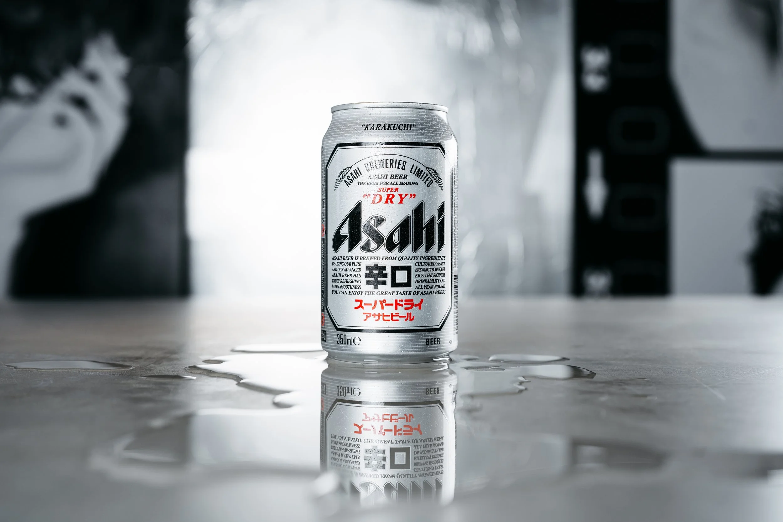
Asahi Super Dry is a strong case study because its custom typography wasn’t created to look distinctive in isolation — it was designed to behave correctly inside a large, global brand system.
It’s important to clarify one thing from the start: this work is not about the main Asahi logo lettering. The focus is on the secondary typographic system used across packaging and advertising — the typography that does the day-to-day work of the brand.
In 2019, Christian Schwartz and Paul Barnes worked with Nippon Design Center to develop ASD Display, a custom sans serif typeface for Asahi Super Dry. The design was inspired by the Japanese concept of kire, often understood as sharpness or clean precision — a direct reflection of how the beer itself is positioned.
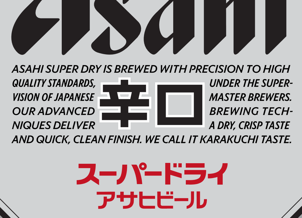
That idea isn’t just conceptual. Sharpness shows up in how the letters are drawn: crisp edges, tightly controlled curves, and a restrained, modern tone. The typeface avoids friendliness or softness. Instead, it reinforces clarity and dryness — qualities already embedded in the product and the brand.
Crucially, ASD Display wasn’t designed as a one-off statement. It’s used consistently across advertising and packaging around the world. Through repetition, restraint turns into recognisability.
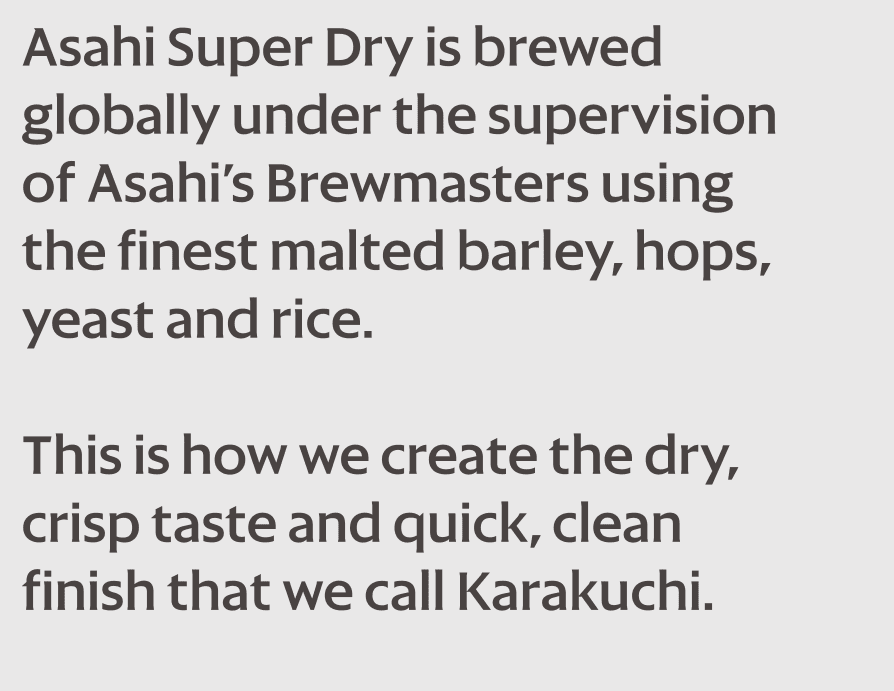
Alongside ASD Display, the team also developed a customised version of Atlas Grotesk with a larger x-height to act as a secondary utility typeface. This is the less visible, but arguably more important part of the system. A larger x-height improves legibility at small sizes, making the type more robust in dense, functional contexts like labels, ingredients, and regulatory information.
This two-typeface setup — display for expression, utility for information — is where the project becomes truly strategic. It allows the brand to handle real-world constraints such as condensed lettering, justified text blocks, and tight spatial requirements without compromising consistency.
The result is a typographic system that doesn’t compete with the logo or the packaging. It quietly holds everything together. That’s what makes this a branding decision, not a stylistic one.
What Brands Actually Gain from a Custom Typeface
When typography is designed specifically for a brand, its role changes.
There is ownership: a visual voice that competitors can’t access. There is consistency: a type system designed to work across all touchpoints, from large headlines to small functional text. And there is differentiation at a deeper level — through structure, proportion, and repetition rather than surface-level effects.
Custom typefaces also tend to last longer. Because they are designed around a brand’s needs rather than a trend, they age more slowly and require fewer disruptive changes over time.
It’s important to say this plainly: high-quality commercial fonts are often more than enough. Custom typography only creates value when a brand uses it extensively and intentionally. Otherwise, it’s just an expensive asset with limited impact.
So, Do You Need a Custom Typeface?
This is where the conversation should always end.
Not with “custom is better”, but with “what does this brand actually need?”
A custom typeface starts to make sense when a brand has a clear identity, relies heavily on typography across many touchpoints, and is building a system meant to last rather than refresh every season. There are real trade-offs — cost, time, and commitment — and they matter.
But as the Asahi Super Dry case shows, when the fit is right, a custom typeface becomes one of the most stable and valuable brand assets there is.
Strong brands aren’t built from isolated design decisions. They’re built from systems that hold together under repetition. And typography — especially when it’s designed specifically for the brand — is one of the strongest systems a brand can own.
Pictures (in order of appearance): Cover: Attlas; Ron Timehin rontimehin.com, The Brand Identity the-brandidentity.com, Commercial Type commercialtype.com, Commercial Type comemrcialtype.com, Beth Johnson Design bethjohnson.design


