Articles
Inside Seasoned Website Design: A Playful UX Breakdown
Feb 16th 2026
Seasoned website design is a case study in concept-driven UX, where interaction, structure, and metaphor transform a simple resource hub into a memorable web experience.

If you’ve ever explored a design resource website, you’ve probably seen the same structure. A clean grid. A list of articles. Minimal navigation. Very sensible. Very safe. There’s nothing wrong with that. Clarity matters. But every now and then, a project reminds us that websites don’t have to choose between clarity and personality. Seasoned does exactly that.
And that’s why Seasoned website design is worth breaking down from a Web & UX perspective.
What Is Seasoned, and Why This Website Matters
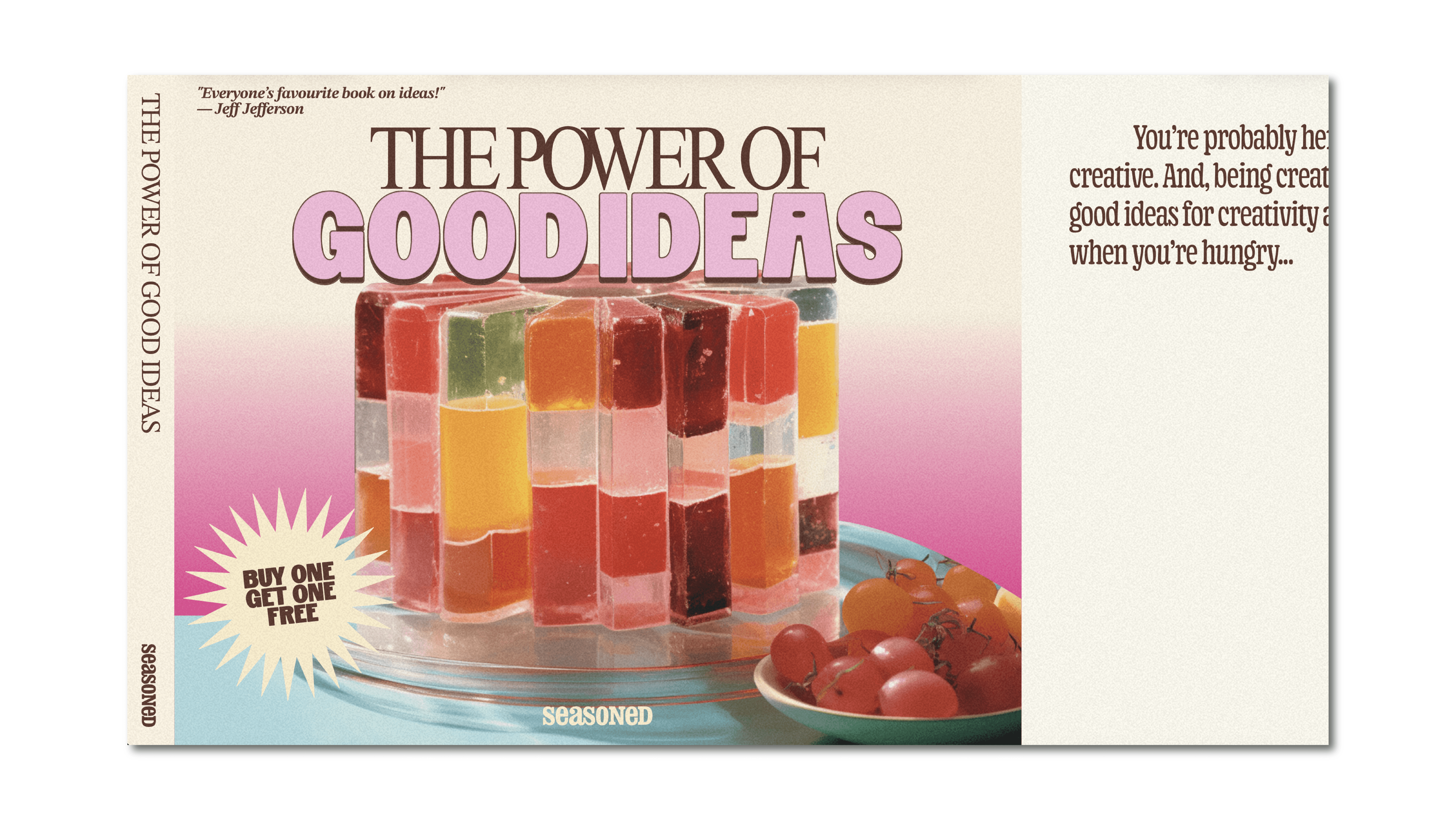
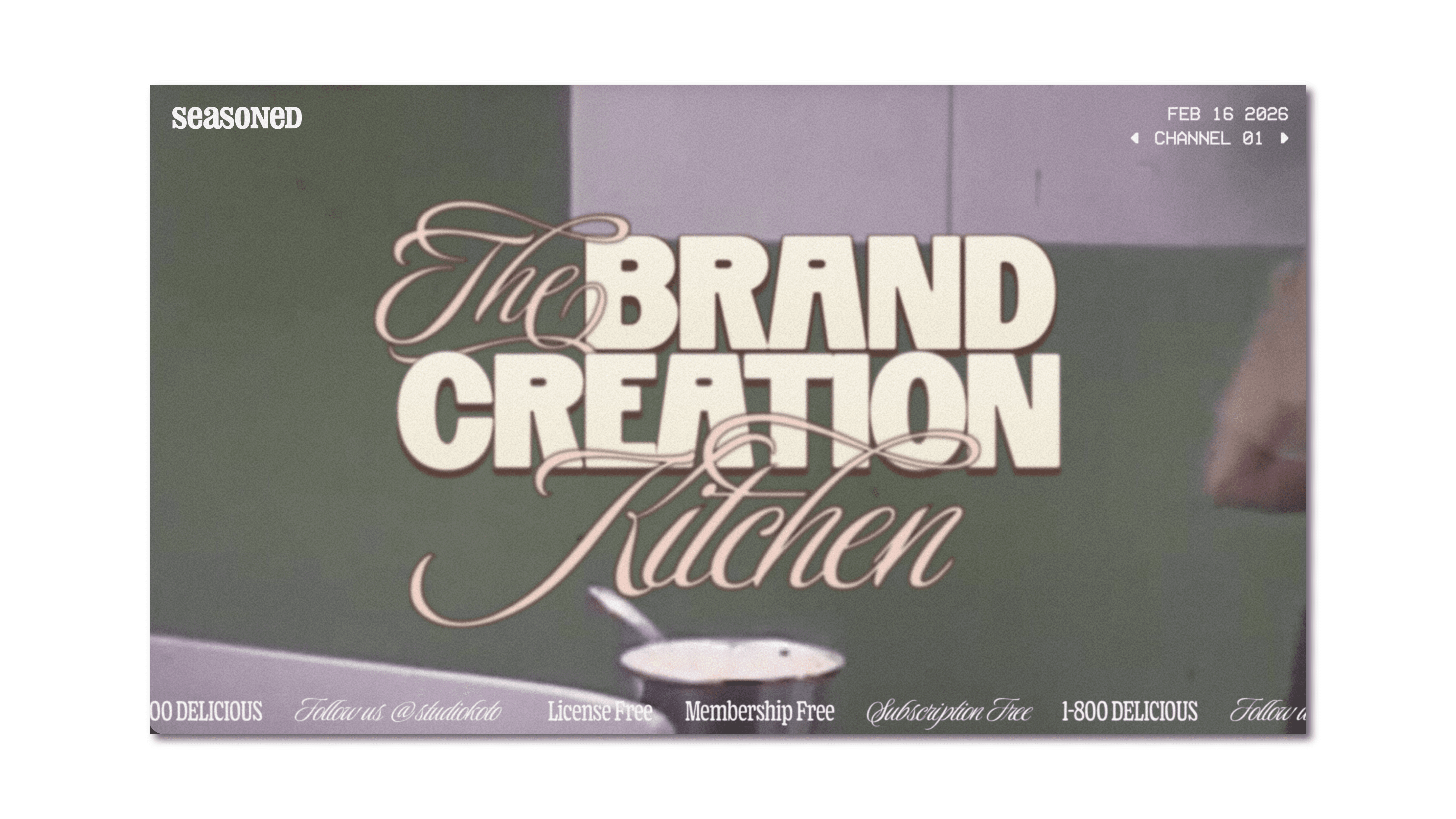
Seasoned is a free online design resource created by Koto, a globally recognised branding agency. The platform is positioned as “The brand creation kitchen” — a space where creative careers, branding processes, and industry advice are presented through the lens of cooking. On paper, it’s an educational content hub. In practice, it’s a crafted web experience.
Instead of publishing a standard blog, the team built a digital environment that feels like stepping into a retro cooking show. The copy references ingredients, recipes, and techniques. The visuals echo vintage TV aesthetics. The structure reinforces the metaphor.
The key difference is this: the website doesn’t just host the content — it embodies the concept.
And that’s where the UX becomes interesting. Most resource platforms prioritise efficiency above all else. Seasoned proves that a website can be usable, structured, and still feel playful.
Concept-Driven Web Design: The Cooking Metaphor as Structure
The cooking theme in Seasoned isn’t a decorative layer. It’s structural.
In UX terms, this is called an interaction metaphor — when a digital interface borrows logic from a familiar real-world system. When done well, it reduces cognitive friction because users intuitively understand how things are organised.
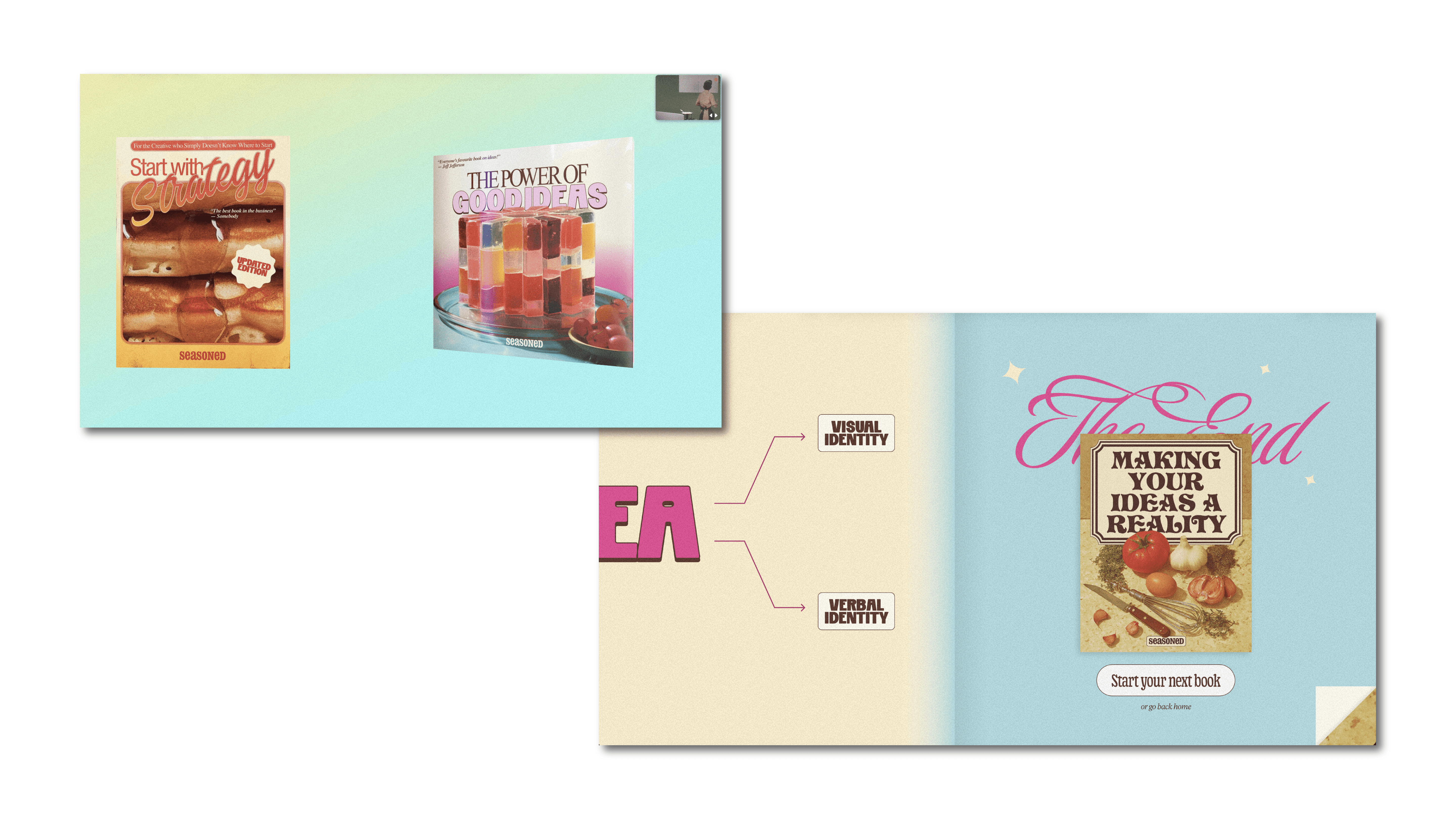
On Seasoned:
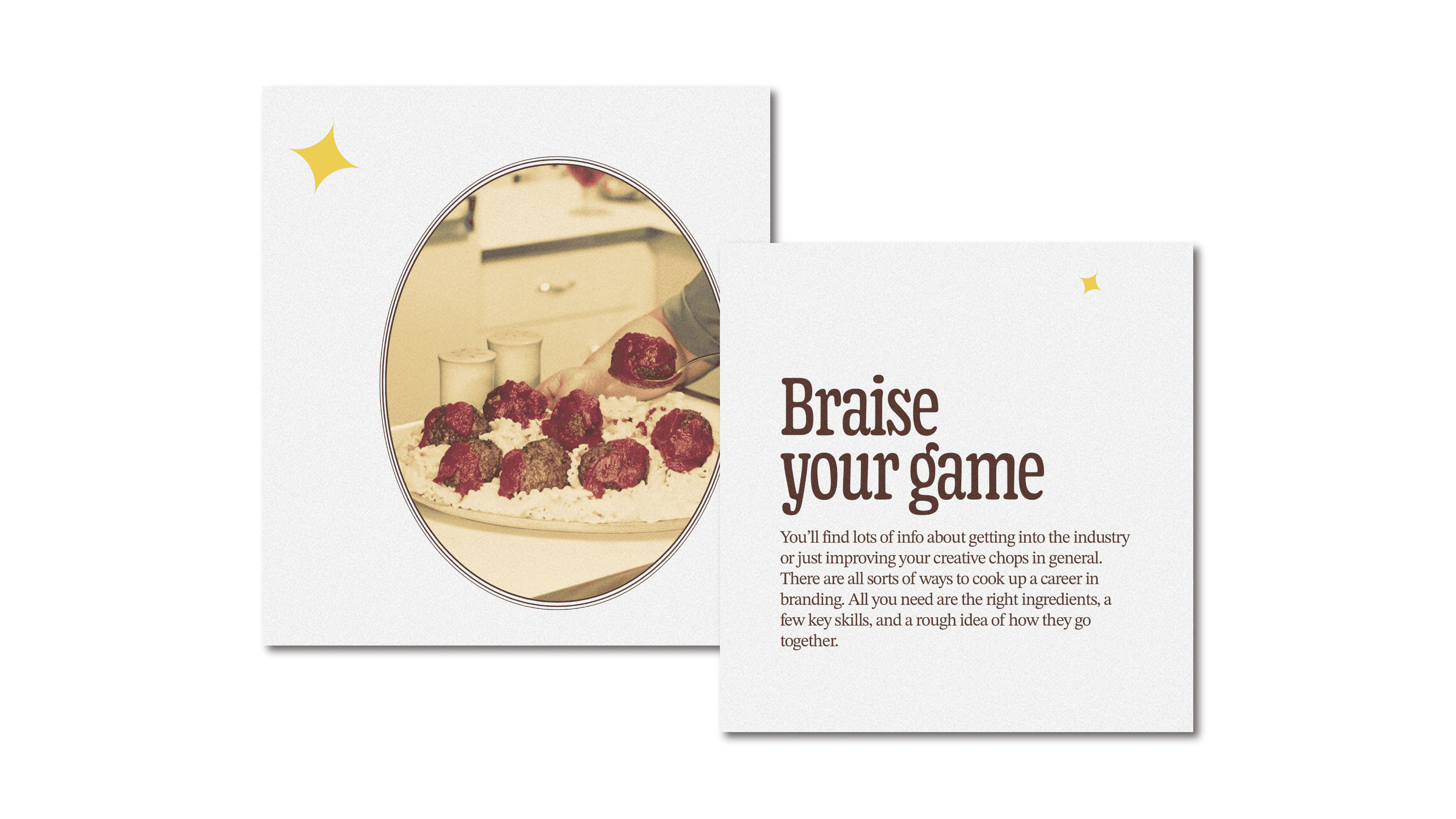
“Ingredients” represent skills and building blocks.
“Recipes” reflect processes.
Educational content is framed as something you prepare, test, and refine.
That metaphor influences:
Naming conventions
Content grouping
Visual direction
Navigation logic
This is where many themed websites fail. They apply a concept visually, but the underlying information architecture remains generic. Here, the metaphor shapes how the user moves through the site. From a web design standpoint, this is important: concept should influence structure, not just styling. When concept and structure align, the experience feels coherent.
Interaction & Motion: Making the Website Feel Tangible
Seasoned leans into a retro TV aesthetic, but the magic is in the interaction design. Scrolling doesn’t feel purely functional. Transitions feel paced. Content blocks are revealed with intention. This is where micro-interactions come into play.
Micro-interactions — small, responsive movements that acknowledge user input — help users understand where they are and what just happened. They provide feedback, rhythm, and orientation.
On this website:
Motion guides attention.
Transitions reinforce the cooking-show tone.
Interaction creates a sense of physicality.
There’s a tactile quality to the browsing experience, almost like flipping through a cookbook or switching TV segments. But here’s the important part. Delight works because it reinforces orientation, not because it distracts from it. Motion acts as feedback. It clarifies hierarchy. It signals progression. That’s strong UX discipline hiding behind playful visuals.
Information Architecture & The Risk of Over-Design
Metaphor-heavy websites are risky.
Too much animation can slow users down.
Too much theming can blur navigation.
Too much personality can reduce clarity.
So why doesn’t Seasoned feel gimmicky? Because beneath the retro aesthetic, the fundamentals are solid.
The information architecture is clear. Content is grouped logically. Sections are chunked into digestible pieces. Typography establishes hierarchy. Interaction patterns are consistent.
From a Web & UX perspective, that foundation matters more than the theme. Strong visual hierarchy ensures that headings, body text, and calls to action are easy to scan. Predictable interaction patterns reduce friction. Clear content grouping supports exploration without confusion. The metaphor enhances the system — it doesn’t replace it. That balance is what keeps the website from tipping into novelty.
What Seasoned Website Design Teaches Us About Building Better Sites
Seasoned is not just a fun project. It’s a reminder of what web design can do when concept and UX are aligned.
Here are a few takeaways we think are worth applying:
Let your concept influence structure, not just visuals.
Use interaction to clarify meaning, not decorate the interface.
Protect creativity with strong information architecture.
Design motion as feedback, not spectacle.
If you’re designing a website — whether it’s a portfolio, a resource hub, or a company platform — ask yourself:
Does your UX reinforce your idea?
Is your interaction meaningful or just aesthetic?
Is your information architecture strong enough to support personality?
Websites don’t have to be sterile to be usable.
And Seasoned website design proves that when concept, structure, and interaction work together, the interface itself becomes part of the lesson.


