February 12, 2026
DESIGN TRENDS 2026: INTENSITY, IMPERFECTION AND IMMERSION
Design trends 2026 are shifting away from safe minimalism toward intensity, immersion and visible humanity. If you want to know what’s shaping visual culture this year, keep reading.
Every first months of the year, design trend lists start flooding our feeds. New colors. New typefaces. New 3D styles. New “must-do” aesthetics. Most of them describe what things look like. Very few explain why they’re happening. And that’s the difference between copying a trend and understanding it.
This year, design trends 2026 are not random aesthetic waves. They are reactions — to AI acceleration, sensory overload, digital fatigue, and a growing desire for emotional intensity.
Let’s unpack what’s really shaping the visual language of 2026.
1. Sensory-Driven Visuals: When Design Tries to Be Felt
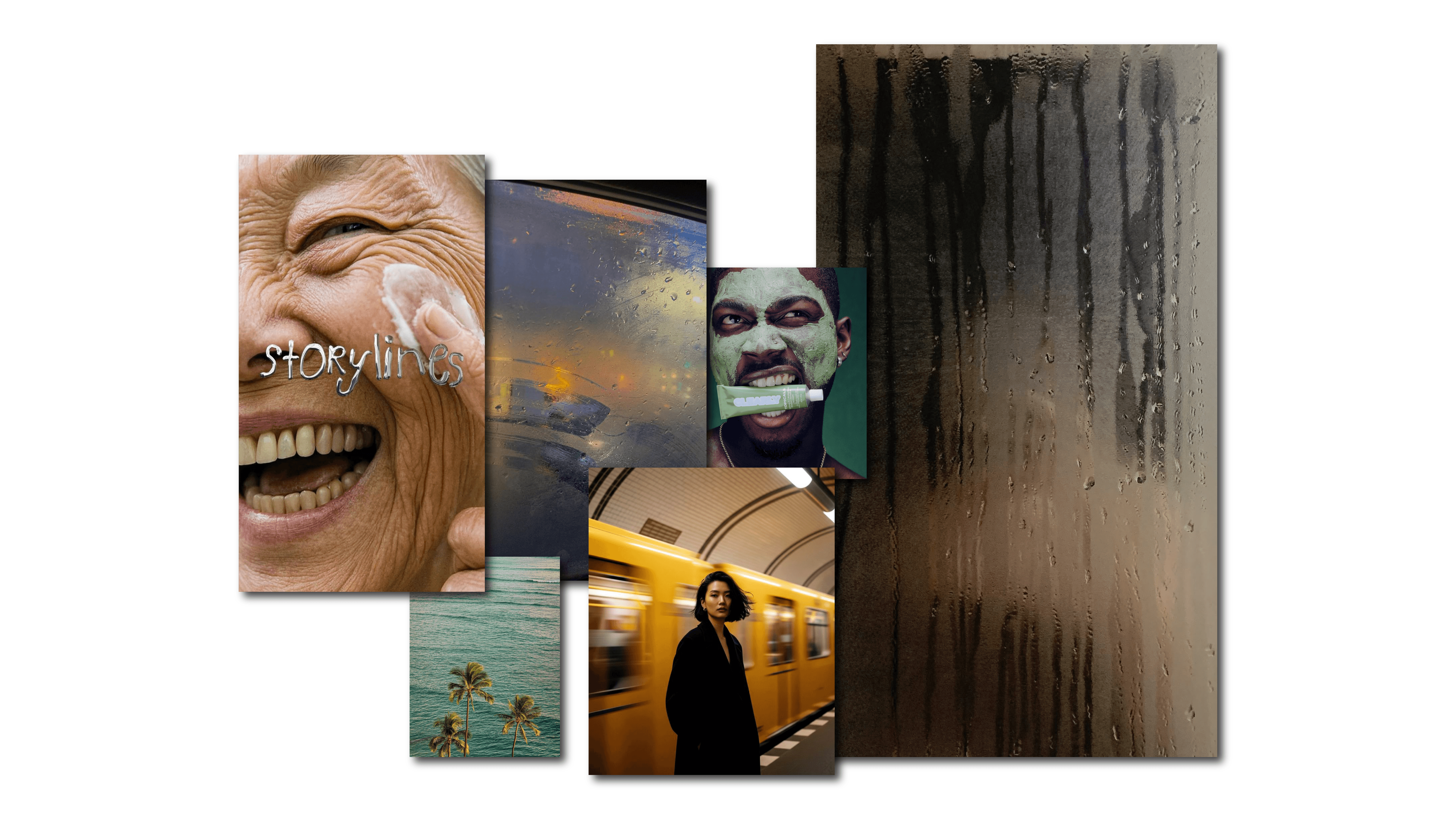
One of the clearest design trends 2026 is the rise of sensory intimacy. Instead of shouting for attention, brands are zooming in. Way in.
We’re seeing condensation drops sliding slowly down glass. Skin pores under directional light. Fabric fibers catching shadows. A coffee drip suspended in silence. A close-up button click paired with a subtle, satisfying sound. And just as important: people who don’t feel over-directed. Less scripted smiles. Less hyper-produced acting. More natural presence. Conversations that feel captured, not staged. Movements that feel observed, not choreographed.
The sensorial shift isn’t only about materials — it’s about atmosphere. And atmosphere collapses the moment something feels fake.
But when we talk about “sensory design,” we don’t just mean texture. We mean the deliberate activation of multiple senses through visual media. It includes texture — yes — but also:
Light becomes surgical. Background noise disappears. Why now? Because we’re exhausted. Overstimulated feeds, aggressive animations, constant noise. Sensory isolation feels premium. Slowness feels intentional.
In a chaotic digital ecosystem, intimacy becomes positioning.
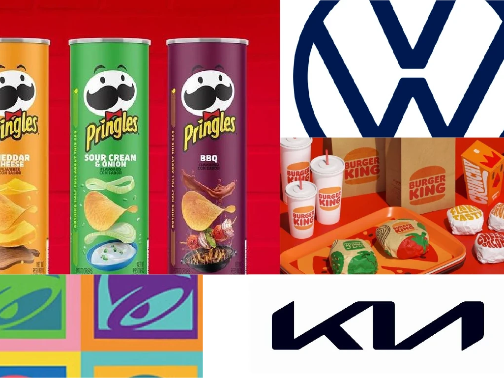
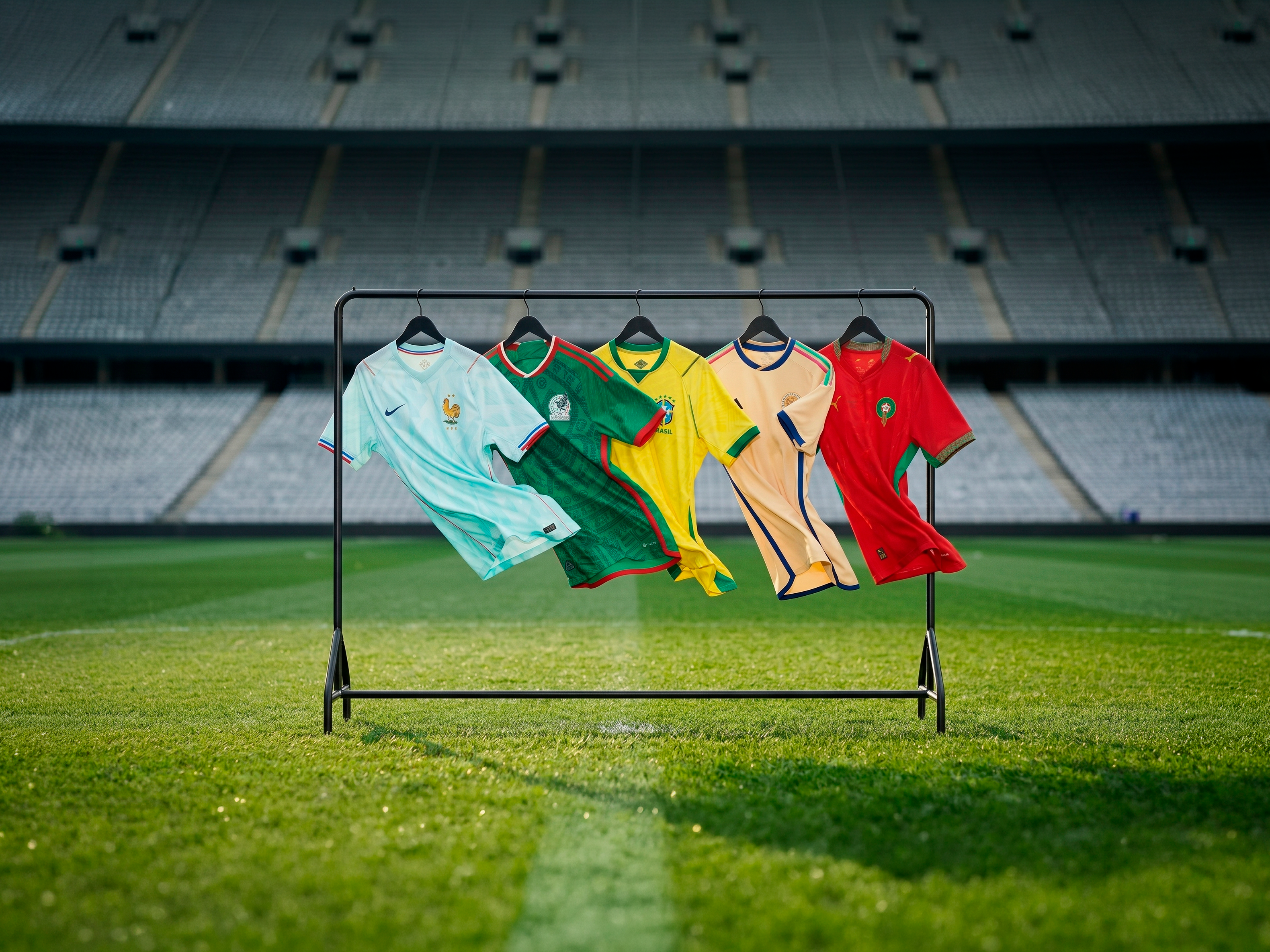
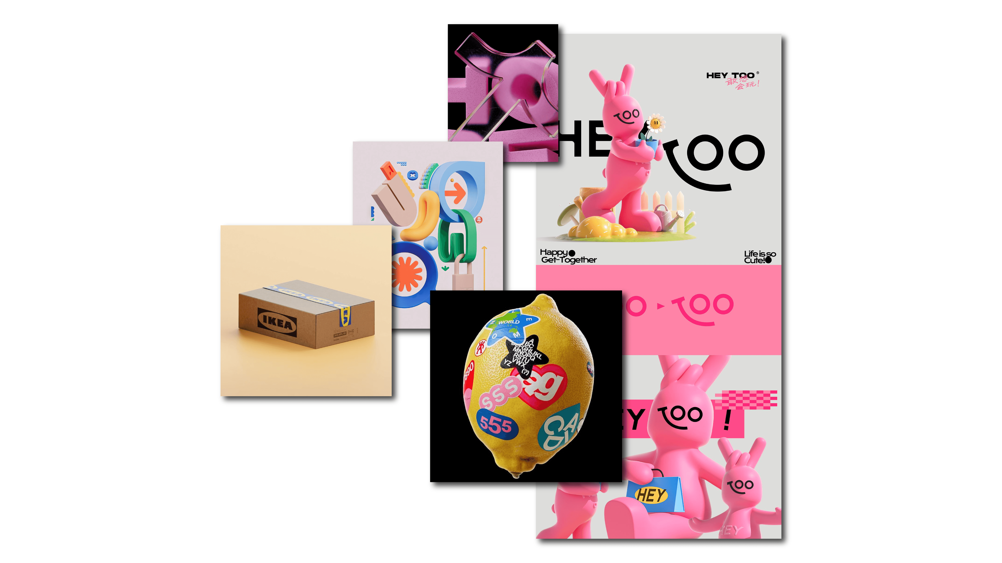
2. Hyper-Bright Expressiveness (The Post-Beige Reaction)
If the last few years were defined by muted palettes, tasteful serif minimalism and beige-on-beige restraint, 2026 is pushing in the opposite direction. Hard. To understand why, we need to acknowledge what happened.
Beige minimalism didn’t just become popular — it became default. Soft sand backgrounds. Elegant serif logotypes. Airy grids. Muted photography. Generous white space. The “quiet luxury” aesthetic translated into every industry, from tech startups to coffee brands. At first, it felt refined. Then it felt repetitive. Then it became invisible. When an aesthetic becomes category-standard, it stops signaling taste and starts signaling safety. And brands don’t want to look safe anymore. That’s where hyper-bright expressiveness enters.
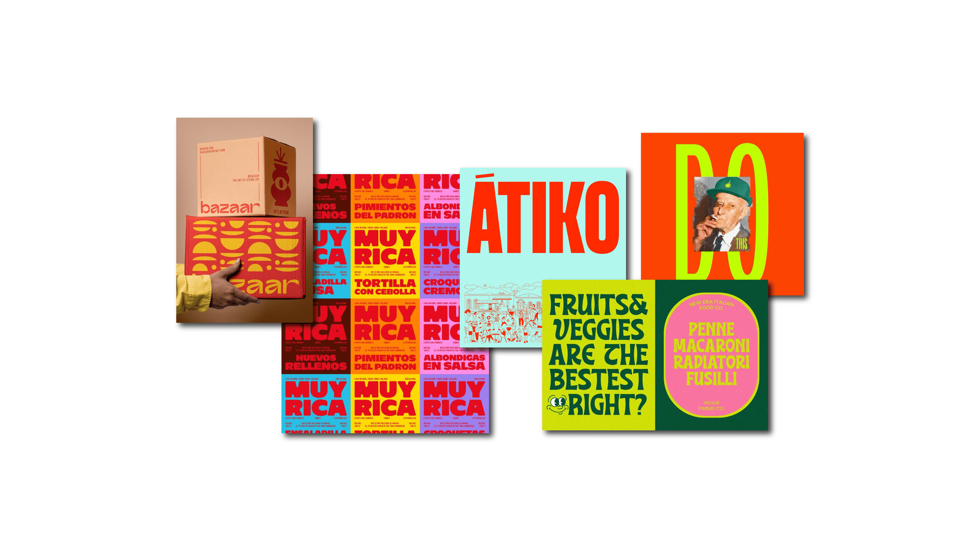
We’re seeing acid greens, electric blues, hyper-saturated reds. Unexpected color clashes. Headlines that dominate the screen. Typography that stretches, compresses and refuses to behave politely. But this isn’t chaos for the sake of noise. It’s a recalibration of energy. Technically, what makes this shift powerful — instead of childish — is structure. It usually involves:
Intensity, yes. But structured intensity. The narrative arc here is clear: when visual calm becomes predictable, emotion becomes differentiating. The real mastery in design trends 2026 is not turning up the volume — it’s orchestrating it.
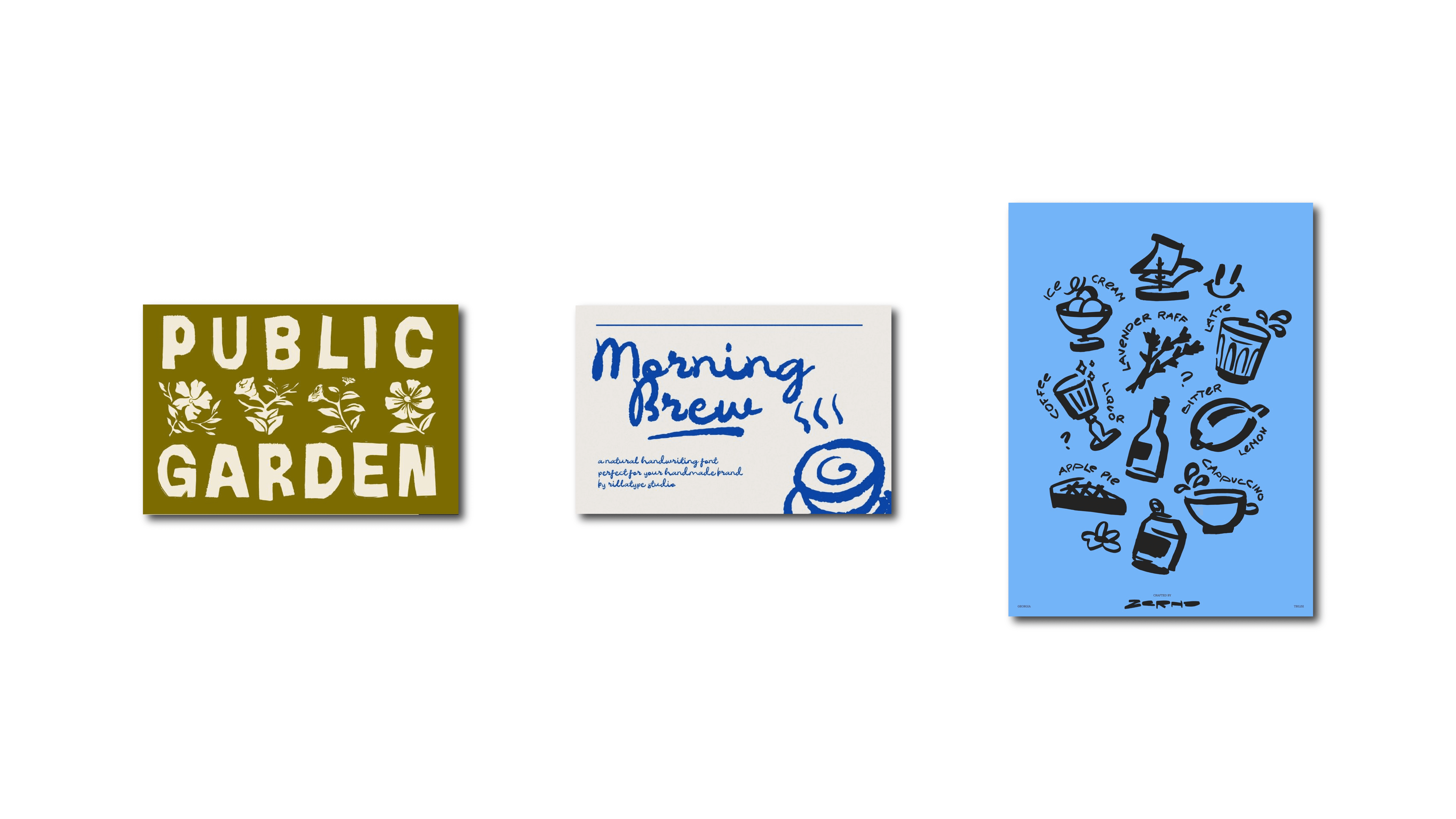
3. Organic Imperfection in the AI Era
If 2026 is defined by AI acceleration, then this trend is its counterweight. AI tools are generating outputs that are cleaner, sharper and more geometrically perfect than ever before. Perfect curves. Perfect symmetry. Perfect spacing. And perfection, when everywhere, starts to feel synthetic. So designers are reintroducing friction. Not carelessness. Friction.
We’re seeing uneven curves, subtle distortions, pressure-sensitive strokes, asymmetrical layouts that feel slightly off — but intentionally so. Analog noise overlays soften vector precision. Shapes look touched, not calculated. But the important part isn’t the texture of the stroke. It’s the signal it sends.
In a world of algorithmic perfection, visible humanity becomes differentiating.
That’s not poetic. It’s strategic.
When everything is optimized and mathematically balanced, the brand that shows a trace of the hand feels closer. Warmer. More relatable. Slight irregularities create psychological proximity.
Under the hood, this still requires rigor. It often includes:
Hierarchy still exists. Alignment logic still holds. Balance is still there. It just breathes. This isn’t rebellion against technology. It’s coexistence with it — using digital systems without erasing the human layer inside them.
4. AI-Driven Surrealism
If AI gives us infinite image generation, designers won’t use it to recreate boring realism. They’ll bend reality.
Design trends 2026 are filled with floating objects defying gravity, hybrid materials merging glass with liquid and chrome with organic matter, dream-like environments that feel hyperreal yet impossible. These compositions break predictability instantly.
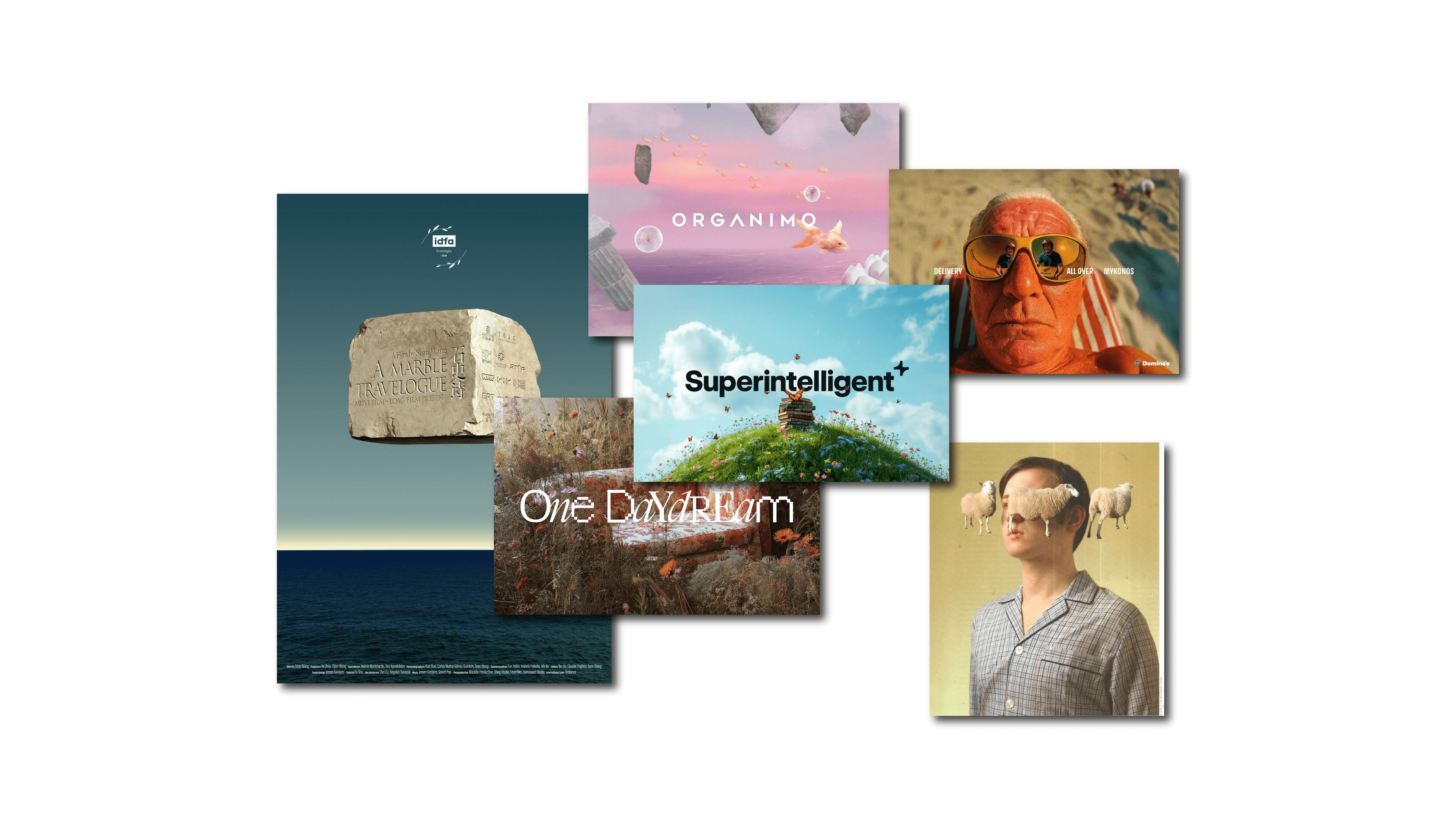
Technically, this often involves AI-assisted compositing combined with deliberate depth simulation through layered lighting. Materials are exaggerated. Reflections are slightly too perfect. Shadows are over-articulated. Spatial transitions feel almost cinematic. The key isn’t just strangeness. It’s coherence within the surreal.
Predictability is the enemy of attention. But spectacle without system becomes forgettable in seconds.
5. Immersive 3D & Spatial Depth as Structure
3D is no longer just decoration layered on top of flat design. It’s becoming structural.
Instead of flat hero sections, we’re seeing environments. Instead of isolated product shots, we’re seeing spatial ecosystems where objects live inside a narrative world. Depth is now a hierarchy system. Through spatial decisions such as:
Designers define importance before typography even enters the scene. Elements closer to the user feel dominant. Backgrounds recede. This is visual hierarchy extended into three dimensions. Used with intention, it feels immersive and premium. Used without strategy, it’s expensive sh*t. The difference is not the software. It’s the system behind it.
6. Microinteractions as Emotional Feedback Systems
Microinteractions might be the most underestimated of all design trends 2026. They’re small. Almost invisible. A hover state that subtly lifts. A button press that compresses by two pixels. A scroll-triggered fade that feels natural instead of abrupt. A quiet sound confirming an action. Individually, they’re tiny. Collectively, they build trust.
Behind the scenes, this requires precision, including:
Most importantly, they close the loop properly. When microinteractions feel gimmicky, it’s usually because they weren’t designed as a system. When they feel effortless, it’s because someone cared about the invisible layer. And that layer shapes perception more than most static visuals ever will.

If we look at who mastered this long before it became a broader trend, one company stands out: Apple.
From the subtle bounce when you unlock your phone, to the gentle shift when activating airplane mode, to the haptic confirmation of Apple Pay — those microinteractions are not decorative. They’re identity. They’ve used microinteractions for years not as a trend, but as a system. A language.
What’s happening in design trends 2026 is that this level of micro-feedback is expanding beyond tech giants. Startups, e-commerce brands, even corporate platforms are beginning to understand that emotional feedback is part of branding. Microinteractions are moving from “nice-to-have animation” to strategic brand asset.
Reading Design Trends 2026 Without Losing the System
Here’s where everything connects. Design trends 2026 are signals. Not strategies.
They reflect deeper shifts:
But branding is not seasonal fashion. The real question is never: “Is this trend cool?” It’s:
Timeless brand systems aren’t anti-trend. They’re selective.
The smartest brands in 2026 won’t chase every new visual wave. They’ll integrate what aligns with their strategy, building ecosystems that feel contemporary without becoming disposable.
Because the goal isn’t to look like 2026. It’s to build something that still feels relevant in 2030 — even if it was informed by design trends 2026.