March 30, 2026
WHY DRAKE’S WEBSITE FEELS BIGGER THAN A STORE
There is a reason Drake’s website feels so easy to move through. Once we break it down, the trick is not more design. It is better web decisions.
A lot of brands say they want a website that feels like an experience.
Then they build one of two things: a standard ecommerce site with a few polished banners, or a bloated portal where every project, product, and side venture fights for attention at the same time.
That is why Drake Related is such an interesting case.
It is technically an ecommerce website, yes. But it does not feel like it was built only to sell. It feels like a digital base camp for everything around Drake’s universe: music, merch, collaborations, sub-projects, and atmosphere. That is what makes it a useful reference for anyone thinking about a brand hub website.
What we like here is not just that it looks good. It is that the site shows how a web experience can hold a lot of brand weight without becoming noisy, confusing, or overdesigned. It gives us a clear lesson: when the system is right, simplicity does not feel basic. It feels confident.
And that is what makes the site worth studying a bit more closely, because the interesting part is not only what Drake Related contains, but how naturally it lets us move through it.
In this article, we are going to look at why that matters: how Drake Related works as a brand hub website, why its simplicity feels so effective, and what brands can actually learn from it if they want to build a site that feels bigger than a website without turning it into a mess.
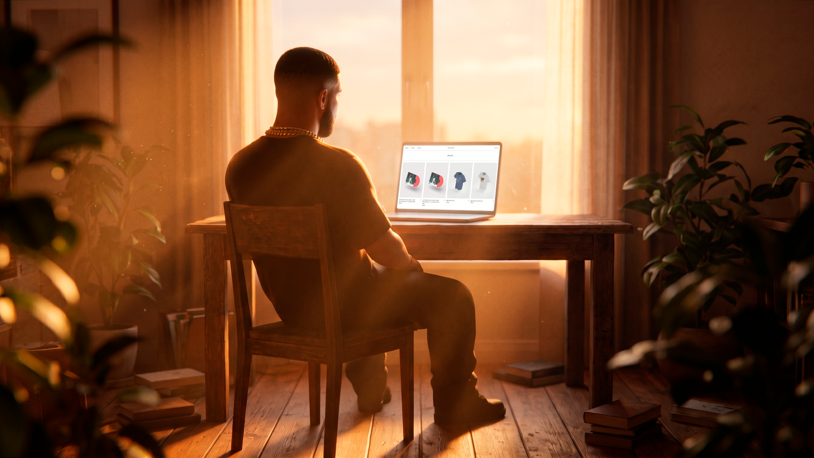
Drake Related is more than an ecommerce site
The easiest way to misunderstand Drake Related is to call it a merch website.
Yes, products are part of it. But the site is doing something bigger. It pulls together different pieces of Drake’s world into one coherent digital environment. Instead of treating music, objects, collaborations, and related projects as separate silos, it makes them feel like they belong to the same system.
That is the difference between a store and a brand hub website.
A store is usually built around transactions. A hub is built around connection.
That does not mean commerce disappears. It means commerce becomes one layer inside a broader experience. The user is not only shopping. They are browsing a world, understanding a brand universe, and moving through a set of connected signals that all reinforce the same identity.
This is also why the site feels relevant beyond celebrity culture. Most readers are not building a platform for an artist with multiple businesses and global recognition. But many brands do have a version of this problem at a smaller scale.
They may have:
- a main service and a few secondary offers
- a product line plus editorial content
- collaborations, events, or seasonal drops
- multiple audiences with different entry points
- sub-brands that still need to feel related
When that happens, the challenge is rarely “we need more pages.” The real challenge is “how do we make all of this feel like one thing?”
That is where Drake Related becomes useful as a reference. It is not just showing us how to present many things. It is showing us how to connect them.
The UX feels simple because the thinking underneath is doing the heavy lifting
One of the smartest things about the site is how little it asks from the user.
There is no flood of messages. No desperate stack of calls to action. No endless animation trying to prove the site is premium. The interface feels calm. You can move through it without the sense that every second is trying to convert you, impress you, or interrupt you.
That calm feeling is not accidental. It comes from clear decisions.
This is where a bit of web and UX language helps. The site has a strong information architecture. In simple terms, that means the content is grouped and organized in a way that makes sense before the visuals even start doing their job.
It also manages cognitive load well. That is just a practical way of saying the site does not make users process too many competing signals at once. When a website is full of options, buttons, banners, pop-ups, and motion, the brain has to work harder. That rarely feels luxurious. It usually just feels tiring.
Drake Related avoids that trap.
The content hierarchy feels edited. The navigation feels considered. The interface is restrained enough that the brand world can breathe. Simplicity, here, is not emptiness. It is prioritization.
Minimal interfaces only work when the logic underneath is strong
We have seen plenty of websites try to look minimal and fail.
Usually the issue is not aesthetic taste. It is weak logic. When the content is messy, the interface has to compensate by adding more labels, more explanations, more sections, more noise. At that point, “minimal” becomes just a visual costume.
Drake Related works because the underlying logic is clear. Different parts of the brand universe have a place. The user is not being forced to decode a clever but confusing system. The site feels simple because the hard work has already been done underneath.
That is also why this kind of simplicity tends to age well. Trend-heavy websites often become dated fast because they depend on visual novelty. Strongly edited digital systems usually last longer because they depend on clarity.
The “rooms” concept turns navigation into a usable brand world
The room-based idea is the feature people notice first, but it matters for more than style.
It is not just a visual gimmick, and it is not just a clever way to display products. It gives the site a point of view about how a digital experience can behave. Instead of presenting Drake’s universe as categories, drops, or brand branches, it presents it as a place you move through. That is what makes the website feel like a world instead of a warehouse.
This is where it connects nicely with the idea we explored in our Matty Matheson piece: world-building is often smarter than treating a brand as a portfolio of disconnected things. When a brand has multiple expressions, the job is not only to show range. The job is to make that range feel native to one universe.
That is why the rooms matter. They give users a mental map, but they also give the brand a tone. The site feels lived-in, spatial, and continuous. We are not browsing a list of assets. We are moving through an environment with its own rhythm and internal relationships.
There is also a bigger web lesson here. A lot of brands think “hub” means making one page that points everywhere else. That can work, but it often feels administrative. Drake Related takes a better route. It does not flatten everything into navigation. It lets navigation become part of the experience.
That is an important distinction.
A product grid is not a bad thing. Sometimes it is exactly the right thing. It is direct, efficient, and familiar. But when a brand is trying to hold culture, identity, products, projects, and mood in the same place, a grid alone usually cannot do all the brand work. It is great at organizing inventory. It is much less effective at creating context, building emotional continuity, or making different parts of a universe feel like they belong to each other. That is the gap Drake Related understands very well.
The rooms are valuable because they give the brand a narrative container. They make products, music, mood, and adjacent ventures feel like expressions of the same world instead of separate things sharing a server. That is a much stronger idea than “cool navigation.” It is a way of turning browsing into meaning. The user is not only finding items. They are absorbing how the brand relates to itself.
For us, that is the most valuable idea in this section: world-building on the web is not about fantasy for fantasy’s sake. It is about giving a brand enough continuity that its different parts stop feeling fragmented. When that is done well, the site does more than guide users. It quietly teaches them how the brand universe fits together, and that is exactly what makes a hub feel coherent instead of crowded.
The best interactions are the ones that guide, not distract
There is another reason the site works: it is interactive, but not exhausting.
This matters because a lot of brands still confuse interaction with quality. They think the path to a cool website is more motion, more transitions, more hover effects, more visual tricks. The result is often a site that feels like a demo reel wearing a conversion funnel as a costume.
Drake Related is more disciplined than that. The micro-animations are subtle, the hotspots inside the scenes are playful but still functional, and the interaction design supports discovery instead of hijacking it. You notice movement, but you never feel trapped inside it.
That is what good interaction design should do: create clarity first, delight second.
The shoppable scenes are a great example. They make products feel discovered rather than aggressively promoted, which changes the emotional tone of the experience. Instead of shouting “buy this now,” the interface quietly invites us to look around and find something. That may sound like a small shift, but it changes the whole feel of the site.
It also shows real restraint. The site could have pushed much harder with prompts, copy, urgency, or spectacle. Instead, it trusts atmosphere, pacing, and user curiosity. From a UX point of view, that is not just elegant. It is smart. It reduces friction, keeps the experience legible, and protects the brand from the kind of digital overacting that gets old very fast.
For founders and teams, the reminder is simple: interaction is not there to prove your site is modern. It is there to make the experience easier to understand, more pleasant to use, and slightly more memorable.
What brands should actually take from Drake Related
The real value of studying a site like this is not copying its aesthetic.
Most brands do not need Drake’s mansion-coded world, celebrity aura, or product ecosystem. What matters is the system underneath. The real lesson is that a brand hub website can feel expansive without becoming chaotic.
That only happens when branding and UX are working together from the beginning. The identity is not added on top after the website is planned. The way users move, discover, and connect things is already part of the brand expression.
So what should brands actually take from Drake Related?
- Build one clear logic, not a pile of pages.
- Let simplicity come from good decisions, not from removing things blindly.
- Use world-building to create continuity, not just atmosphere.
- Keep interactions purposeful and restrained.
- Make the site feel distinctive without making it harder to use.
That is especially relevant once a business starts growing. The more offers, audiences, products, or content a brand adds, the easier it becomes for the website to turn into a storage unit for disconnected things. Drake Related shows another path. A site can hold a lot, feel rich, support commerce, and still stay calm.
That is the sweet spot.
A website that feels bigger than a website is usually not the one with the most effects. It is the one with the strongest thinking underneath. That is where good brand thinking and good web thinking stop being separate jobs.
At Attlas, that is exactly the kind of site we care about building: websites that do not overload the user, but still create a world worth moving through.