Articles
What Makes a Brand Feel Premium?
Mar 14th 2026
Some brands feel premium almost instantly. Others use all the same visual cues and still fall flat. So what is the difference?

We often reduce premium branding to a visual stereotype: muted colors, elegant type, lots of whitespace, maybe a beautiful box.
Those things can help, but they are not the reason a brand feels premium. Plenty of brands borrow that aesthetic and still feel generic or awkward. What people actually respond to is something deeper: a sense that the brand is clear, controlled, and consistent.
That is the real thread of this article. Premium is not a style you apply. It is a perception you build through design decisions that hold together.
Premium is not about looking expensive
The easiest mistake brands make is treating premium as a style category. They assume that if they use the right visual signals, the right typeface, the right palette, the right minimalist layout, people will naturally read the brand as high-end. Sometimes that works for about three seconds. Then the rest of the experience starts talking.
Premium branding is not a moodboard. It is a perception of quality built through repeated signals.
That perception comes from how a brand behaves, not only how it dresses. It comes from how clearly it presents itself, how confidently it communicates, how consistently it applies its system, and how much care is visible in small details. This is why two brands can use similar visual references and still land very differently.
One can feel calm, considered, and valuable. The other can feel like it is performing sophistication a little too hard.
That difference matters because people are surprisingly good at sensing when a brand is borrowing the surface without having the structure. A premium brand does not need to constantly insist on its value. It creates the conditions for that value to feel believable.
This is also why premium does not always mean luxury. A premium brand can live in fashion, hospitality, software, wellness, food, or consumer products without behaving like an old luxury house. Sometimes premium means elevated and polished. Sometimes it means focused and intelligent. Sometimes it means the experience feels smoother, sharper, and more intentional than the rest of the category.
So before we talk about color, typography, packaging, or websites, we need to anchor the idea properly: premium is not a look you apply at the end. It is the result of disciplined brand decisions working together.
The first signal is restraint
Once we stop treating premium as a style, one pattern becomes easier to see: premium brands are usually edited better. They do not try to say everything at once. They do not overload every surface with messages. And they do not mistake visual abundance for visual quality.
What often makes a brand feel premium is not what it adds, but what it leaves out.
That restraint shows up in more than just layout. It appears in messaging, packaging copy, product naming, photography, menus, buttons, and brand storytelling. Premium brands tend to create room around their ideas. They make information easier to follow and give one thing space to matter at a time.
That changes perception fast. When everything is loud, nothing feels important. When every message is highlighted and every asset is trying to impress, the result is usually not richness. It is noise.
A more premium feel usually depends on a few structural choices working well together:
Clear visual hierarchy so the eye knows where to go first
Negative space that gives the brand room to breathe
Controlled pacing so content does not arrive all at once
Selective emphasis so not every message fights for attention
This is also why premium identities often rely on fewer, stronger moves. A tighter color system, more disciplined typography, or more consistent art direction usually does more than a pile of extra graphic devices.
Many brands weaken themselves by adding too much after the fact: more colors, more badges, more slogans, more exceptions, more decorative touches. The system gets busier, but not better.
Restraint is not about being minimal for the sake of it. It is about making decisions with enough confidence to stop before the brand starts competing with itself.
Premium branding feels consistent because it knows what it is
A premium feel cannot survive inconsistency for very long.
You can have a polished logo, refined typography, and beautiful packaging, but if the website feels clumsy, the copy sounds generic, the photos shift tone every two weeks, and the social content looks like it belongs to another company, the illusion breaks immediately.
A more useful way to think about premium branding is as alignment across three layers: identity, language, and experience.
Identity is the visible system: typography, color, layout, image direction, motion, packaging, brand assets.
Language is how the brand sounds: naming, tone of voice, headlines, product descriptions, calls to action.
Experience is how the brand behaves in the real world: website flow, onboarding, retail touchpoints, customer service, unboxing, signage, navigation.
Premium branding happens when those three layers support the same idea of quality.
That does not mean everything has to look identical. It means everything should feel like it belongs to the same point of view.

This is where coherence becomes more important than complexity. A premium brand is often not the one with the most elaborate system. It is the one with the clearest one. The pieces reinforce each other. The tone feels stable. The photography does not fight the typography. The website does not undermine the packaging. The product descriptions do not sound cheaper than the visuals look.
In practice, this is why premium branding is often less about visual style and more about system discipline. People experience brands in fragments. They see the ad before the homepage, the homepage before the packaging, the packaging before the email, the email before the support interaction. If those fragments feel disconnected, the brand starts to lose altitude.
But when the fragments align, something else happens: the brand starts to feel intentional. And intentionality is one of the strongest ingredients in premium perception.
What premium branding looks like in practice
By this point, the difference is clearer: some brands feel premium because their whole system is disciplined, while others only borrow the surface-level cues.
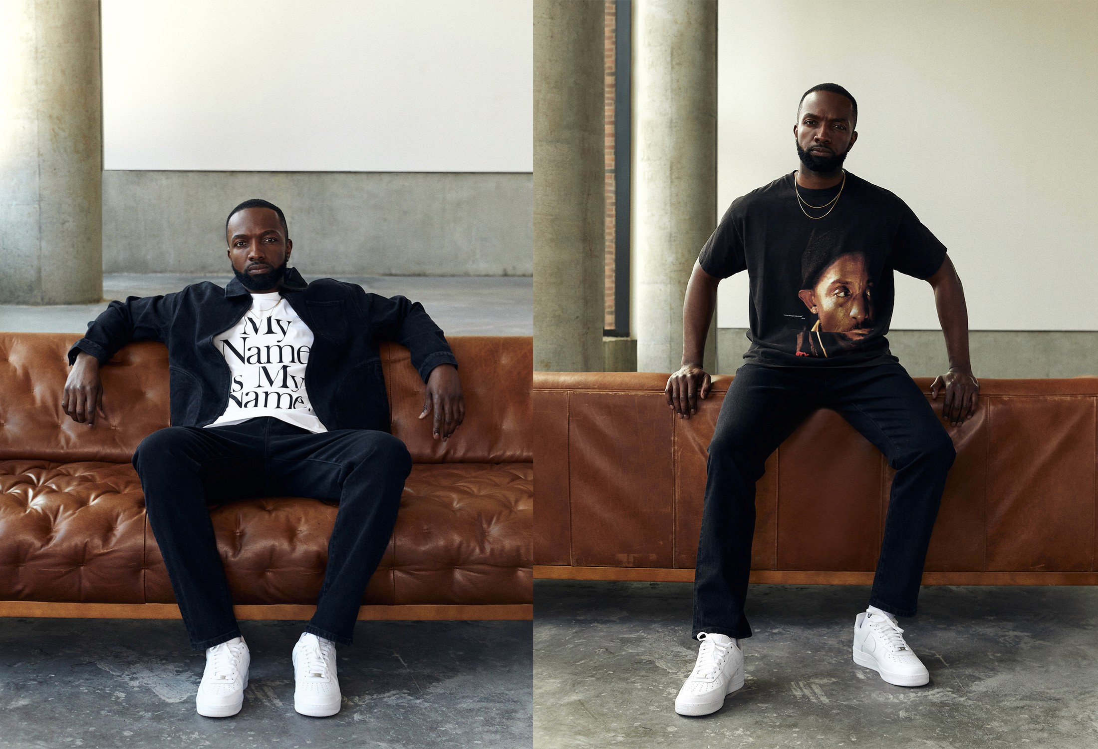
Take apparel as a simple example. A brand like Lululemon does not only feel more premium because of cleaner visuals or a higher price point. It also feels more controlled in how product stories are framed, how photography is art directed, and how consistently the brand holds its tone across touchpoints.
A more mass-market brand can borrow some of those signals, simplify the logo, add more whitespace, quiet the palette, and still not feel premium. The reason is usually the same: the rest of the experience still feels busy, inconsistent, or over-promotional.
Premium branding is usually more coherent, not more decorated.
That is why the strongest premium signals are often simple ones. Typography feels chosen. Layout gives things room to breathe. Images follow a clear point of view. Copy sounds calm and precise. The brand uses fewer elements, but uses them with more control.
So if you want your brand to feel more premium, do not start by asking whether it looks expensive enough. Start by asking whether it feels edited, aligned, and intentional from one touchpoint to the next.
A simple audit helps:
Where are we adding too much instead of editing?
Where does the brand feel inconsistent?
Does our copy support the same level of quality as our visuals?
Do our images, tone, and layout feel like one system?
A brand feels premium when people can sense the quality of the decisions behind it. That is the real point. Premium is not a layer of polish you apply at the end. It is what happens when design, language, and experience communicate the same level of care.
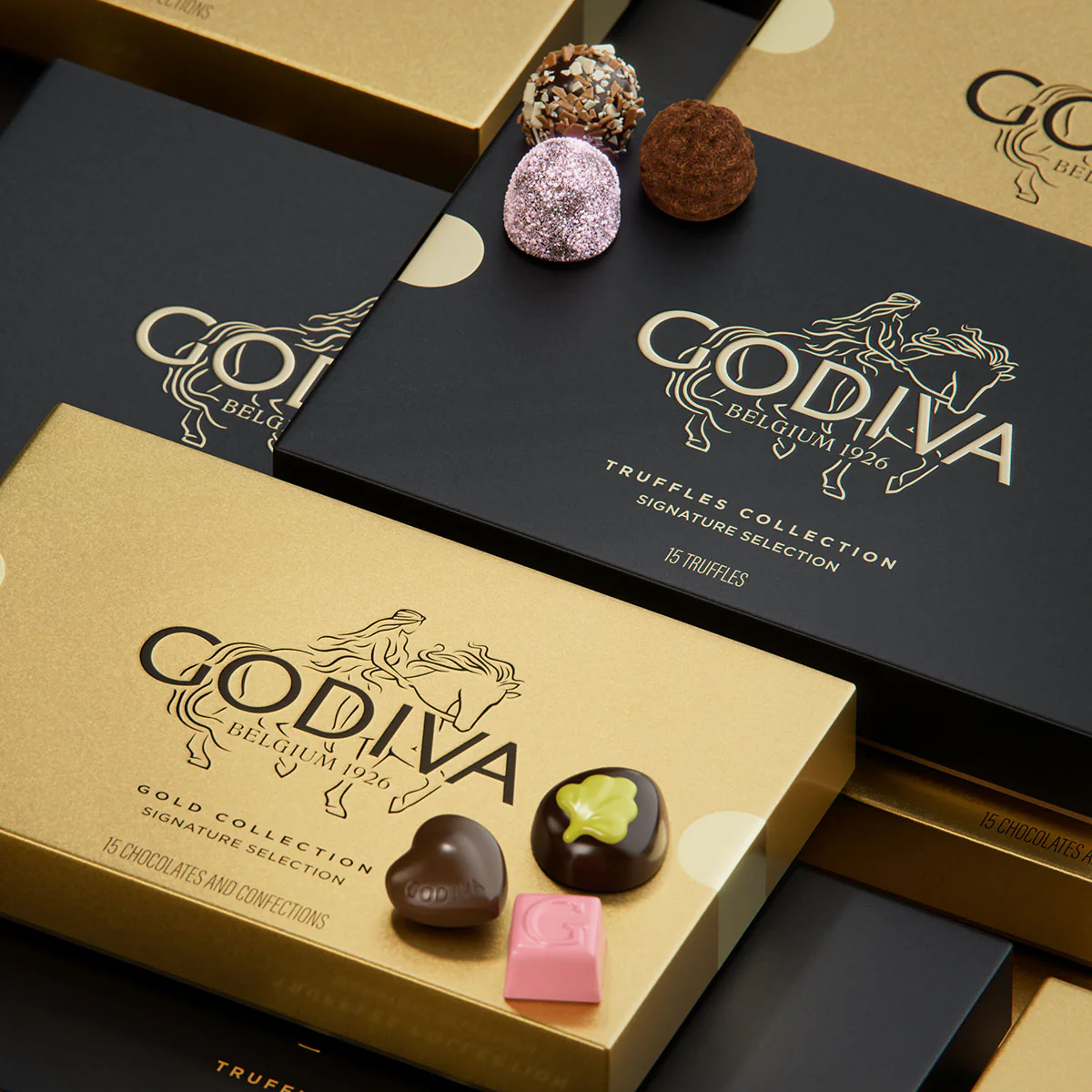
Photos: Lululemon, Kith, Godiva


