March 8, 2026
CMYK VS RGB: DIFFERENCES, USES, AND HOW TO CHOOSE THE RIGHT ONE
CMYK and RGB are often treated like basic design terms, but the difference between them affects how color actually behaves in the real world. This guide breaks down what each mode does, where it belongs, and how to use both more confidently.
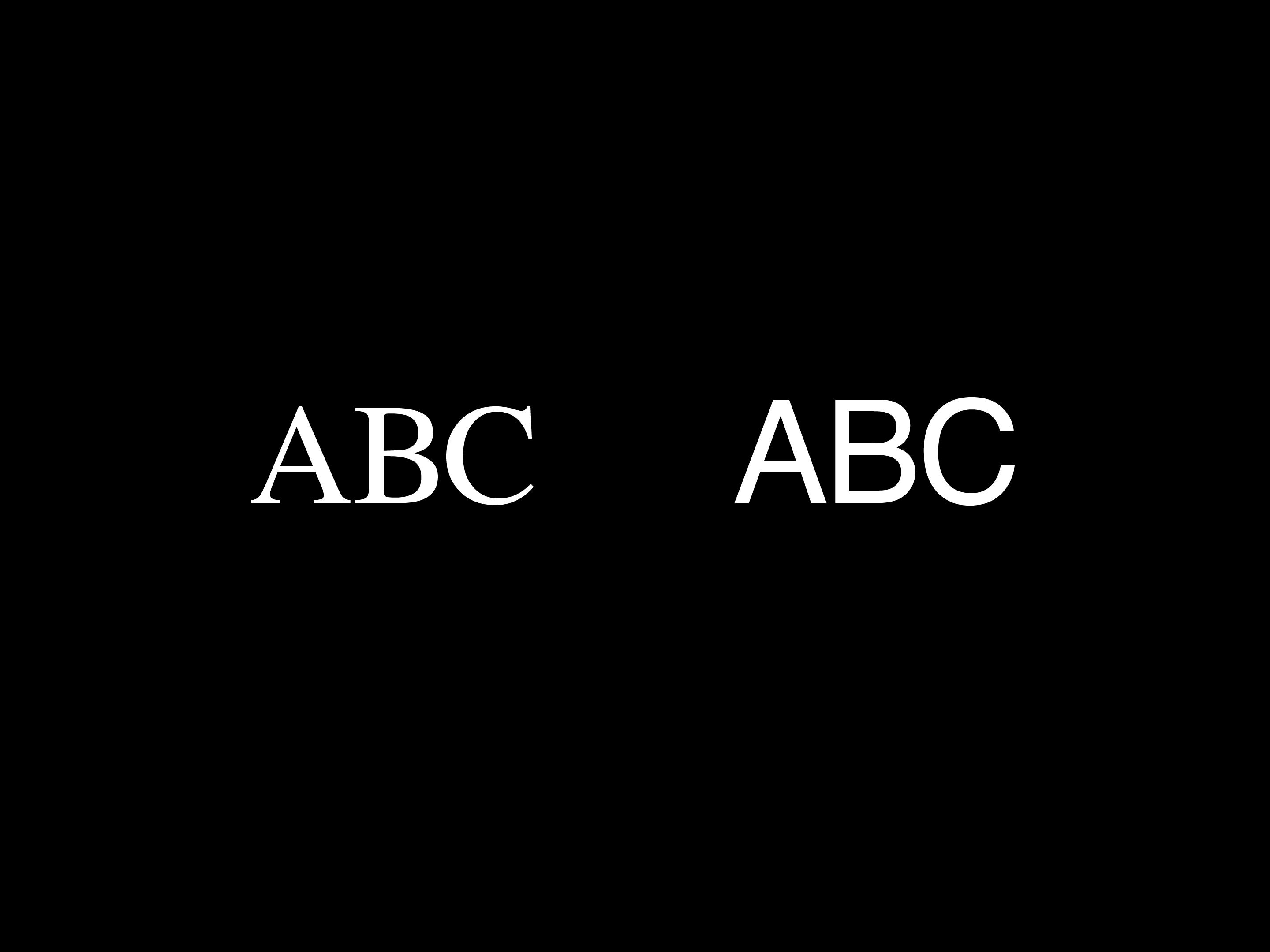
One of the most common color mistakes in design is also one of the most basic. We make something on screen, love how vivid it looks, and then the printed version shows up with a completely different attitude. That is usually the moment we stop nodding along and actually ask: what is the difference between CMYK and RGB?
The answer is not just that one is “for print” and one is “for screens,” even though that is part of it. The real difference is that CMYK and RGB create color in completely different ways, and that affects how our work looks, where it works, and how we should prepare it.
In this guide, we are going to break down the difference between CMYK and RGB in a practical way. We will look at how each color mode works, where each one should be used, what usually goes wrong, and what designers should keep in mind before calling it done.
Why CMYK and RGB are not the same thing
CMYK and RGB are both color models, but they do not behave the same way because they are built for different environments.
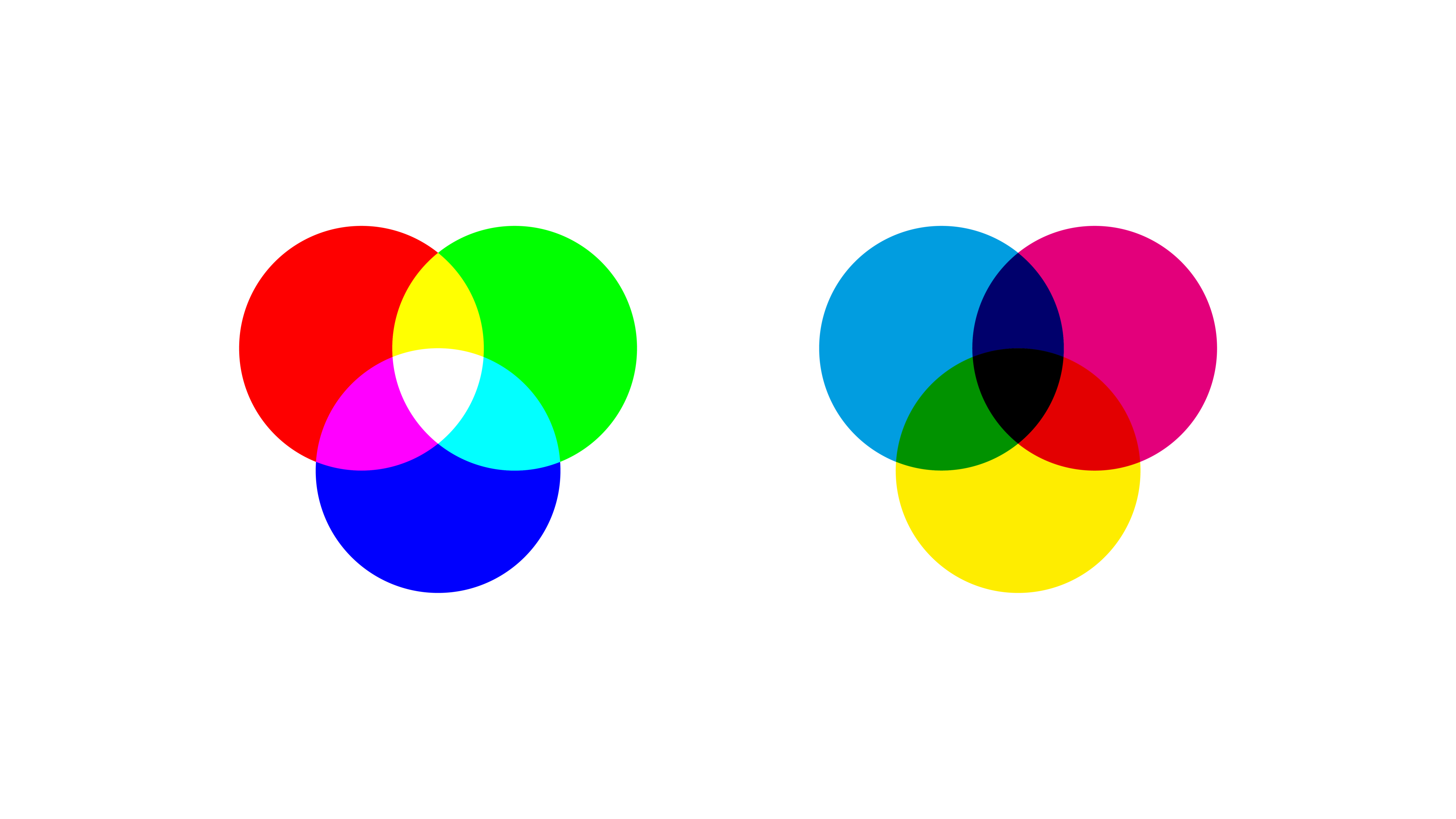
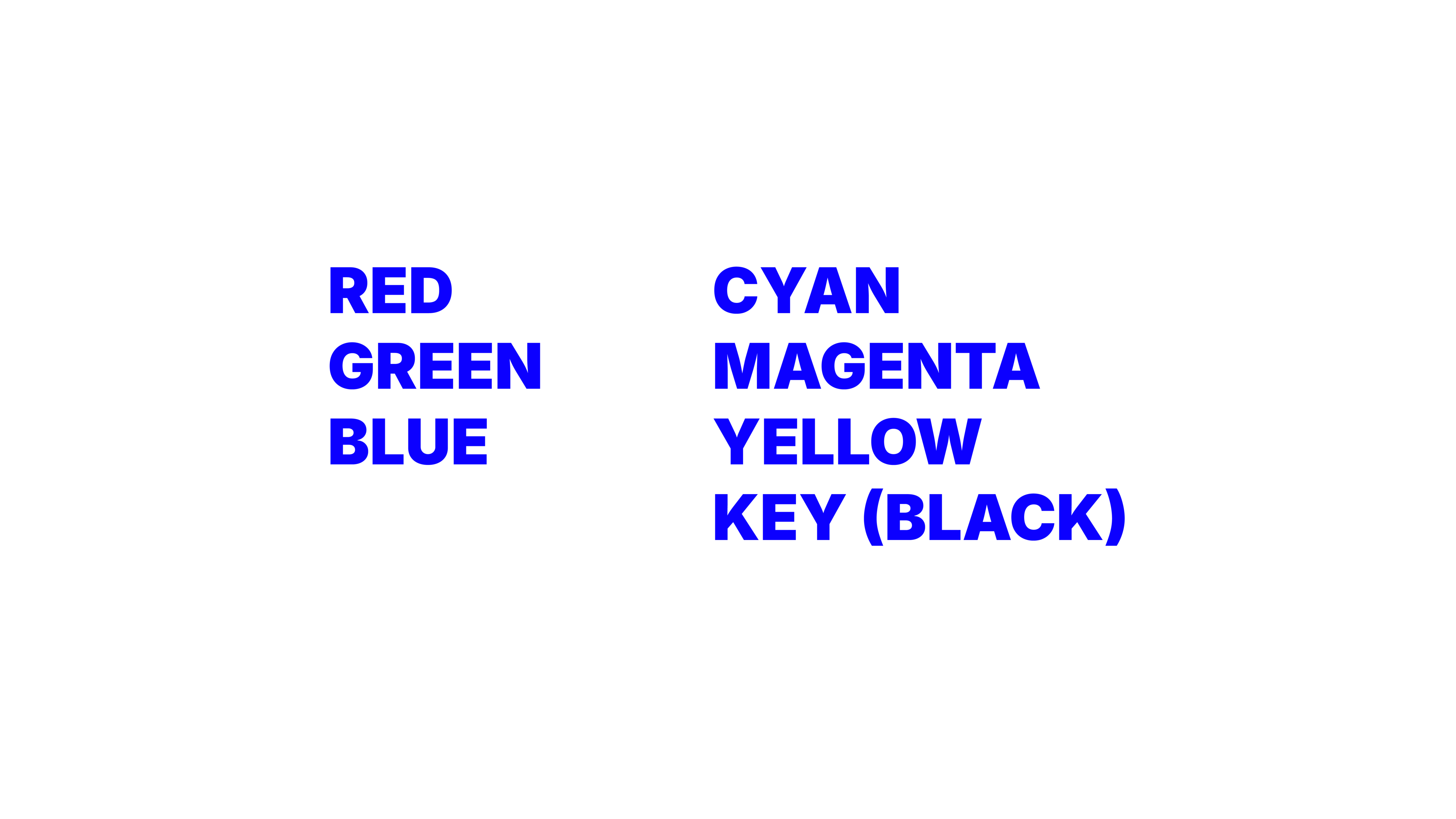
RGB stands for red, green, and blue. It is the color model used for screens. Phones, laptops, TVs, digital ads, websites, presentations, social posts, and interfaces all rely on RGB. RGB is a light-based system, which means color is created by emitting light.
And yes, there is a slightly funny irony in explaining CMYK on a screen. Even when we are talking about print color, we are still looking at a digital simulation of it. Color likes to keep us humble.
CMYK stands for cyan, magenta, yellow, and key (black). It is the color model used for print. Posters, brochures, packaging, magazines, business cards, and other printed materials are usually produced in CMYK. CMYK is an ink-based system, which means color is created by layering ink on a surface that reflects light back to our eyes.
This is where the useful technical language comes in.
RGB is an additive color model. That means the more colored light we add together, the closer we get to white. A screen starts from darkness and adds light to create color.
CMYK is a subtractive color model. That means the more ink we add, the more light gets absorbed, and the result moves closer to black. Print starts from a light surface, usually paper, and subtracts light through ink.
That may sound like a tiny technical distinction, but it changes everything. It changes brightness, saturation, file preparation, output quality, and expectations.
The real differences between CMYK vs RGB
If we strip the topic down to what actually matters in practice, there are a few differences designers should understand clearly.
The first difference is how color is produced. RGB creates color with light. CMYK creates color with pigment. That is the foundation for every other difference between the two.
The second difference is where each one is meant to be used. RGB belongs to digital environments. CMYK belongs to print production. When we use the wrong mode for the final output, we increase the chance of surprises.
The third difference is range. Not every color that can exist in RGB can exist in CMYK.
This is where the idea of gamut becomes useful. A color gamut is simply the range of colors a system can reproduce. RGB generally has a wider gamut than CMYK, especially when it comes to bright, luminous, highly saturated colors.
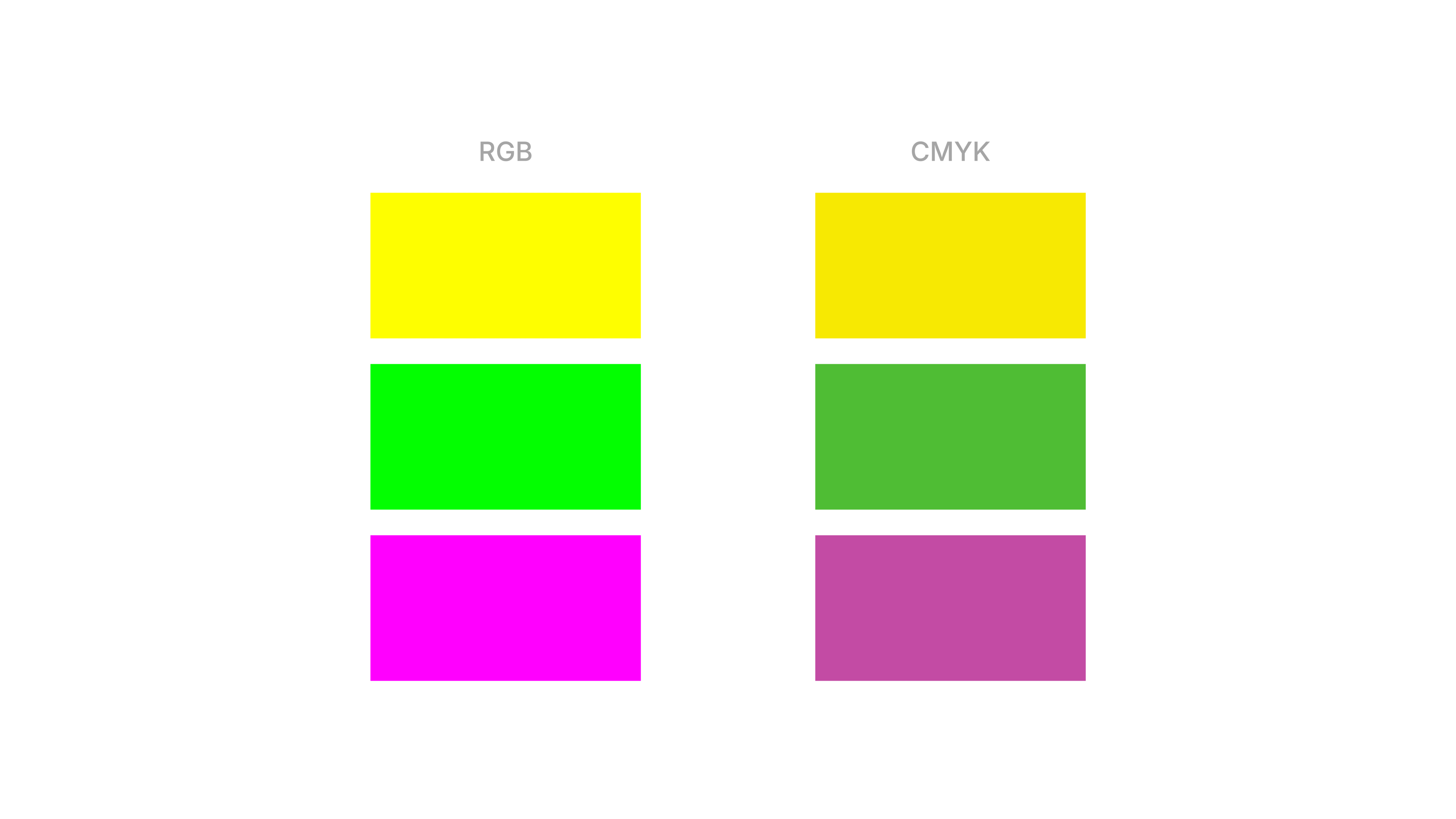
Why RGB usually looks brighter
RGB often looks more vivid because screens emit light directly. That gives colors a brightness and intensity that print cannot naturally reproduce. Think about neon greens, electric blues, or ultra-bright pinks. On screen, those colors can feel almost glowing. On paper, they lose that light-based energy because paper is not backlit. It reflects ambient light instead.
That is why a design can feel alive on a monitor and more restrained in print, even when nothing is technically “wrong.” The medium itself changes the experience.
Why CMYK changes the result
CMYK has more physical constraints. Ink, paper stock, coating, printer calibration, and production methods all influence the final appearance. A matte uncoated paper will not behave like a glossy coated stock. A newspaper will not behave like premium packaging. Even the same CMYK values can feel different depending on the surface and print conditions.
This is why conversion from RGB to CMYK is not a clean one-to-one translation. Some colors have to be approximated because they simply sit outside the printable CMYK range.
So when color shifts happen in print, the reason is often not designer incompetence. It is the reality of moving from light to ink.
When should we use RGB and when should we use CMYK?
This part is thankfully simple. If the final design is going to be experienced on a screen, RGB is usually the right choice.
That includes things like:
RGB gives us the flexibility and brightness that digital work needs. It also aligns with how screens actually display color. If the final design is going to be physically printed, CMYK should be part of the process.
That includes things like:
The simplest rule is this: the destination should decide the color mode. Not habit, not personal preference, and definitely not whatever file template happened to be open.
This is also where software comes in. In tools like Adobe Illustrator, InDesign, Photoshop, Figma, or even presentation software, the working color mode and export settings shape what we are really designing for. A layout might look fine inside the software, but if the document setup, color profile, or export format does not match the final use, problems usually show up later.
In other words, the software is not the point, but the setup inside it absolutely matters.
That said, real design projects are often mixed. A brand identity, campaign, or event system may need to exist in both digital and print environments. In those cases, the goal is not to force one file to do everything perfectly. The goal is to adapt the system intelligently.
Sometimes that means building screen-first assets in RGB and preparing separate print-ready versions in CMYK. Sometimes it means choosing a palette that behaves more consistently across media. Sometimes it means accepting that a digital hero color will need a print-friendly equivalent.
That is not overcomplicating things. That is just professional color planning.
Common misconceptions that keep causing problems
A lot of confusion around CMYK and RGB comes from a few very persistent myths.
“If it looks right on screen, it will print the same”
No, and honestly, this one causes more pain than it should.
Screens are bright, emissive, and often uncalibrated. Print is physical, reflective, and dependent on materials. The same design can never behave exactly the same way in both conditions. A screen preview is not a promise of print output. It is only one version of the experience.
“CMYK is just the print version of RGB”
Not really. They are different systems with different capabilities.
When we convert RGB to CMYK, software has to reinterpret colors that may not exist in the print gamut. That is why certain shades shift, flatten, or dull out. It is not like saving a file from PNG to JPG. The color space itself is changing.
“One file should work perfectly for everything”
In a perfect world, sure. In actual design work, not always. A file built for Instagram, a keynote screen, and offset printing does not live under the same technical conditions. Trying to make one master file do all of that flawlessly is often what creates inconsistent results.
A better approach is to think in systems. We can keep the design language consistent while preparing output-specific assets.
“CMYK is worse because it looks duller”
This one is more emotional than technical. CMYK is not worse. It is just more limited in certain areas because print works differently from screens. In exchange, it gives us something RGB cannot: physical presence. Texture, material, finish, scale, and tactility all belong to the print world.
So the comparison is not really about which one is better overall. It is about which one matches the job.
What CMYK vs RGB really teaches us about design
At first glance, CMYK vs RGB feels like beginner-level design knowledge. It is one of those terms we hear early, nod at, and assume we fully understand. But the more we work, the more we realize it is actually about something much bigger than memorizing two acronyms.
It teaches us that design decisions only make sense in context. Color is never just a visual choice floating in space. It depends on medium, material, environment, and use.
That is why the right question is not “which color mode is best?” The right question is “where is this design going to live, and how will people experience it?”
Once we start there, a lot of things become clearer. We stop expecting paper to behave like a screen. We stop treating conversion like magic. We stop assuming a bright digital palette will survive print unchanged.
And we start making calmer, smarter design decisions from the beginning. For designers, that shift matters. It means fewer surprises in production, fewer awkward client conversations, and a better understanding of how visual systems work in the real world.
So yes, CMYK and RGB are different color modes. But more importantly, they remind us of something useful: good design is not only about choosing colors well. It is about preparing those colors for the conditions where they actually need to perform.