Articles
Brands That Own Colors: What That Really Means
Mar 12th 2026
Some brands become so tied to a color that it stops feeling neutral and starts feeling untouchable. Here, we unpack why that happens, what it really means legally, and what brands that own colors can teach us about perception, branding, and design.

We love saying that a brand “owns” a color. Tiffany owns that blue. Barbie owns that pink. Louboutin owns that red. The phrase sounds clean and definitive, which is exactly why people repeat it so easily. But brands do not just pick a color and suddenly own it. What they really build is association — in people’s minds, in the market, and sometimes in the legal system too.
That matters because once a color starts feeling inseparable from a brand, everyone else starts reacting to it. They avoid it, imitate it, or build around it. So this article is really about why some colors stop feeling generic and start feeling branded, what has to happen for that to work legally, and how that has shaped the design industry.
We say brands “own” colors because our brains love shortcuts — and because branding keeps proving them right
Most people do not experience branding as a formal system. They experience it as recognition. They see a robin’s-egg blue box and think of Tiffany. They see a hot pink world and think of Barbie. They see a glossy red sole and know exactly what game is being played. Color is one of the fastest shortcuts we have for recognition. It lands before language does.
That is why color ownership feels real even before it becomes legal. A brand can become so consistent with a specific hue that the color stops reading as neutral and starts reading as authored.
What people usually mean is not that the brand has literally removed that color from the world. They mean the brand has made that color feel symbolically unavailable to everyone else. Once that happens, every competitor has to decide whether to challenge it, avoid it, or carefully work around it.
For designers, the lesson is simple: color becomes powerful when it is repeated inside a coherent system. Without that repetition across packaging, campaigns, retail, digital, and product touchpoints, color is just a nice choice.
So what does it take to legally register a color — and why do only a few brands get there?
Legally, color can function as a trademark in some cases, but the bar is high. Trademark law is not there to reward aesthetic taste. It is there to prevent confusion about source.
In plain English, two big things have to be true.
The color has to distinguish the brand from others in the market.
The color cannot be functional.
The first point means people need to connect that color to one company, not just to a category. In branding language, this is about distinctiveness. A beauty brand cannot suddenly claim beige, and a tech company cannot just call dibs on blue, because those colors are too common to point clearly to one source.
The second point means the color cannot be doing a practical job beyond brand identification. If it signals a warning, improves visibility, or serves a functional product purpose, protecting it becomes much harder. This is where the fantasy of color ownership crashes into reality. You are not protecting a vibe. You are protecting a source identifier.
And that is why only a few brands get there. The real game is not color alone, but distinctiveness at scale:
Consistency: the brand uses it relentlessly over time.
Contrast: it stands apart from the category.
Context: it appears in recognisable touchpoints.
Commercial recognition: the market starts connecting it to one company.
The law is not the beginning of the story. It is the final receipt.
The famous examples are not just pretty colors — they are branding systems with insane discipline
This is where the myth gets flattened in the best possible way. Because none of the classic examples worked just because the color was beautiful, bold, or trendy. They worked because the brands built an environment around the color that made recognition almost automatic.
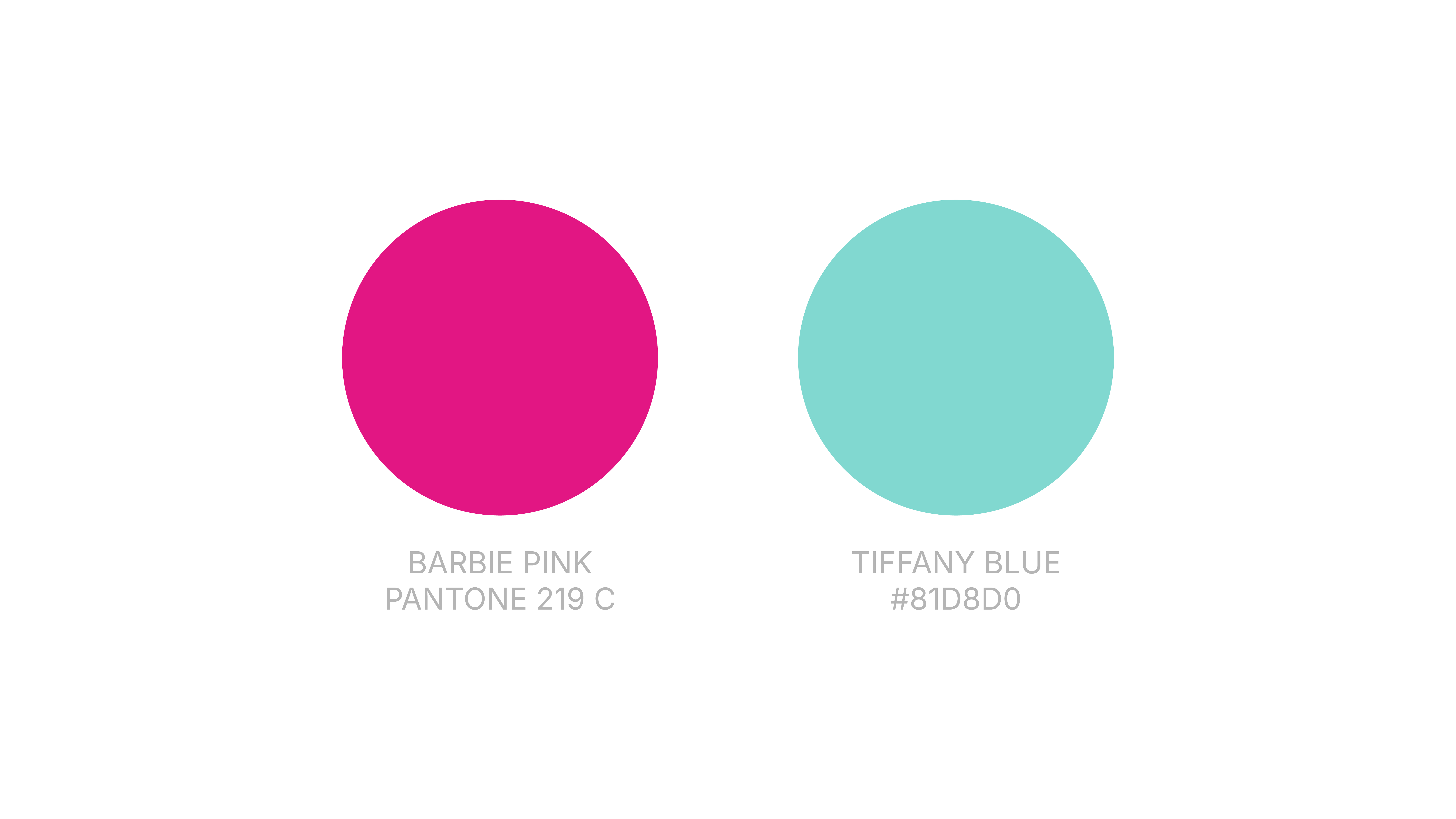
Tiffany Blue
Tiffany Blue is probably one of the cleanest examples of color becoming brand theater. It is not just a shade. It is an experience cue. The box matters as much as the jewelry, sometimes more in the public imagination. The color became inseparable from gifting, luxury, ceremony, and aspiration.
What Tiffany did right was not just choosing a memorable color. It was making that color ceremonial. The packaging became part of the product story.
Barbie Pink
Barbie Pink is a different kind of beast because it lives in pop culture as much as it lives in product branding. That matters. A color gets stronger when it is reinforced not only through brand use, but through media, nostalgia, parody, fashion, and cultural repetition. Barbie’s pink is not powerful just because it is pink. It is powerful because decades of storytelling made that specific use of pink feel like a whole universe.
And that is a useful lesson for designers: cultural saturation can amplify brand color far beyond the logo system.
Louboutin Red
Louboutin is one of the most instructive examples because it reminds us that placement matters. It is not just “red” floating abstractly in the world. It is red on the sole. That specificity changes everything. The brand built distinctiveness around a particular application of color in a recognisable location.
That is a great case study in how brands do not always own a color broadly. Sometimes they own a very particular branded use of it.
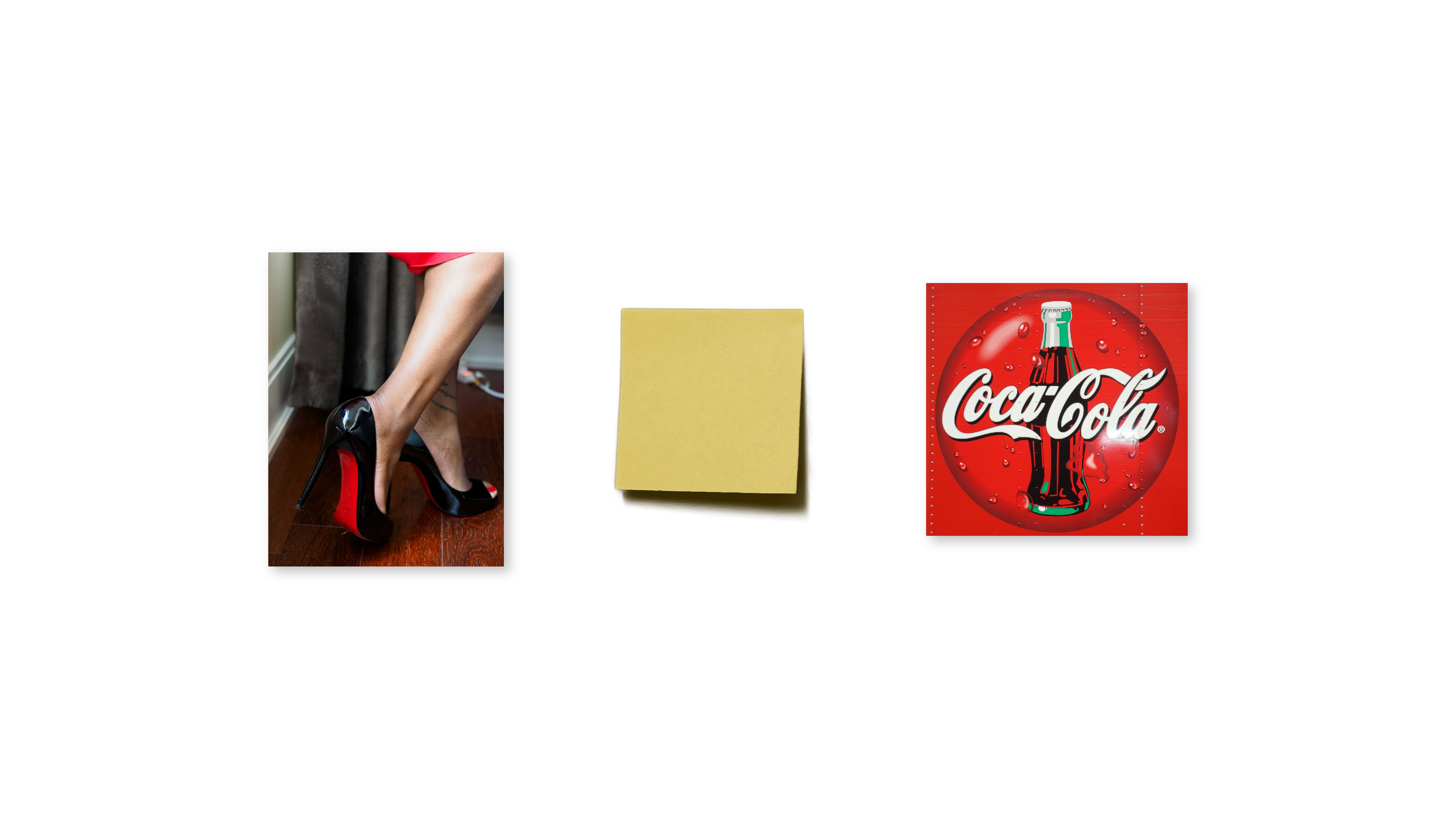
Post-it Canary Yellow
Post-it notes are a good reminder that ordinary objects can build extraordinary recognition. Canary yellow was never just a charming office supply decision. Over time, ubiquity did the heavy lifting. Repetition in schools, offices, studios, and homes turned the color into part of the product’s identity.
This is less about glamour and more about category dominance. When a brand becomes the default object people imagine, its color can start feeling equally default and equally proprietary.
Coca-Cola Red
Coca-Cola Red shows what happens when color is reinforced at absurd scale. Packaging, signage, trucks, vending machines, sponsorships, seasonal campaigns, retail presence — the brand has pushed red through nearly every touchpoint imaginable. Even though red is obviously not unique in the abstract, Coca-Cola’s disciplined use of it has made the association incredibly strong.
It is a useful example because it also proves something else: a color does not need to exist alone to be powerful. Red works here inside a much bigger identity system that includes typography, shape, tone, and massive cultural familiarity.
UPS Pullman Brown
UPS is maybe the most deliciously stubborn example in the whole conversation. Brown is not the color people fantasize about when they are trying to build an iconic brand. Which is exactly why the case is so good. UPS shows that a color does not have to be conventionally sexy to become ownable in perception.
It just has to be used with commitment, clarity, and enough consistency that the market starts to read it as intentional rather than accidental. That is one of the best educational takeaways in this entire topic: color power is not about prettiness. It is about coded recognition.
When a color gets strongly associated with a brand, it starts shaping the whole design industry
Once a brand becomes strongly associated with a color, the industry around it starts reorganizing itself. Competitors avoid that hue, newcomers choose nearby shades, and some brands try to challenge the association directly.
That ripple effect is real. A strongly branded color changes the visual map of a category. And this is where the industry often learns the wrong lesson. Instead of asking how a brand built such strong distinctiveness, people ask what color they should use to get the same effect. That is how we end up with waves of surface-level imitation.

The design industry loves visible shortcuts because they are easier to copy than invisible discipline. It is easier to borrow the color than to build the years of consistency that made the color meaningful. That is why the most interesting brand work often does not come from finding an “ownable” color at all. It comes from using color in a way that is specific, structured, and tied to a larger identity logic.
What we can learn from brands that own colors
The big lesson is not that every brand should go hunting for a trademarkable hue.
The real lesson is that when a brand seems to own a color, what we are usually seeing is the result of long-term system building. We are seeing consistency, repetition, contrast, cultural reinforcement, and clear use across touchpoints. In a few cases, that becomes legal protection. But the legal piece is downstream from the branding work, not the other way around.
That should calm people down a bit. Too many teams still act as if success is hiding inside the palette deck. It is not. A color can accelerate memory, but only if the rest of the brand gives that memory something solid to hold on to.
So what can we actually take from all this?
Distinctiveness beats trendiness.
Consistency matters more than novelty.
Context changes everything.
Legal protection is the last step, not the first.
For smaller brands, that is actually good news. You do not need to own a color in the Tiffany sense to build a memorable identity. You need to use color coherently enough that it becomes part of how people recognise you.
What we can learn from this
A brand rarely “owns” a color because of taste alone; it earns that association through repetition and system-building.
Trademark protection matters, but only after a color already functions as a real source identifier.
The smartest move for most brands is not chasing an iconic hue, but building a palette people can recognise in context.


