May 11, 2026
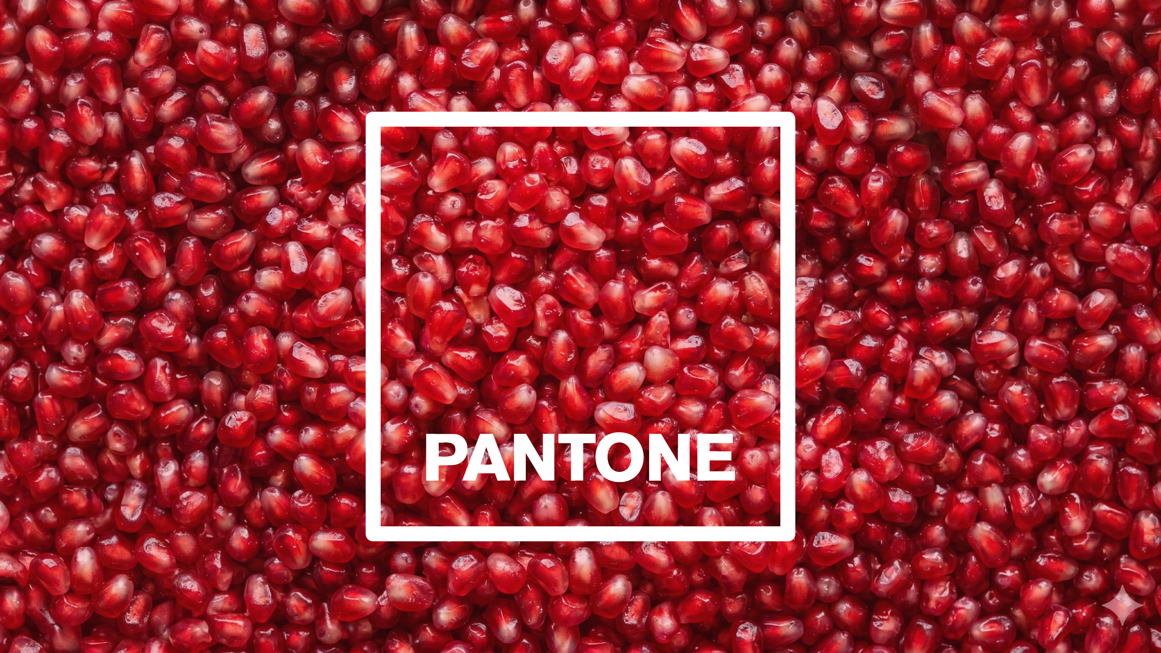
WHAT ARE PANTONE COLORS? A SIMPLE GUIDE FOR DESIGNERS
Learn what Pantone colors are, how they compare to RGB and CMYK, and when they really matter for your brand.
You’ve probably heard things like “let’s use Pantone 186 for the red”, or seen headlines about the new Pantone Color of the Year. But if someone stopped you and asked “okay, but what is Pantone, exactly?”… it’s not always easy to answer.
The short version: Pantone colors are part of a standardized color matching system that helps everyone reproduce the same color across different printers, materials and places. On top of that system, Pantone also runs a big marketing and trend exercise every year: Color of the Year.
In this piece we’ll walk through why Pantone exists, how Pantone colors actually work in real projects, how they compare to RGB/CMYK/HEX, and how much attention you should really pay to Color of the Year.
Why Pantone exists (and what it actually is)
Before Pantone, printers would mix inks more or less “by eye”. Designers and clients would ask for “a bright red”, and the press operator would do their best. Then you’d reprint in a different city… and suddenly your “brand red” didn’t look like your brand at all.
The problem was simple:
- Different printers mix inks differently.
- Different papers absorb ink differently.
- “Red” means something slightly different to everyone.
Pantone was created to fix that. Instead of vague color names, Pantone built a color matching system (PMS – Pantone Matching System): a big catalog of specific colors, each with a code and a formula.
When we say “Pantone 286 C”, we’re referring to:
- A formula for mixing that ink (using base inks in fixed proportions).
- A printed reference in a swatch book, so everyone can see how it should look.
- A code (“286 C”) that designers, printers and clients can share.
You’ll often see letters like:
- C – Coated (for glossy/satin papers)
- U – Uncoated (for more porous, matte papers)
The same Pantone color can look different on coated vs uncoated paper, even though it uses the same underlying formula. That’s why Pantone prints separate swatches for each type of paper.
Pantone doesn’t “own” colors in a magical sense; it defines very precise recipes and physical references so everyone can reliably reproduce the same color.
How Pantone colors work in real life
The easiest way to understand Pantone is to compare two ways of printing color: spot colors and process colors.
- Spot colorA specific, pre-mixed ink.Example: the printer mixes “Pantone 186 C” ink in a bucket, and that exact ink is printed wherever you need that red.
- Process color (CMYK)Colors are built on the press using dots of Cyan, Magenta, Yellow and blacK. Red isn’t a single ink; it’s a mix of those four.
Pantone lives mainly in the spot color world. The Pantone guides tell printers exactly how to mix each spot ink so it matches the reference swatch.
A typical workflow looks like this:
- Designer chooses a Pantone color from the swatch book (never just from the screen).
- They specify the code (e.g. “Pantone 186 C”) in the brand guidelines and production files.
- The printer mixes that ink according to Pantone’s formula and prints it on the chosen paper.
- Everyone can compare the final print to the physical swatch to check if it’s close enough.
Of course, real life still gets in the way:
- Different papers absorb ink differently.
- Different print conditions (humidity, speed, calibration) affect the result.
- Viewing under warm vs cool light changes our perception.
That’s why the printed swatch in a Pantone guide is the “truth”, not whatever you see on your laptop.
On the digital side, design tools like Illustrator, Figma or InDesign include Pantone libraries. You can pick Pantone colors from a dropdown, but those on-screen previews are still approximations. The system only becomes really reliable when you compare it to the physical guide.
Pantone vs RGB, CMYK and HEX
Pantone is just one piece in a bigger puzzle of color systems. To work as a designer today, you need to understand how they fit together.
Color systems at a glance
Here’s the simple overview:
- RGB
- Used for: screens (monitors, phones, TVs, projectors).
- Built with: light (Red, Green, Blue).
- Logic: the more light you add, the brighter/whiter it gets (additive color).
- HEX
- Used for: web and digital design.
- Built with: a way of writing RGB values (e.g. #FF0000).
- Logic: convenient code format for developers and CSS.
- CMYK
- Used for: full-color printing (magazines, flyers, posters, packaging).
- Built with: Cyan, Magenta, Yellow and blacK inks.
- Logic: the more ink you add, the darker it gets (subtractive color).
- Pantone (PMS)
- Used for: precise spot color printing, brand colors, special inks.
- Built with: pre-mixed inks defined by a formula.
- Logic: each Pantone color has its own specific recipe and swatch.
So where does it get tricky?
- Gamut differences:Some Pantone colors are extremely vivid or special (neons, deep blues, metallics). These can’t be reproduced exactly in CMYK, and they often look different again in RGB.
- Conversions:Design software can “convert” a Pantone color to CMYK or RGB, but those are approximations. The tool is basically saying “this is the closest CMYK mix we can manage to simulate this Pantone”.
That’s why serious brand guidelines usually show all four for each key color:
- Pantone code (for spot printing)
- CMYK values (for process printing)
- RGB values (for screens)
- HEX code (for web)
Pantone colors are not a replacement for RGB, CMYK or HEX; they’re a way to lock in one precise reference inside a wider cross-media color system.
Can brands “own” a Pantone color?
You’ll sometimes hear that a brand “patented” or “owns” a specific color. That’s not quite accurate, but there is a grain of truth.
Legally speaking, brands can:
- Trademark the use of a specific color in a specific context.For example (speaking generally): a particular shade of red for delivery trucks, or a specific blue for banks cards.
What they cannot do is:
- Own that color in every possible context, everywhere in the world, forever.
In relation to Pantone:
- Some brands work with Pantone to create a custom color that is not part of the standard public guide.
- That custom formula can be used as a kind of “exclusive” brand ink for their packaging or communication.
- The real power, however, comes from consistent and recognizable use, not from the formula itself.
Over time, if a brand uses the same color everywhere — in their logo, stores, website, packaging — we start to connect that color with that brand. That’s brand association, not magic legal ownership.
You can’t own blue as an idea, but you can absolutely build a brand where a specific blue feels unmistakably “you”.
Every year, Pantone announces a Color of the Year. You’ll see it all over design blogs, interior moodboards and marketing presentations.
What is it, really?
- A trend and storytelling program: Pantone picks one color (sometimes a pair) and builds a narrative around it.
- They typically connect it to:
- Cultural moods (“optimism”, “stability”, “comfort”, etc.).
- Lifestyle imagery (fashion, interiors, objects).
- A broader feeling of “this is what the year looks like”.
It’s clever for several reasons:
- It keeps Pantone at the center of design conversations.
- It gives brands and designers a shared reference point.
- It inspires product lines, packaging, campaigns and content.
But here’s the key thing: Pantone Color of the Year is not a rulebook for good design.
You don’t need to:
- Rebuild your brand palette every January.
- Force that color into every project.
- Treat it like some kind of official trend law.
You can use it to:
- Spark ideas for seasonal campaigns or limited editions.
- Build moodboards for clients who love trend references.
- Practice explaining color decisions in emotional and cultural terms (the way Pantone does in their announcements).
Think of Color of the Year as a design conversation starter — useful and fun, but not a sacred command.
How and when to use Pantone in your projects
In practice, you don’t always need Pantone. It depends a lot on the type of work you’re doing and how important physical, printed touchpoints are for the brand.
Pantone is especially useful when:
- The brand has strong, specific colors that need to look consistent across many printed materials.
- You’re working with packaging, signage, uniforms or wayfinding, where color consistency is part of recognition.
- You need special inks like neons, pastels or metallics that CMYK can’t reproduce well.
Pantone is “nice to have” (but not essential) when:
- The brand is mostly digital, with only occasional or low-stakes printing.
- You’re printing small runs with standard CMYK where spot colors would dramatically increase cost.
- The project doesn’t rely heavily on a single, hero brand color.
Our own approach when we build or refine a brand palette is:
- Start with meaning and contrast.What should this brand feel like? What colors work well together and serve the idea?
- Then translate those colors into systems.For core brand colors, we:
- Decide on Pantone references for key print use.
- Define CMYK / RGB / HEX equivalents for other media.
- Check them all visually, not just numerically.
- Specify everything clearly in guidelines.A designer in another country, or a printer you’ve never met, should still be able to reproduce the brand correctly from the specs alone.
Quick checklist before you send anything to print
Before you hand off files or approve a print job, ask yourself:
- Do we have Pantone references for the main brand colors that matter in print?
- Have we included Pantone + CMYK + RGB + HEX values in our brand guidelines or handoff?
- If the job uses spot colors, have we:
- Clearly labelled them as Pantone spot colors in the file?
- Confirmed with the printer that they will be printed as spots, not converted to CMYK?
- Have we checked printed proofs (even small ones) against the Pantone guide under normal lighting?
The more precisely you specify colors — and the more you talk openly with printers — the less your brand has to suffer from unexpected “surprise oranges” that were supposed to be red.