Articles
Most ecommerce websites are super boring. Here’s why.
Feb 9th 2026
Most ecommerce websites aren’t bad. They’re just boring. And it has nothing to do with platforms, tools, or trends...
Let’s start with a familiar scene.
You pick a clean template. You upload good-looking product photos. You adjust the colors, tweak the typography, connect payments, and hit publish. Technically, your ecommerce site works. And yet… it feels bland. Interchangeable. Slightly fragile.
That’s not a coincidence. Most ecommerce websites today are functional, but barely so. They do the minimum required to exist online, not the work required to convince, reassure, and convert.
Good ecommerce web design isn’t about doing more — it’s about making a few deliberate decisions that remove friction and make buying feel obvious.
This article isn’t about trends or tools. It’s about the structural and UX choices that separate forgettable stores from serious ecommerce brands.
Most Ecommerce Sites Are Bland, Barely Functional, and Built on Defaults
The uncomfortable truth is that many ecommerce sites look the same because they are the same.
Templates encourage speed and accessibility, which is great. But they also come with baked-in assumptions about how people browse, decide, and buy. And most brands never question those assumptions.
So what happens?
Every section feels equally important.
Navigation grows without intent.
Product pages become cluttered containers instead of decision tools.
The result isn’t catastrophic failure. It’s quiet underperformance.
Most ecommerce sites don’t fail because they’re ugly — they fail because nobody questioned the structure.
Using a template is not the problem. Blindly accepting its priorities is.
Hierarchy, Navigation, and Product Pages Are the Same Problem
In ecommerce, everything revolves around one thing: helping people decide.
Visual hierarchy, navigation, collections, and product pages are often treated as separate tasks. In reality, they’re all part of the same system — the system that guides users from curiosity to commitment.

Here’s how breakdowns usually happen:
Pages where everything screams for attention.
Menus organized around internal categories, not shopping intent.
Product pages overloaded with information, but poorly ordered.
Hierarchy is how you tell users what matters — without saying a word.
Strong ecommerce web design does three things consistently:
It prioritizes information clearly Price, product, action, reassurance — in that order. If users have to hunt for what matters, they hesitate.
It reduces cognitive load Fewer choices, clearer paths, better grouping. Complexity doesn’t feel premium — clarity does.
It treats product pages as decision spaces Not galleries. Not brand moodboards. Decision environments.
When hierarchy is unclear, no amount of branding or content will save conversion.
Trust Is Not a Section. It’s a System.
(And yes — it also has to look good.)
Many ecommerce sites try to add trust instead of designing it.
They bolt on badges. Hide shipping details in footers. Push reassurance into dense FAQ pages. And then wonder why users still hesitate.

Trust doesn’t come from declarations. It comes from consistency and clarity.
Well-designed ecommerce sites build trust through:
Pricing transparency (no surprises, no fine print gymnastics)
Visible shipping and return logic at the right moments
Calm, confident tone of voice instead of overpromising
Spacing and layout that feel intentional, not rushed
In ecommerce, uncertainty is friction — and friction is abandonment.
If users feel unsure at any step, design has failed them.
How the Best Ecommerce Brands Quietly Do This Better
The best ecommerce brands don’t necessarily look louder or more complex. They look considered.
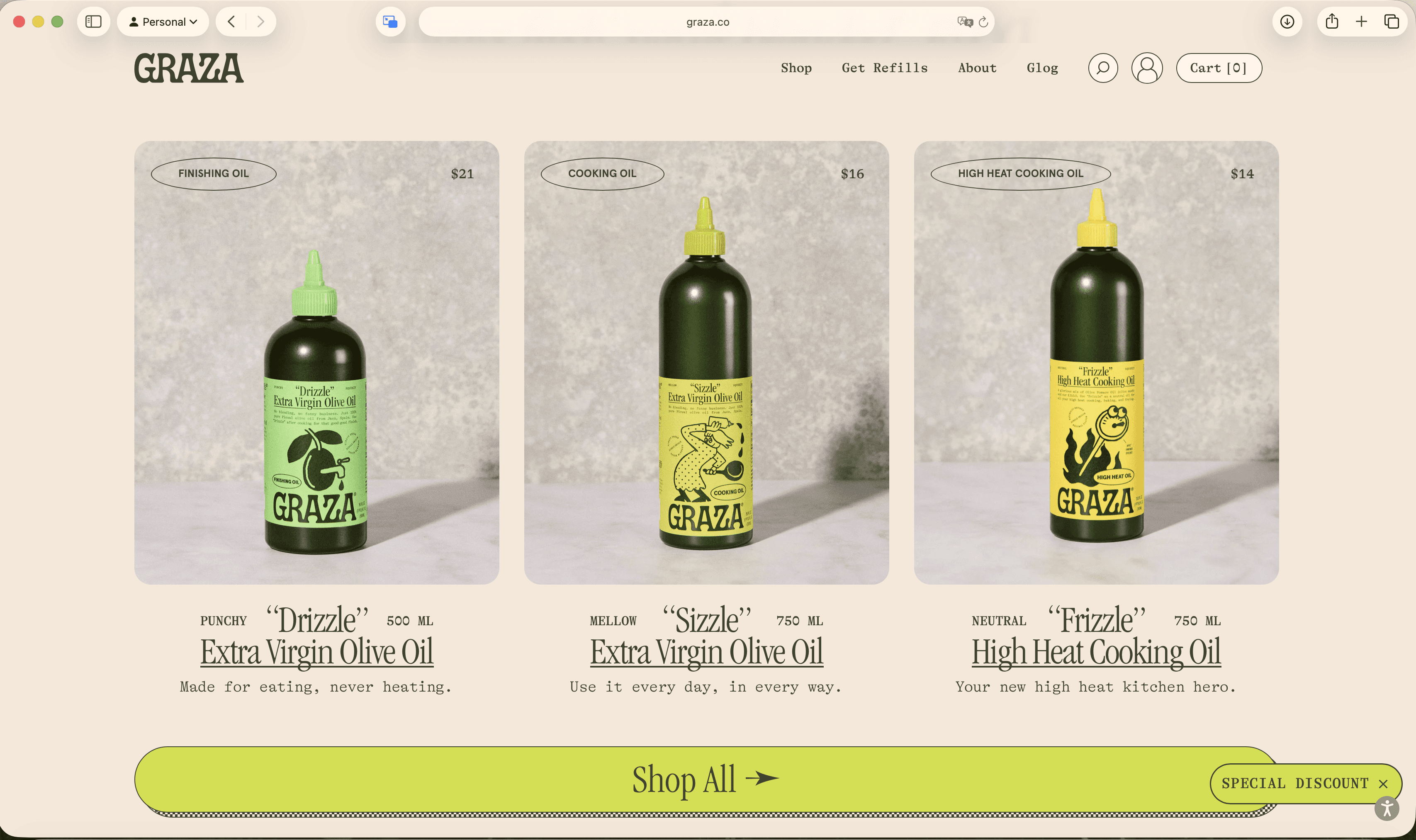
A good reference here is Graza — not because it reinvented ecommerce, but because it made very clear, very intentional design decisions. The site feels confident, readable, and human. Nothing is fighting for attention, and nothing feels accidental.

What Graza gets right isn’t a single feature. It’s the combination of:
Strong visual hierarchy that guides the eye naturally
Clear product storytelling without clutter
Design choices that feel brand-led, not template-led
Good ecommerce design doesn’t scream. It reassures, guides, and stays out of the way.
This is the difference between a site that merely functions and one that feels credible from the first scroll.
Stop Auditing. Start Being Honest About Your Ecommerce Site
Let’s be blunt.
Most ecommerce sites don’t need another audit. They need a reality check.
If your store feels slow, generic, or hard to trust, it’s not because you missed a clever trick. It’s because the fundamentals were never decided with enough intent.

Ask yourself these — and don’t answer defensively:
If someone lands on this page, is it immediately clear what they should do next?
Does the design visually push them toward that action, or politely step out of the way?
Are you earning trust before asking for commitment — or hoping users will figure it out?
Are your categories built for how people shop, or how your internal team thinks?
Does your product page help someone feel confident, or just informed?
Here’s the uncomfortable part: most ecommerce brands already know the answers. They just avoid acting on them.
You don’t need a new template. You don’t need more features. You need better decisions — and the discipline to follow through.
This is exactly where good ecommerce design lives. Not in decoration. Not in development. But in the hard work of aligning brand, UX, and business so buying feels effortless.
At Attlas, this is what we help brands do every day — turn vague problems into clear systems that actually perform.


