Articles
Branding for Everyday Products: Harinas La Encarnación’s Sacks as Art
Feb 18th 2026
Industrial flour sacks aren’t supposed to be beautiful. But Harinas La Encarnación proves that with the right visual system, even B2B packaging can feel like art—and still work in the real world.

Flour is one of those products we almost never look at.
Not because it’s unimportant—because it’s usually sold in the most practical format possible: big sacks, stacked on pallets, handled fast, ordered by specs, and destined for bakeries, kitchens, and industrial food production. That context matters.
When the “customer” is a procurement team or a bakery owner, packaging is often treated like a checkbox: legible, durable, cheap to print, done. Most brands in these categories live under an unspoken brief: don’t get in the way, don’t be expensive, don’t be weird. The result is functional design that’s generic, forgettable, and visually interchangeable. Harinas La Encarnación flips that script.
The identity was developed by Rubio & del Amo, a Spanish design studio—and it’s a great example of how a grounded concept plus a disciplined system can make even industrial packaging feel like a designed object.
Their sacks show what happens when we take a humble, industrial product seriously—artistically and aesthetically, yes, but also structurally. The identity doesn’t pretend the flour is luxury. It simply proves a better point: you can make branding out of anything if you translate the product’s truth into a coherent visual language that survives real life.
Below, we’ll unpack what makes this work—so we can steal the method, not the look.
Make the visuals behave like the product (why this identity works)
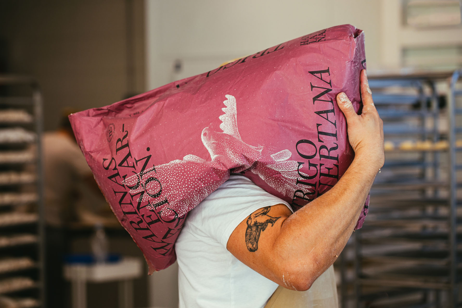
A lot of packaging looks good in a mockup and falls apart in the wild. But “the wild” for flour isn’t a boutique shelf—it’s a warehouse, a loading dock, a production floor, a storeroom. Sacks get folded, stacked, dragged, dusted, and re-stacked. Ink shifts. The surface gets scuffed. And the brand still has to read.
So when we say this identity feels “artistic,” we don’t mean it’s delicate. We mean it’s designed to hold up. Here’s the key idea: the visuals don’t just decorate the product—they behave like it.
Material translation (a simple term that changes how we design)
Let’s name the move happening here: material translation. Material translation is when we take the physical qualities of something—texture, granularity, weight, rhythm, messiness—and turn them into visual rules people can feel.
Think of it like a translation exercise:
Fizzy water → bubbles, sparkle, lightness.
Olive oil → viscosity, gloss, slow movement.
Flour → dust, grain, scatter, softness.
Harinas La Encarnación leans into that “flour-ness” with a dove illustration built from thousands of tiny dots (famously drawn by hand, dot by dot). (the-brandidentity.com) Up close, the dots feel like powder. From far away, they resolve into a clear symbol.
It’s not pointillism because pointillism is “cool.” It’s pointillism because flour is particulate.
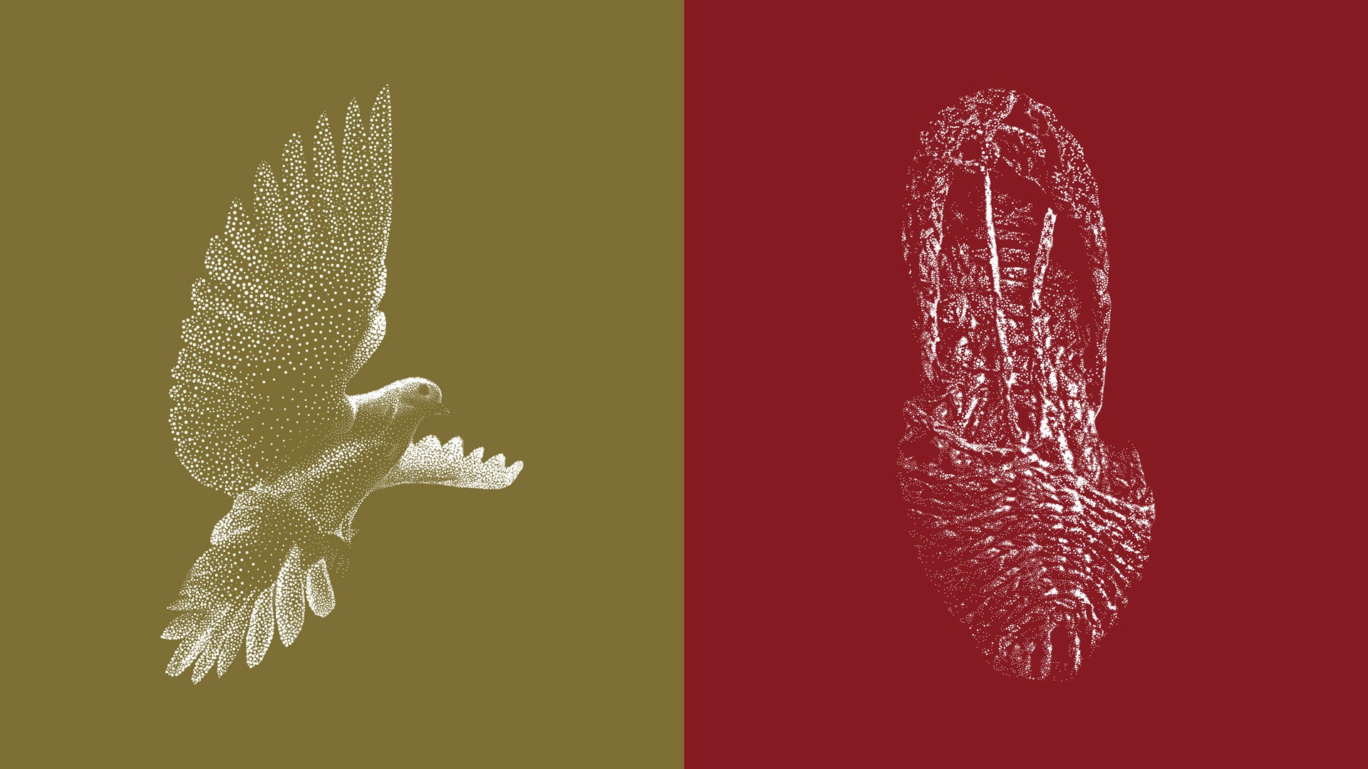
The dove isn’t just a logo—it’s a behavior
There’s a difference between a brand symbol and a brand system. A symbol is a mark we recognize. A system is how that mark lives across sizes, formats, and moments. What’s clever here is that the dove shifts roles without losing identity:
From far away, it reads as a strong silhouette.
At mid-range, it becomes a distinctive illustration.
Up close, it turns into texture—almost like the surface of the sack.
That means the brand doesn’t rely on a single perfect view. It works at multiple distances, in multiple conditions.
A practical tool: the “distance ladder”
If we want this kind of resilience in our own work, it helps to design across three distances (especially for B2B / industrial packaging):
10 meters (pallet mode): can we identify the brand or product family fast?
2 meters (warehouse aisle mode): can we read the variant/type without stopping?
30 centimeters (in-hand mode): does the detail reward the closer look?
Harinas La Encarnación’s dot language performs at all three levels.
Designed for the messy world of sacks
Sacks aren’t perfume boxes. They wrinkle, crease, stack, and get handled fast. This matters because a lot of branding dies the moment the substrate gets honest. Dot-based illustration is surprisingly resilient here:
It still looks intentional when print isn’t perfect.
It absorbs minor inconsistencies instead of amplifying them.
It feels at home next to dust, grain, and real materials.
And there’s another layer: the project is described as a complete range for the industrial food sector—so this “real world” performance isn’t optional; it’s the brief. (packagingoftheworld.com)
A quick note on semiotics (why “pretty” isn’t enough)
Semiotics is simply the study of signs—how visuals carry meaning. A dove isn’t neutral. It signals things: peace, spirit, purity, protection. In this case, the symbol is tied to the name and cultural context of “La Encarnación,” where the dove is used as a symbolic representative. (adg-fad.org) That grounding is what keeps the identity from feeling like decoration.
When we choose symbols because they’re meaningful (not just trendy), everything downstream gets easier: color, composition, illustration style, tone of voice.
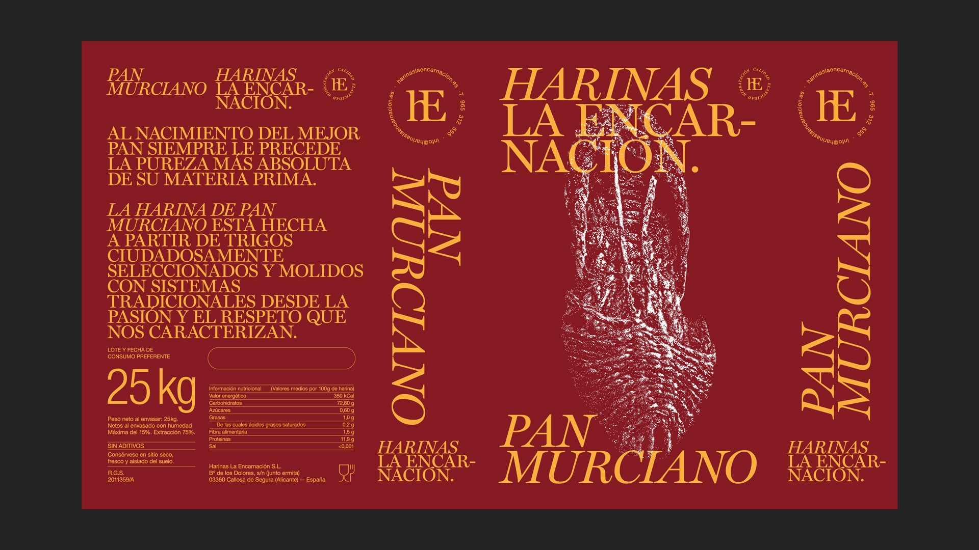
The system that holds it together (color + type + hierarchy)
The most common trap with “artistic” packaging is that it becomes a one-off poster. It looks amazing once… and then the product range shows up and everything collapses.
Harinas La Encarnación avoids that by doing the unglamorous work: building a system across a broad range of references, organized through a balanced color structure so each product is easy to identify. (rubioydelamo.com)
The art works because the structure is consistent.
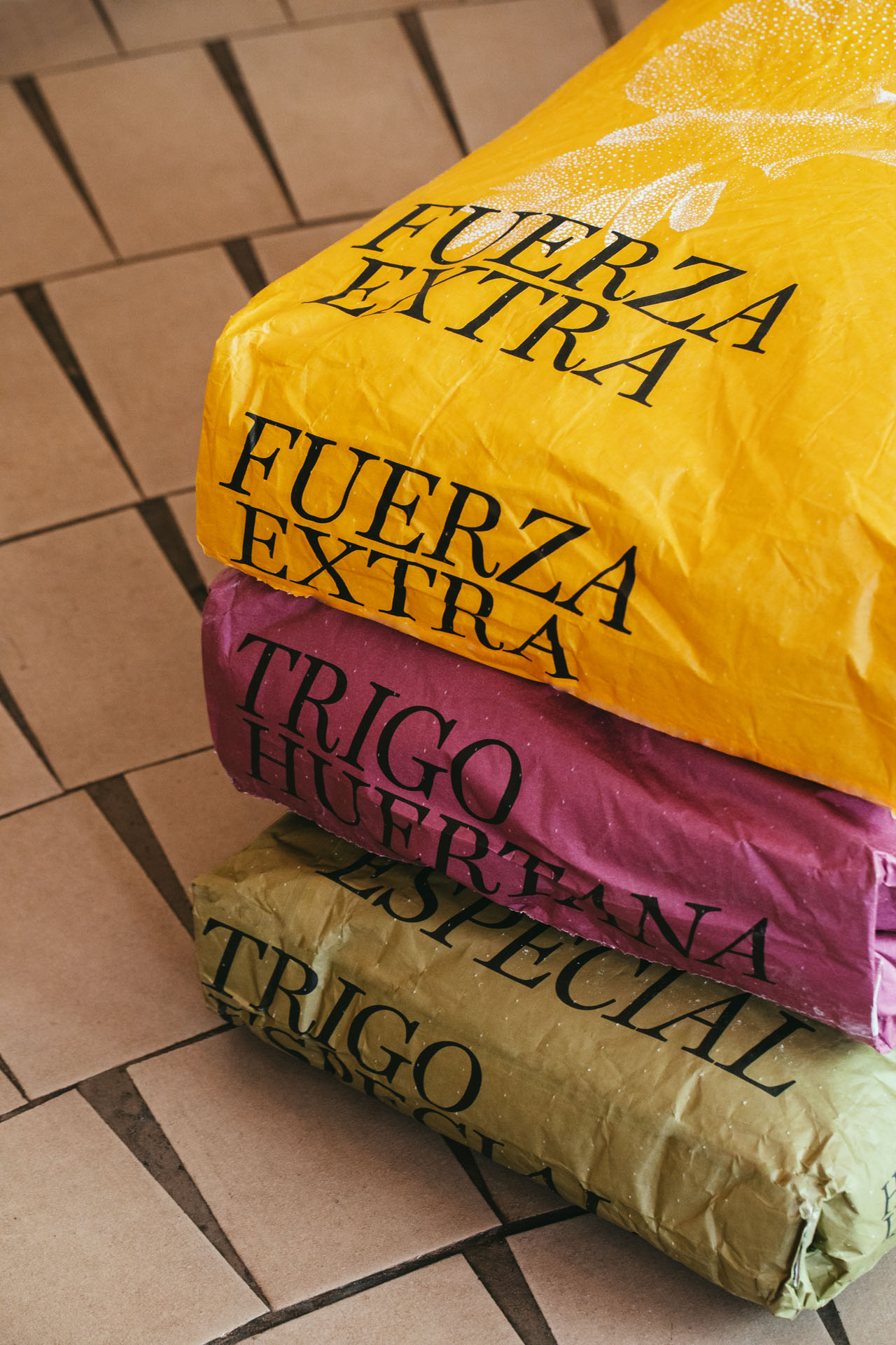
Color as categorization (not decoration)
Color here isn’t just mood—it’s navigation. In industrial and B2B categories, color has a particularly practical job: it reduces mistakes. When sacks look too similar, the risk isn’t “confusion on shelf”—it’s confusion in storage, in production, or during reorders.
A simple color system helps people act fast:
one primary color per variant
consistent placement across sacks
illustration and typography stay stable while the color changes
That’s what a brand system really is: a repeatable set of decisions that makes variety feel cohesive and usable.
Visual hierarchy (how we control what people read first)
“Visual hierarchy” sounds like a classroom term, but it’s logistics survival. Visual hierarchy is the order in which information gets read. On a sack, people don’t read—they scan.
So we design for scanning:
Brand name: recognizable at a glance
Product type: readable from a couple of meters
Functional info: present, clear, not fighting the main message
Hierarchy is built with a few levers:
size (big beats small)
weight (bold beats light)
spacing (air creates importance)
contrast (difference creates focus)
repetition (consistency creates recognition)
None of that is fancy. But together, it’s what makes the design feel effortless.
Typography as structure (why the calm type matters)
Typography is often treated as a style choice (“serif or sans?”). In packaging, it’s closer to architecture. Type defines where the eye lands, how the range stays consistent, and how trustworthy the product feels.
When typography is calm and disciplined, it gives the illustration permission to be expressive. That balance is what keeps the sacks from feeling chaotic.
Constraint is part of the aesthetic (and that’s why it feels honest)
One of the most underrated design skills is learning to love constraints—not tolerate them. Because constraints force decisions. They push us toward systems. They remove the temptation to “add one more element.” And in everyday product branding—especially industrial packaging—constraints are not optional:
budgets exist
print methods have limits
substrates behave differently
products ship, stack, and get touched
This identity embraces those realities by working with packaging printing conditions (including flexographic printing, common in packaging). (adg-fad.org) In other words: the design is built for the production world it lives in.
That’s why it feels honest. The aesthetic isn’t pasted on top of the product—it’s shaped by the product’s constraints.
A useful way to sanity-check our own work is to ask:
If the design only works on a perfectly lit mockup, is it really a brand system?
If it still feels like itself when it’s scuffed, folded, and dusty, it probably is.
For junior designers, this is a big mindset shift: designing for reality isn’t “compromise.” It’s the job.
Why it feels like culture (not “branding”)
Let’s talk about the part that’s harder to measure. Why do these sacks feel like more than packaging? Why do people share them like posters—even though they’re built for an industrial context? A lot of brands try to look “authentic” by borrowing signals: folk patterns, historic type, vintage stamps. The problem is that borrowed heritage reads like a costume. Harinas La Encarnación doesn’t do costume.
It feels cultural because it starts from specificity, then translates that specificity into a contemporary system.
Culture as a constraint, not an ornament
Here’s a deeper way to think about “cultural branding” (and how to avoid the cliché trap):
Ornament approach: we add traditional-looking visuals on top of a generic system.
Constraint approach: we let local meaning limit our choices (symbol, tone, palette logic), so the identity can’t become generic.
The dove is a good example. It’s not just “a nice bird.” It’s a symbolic element connected to the brand’s name and context, which gives the whole system a quiet narrative backbone. (adg-fad.org)
Pride in the humble
There’s something quietly radical about making flour beautiful. Not luxury-beautiful. Just cared-for. Because it signals a belief: this product matters—even if it’s bought by the sack and used at scale. And when a brand treats a humble product with care, people feel it. They may not call it “semiotics” or “hierarchy,” but they sense:
intention
clarity
respect
coherence
People don’t connect to products. People connect to meaning. Branding is how meaning becomes visible.
What we can learn from Harinas La Encarnación (and use tomorrow)
We don’t need every project to have thousands of dots. We do need every project to have a point of view—and a system strong enough to survive reality. Here’s a method we can apply to almost any “boring” product, whether it’s sold on a shelf or in a warehouse.
Truth → Behavior → System → Reality
Find one truthful anchor. Pick a single thing that already belongs to the product (place, craft, ritual, or even the material reality of how it’s made and handled).
Translate one product behavior into visuals. Choose one physical “verb” (dusty, glossy, crunchy, airy) and decide how it shows up: texture, rhythm, form, composition.
Build the system, not a poster. Lock a few rules you can repeat: a color logic for variants, a typographic hierarchy, and a consistent layout structure.
Stress-test early (and brutally). Check readability at distance, print limitations, substrate texture, and real-life handling—folds, dirt, stacking, shipping.
If we do those four steps well, “beautiful” stops being subjective. It becomes the natural result of coherence. What to avoid (so it stays authentic):
Don’t luxury-wash basic products with random gold, embossing, and fake heritage.
Don’t borrow cultural cues that don’t belong to the story.
Don’t mistake complexity for craft.
The goal isn’t to make everything feel expensive. The goal is to make it feel intentional.
Three key takeaways
Artful branding comes from constraints + meaning, not luxury cues.
A strong visual behavior can make a basic product feel iconic.
Systems (type, color, hierarchy) are what make beauty scalable.
And if you ever want a partner to translate “real” into “coherent”—that’s exactly what we do at Attlas.
ALL PICTURES USED INTHIS ARTICLE BELONG TO RUBIO & DEL AMO STUDIO (https://rubioydelamo.com/proyecto/diseno-de-sacos-de-harinas-la-encarnacion/)


