Articles
How Gerber Modernized a Heritage Brand Without Breaking Recognition
Feb 20th 2026
Gerber just did the most dangerous thing a legacy brand can do: edit the icon everyone thinks is untouchable. Here’s why it works — and why the backlash is mostly nostalgia.

Some brands have a logo. Gerber has a family member.
The “Gerber Baby” isn’t just a mark you recognize — it’s a shared memory. It’s the face that’s been quietly watching over kitchen counters for generations, like a tiny guardian of purées and parental panic.
So when Gerber rolled out an updated look — new packaging and a refreshed logo — the internet did what it always does: took one look, clutched its pearls, and screamed, “They ruined it!” (Spoiler: they didn’t.)
This rebrand is a good case study in how to modernize a brand with an iconic asset without losing the thing people actually love. And if you’ve ever had to update a “sacred” logo — for a heritage brand, a beloved local institution, or a product that’s basically part of someone’s childhood — there’s a lot to steal from how Gerber handled it.
And yes, we’re going to talk about the baby. But we’re also going to talk about everything around the baby — because that’s where the real rebrand lives.
When a logo is a family heirloom, every change feels like betrayal
Let’s name the real dynamic here: people aren’t evaluating Gerber’s refresh like designers. They’re evaluating it like someone moved the couch in their childhood home. That’s why reactions are so extreme. It’s not “do the letterforms work?” It’s “why does this feel unfamiliar?” And unfamiliar, in heritage-brand land, is basically a personal attack.
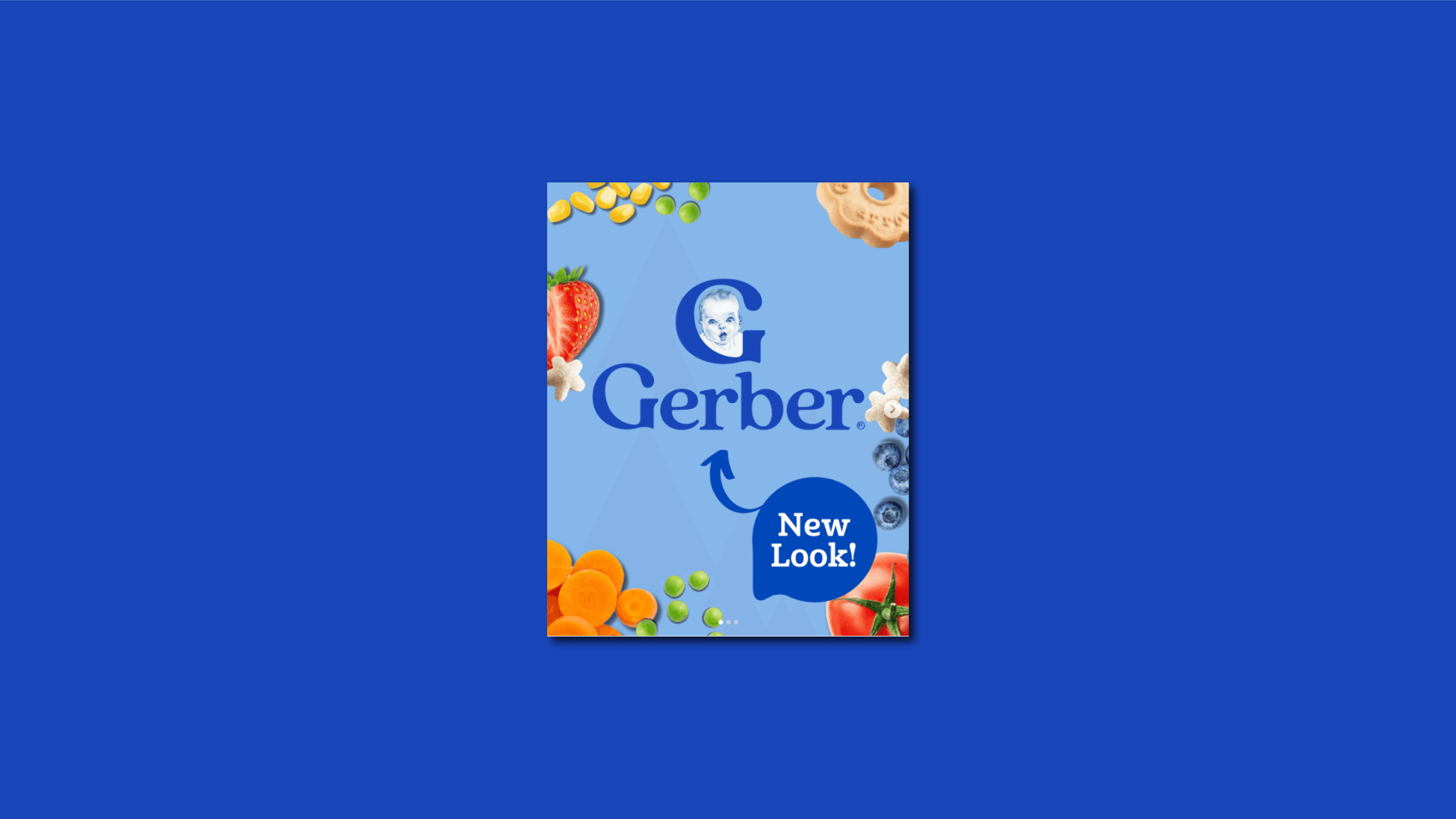
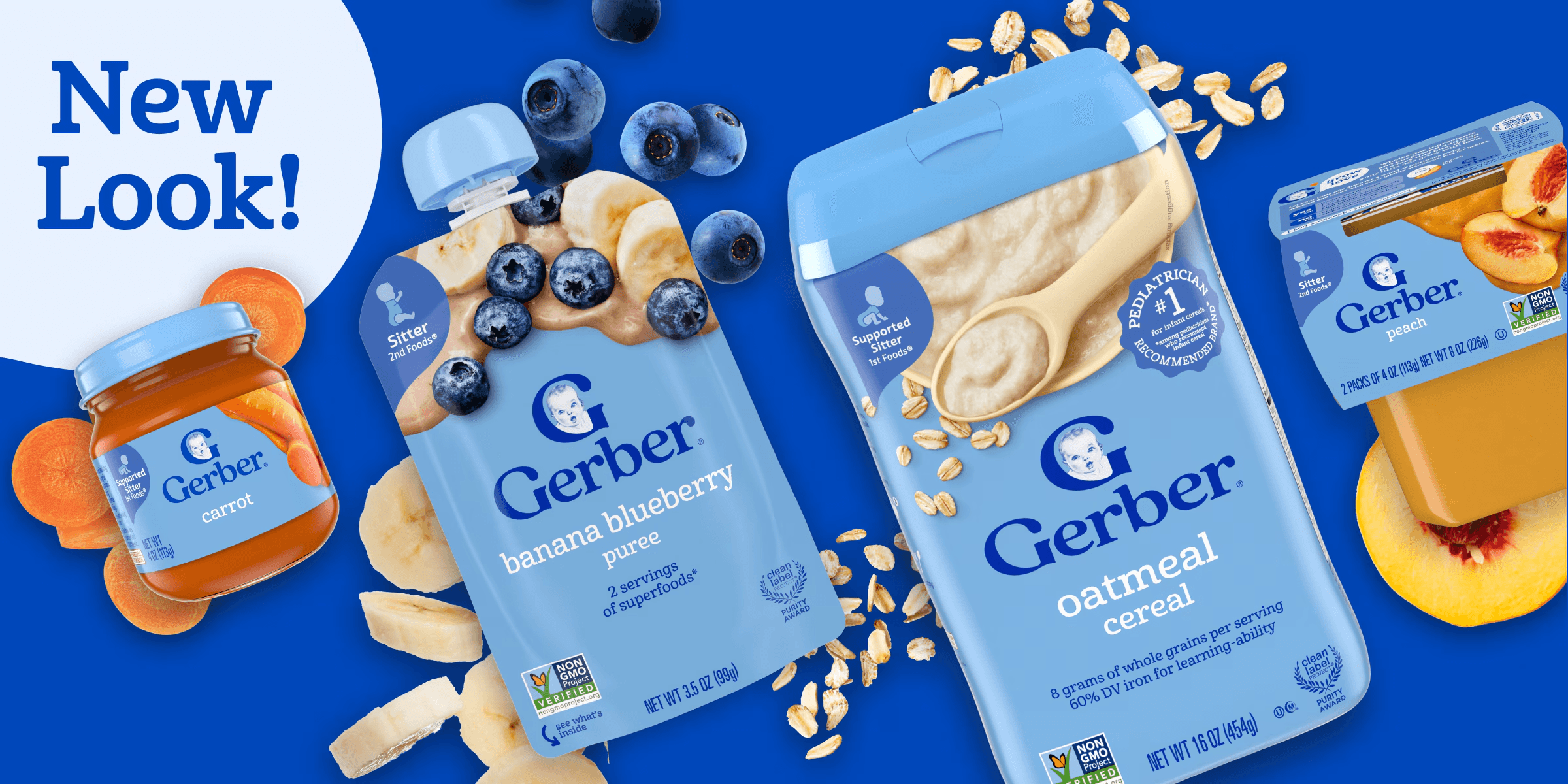
Gerber themselves made the goal pretty clear: the refresh is meant to make it easier for parents and caregivers to quickly identify ingredients and key details, while keeping the same products inside. They also explicitly said they’re not trying to minimize the Gerber Baby — the baby remains prominent on packaging.
Which is exactly the right strategy for an icon-heavy brand: don’t mess with the emotional anchor. Modernize the system around it. Because here’s the thing we all forget: the logo is not the whole brand — it’s the trigger that unlocks the brand in someone’s brain. Once the trigger works, the rest of the system has to do the actual job.
And the “actual job” of baby-food packaging is brutally practical: help a tired adult make a fast, confident choice on a crowded shelf. That’s our bridge into the part that matters most.
What actually changed (and why it matters more than the logo)
If you only look at the logo and stop there, you miss the plot.
Gerber’s refresh is a packaging and system redesign first — and a logo tweak second. Think of it like renovating a house: everyone stares at the front door, but the upgrade is really the wiring, the plumbing, and the fact that now you can find the bathroom without opening three wrong doors.
Here’s what we’re seeing, through a design lens.
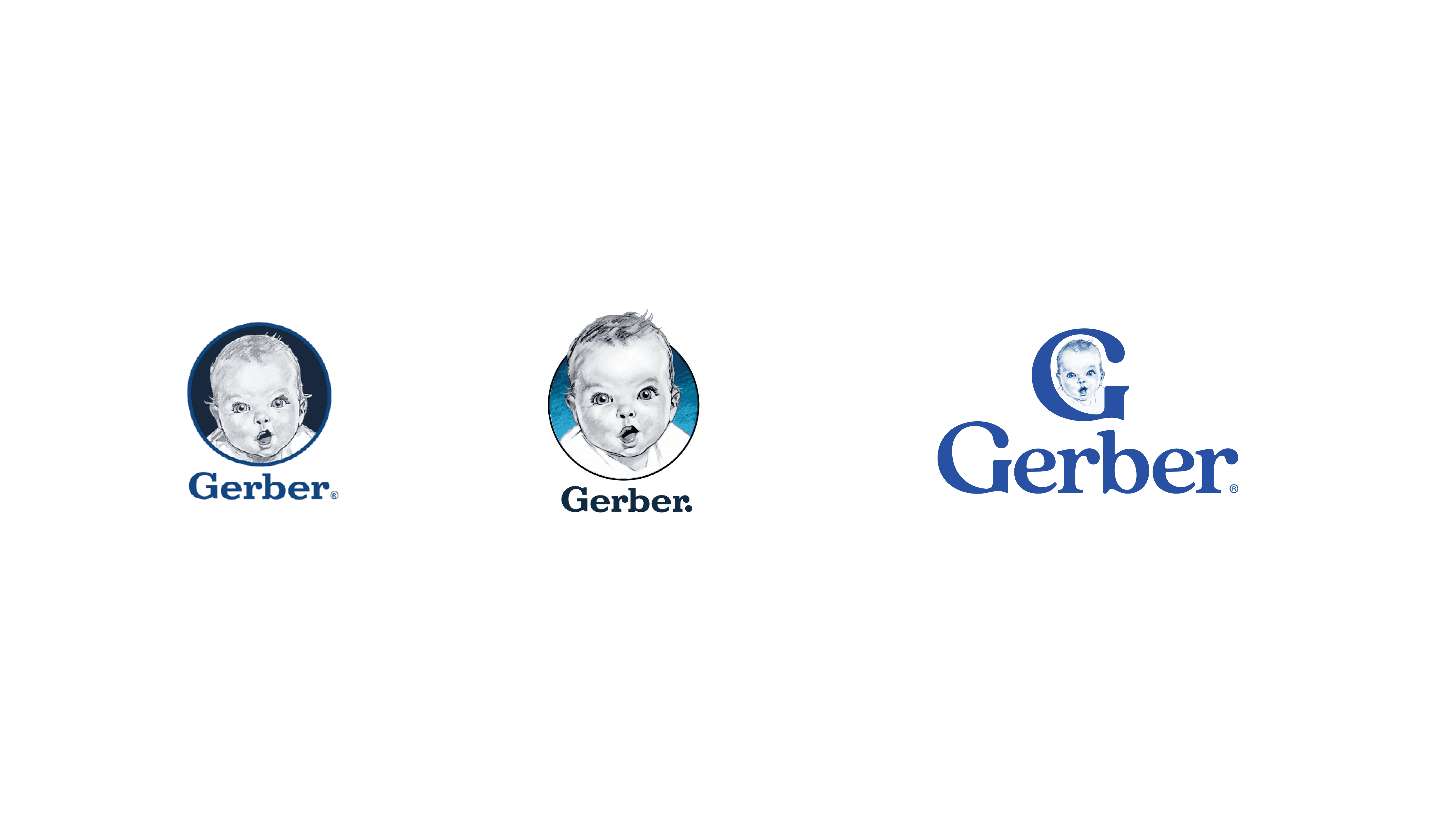
1) The baby stayed — but its role got cleaner
In an iconic brand, the hero asset has two jobs:
Recognition: “Oh, it’s Gerber.”
Trust: “This is safe. This is familiar. I’ve seen this before.”
Gerber kept that equity intact by continuing to feature the baby prominently. That matters because the baby isn’t just decorative — it’s a trust shortcut.
The update doesn’t try to “improve” the baby into something trendy or overly simplified. It keeps the soul. (Which, frankly, is how you avoid a full-blown brand exorcism.)
And once the hero asset stays stable, the supporting design can do its job without causing a crisis.
2) The packaging hierarchy got simplified (aka: less visual yelling)
Gerber described the refresh as simplifying packaging to highlight the most important information — helping parents quickly identify ingredients and other key details. That sounds like marketing copy, but it’s also the core principle of good packaging UX: reduce cognitive load. In practice, hierarchy is about a few repeatable questions:
What do we need people to notice first?
What do they need to know second?
What do they need to confirm before they buy?
On baby-food packs, the usual scanning order is something like:
Brand recognition (Gerber = baby + blue)
Product type (purée, snack, cereal, etc.)
Stage/age range (because that’s a high-stakes filter)
Flavor/variant (what the kid will actually eat)
Ingredients/claims (especially for modern parent expectations)
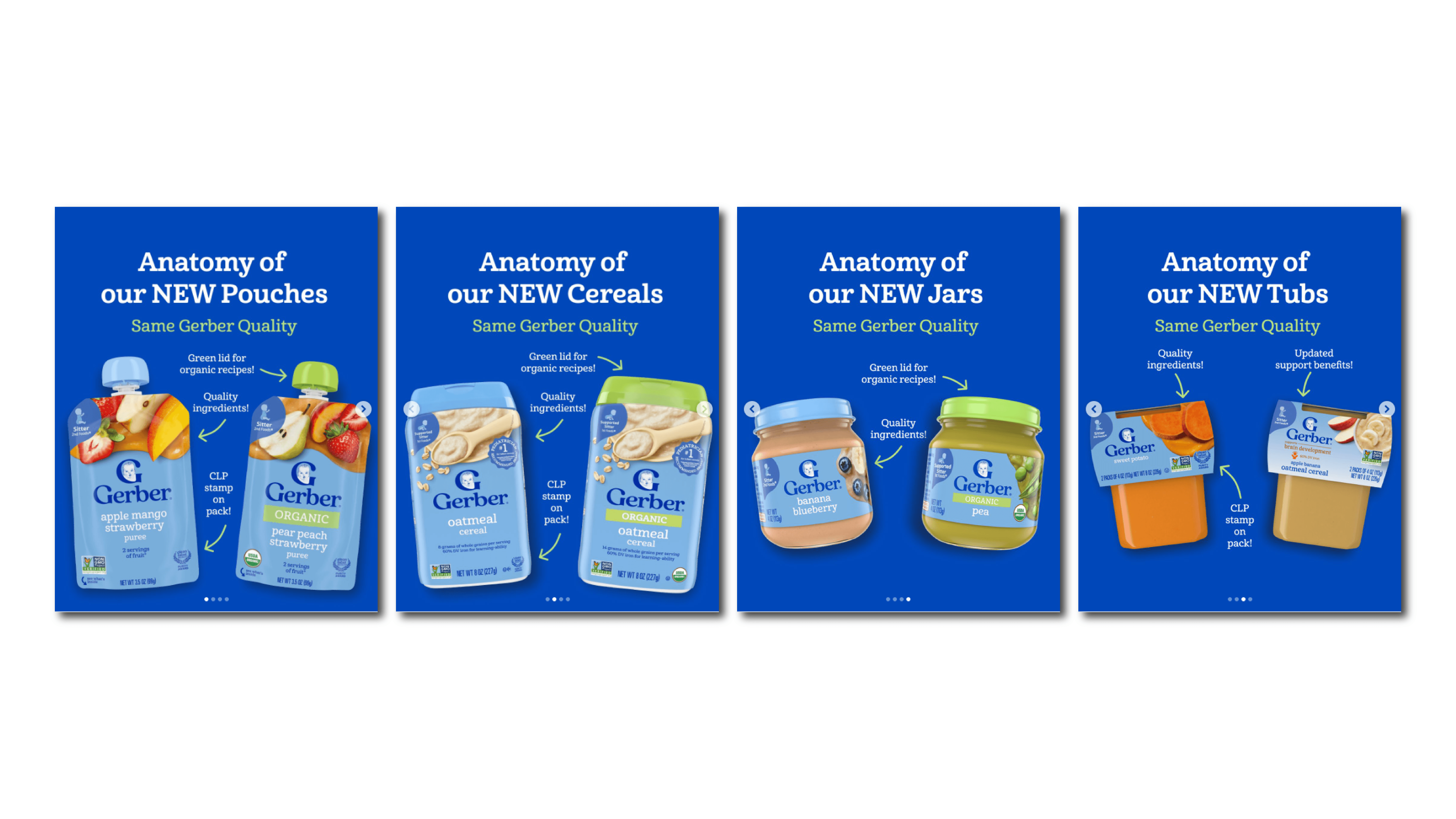
The win here isn’t that the design got “prettier.” It’s that it got easier to parse. Less competing noise. More deliberate structure.
And if that sounds like a small change, remember who the user is: someone shopping one-handed while texting their partner, holding a stroller, or bargaining with a toddler like it’s a hostage negotiation.
3) The typography feels more contemporary without changing the accent
We’re not judging this by “serif vs sans” internet debates. We’re judging it by: does it feel like Gerber, and does it behave like a modern logo system? The refreshed wordmark reads cleaner and more current while keeping the same general personality — the kind of change that’s meant to work across:
tiny digital contexts (avatars, app tiles, thumbnails)
real-world packaging at a distance
lots of SKUs that need consistency
This is what good modernization looks like: not a personality transplant — a posture correction.
4) The “Gerber blue” still anchors everything — but it’s used more deliberately
They didn’t abandon the blue. That matters because blue is doing brand work here. It’s a category signal (“trusted, classic, parent-approved”), and it’s a shelf signal (you can spot it quickly across product lines).
Modernizing doesn’t mean swapping your most recognizable color for whatever’s trending on design Twitter this week. It means tightening the rules:
where the blue lives
how much space it gets
how it supports (not fights) the information
The result is a system that feels cleaner and more contemporary while staying unmistakably Gerber.
All of that sets up the inevitable question: if this is so rational, why are people still mad?
Why people are confused (and why “I hate it” isn’t a design critique)
Backlash to a heritage refresh usually follows a predictable script:
“It looks weird.”
“The old one was better.”
“Design is dead.”
Someone posts a 200-slide thread titled Capitalism Ruined My Childhood.
Here’s the uncomfortable truth: most people aren’t reacting to design quality — they’re reacting to difference. Our brains love shortcuts. Familiar visuals become mental defaults. And when you change the default, it creates friction — even if the new system is objectively clearer. Three things are usually happening at once:
First, familiarity bias. We confuse “what we’re used to” with “what’s best.” It’s not a moral failing — it’s just brain economics.
Second, identity ownership. When an icon has been around long enough, people feel like they own it. Not legally, obviously. Emotionally. So any shift feels like someone changed the password on your account.
Third, the internet’s favorite cardio: before/after outrage. Side-by-side comparisons erase context. Packaging isn’t viewed on a white background in a design blog — it’s viewed among competitors, under store lighting, in peripheral vision, at speed. What looks “too simple” in a screenshot often reads “finally understandable” on shelf.
And yes: sometimes the discourse is just… vibes. Pure vibes. The kind of take that would not survive five minutes in a real design review without someone asking, “Okay, but what problem are we solving?”
Which brings us to the part where we stop doomscrolling and actually critique the work.
What Gerber did right (the design read)
Let’s be clear about our stance: this isn’t the rebrand of the century. But it is a disciplined, well-executed modernization — and that’s way harder than it sounds. Here’s what they got right, without turning this into a TED Talk with 14 subheadings.
They protected brand equity instead of chasing novelty. Keeping the baby prominent is the big move. It preserves recognition and trust — the two things a baby-food brand cannot afford to gamble with.
When you have a symbol with near-instant recall, your job isn’t to reinvent it. Your job is to stop everything else from getting in its way.
They treated packaging like an interface. Gerber’s stated rationale was usability — making it easier to identify ingredients and key details. That’s the correct north star. Packaging isn’t just “branding.” It’s a decision-making tool. And when the user is stressed, tired, or in a rush, clarity isn’t a nice-to-have — it’s the product.
They modernized the system, not just the logo. A lot of rebrands die because the team updates the mark and forgets the ecosystem. Then the new logo gets slapped onto old layouts, old typography, old hierarchy, and the result is a Frankenbrand: technically new, emotionally confusing. This refresh reads more like a coherent kit of parts: tighter rules, cleaner layout logic, and more consistency across products.
And they didn’t over-innovate. The temptation with an iconic brand is to “make a statement” to justify the budget. Gerber went the other way: changes that feel obvious in hindsight. If you’re thinking “I can’t tell what changed,” that’s not failure — that’s restraint. (Design maturity is basically doing less, on purpose, and still getting blamed.)
So what do we do with all of this, beyond judging the baby like it’s a contestant on a reality show? We steal the playbook.
What we can learn from this (the iconic-asset rebrand playbook)
If you’re rebranding something with a sacred icon — a mascot, a seal, a symbol people tattoo on their souls — we keep coming back to a simple framework:
Preserve / Modernize / Clarify.
Preserve the memory trigger: identify the assets that carry the most equity (not the ones you personally find cutest). Touch those lightly. Keep them doing their job.
Modernize the system around it: typography rules, spacing, hierarchy, color logic, and the unglamorous stuff that makes a brand feel current everywhere — not just in a keynote slide.
Clarify the user job: ask what someone needs to do, quickly, with this brand. On baby food, the job is “choose the right thing confidently with minimal mental effort.” Clarity reduces anxiety. And reducing anxiety is basically a brand superpower.
If we had to condense this into the most practical version possible, it’s this:
Define your untouchables (high-equity assets) and your flex zones (everything else).
Redesign hierarchy at real sizes: thumbnail, shelf distance, mobile screen.
Build a system that scales across SKUs before you obsess over one perfect pack.
Plan rollout so old and new don’t coexist long enough to make the brand look messy.
And if that sounds like more than “let’s just tweak the logo,” that’s because it is. That’s the soft lesson of the Gerber rebrand: iconic brands don’t need louder design. They need cleaner systems. Because when the baby is 98 years old (give or take — and yes, we’re saying that with love), the goal isn’t to make it younger. It’s to make everything around it work better — so the icon can keep doing what it’s always done: quietly earn trust, one jar at a time.


