Articles
Wobble & Wow: Unveiling Jell-O's New Look
Sep 26, 2023

Ladies and gentlemen, hold onto your spoons! The legendary wobbly delight that has graced our dessert tables since forever, yes, we're talking about Jell-O, has decided to go for a makeover. That's right, the Jell-O we all know and love is putting on a new outfit after a whole decade. It's like Jell-O decided it's time to shed its old charm and embrace a fresh look!

Imagine, after ten years of Jell-O being the hallmark of wobble-chic, the parent company Heinz decided it's time for a facelift—a Jell-O facelift, to be precise. It's all about capturing that "jiggly fun" that Jell-O has brought to every age. Because why settle for just playful, when you can be playful and trendy? It's a wobblevolution!
Wobble Up: Jell-O's Colorful Comeback
In the realm of timeless brands, Jell-O stands as a culinary icon—a taste of nostalgia that has adorned our tables for generations. However, even the classics need a refresh every now and then, and Jell-O has taken that leap into the contemporary age with a revitalized look, the first of its kind in a decade.
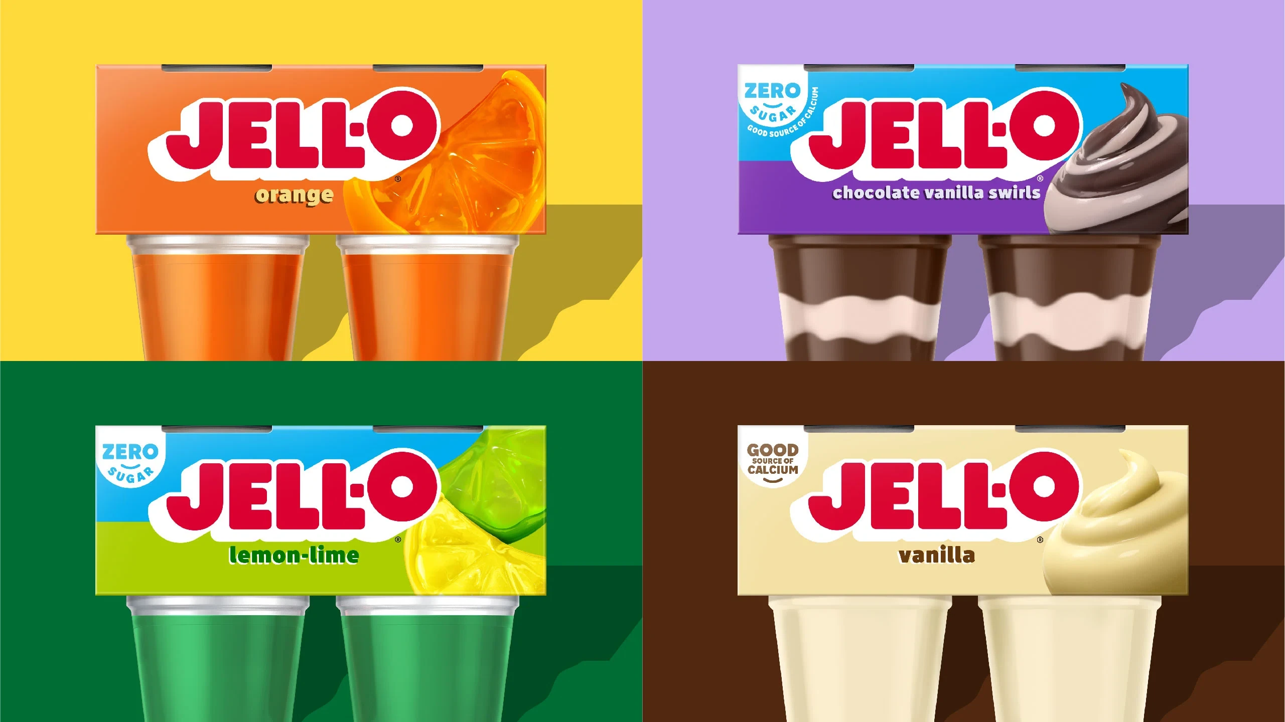
The revamp is more than a surface-level makeover. It's a deliberate endeavor to encapsulate the vivacious spirit and enduring appeal of Jell-O, ensuring its relevance for years to come. Central to this transformation are the vibrant hues, with red prominently leading the palette—a symbol of the zest that Jell-O has brought to desserts through the ages.
Not to be overlooked, the logo has undergone a subtle yet effective change. The addition of a new drop shadow renders it bolder and more eye-catching, maintaining its distinctiveness while embracing a modern aesthetic. It's a balancing act between nostalgia and contemporary allure.

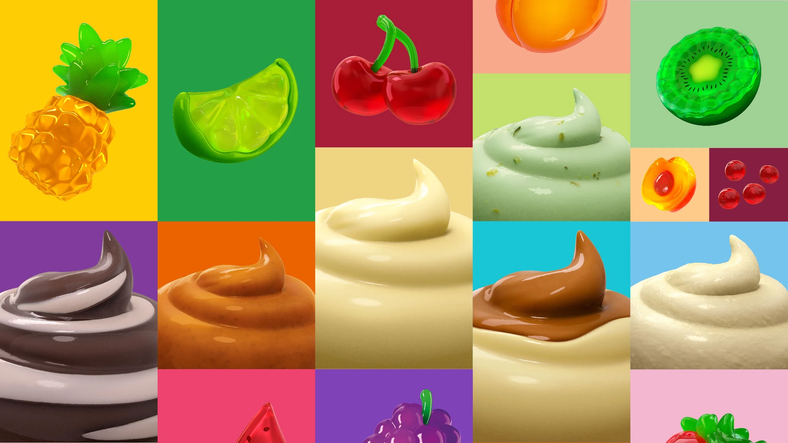
But perhaps the most visually striking aspect of this rebranding effort is the introduction of new illustrations adorning the products. Adopting a 3D gummy-style approach, the packaging now proudly showcases fruits, puddings, and more, embodying the delightful essence of the brand. Jell-O's rebranding is a testament to the brand's adaptability and enduring relevance. The careful infusion of modern elements while preserving its timeless appeal showcases a brand that respects its heritage while embracing a vibrant future.
A Sweet Blend of Tradition and Trend
Jell-O's recent makeover shines as a prime example of a rebrand done right. We've seen brands attempt transformations like wardrobe changes at a fashion show, but not all have managed to hit the sweet spot like Jell-O. The new look doesn't scream "I've changed everything!" but rather whispers, "Look at me, but also, I'm still the wobbly dessert you love."
The real magic here is that Jell-O didn't have to go on a rebranding spree every other year. One well-executed transformation after a decade of wobble stardom was enough. It's like they knew when to make an entrance, and boy, did they make an entrance! We're unashamed fans of this redesign. It's like finding out your favorite dessert also got a secret upgrade—still the one you know and adore, but with a sprinkle of modernity. Here's to hoping that Heinz's other products take part in this delightful evolution. After all, who wouldn't want to see beans in a can do a little jiggle of their own?


