Articles
Color psychology in branding: how to choose your brand colors
Dec 5th 20025
Color psychology in branding: how to choose brand colors that really match your personality, your audience and your industry

Why color psychology in branding matters (and how it actually works)
When someone scrolls past your post or walks past your product on a shelf, they don’t start by reading. Their brain grabs whatever is quickest to process: color, basic shapes, overall contrast. That’s why color can quietly shift how your brand feels on first contact—serious or playful, premium or affordable, calm or energetic.
Color is one of the first filters people use to decide whether you’re “for them” or not. It also helps with memory. Even if someone can’t draw your logo from memory, they might still recall “that friendly yellow brand” or “the dark blue app with the bright accent”.
You don’t need a degree in color theory to make good choices. It’s enough to understand a few simple tendencies:
Warm colors (reds, oranges, yellows) feel more energetic and active.
Cool colors (blues, greens) feel calmer and more stable.
Soft, muted tones feel more subtle and sophisticated, while bright, saturated tones feel louder and more playful.
On top of that, color is partly cultural and contextual. White can mean purity in one culture and mourning in another. Red can feel festive, dangerous, passionate or discounted depending on the setting. Pink can be read as playful, bold, caring or edgy depending on how it’s used and what surrounds it.
So instead of memorising a strict dictionary of meanings, we like using a simple framework:
Color = Emotion (what you want people to feel)
Category (what people expect)
Differentiation (how you stand out).
If you want people to feel calm and cared for in a category where everyone is blue, maybe you look at softer greens or muted purples. If you’re in a fun, high-energy space, you might lean into warmer, brighter colors but pick a slightly unusual shade so you don’t look like every other player. The goal isn’t to find the one correct color—it’s to choose colors that tell the same story as your brand.
***Quick (and necessary) disclaimer***
Before we go any further: this is not a sacred color law handed down by the branding gods.
Color psychology works at a very general level. Real brands don’t live in a vacuum, and they definitely don’t live in a single color. Logos and identities sometimes use combinations—blue with red, red with orange, green with black, loud colors balanced by neutrals—to create more specific, layered emotions.
Context does most of the heavy lifting. Red can mean danger and warnings… or it can mean fast food and comfort. Green can scream sustainability and recycling, or it can just mean “music streaming app you open 20 times a day.” Same color, completely different feeling.
So don’t read the sections below as “red always means this” or “blue always means that.” Think of them as strong tendencies, not unbreakable rules. Color gives you a direction; typography, imagery, layout and tone of voice decide where you actually end up. If branding were as simple as picking the “right” color, we’d all be done in five minutes—and sadly, that’s not how this works.
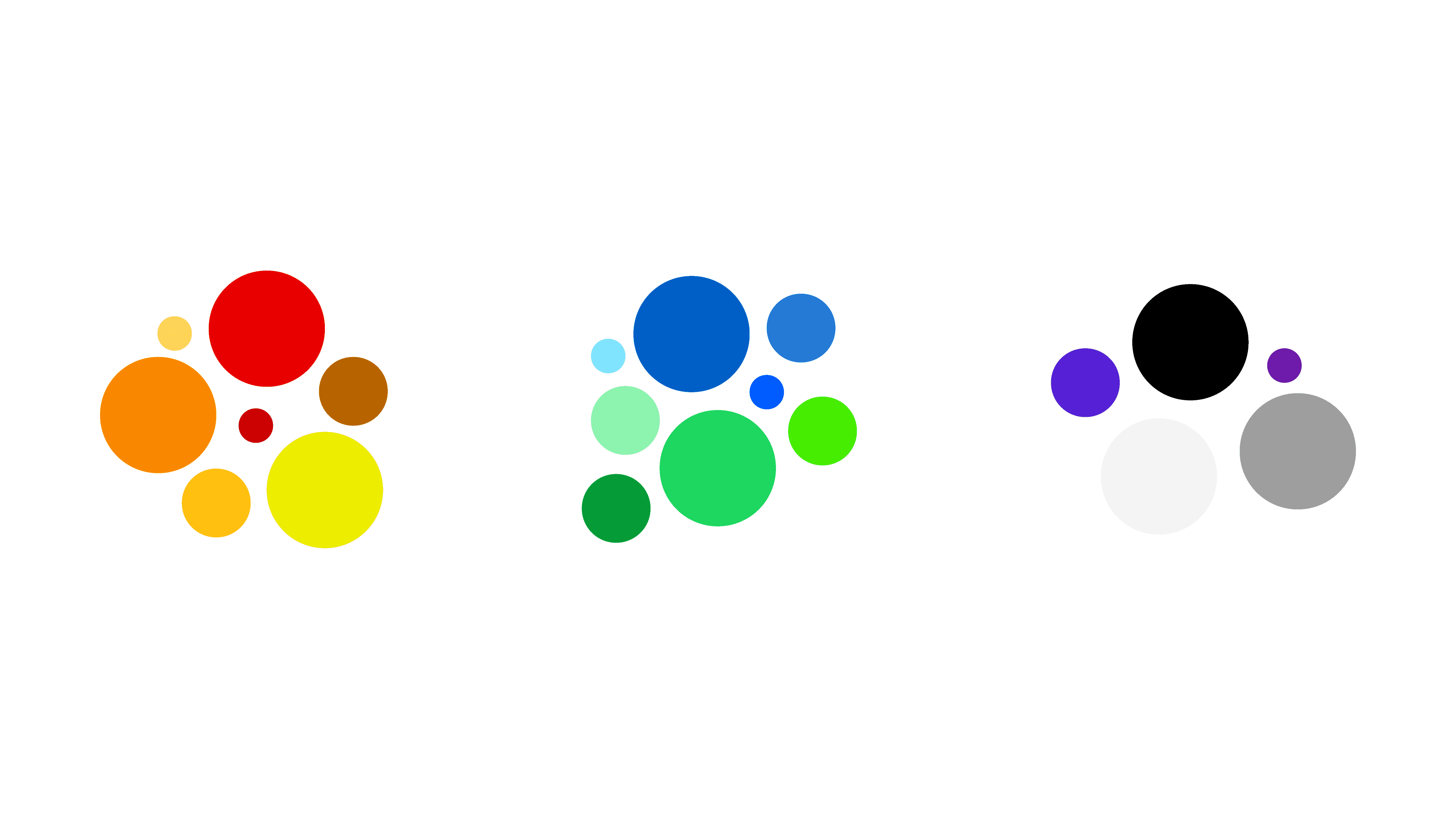
What different colors tend to evoke (and where we usually see them)
Let’s walk through the main color families and how they often show up in branding and across industries. Think of these as tendencies, not laws.
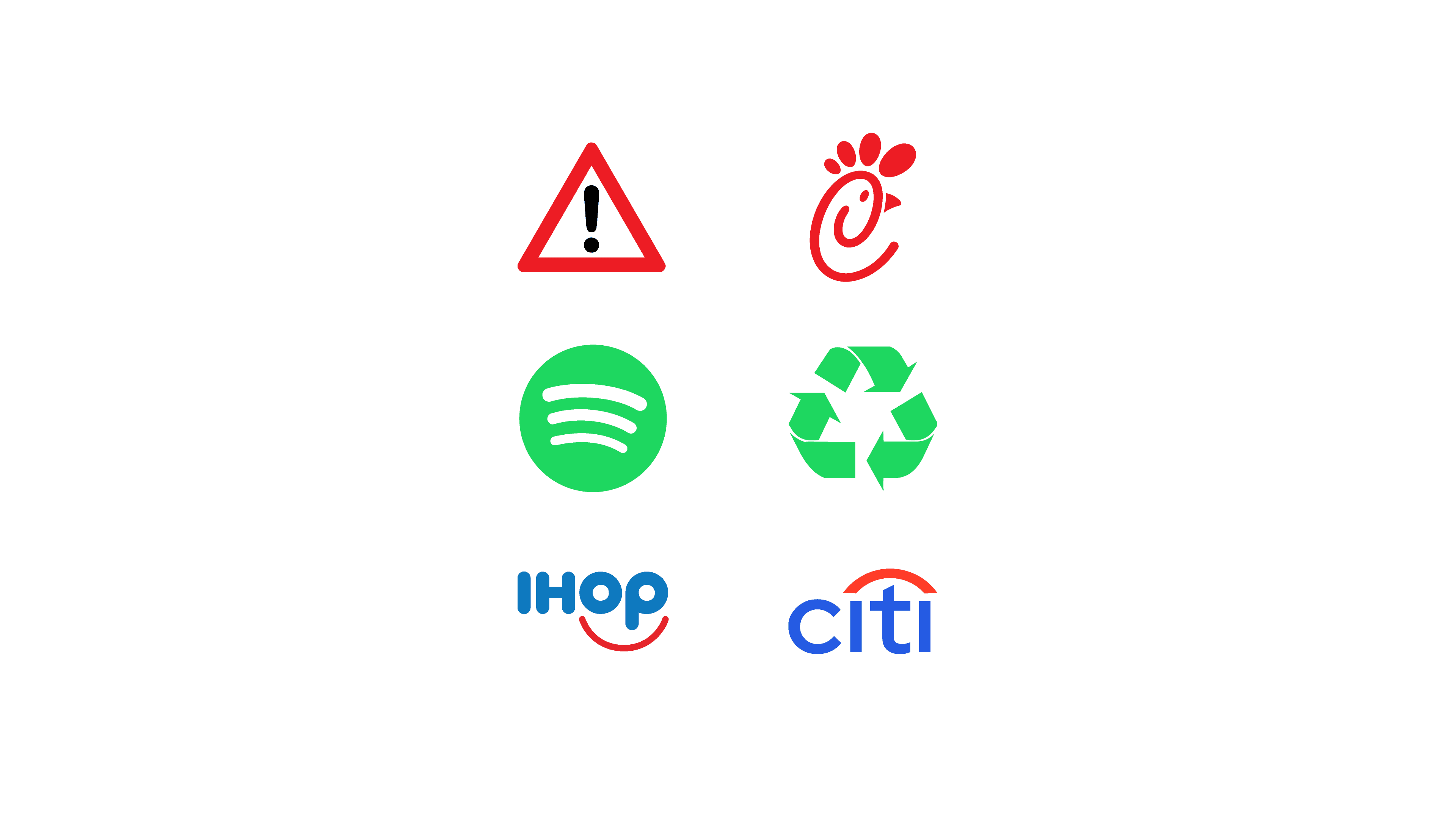
Red: urgency, appetite, energy
Red is a spotlight. It instantly demands attention and has a strong physical presence. We associate it with energy, excitement, passion, urgency and appetite.
That’s why you see so much red in food and restaurants (especially fast food and snacks), entertainment, sports and anything that needs to scream “sale” or “now”. A red sign above a busy corner almost always means quick, casual food. In that context, it reinforces speed and appetite.
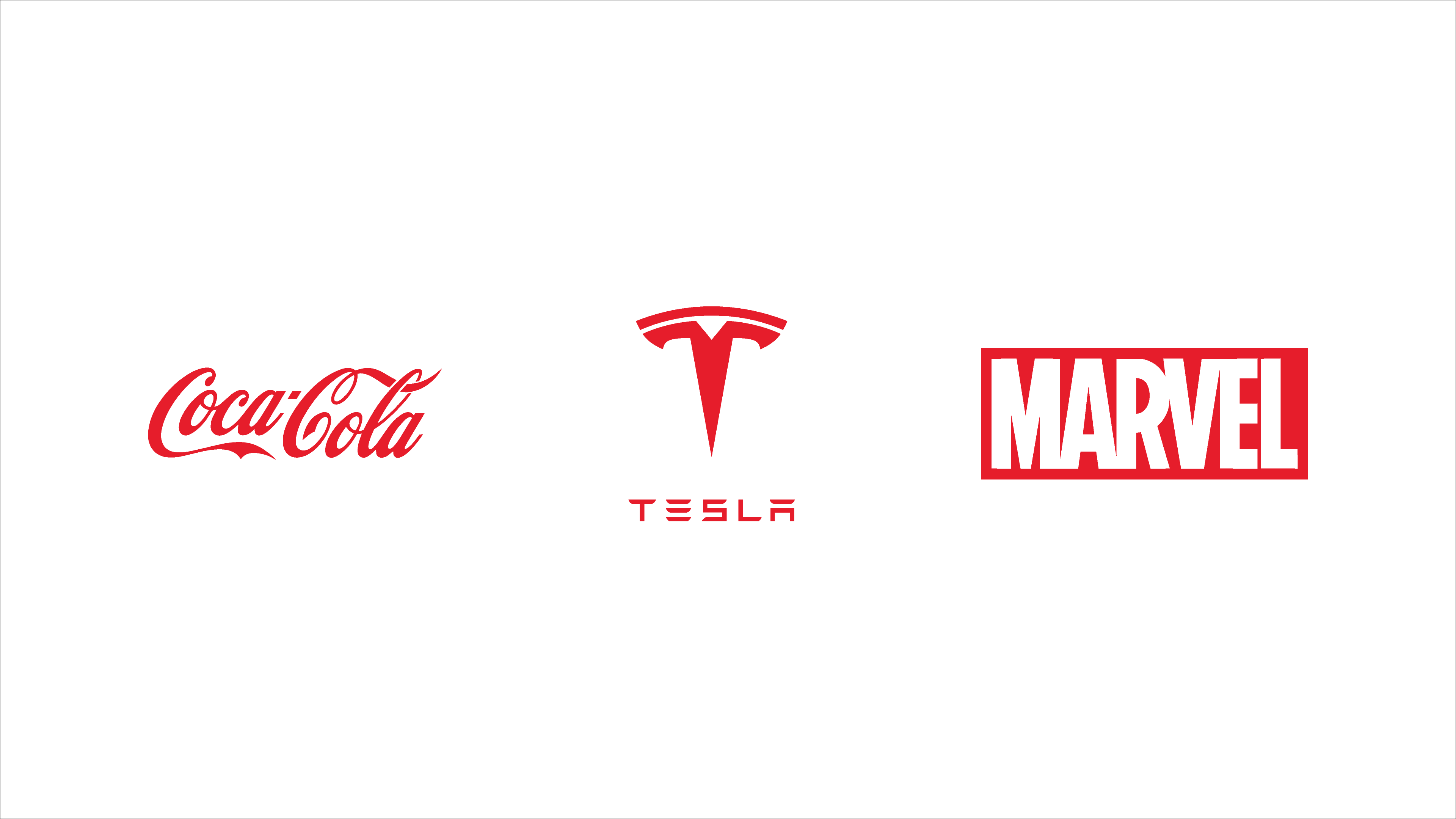
Used well, red is great for calls to action and for brands that want to feel bold and high-energy. Used badly, it can feel aggressive or stressful, especially in categories where people are already tense. In those spaces, red is often reserved for warnings and alerts rather than the core identity.
Use red when you want people to feel activated—but give it space to breathe.
Blue: trust, calm, reliability
Blue is the classic “safe choice” for brands that need to feel dependable. It carries associations of trust, calm, stability and clarity.
That’s why it dominates banks and financial services, insurance, healthcare, and B2B tech. A dark blue card or app interface instantly suggests money, security or serious services. Traditional institutions lean into deep, conservative blues to project stability; newer fintech brands use fresher blues and brighter accents to feel more digital and friendly without losing that sense of trust.

A blue brand often feels professional almost by default, and it pairs easily with neutrals for a clean, modern look. The downside is that so many banks and tech companies use blue that it can become invisible. If everything in your category is mid-blue with white, you may need a distinctive shade, a bolder accent color or a more characterful typeface to avoid disappearing into the background.
Blue is fantastic for trust—but you still need something that makes your blue feel different.
Green: nature, balance, growth
Green sits at the intersection of nature and growth. It’s linked to freshness, health, balance, responsibility and, in financial contexts, the idea of growing wealth.
You’ll see it everywhere in eco and sustainable brands, organic food, wellness, and also in finance when the focus is on investment and growth. A green logo on packaging quickly signals “natural” or “better for you”, while a green accent in a financial app leans into the idea of upward movement and positive results.
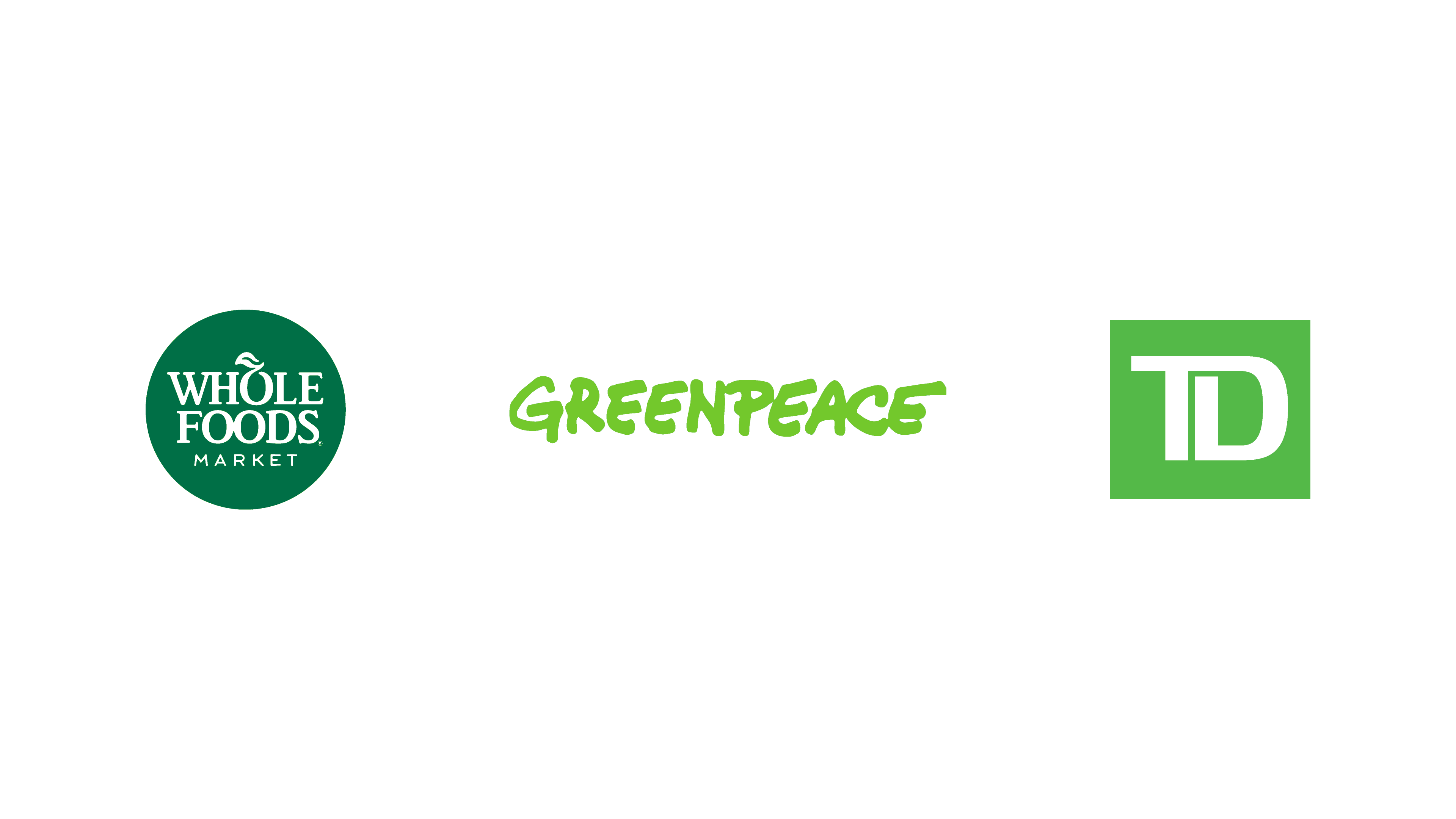
Bright greens feel energetic and lively, which works well for active or sporty brands. Muted, earthy greens feel calm and sophisticated, ideal for organic products, skincare, or mindful services. The catch is that there are a lot of “green + leaf” brands. It works, but it’s a visual cliché, especially in anything eco-adjacent.
Typography, imagery and secondary colors become crucial if you want to stand out. Green is powerful, but the way you use it determines whether you feel cliché or considered.
Yellow and orange: optimism, friendliness, creativity
Yellow and orange are your built-in sunshine. Together they communicate joy, optimism, warmth, friendliness and creativity.
They’re popular in food and snacks, kids’ products, events and creative services. A warm yellow or orange on a restaurant or café sign suggests warmth and sociability; bright yellows on snack packaging jump off the shelf; playful oranges in a creative studio or festival brand feel energetic and informal.
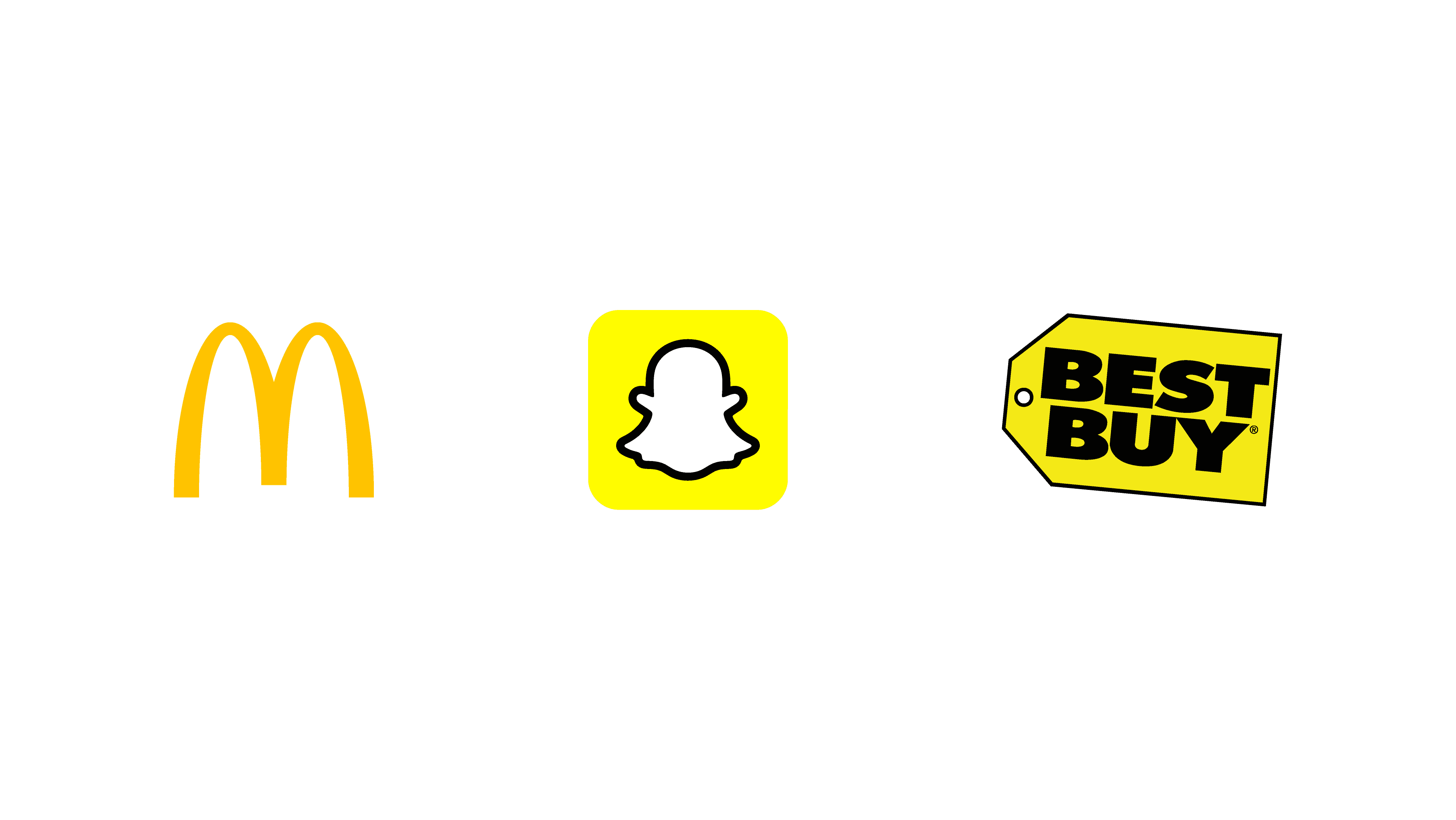
They’re great when you want to feel welcoming and approachable, and they’re very effective for highlights and micro-moments of joy in an interface.
A few things to watch out for:
Large blocks of bright yellow can be tiring on screens.
Yellow text on light backgrounds is almost always a bad idea.
Orange tends to be more forgiving, but contrast is still crucial.
Use yellow and orange as your brand’s smile—just don’t ask them to carry everything on their own.
Purple: imagination, luxury, “a bit different”
Purple has a slightly magical, offbeat energy. Historically it’s linked to luxury and rarity, but it also signals creativity, imagination and a touch of the unexpected.
You’ll find it in beauty and cosmetics, wellness, education, culture and some tech brands that want to be seen as premium but not stiff. A deep, rich purple can feel luxurious and intimate; a softer lavender leans into calm and care; a bright, electric purple can feel experimental and techy.

Because purple is used less than blue or red in many categories, it can help you stand out quickly—useful if you’re in a crowded market where everyone else looks the same. Go too intense, though, and it can drift into childish, artificial or overly mystical territory. The rest of your identity—typography, photography, tone of voice—will push it either toward elegant and modern or toward crystal-shop poster.
Purple shines when you want to say: “We’re serious about what we do, but we see the world a bit differently.”
Pink: playfulness, care, pop culture
Pink has gone through a big rebrand of its own. It used to be boxed into narrow gender stereotypes; now it’s more about attitude.
In softer shades, pink shows up a lot in beauty, wellbeing, therapy and care, and lifestyle brands—it feels warm, kind and human. In brighter, punchier tones, it appears in fashion, pop-culture-driven brands, and some social apps that want to feel expressive, fun and a bit rebellious. Kids’ products still use a lot of pink too, though the more interesting ones combine it with other bold colors instead of relying on it alone.
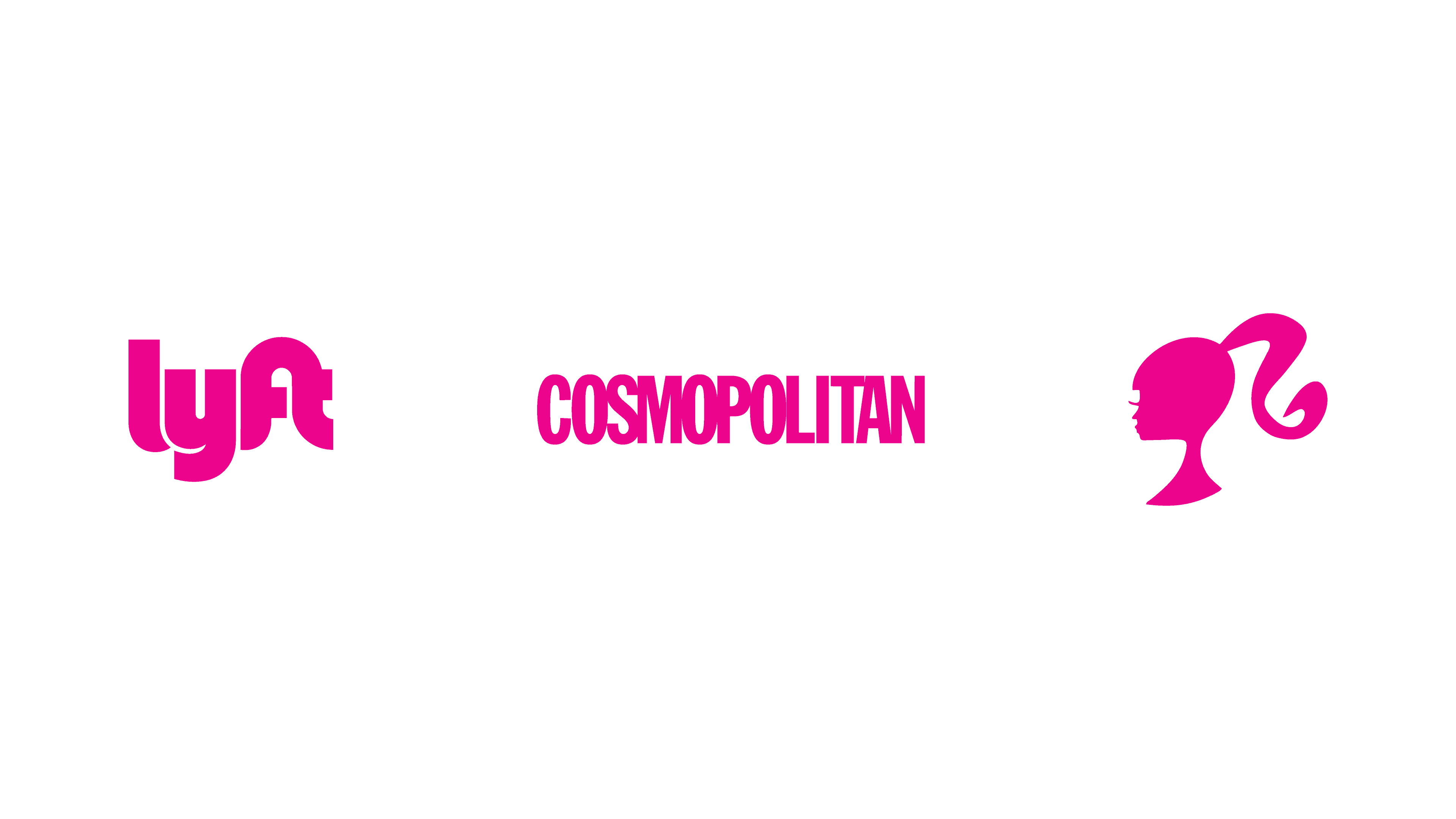
Done well, pink can feel fresh, modern and culturally aware. Done lazily, it falls straight back into stereotypes. The same color can say “softly supportive” or “bold and loud” depending on the shade and what you pair it with.
Pink isn’t “for girls”; it’s for brands that want to feel human, expressive and a little bit brave.
Black, white and neutrals: the quiet power players
Neutrals rarely get the spotlight, but they hold your whole system together. Black, white, greys and soft beiges are the surfaces your brand lives on.
Black usually reads as strong, premium and authoritative, which is why luxury, fashion and high-end tech lean on it heavily. White and light neutrals create space, calm and “breathing room”, making layouts feel cleaner and more modern. Greys and beiges sit in the background, supporting your main brand colors without fighting for attention.
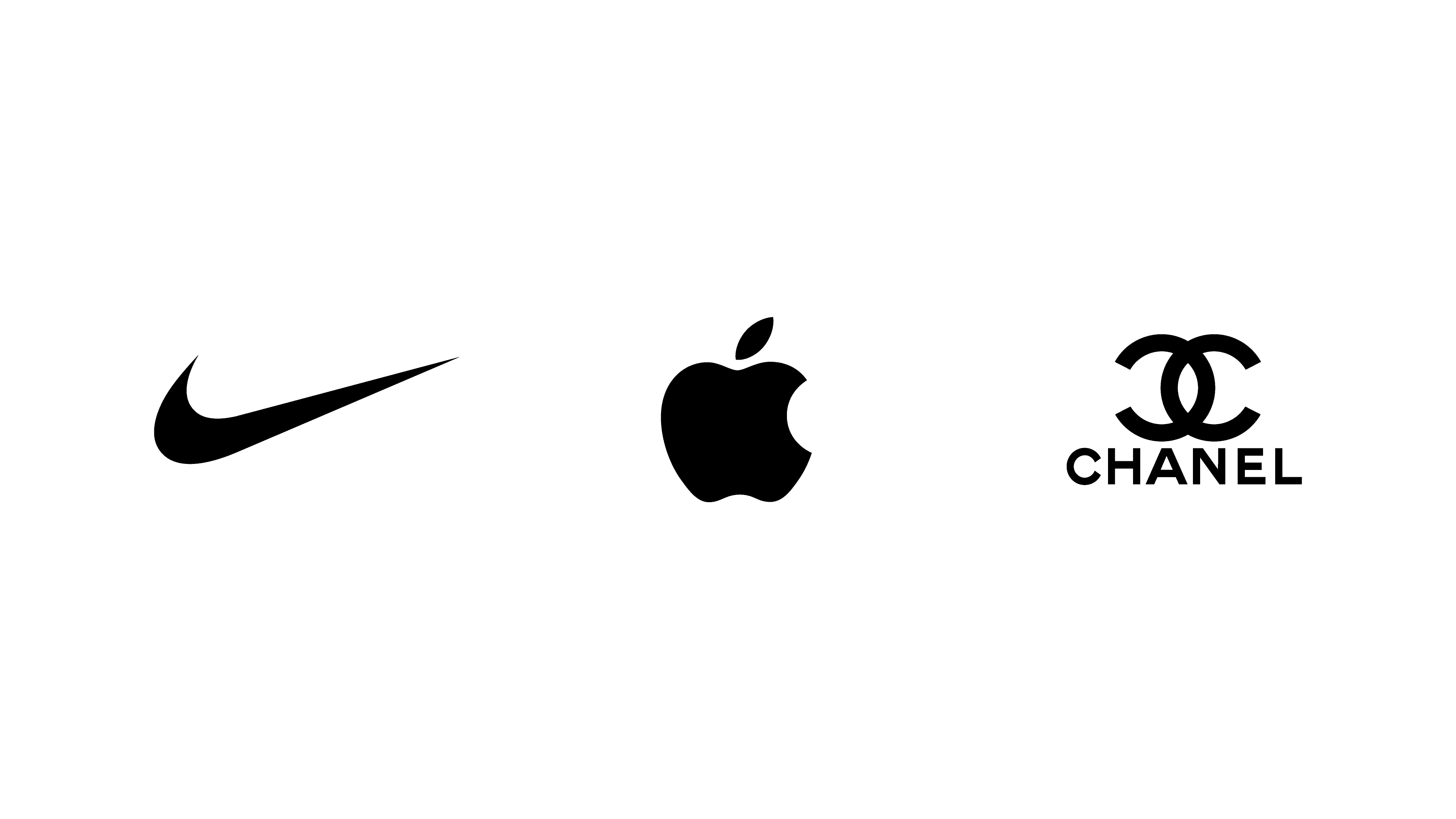
Even in very colorful categories—like kids’ brands or multi-color platforms—neutral tones are the glue that keeps things readable and consistent. They’re especially important for digital products, where you need:
Clear text on backgrounds
Obvious clickable elements
Enough contrast for different lighting conditions
Strong identities often rely on a good neutral backbone, not just a single loud color.
Multicolor or flexible palettes
Some brands don’t want a single hero color at all. Instead, they use a flexible or multi-color system to express variety and diversity.
You’ll often see this with content platforms, events and festivals, cultural institutions and creative tools. It’s a natural fit when your whole promise is “lots of different things under one roof”.
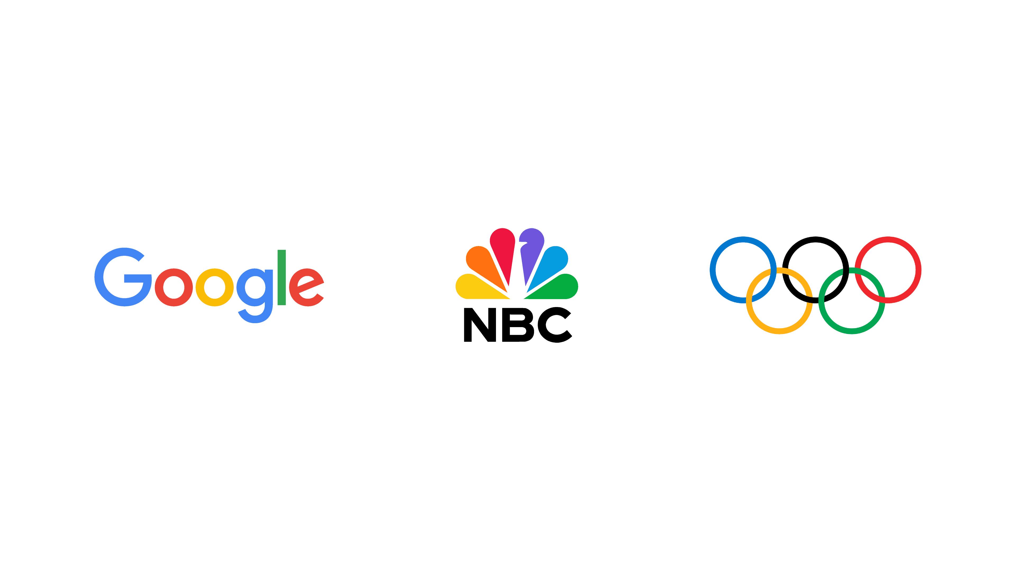
Done well, it’s a great way to represent many topics, audiences or product lines under one umbrella. Done badly, it turns into visual noise. You still need structure—rules about when each color appears, and consistent elements like typography and layout—so the system feels intentional rather than random.
Multicolor systems work best when there’s a clear logic behind the variety.
Common myths and mistakes in color psychology
Because color psychology is so attractive, it comes with some persistent myths and a few classic traps.
Myth 1: “There’s a perfect color that will instantly increase sales.”
You’ve probably seen claims like “red buttons always convert better”. In reality, a button color that performs well on one site might do nothing on another. The effect depends on the rest of the page, the product, the audience and even the background color. Color can support clarity and emphasis; it doesn’t replace a clear offer, a useful product or a decent user experience.
Myth 2: “Red means X, blue means Y, always.”
Red in a warning message, a lipstick, a sale sticker and a wine label all feel different. Typography, imagery, layout and context shape the final meaning as much as the hue itself. Color gives you a direction, not a fixed dictionary entry.
On the mistake side, one of the most common issues is using too many colors with no hierarchy. Everything is bright and important, so nothing stands out. A simple structure—one primary color, one or two accents and a small set of neutrals—is usually far more effective and much easier to apply consistently.
Another big one is ignoring accessibility and culture. If people can’t read your text or see your buttons clearly, your palette is working against you. Contrast matters just as much as the colors you pick. And if you operate in different regions, it’s worth a quick check for any strong local associations. Sometimes a tiny tweak in shade is all it takes to avoid confusion.
Bringing it together: a quick brand color mini-checklist
When you’re reviewing or choosing your brand colors, this simple checklist helps keep things on track:
Emotion: Do these colors match how we want people to feel (calm, bold, playful, premium)?
Category: Do they make sense in our industry, while still leaving room to stand out from direct competitors?
Simplicity: Can we describe our palette in one primary color, one or two accents and a few neutrals?
Recognition: Would someone recognise us from a few colored shapes in a feed, even without the logo?
Usability: Is text readable and are buttons clearly visible on all backgrounds and devices?
If you go through these questions and still feel stuck between three shades of blue or two completely different directions, that’s usually a sign it might be time to bring in a design partner. A studio can help translate your strategy and personality into a color system that isn’t just pretty, but coherent and usable across everything you do—from your logo and website to packaging, decks and everything in between.


