Articles

Caps Lock Off: Avianca's Subtle Shift from 'A' to 'a'

Jan 2 2024

Matty Matheson surrounded by products from his creative universe, including Matheson Food Company sauces, cookware, apparel, books, and merchandise, illustrating a lifestyle brand ecosystem.

In the ever-changing skies of social media trends, Avianca recently took center stage with the hashtag #QuePasoConLaA ("What happened to the 'A'?"). The airline's much-anticipated rebranding turned out to be less of an overhaul and more of a subtle nudge. Everyone's left asking: was swapping a capital 'A' for a lowercase one really worth the hype? As we dive into this branding puzzle, let's explore what this means amid Avianca's recent bumpy ride in service quality.


From point ‘A’ to point WTF is happening…

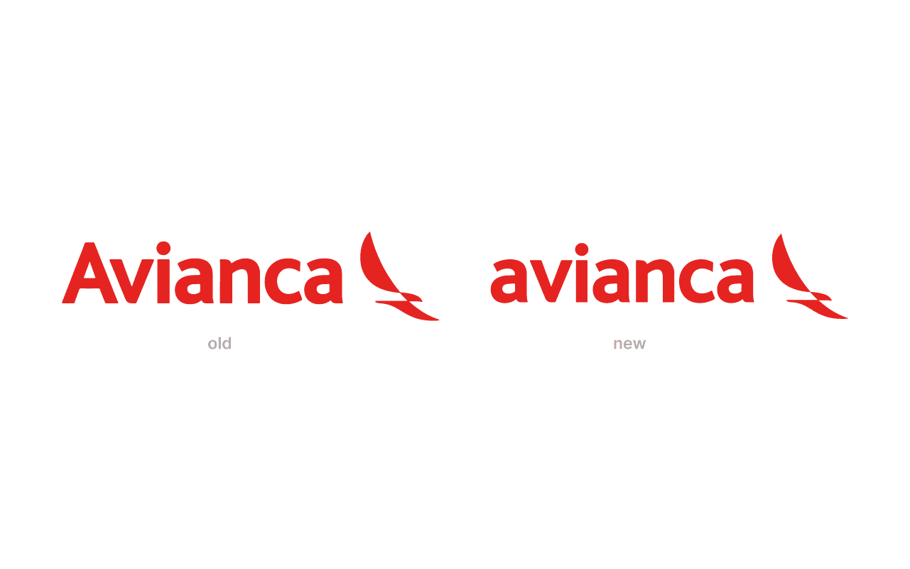
When Avianca signaled a change, expectations soared sky-high. Picture the suspense, the buildup, and then... a lowercase 'a'. Yes, just that. The color, typography, and symbol stood unchanged, prompting a universal scratch of the head — was that it, or were we missing something?


This seemingly small change has left many scratching their heads. Is this a subtle branding genius or a moment that makes us wonder what they were thinking? This shift, small as it may seem, is rumored to be tied to a new strategy aiming for lower costs, a risky move like flying through cloudy weather. Pairing their well-known logo with recent complaints of poor service feels off, like a mismatched puzzle piece.

Discussing design, there's not a lot to say about one letter change — but let's give it a go. The lowercase 'a' doesn't stir much excitement, but the iconic bird and vibrant red color still capture the spirit of Avianca. It's as if the bird is glancing back at the 'a', questioning, "Is this the right direction?


Reflecting on a rebrand that raised more questions than answers‍

Calling Avianca's latest move a rebranding might be giving it too much credit. It's more of a subtle change, a quiet step rather than a bold leap. This decision has slightly loosened the airline's once tight-knit brand philosophy, creating a gap that's hard to overlook. The launch of the rebranding was just as subtle as the change itself. With hardly any explanation, the switch left many more puzzled than amazed. Now, Avianca's identity seems as uncertain as a kite on a windy day, drifting away from its business model, philosophy, and visual communication.


In the world of branding where every detail counts, Avianca's small change is an intriguing, if slightly amusing, chapter in corporate identity. Will this be seen as a smart, understated move or just remembered as that time an airline made a noticeable blunder? Only time will tell.

P.D.: They do have a cool looking livery on their 787.

© 2025 Attlas Design. All rights reserved. All text, images, and graphics on this site are the intellectual property of Attlas Design and may not be reproduced, distributed, or translated without prior written consent.

© 2025 Attlas Design. All rights reserved. All text, images, and graphics on this site are the intellectual property of Attlas Design and may not be reproduced, distributed, or translated without prior written consent.

Title slide reading “Branding vs Marketing” with Attlas logo below and media and design icons.

Feb 17th 2026

Branding vs Marketing: What’s the Difference and Why It Matters

Branding

Branding vs marketing — they’re often confused, but they solve different problems. Here’s the real difference and how to know which one your business needs right now.

Feb 16th 2026

Inside Seasoned Website Design: A Playful UX Breakdown

Web

Seasoned website design is a case study in concept-driven UX, where interaction, structure, and metaphor transform a simple resource hub into a memorable web experience.

Feb 16th 2026

Inside Seasoned Website Design: A Playful UX Breakdown

Web

Seasoned website design is a case study in concept-driven UX, where interaction, structure, and metaphor transform a simple resource hub into a memorable web experience.

Mosaic dragon and Snoopy street artworks beneath Rue du Dragon sign in Paris.

Feb 13th 2026

You’ve Seen Pixel Street Art in Paris. Here’s What It Really Means...

Education

Those pixel mosaics scattered across Paris aren’t random decoration — they’re part of one of the most coherent visual systems in contemporary street art.

2026 Design Trends title in white hand-drawn lettering on blue background with Attlas logo.

Feb 12th 2026

Design Trends 2026: Intensity, Imperfection and Immersion

Opinion

Design trends 2026 are shifting away from safe minimalism toward intensity, immersion and visible humanity. If you want to know what’s shaping visual culture this year, keep reading.