Articles
Museum Branding Done Right (and Why It Matters to Your Visit)
Dec 13th 2025
You’re not supposed to notice museum branding. But it’s already telling you where to go, and when to buy the tote.
We don’t walk into a museum thinking, Can’t wait to evaluate their brand system. We walk in for the exhibitions, the objects, the stories, the feeling that time just got bigger than our calendar.
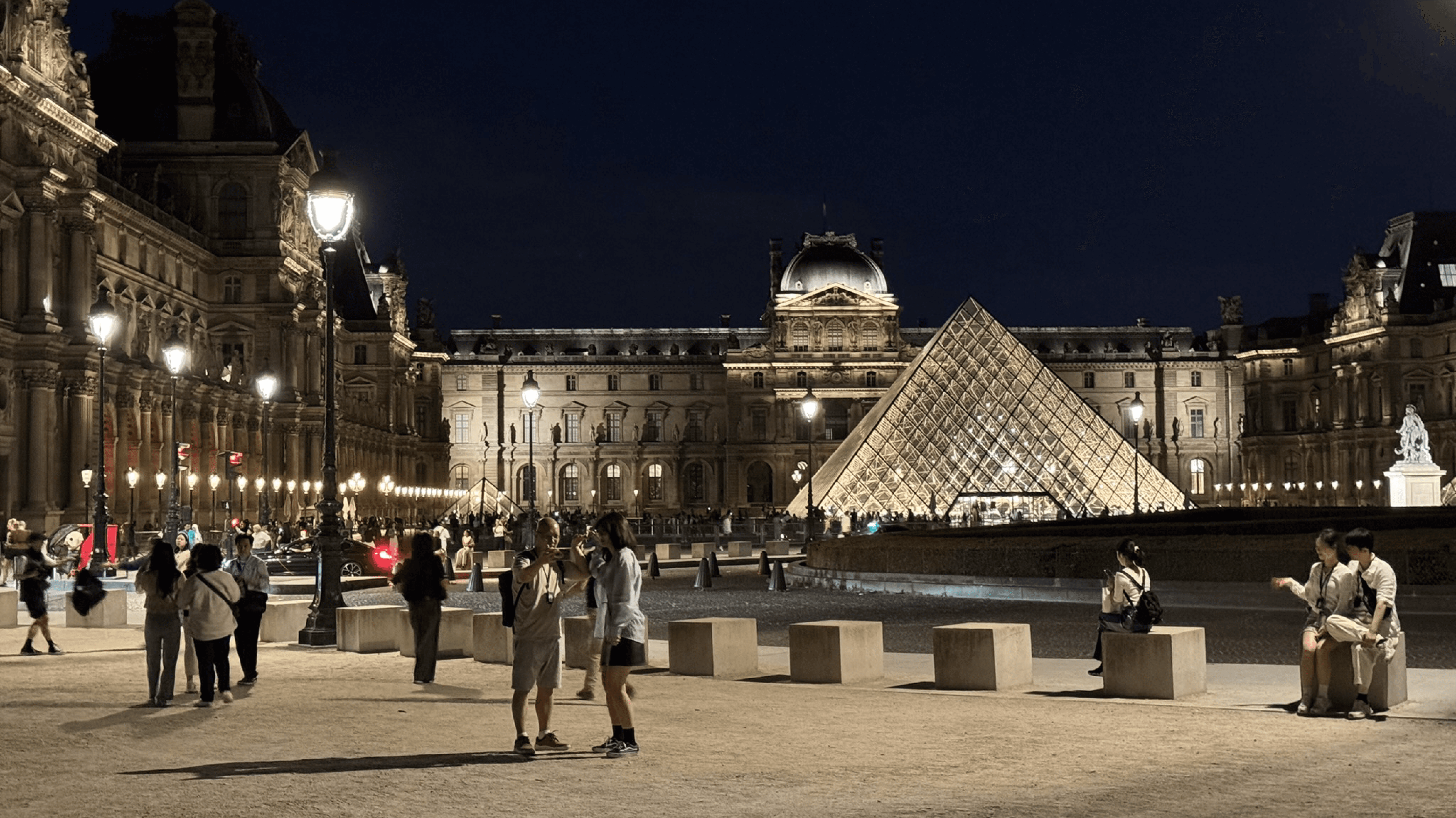
Most of the time, we only notice the systems behind a museum when something goes wrong. A few weeks ago, when news about a robbery at the Louvre started circulating, the conversation wasn’t about art history—it was about movement, access, blind spots, and control. Apparently, the robbers were the only people who had fully mastered those impossible museum maps. Which is exactly the kind of invisible stuff museums choreograph every day.
And yet… within the first five minutes of any visit, branding is already doing its job.
It tells us where to go without making us feel lost. It helps us understand what matters without yelling at us. It decides whether the place feels intimidating or inviting, dated or alive, confusing or calm.
Great museum branding doesn’t compete with the exhibits—it choreographs the visit around them.
And museum branding is never “just the logo.” It’s the whole ecosystem you move through:
The wayfinding and maps (the difference between “wandering” and “trapped”)
The signage hierarchy (what gets big type vs. small type)
The exhibition labels and object cards (tone, clarity, rhythm)
The tickets, website, audio guides, app flows
The shop, the tote bags, the posters, the catalogue spines
Staff touchpoints (uniforms, badges, front desk language)
The ambience cues (color, light, sound, pacing)
Motion and screens (how the place literally moves)
Museums are special because the “product” isn’t a thing you own—it’s an experience you carry home. Branding can’t replace content. The exhibitions are the reason we’re there.
But branding can change how the content lands. It’s stage lighting. Not the actor.
Branding a museum is a delicate balancing act
Museums have a problem most brands would love to have: their main attraction is already meaningful. That also makes branding harder.
If the brand system is too loud, it can feel like it’s trying to be the exhibition. If it’s too timid, the museum can feel generic—like one of those indie, incense-scented galleries in NYC where everything is white, earnest, and somehow always feels like it could be about anything.
The best museum branding is supportive, not submissive.
Supportive means:
It clarifies without over-explaining.
It creates emotional tone without stealing attention.
It scales across hundreds of touchpoints without turning into visual noise.
A small technical note we’ll keep coming back to: museums don’t need more “brand assets,” they need a brand system.
Assets are the logo, the poster template, the palette. A system is the logic that holds everything together—typography rules, spacing, motion behavior, wayfinding principles, tone of voice, and how the identity adapts from a gallery label to a billboard to a tote bag.
Now let’s walk through three museums that approach this challenge in totally different ways—and still land in the same place: elevating the visitor experience without hijacking the art.
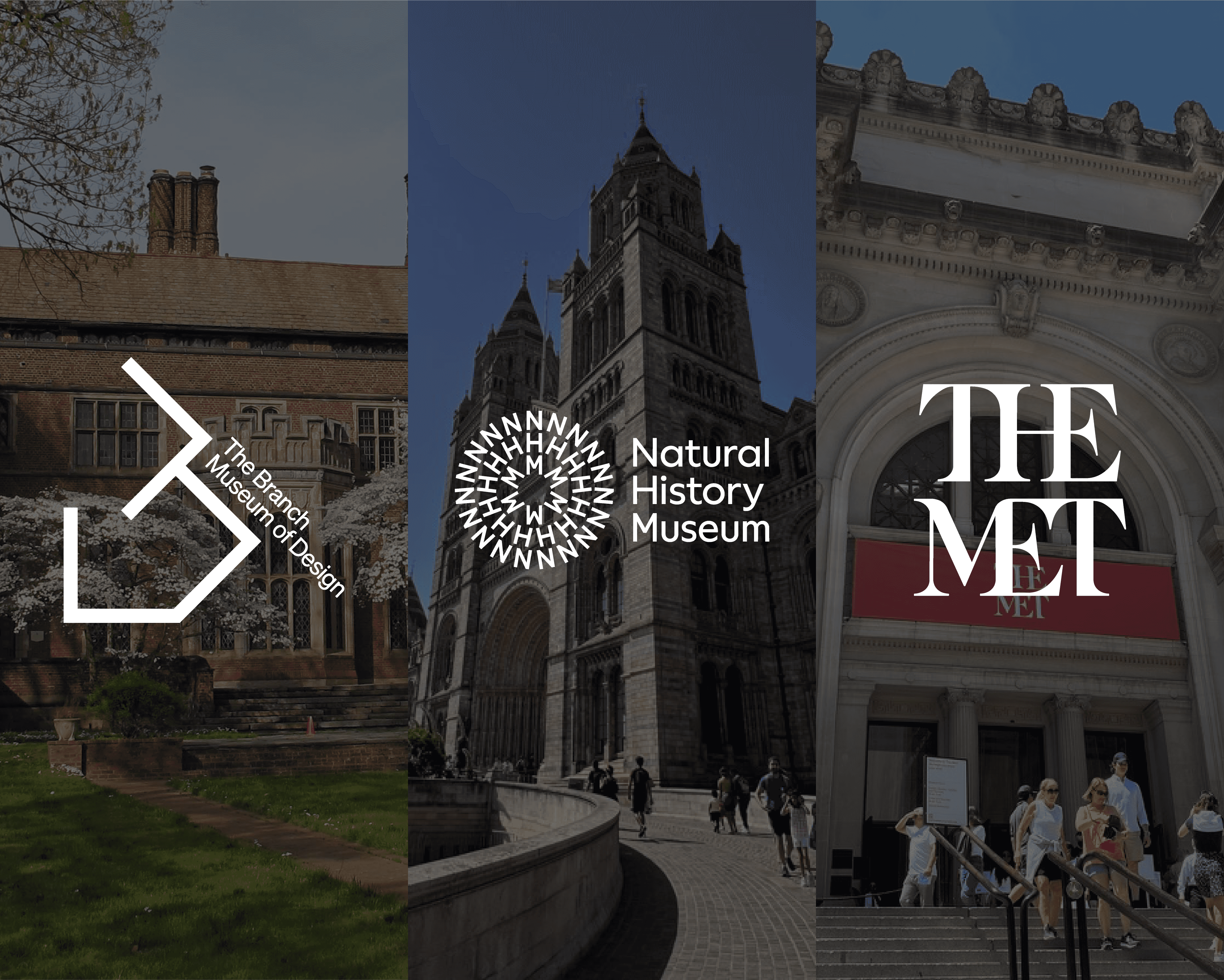
Branch Museum of Design — When the Identity Behaves Like Design Itself
A design museum has a slightly unfair advantage: visitors arrive expecting the place to be intentional.
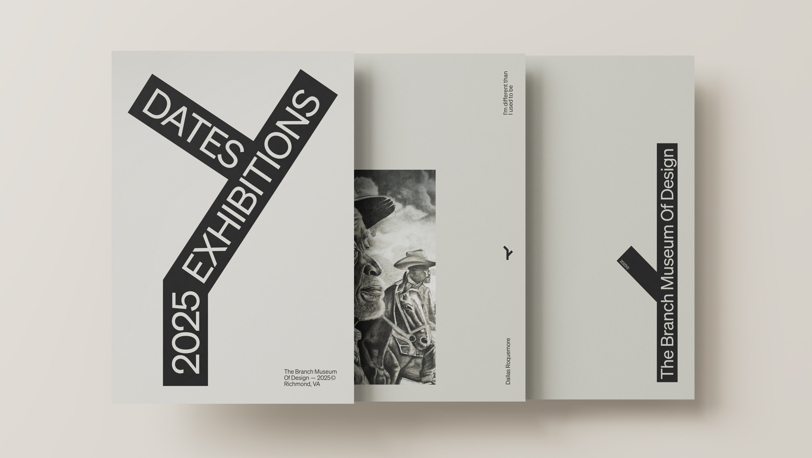
But the Branch Museum of Design (in Richmond, Virginia), whose identity was developed by MullenLowe, didn’t just “make it look modern.” They built a visual identity that behaves like design thinking: structured, adaptable, and a little disruptive.
The starting point is deliciously museum-specific: architecture.
The Branch lives in a Tudor-style building with a signature inverted V-shaped tower. Instead of treating the building as background scenery, the identity pulls that form into the system. The mark mirrors and transforms that V into a more symmetrical, house-like shape—quietly framing the museum as a home for design. And then it does something small but powerful: it tilts.
That tilt matters. It’s not chaos for the sake of being edgy. It’s a visual metaphor for what good design does: it nudges perspective. This is museum branding as a point of view, not a paint job.
What we love most is how the identity moves. The logo isn’t a static stamp. It morphs. It adapts. It becomes a set of geometric rules that can stretch across touchpoints:
Motion graphics that feel like forms assembling and reassembling
A flexible geometry that can frame content without boxing it in
A system that can live on posters, signage, social, and spatial applications without losing its core idea
Here’s the technical touch: this is consistency through behavior, not repetition.
A lot of brands think consistency means “always show the same logo in the same way or in a pattern.” In a museum, that gets boring fast—and it doesn’t help when you need the brand to work across hundreds of contexts.
The Branch identity stays coherent because it has a clear underlying logic (shape language + motion rules). That’s the kind of system that can support exhibitions without competing with them.
Visitor experience moment: when branding behaves like design, the museum doesn’t just talk about design—it makes you feel it while you walk.
Natural History Museum London — Branding as a Living, Moving Ecosystem
Natural History Museum London has a different challenge. It’s not one “category.” It’s science, education, entertainment, research, activism, family tourism, climate emergency—sometimes in the same hallway.
So the brand can’t be a single mood. It has to be a structure that can hold many moods without falling apart.
The identity, developed by Pentagram, leans into circularity: a symbol built from the letters NHM arranged in rings, with circular patterns and “Word Rings” as a core visual tool. The museum describes this as a catalyst—a ripple effect that can expand, grow, change form, and communicate.
And that’s the key: the brand isn’t a badge; it’s an engine.
Color plays a huge role here too. The palette is broad and energetic, reflecting diversity in nature and inviting different audiences in. This matters because museum branding isn’t only about recognition—it’s also about welcome.
A detail we think is quietly brilliant: the team built tools (a generator) so designers can create patterns and word rings consistently across static and motion outputs.
That’s the technical takeaway: designing the system includes designing how others will use the system. A brand guideline that requires a specialist to touch every asset isn’t a guideline; it’s a bottleneck.
Motion is where this identity really earns its keep. The movement routes—Ripple, Grow, Pulsate, Orbit—take cues from nature and make the logo instantly recognizable in digital contexts. Even the idea of sound-reactive animations adds a playful, living quality.
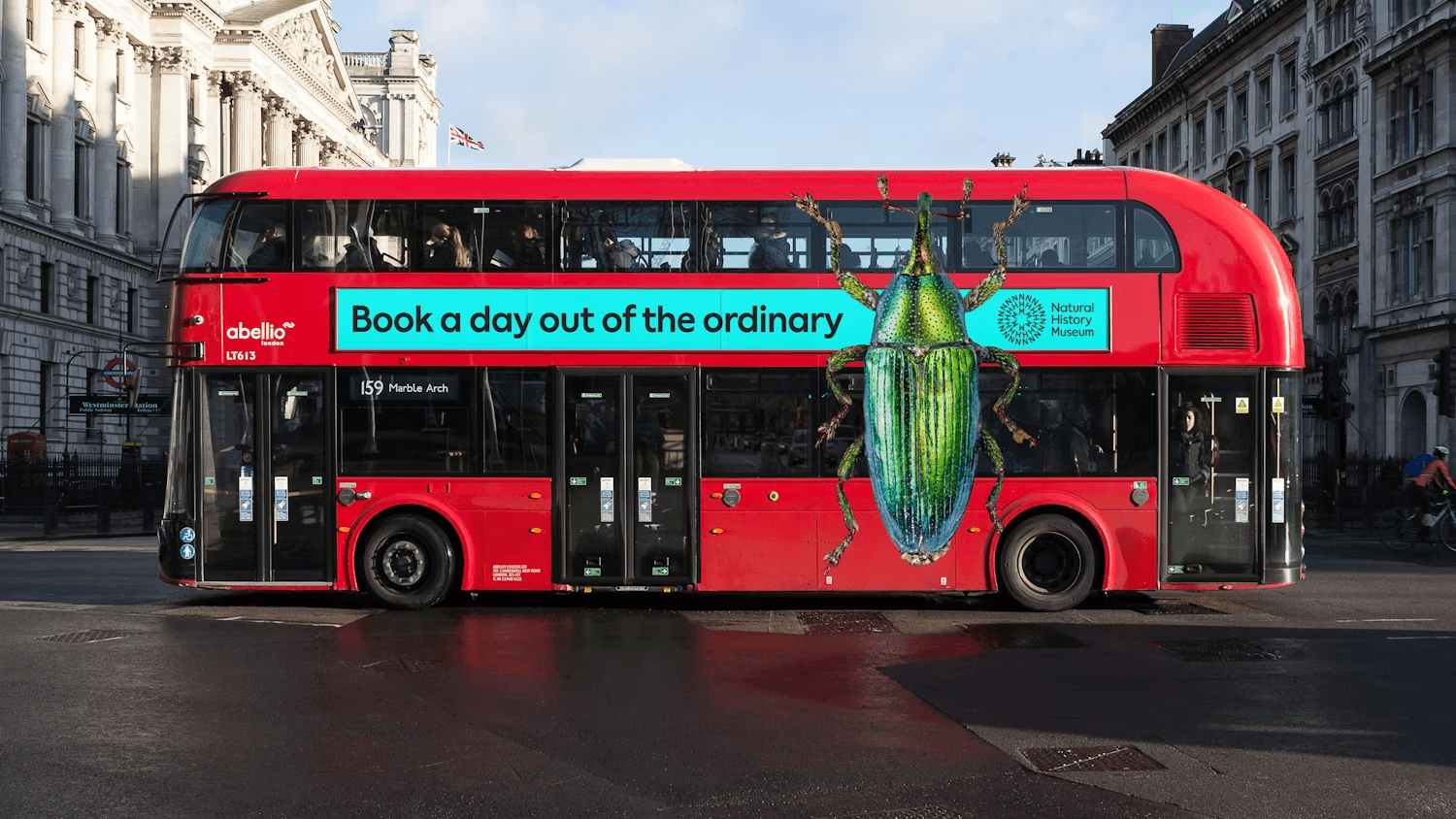
Visitor experience moment: Natural History Museum’s branding doesn’t try to “look scientific.” It tries to feel like life—messy, energetic, interconnected, a bit like a room full of kids with muddy shoes who just discovered bugs for the first time. That’s exactly the emotional tone you want when the museum is talking about the planet’s future.
(Also: if you enjoy a bit of science flex mixed into your design gossip, the museum’s scientists described and named hundreds of new species in 2025. That’s the kind of institution this branding has to serve: alive, evolving, and very much in the present—not frozen in a display case.)
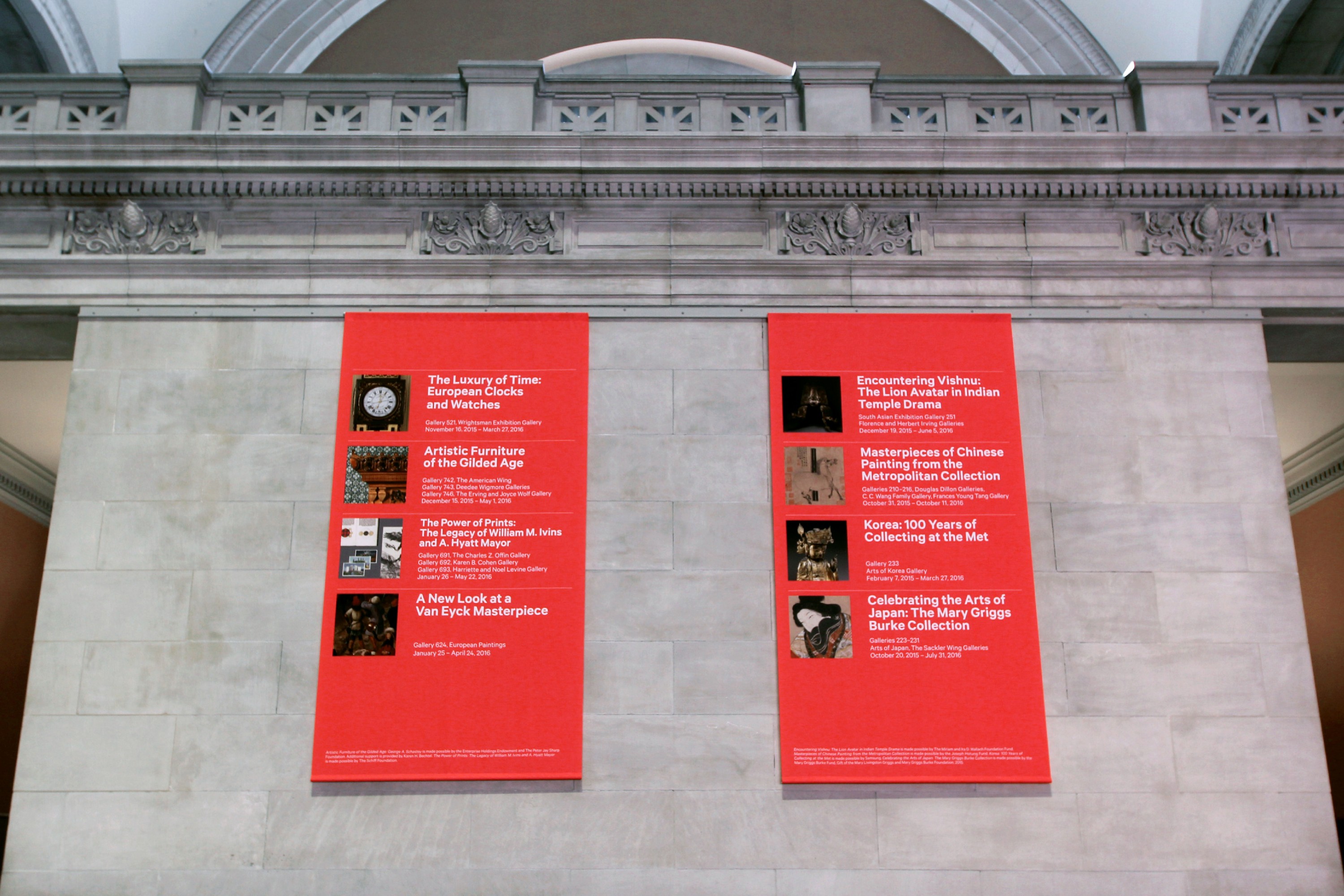
The Met — When Simplicity Carries Cultural Weight
If the Branch is motion-forward and NHM is system-as-engine, The Met is the masterclass in cultural gravity.
The Met’s identity, designed by Wolff Olins, is famously simple: that bold red field, the white logotype, and a mark that has become instantly recognizable. But it’s not “simple” in the lazy way.
The logo is an original drawing designed around the idea of connections—across time, culture, and people. The letterforms deliberately mix serif and sans serif characteristics, acknowledging the museum’s ability to hold classical and modern work under one roof—like a place where marble statues and fresh sneakers somehow get along.
It’s a logo that behaves like the museum’s collection: eclectic, connected, and unified.
Color is where the system becomes iconic. The Met uses a wide spectrum across its programming, but it anchors the identity with a single unmistakable red. That consistency matters for a massive institution with countless exhibitions, departments, and communications. Here’s the technical touch: in a complex brand architecture, a strong anchor element reduces cognitive load.
Cognitive load is just the mental effort it takes to process information. In a museum (especially a huge one), visitors are already processing a lot. A clear brand anchor—like The Met’s red—helps people instantly recognize “this is Met territory,” even as the content changes.
Visitor experience moment: the identity doesn’t distract from the art—it gives the museum a confident, modern frame. That’s why the same institution can host ancient sculptures, contemporary installations, and blockbuster exhibitions without ever feeling conceptually scattered.
That coherence is also what allows the Met’s physical spaces to take on cultural meaning beyond the galleries themselves. The front steps have become a stage in their own right—equally at home hosting red-carpet galas or starring in Gossip Girl. It’s the same old-meets-new tension baked into the logo and color system, playing out in real life: heritage architecture colliding effortlessly with modern spectacle. That’s museum branding working at its best—embedded in the experience, not bolted on at the end.
Once you notice museum branding, you can’t unsee it
Here’s the funny part: once you start paying attention, museum branding is everywhere.
You see it in how you’re guided through a building you’ve never been in. You feel it in how long you linger. You notice it in the tone of label writing, the clarity of maps, the rhythm of signage, the quiet confidence of the shop experience.
And the lesson isn’t “museums should brand harder.” It’s subtler than that.
Museum branding is at its best when it disappears into the experience—while still holding everything together.
Across our three examples, the approach changes, but the outcome is similar:
The Branch uses a system rooted in architecture and motion to make design feel alive.
Natural History Museum London uses flexible rings, tools, and movement to translate complexity into energy.
The Met uses simplicity and a strong color anchor to keep a massive cultural ecosystem coherent.
Honorable mentions (because yes, there are more): the National Museum of Iceland and the National Portrait Gallery both offer great reference points for identity meeting space.
So next time you’re in a museum, try a tiny experiment.
Don’t just look at the exhibitions.
Look at the experience around them:
Where does your eye go first? (visual hierarchy)
What helps you navigate without thinking? (wayfinding logic)
What makes the place feel calm, exciting, or intimidating? (tone and ambience)
What do you remember after you leave? (brand anchors)
Because in museums, the exhibits are the reason we show up—but branding often decides whether we feel oriented, curious, and connected… or just tired and slightly lost. And honestly, nobody wants to be emotionally moved by a masterpiece and then defeated by a map.
Credits
All branding work and images shown belong to their respective studios and clients, and are included for editorial analysis.
Studios featured:
Mullen Lowe — Branch Museum of Design 🇺🇸
Pentagram — Natural History Museum London 🇬🇧
Wolff Olins — The Met 🇺🇸


