Articles

Beyond Tumblers: The Colors That Built YETI's Empire

Oct 26 2023

Matty Matheson surrounded by products from his creative universe, including Matheson Food Company sauces, cookware, apparel, books, and merchandise, illustrating a lifestyle brand ecosystem.

YETI, the brand that began with a simple mission—keeping drinks and provisions colder for longer—is now worth a cool $1.7 billion. While you might attribute this success to the sleek design of their rugged coolers and trusty tumblers, there's more than meets the eye. Or should we say, there's more than meets the color palette?

In a world where color choices often come across as an afterthought, YETI has mastered the art of brand strategy with its product positioning and a remarkably colorful approach. That's right; when it comes to YETI, their colors are just as much a part of the strategy as the quality of their products. They've gone beyond picking any random hue and made color an integral part of their brand identity. Join us as we embark on a journey into YETI's distinctive 'color strategy' and delve into the factors behind their billion-dollar brand.


From Pigments to Profits: YETI's Strategic Color Play

YETI's successful color strategy rests firmly on the foundation of two pivotal elements: Positioning & Presentation, which focuses on the visual context and marketing representation, and Creative Color Naming, which infuses evocative language into the spectrum of hues.

YETI does more than offer a color; it conjures up an entire experience. Vivid imagery, campaigns, and marketing seamlessly weave the story of each color with distinct outdoor settings. Whether it's a tranquil lakeside, a dense forest, or a sunny beach, YETI's visual showcases teleport you into these scenes, making you feel that each color is custom-tailored to your beloved activities. It's not just a purchase; it's an invitation to embark on an adventure.


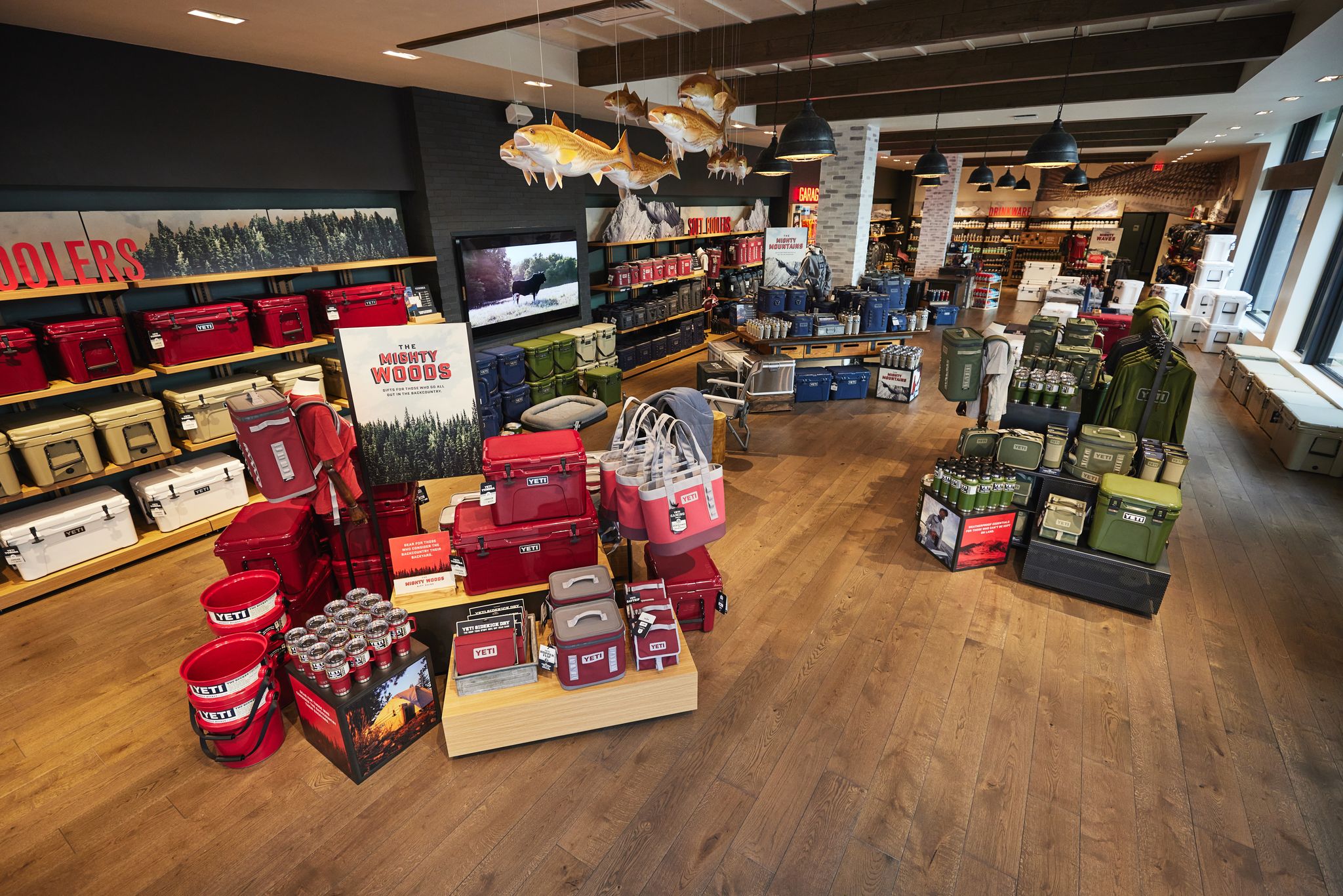
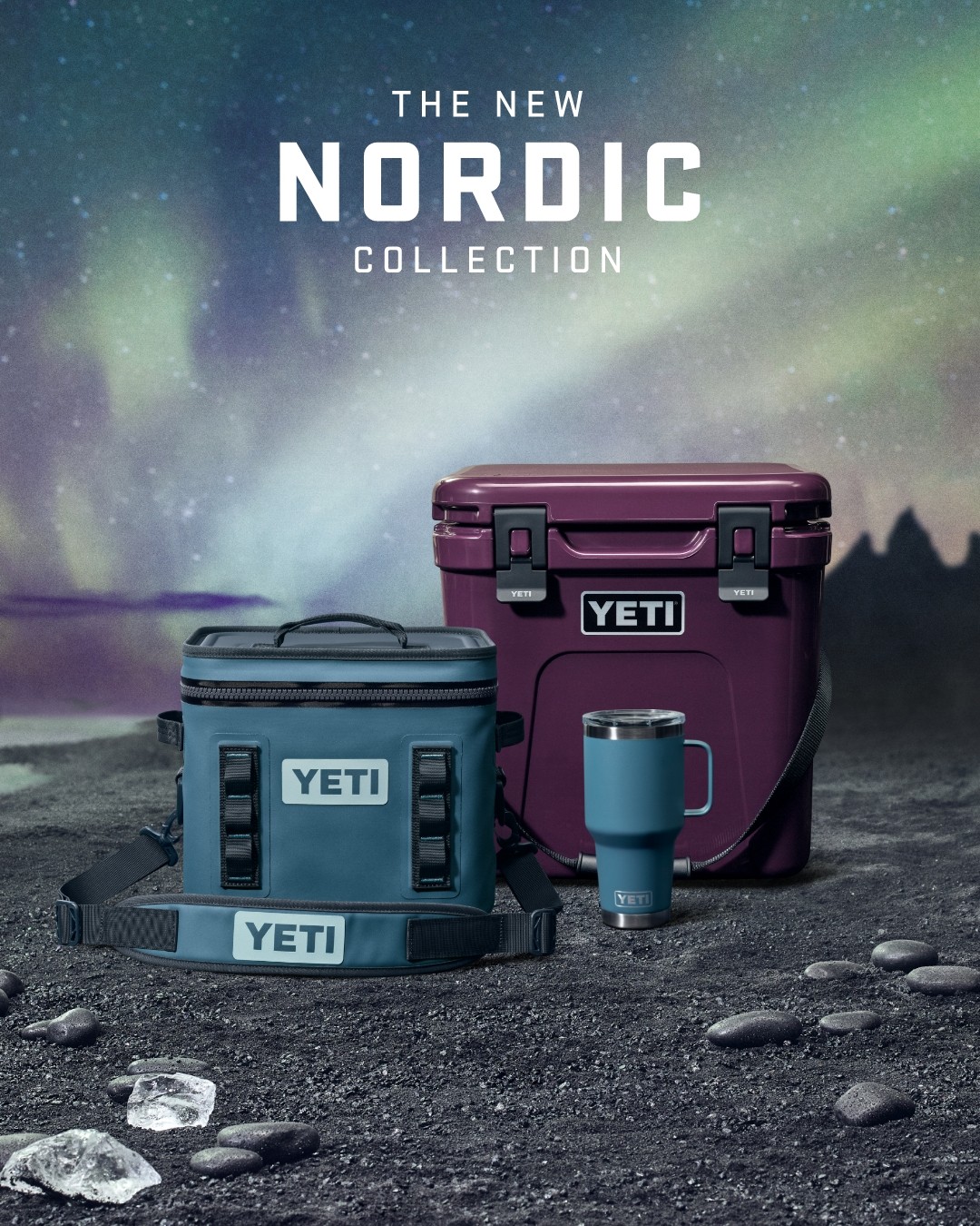
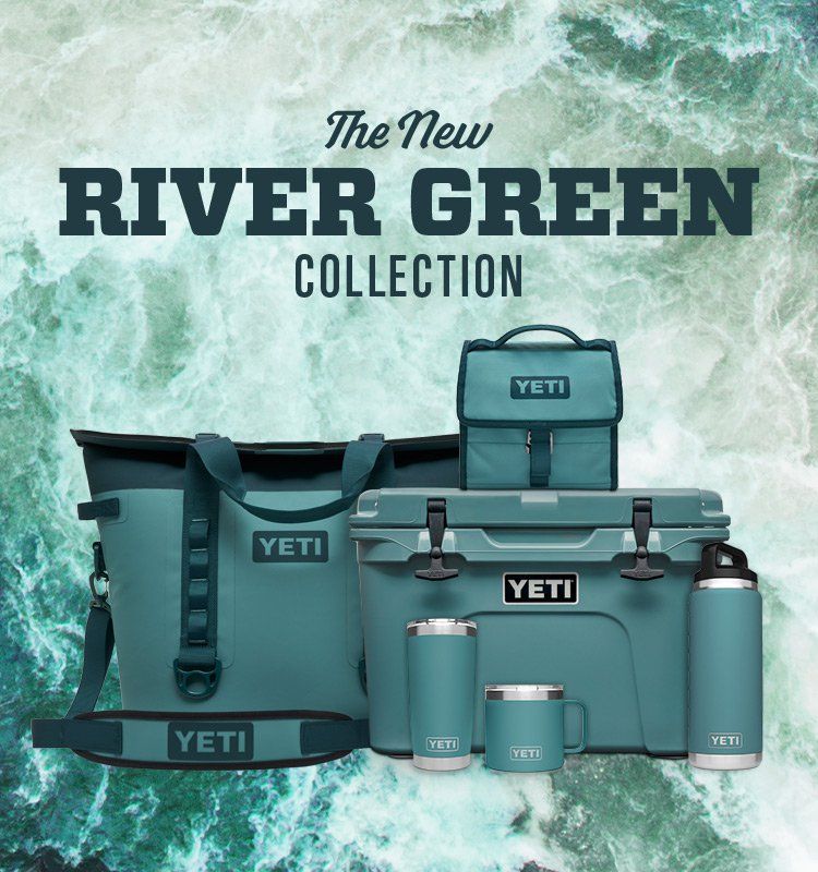
YETI doesn't merely name its colors; it crafts phrases that awaken your senses. Forget plain "aqua" or "red." YETI's color labels evoke rich experiences. It's not an "aqua-colored cooler"; it's the "River Green Cooler," the companion for your forest camping escapades. That's not a "red tumbler"; it's the "Canyon Red Tumbler," your sidekick for rambling journeys. YETI's witty color naming transforms a simple shade into a product teeming with adventures, tailored to every unique situation. So, have you noticed your coworker flaunting a different big a$s YETI hue every day of the week? It's not just a color; it's a voyage waiting to be explored.


Are colors the way to connect with customers?…

YETI is a shining example of how paying attention to something as seemingly simple as color can elevate your brand into the billions. The magic lies not just in the tumbler or mug but predominantly in the rich tapestry of colors that YETI has artfully woven into its brand story.

As we observe YETI's journey, it becomes evident that the secret to true consumer engagement and connection is found in evoking emotions and personal experiences. YETI's ability to turn color into a vibrant narrative is a testament to their brilliant brand strategy.

So, the next time you reach for that "Harbor Pink" YETI cooler, remember, it's not just a color; it's a promise of an unforgettable seaside adventure. This is the power of a billion-dollar brand strategy that embraces color as more than just a hue; it's a window to a world of experiences


P.D. : There's a color named "King Crab" we don't know why...

© 2025 Attlas Design. All rights reserved. All text, images, and graphics on this site are the intellectual property of Attlas Design and may not be reproduced, distributed, or translated without prior written consent.

© 2025 Attlas Design. All rights reserved. All text, images, and graphics on this site are the intellectual property of Attlas Design and may not be reproduced, distributed, or translated without prior written consent.

Title slide reading “Branding vs Marketing” with Attlas logo below and media and design icons.

Feb 17th 2026

Branding vs Marketing: What’s the Difference and Why It Matters

Branding

Branding vs marketing — they’re often confused, but they solve different problems. Here’s the real difference and how to know which one your business needs right now.

Feb 16th 2026

Inside Seasoned Website Design: A Playful UX Breakdown

Web

Seasoned website design is a case study in concept-driven UX, where interaction, structure, and metaphor transform a simple resource hub into a memorable web experience.

Feb 16th 2026

Inside Seasoned Website Design: A Playful UX Breakdown

Web

Seasoned website design is a case study in concept-driven UX, where interaction, structure, and metaphor transform a simple resource hub into a memorable web experience.

Mosaic dragon and Snoopy street artworks beneath Rue du Dragon sign in Paris.

Feb 13th 2026

You’ve Seen Pixel Street Art in Paris. Here’s What It Really Means...

Education

Those pixel mosaics scattered across Paris aren’t random decoration — they’re part of one of the most coherent visual systems in contemporary street art.

2026 Design Trends title in white hand-drawn lettering on blue background with Attlas logo.

Feb 12th 2026

Design Trends 2026: Intensity, Imperfection and Immersion

Opinion

Design trends 2026 are shifting away from safe minimalism toward intensity, immersion and visible humanity. If you want to know what’s shaping visual culture this year, keep reading.