Articles
Navigating the City in Style: Aesthetics of Public Transport
Sep 19, 2023

In the bustling world of urban mobility, where millions traverse cities daily, design and brand image play a far more crucial role than one might anticipate. Public transport, often seen as a functional necessity, is also an artistic canvas, with its design serving as a powerful tool. In the world of public transport networks, where complexity can be overwhelming, design emerges as a beacon of clarity, guiding passengers through the maze of stations and routes.
Striking that perfect balance between functionality and aesthetics is a challenge, especially when unifying diverse branches under a single brand image. However, when this challenge is met, the result is a seamless fusion of cleanliness, beauty, and utmost clarity.
Public transport is more than just a means of getting from point A to B; it's a reflection of a city's character and efficiency. Let's delve into two remarkable examples from opposite ends of the globe that showcase exemplary design and branding in public transport networks: London and Mexico City.
London
Transport for London (TfL) operates one of the world's busiest and most intricate transportation systems, with a staggering 4 million passengers daily. At the heart of its brand image is the iconic roundel, originally designed by Edward Johnston in 1915. Modernized over the years with brighter red and blue colors, the roundel remains a clear and distinguished logo, adapted seamlessly across all services, with varying colors that aid in easy identification. Each system has its own color scheme, that is not just only in their respective roundel, but across all the system, including maps, signs and even on the trains and cars. This unification portrays a well design systems that gives many different services, but still looks as if it's all the same.

Alright, let's talk about London's transport style—it's the epitome of 'less is more.' Picture sleek lines, simple vibes, and a look that screams 'London cool.' It's like the city's signature outfit, never out of fashion and always on point. You see it, you know it's London calling. But hold on, the mastermind behind this sleek operation, is basically a celebrity. They've got their own hangout spot—a museum, no less! Ever thought you'd see Tube-themed merchandise? Think again, because TfL's got that covered too. Oh, and they're even in cahoots with big names like Nike, creating limited-edition Tube-themed sneakers that'll make you want to ride the underground in style. London's transport isn't just a system; it's a statement, a lifestyle, and it's turning heads way beyond the tracks.

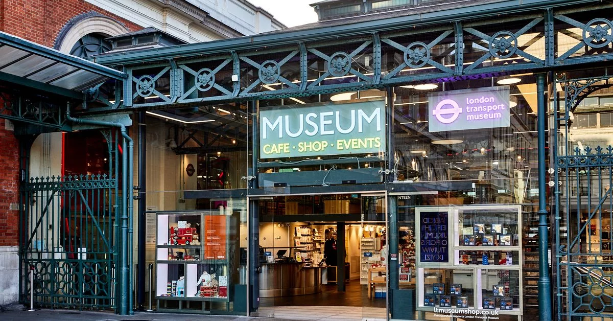
TfL ain't messing around when it comes to keeping it real! I mean, their commitment to keeping things on point is just chef's kiss. Imagine this: you step into any station, and bam! You're hit with those iconic colors, the 'mind-the-gap' reminders, and that station layout you can sketch in your sleep. It's like your own personal 'Welcome to London' party, every single time.
And oh, let's talk about uniformity—their game is strong. Every station, every line, they've got this flawless consistency. You don't need a map; it's like London's transport system is winking at you saying, 'Gotcha covered, fam.' Regulars love it, and tourists? They're snapping pics of it like they've just met a superstar. It's not just public transport; it's the London way of saying, 'We got style, even underground.'

Mexico City
Redesigned in 2019 by Lance Wyman, a veteran designer involved in the branding of the 1968 Olympic Games in Mexico, the brand identity of Mexico City's public transport network is a vibrant mosaic. Encompassing eight diverse transport services, including trams, metro, and bikes, the brand design is characterized by its cohesion and exuberant use of bright colors and icons.
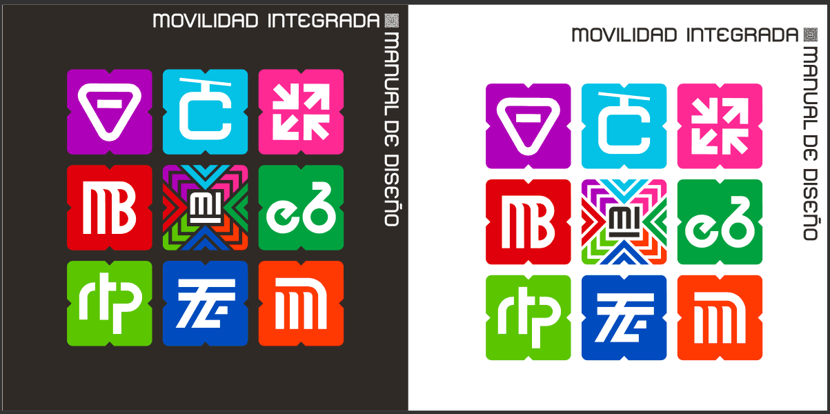
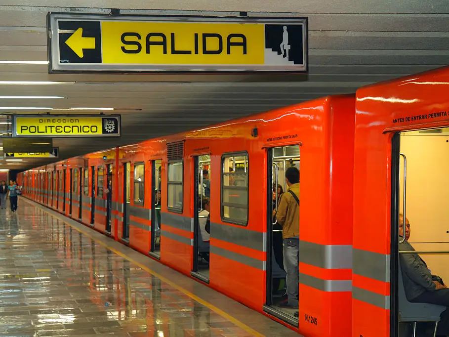
Mexico City's got some serious street smarts when it comes to their transport game. Check this out—this city's got heart. With over 4 million folks here facing the reading struggle, the metro system steps up big time. They've got a design hack that's straight-up genius! You've got 195 stations, spread across 12 lines, and guess what? Each one's got its own special icon.
Imagine rolling up to a station and thinking, 'Hmm, where am I?' But then, bam! There's a fcking kangaroo icon telling you you're at "Oceania" (like the continent) Station. Like a friendly high-five saying, 'You're at the right spot, amigo.' It's like a secret code that makes Mexico City's metro the cool kid on the inclusivity block. No reading? No problem. Mexico City's got your back, making sure everyone can ride the metro wave."

Alright, let's talk about Mexico City's secret sauce—those crazy, vibrant colors. It's not just a random crayon box explosion; oh no, it's a master plan to jazz up your daily grind. But hey, these colors aren't just for show. They're a mirror to the soul of this lively city. Mexico City's got heart, and these colors are its beat. They reflect the pulse of the culture, the joy of the people, and the energetic rhythm of urban life.
Next stop...
Alright, let's spill the beans on this—good design in public transport is an absolute game-changer. We're not just talking about making things look pretty; we're talking about a silent influencer in the everyday hustle and bustle of urban life. Ever realized how that well-thought-out design can shave off some minutes from your daily commute? Yep, it's a time-saver! A snappy, eye-catching design isn't just about aesthetics; it nudges your choices and streamlines your journey in the urban jungle. In a city where every second counts, a few well-placed colors and signs can work wonders.
Think about those huge, jam-packed cities. In the midst of the chaos, having a distinct brand design isn't just a nice-to-have—it's a must. It's like having a clear road sign in a complex maze, guiding you through the labyrinth of stations and routes. In these bustling cities, a solid brand design isn't just about looking good; it's about making urban life a tad easier for the millions relying on public transport. So, here's the takeaway: Public transport design is more than just pixels and hues. It's about shaping an experience, turning a run-of-the-mill commute into a journey marked by efficiency, maybe even a bit of fun. Every color, every line, and every quirky icon—they're all part of this urban adventure we call commuting.
Next time you're waiting for that train or hopping on a bus, take a sec to appreciate the thought behind the design. Because in the whirlwind of city transit, that cool design is your trusty sidekick, making your daily trek just a bit more awesome.
PS: if you wanna play a super cool metro game, play mini metro (that's where we got the cover image) our record is 1,321 delivered passengers in Barcelona...


