Articles
Pepsis Electrifying Rebrand: A Bold and Alluring Transformation
Jun 9, 2023

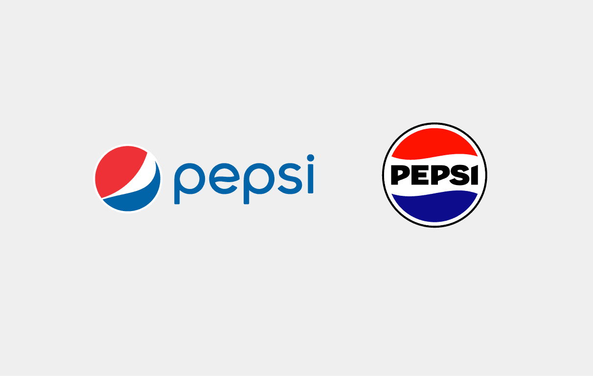
Pepsi has once again embarked on a transformative journey—a journey that finds its roots in the 1890s but returns with a modern twist. This marks the sixth time Pepsi has dared to redefine its identity, with the latest reincarnation taking a bold leap backward in time. But what led to this decision? To understand the present, we must revisit the past, specifically the enigmatic year of 2008 when Pepsi introduced a logo that sparked debate, memes, and criticism. It was a logo that stood out, not for its boldness and grandeur, but for its rareness and susceptibility to scrutiny. In this article, we'll explore Pepsi's latest rebranding venture, analyzing its motivations and how it seeks to recapture the essence of a bygone era.
A New Pepsi: A Bold Leap into the Future, Rooted in the Past
Pepsi, a name synonymous with refreshment and taste, has once again entered the spotlight with a daring redesign that pays homage to its history while propelling itself into the future. This marks the sixth chapter in Pepsi's logo evolution, and it's a chapter that beckons to the boldness of the 1990s. But what sets this rebrand apart?

Typography Takes Center Stage the Energetically Bold Rebrand
One of the most striking changes in Pepsi's new look is the typography. They've abandoned the slim, rounded font of their 2008 logo in favor of something thicker and bolder. This change ensures that the wordmark doesn't fade into the background, maintaining its prominence alongside the iconic colors and circular emblem that have defined Pepsi for generations. It's a nod to the past while embracing the present.
In this rebranding effort, Pepsi has electrified its color palette. The classic blue has been infused with a vibrant energy, making it pop with a new intensity. On the flip side, the darker colors have deepened, creating more pronounced contrasts that demand attention. This strategic use of color reinvigorates Pepsi's visual identity and makes it impossible to ignore.

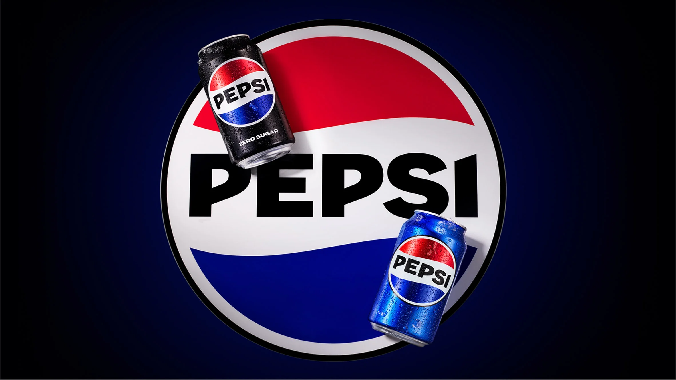
Perhaps one of the most commendable aspects of Pepsi's rebrand is its seamless implementation across all products and channels. From packaging to advertisements, the new visual identity is a testament to the meticulous planning and execution that went into this transformation. It's not just a change in logo; it's a reinvigoration of the entire brand experience.
Our Verdict: A Resounding Success
As they celebrate their 125th anniversary, this transformation couldn't have come at a better time. It's not just a rebrand; it's a declaration of resilience and evolution.
What's our take on Pepsi's bold move? In one word, it's a resounding success. Coming from a logo that sparked debates and memes, this rebrand is a breath of fresh air. The thicker, bolder typography, the electrifying colors, and the bold contrasts all come together to create a visually stunning and impactful brand identity. But the question remains: Will Pepsi extend this revitalization to its sub-brands? And if executed as masterfully as this main rebrand, it could elevate the entire PepsiCo family.
Pepsi's rebranding journey is not just about changing a logo; it's about forging a new path while honoring their storied past. It's a testament to the enduring power of a brand that can adapt and evolve with the times. As Pepsi boldly strides into the future with its electrifying new identity, one thing is clear: This is more than just a rebrand; it's a statement. A statement that Pepsi is here to stay, to inspire, and to refresh for generations to come.


