Articles
The Typography of New York: Fonts, Lettering, and Voice
Jan 19th 2026
Not all iconic typography is about choosing a font. This article breaks down the lettering, typefaces, and systems that shaped New York’s visual voice.

New York has a sound. It has a rhythm. And if you pay attention, it also has a very specific typographic voice.
You see it before you read it. On subway platforms. On magazine covers. On souvenirs, newspapers, street corners. Long before you start identifying fonts by name, New York typography works on you emotionally — it tells you where you are, how to behave, and what kind of city you’re moving through.
This article is not a list of fonts to download. It’s a guided walk through some of the typographic artifacts that shaped New York’s visual identity — some of them typefaces, some of them lettering, all of them inseparable from the city itself.
Typography, typefaces, and wordmarks: how to read New York before naming it
Before we talk about specific examples, we need to clear one thing up — because New York is a city where this distinction matters.
Typography is the practice: how letters are arranged, spaced, and used.
A typeface is the design of a set of letters (like Helvetica or American Typewriter).
A font is the file or specific style of that typeface.
A wordmark is custom-drawn lettering, created for a specific name or logo.
Some of New York’s most famous “fonts” aren’t fonts at all — they’re carefully preserved pieces of lettering.
That’s why naming things too quickly can be misleading. In this city, it’s often more useful to ask what the typography is doing before asking what it’s called.
I ❤ NY: American Typewriter and the typography of emotion
Few graphic marks are as instantly recognisable as the “I ❤ NY” logo. It’s been printed on millions of T-shirts, mugs, posters, and postcards — and yet it still feels oddly personal.
That’s not an accident.
The wordmark uses American Typewriter, a slab serif typeface designed in the 1970s by Joel Kaden and Tony Stan for the International Typeface Corporation (ITC). The typeface was created as part of a broader revival of typewriter-inspired designs, drawing directly from the proportions and mechanics of mid‑century American typewriters.
Unlike 19th‑century slab serifs, which were engineered for industrial printing and heavy display use, American Typewriter references office technology: monospaced logic adapted into proportional type, rounded slab serifs, and relatively even stroke modulation. Its design deliberately avoids sharp terminals and extreme contrast, prioritising consistency and familiarity.
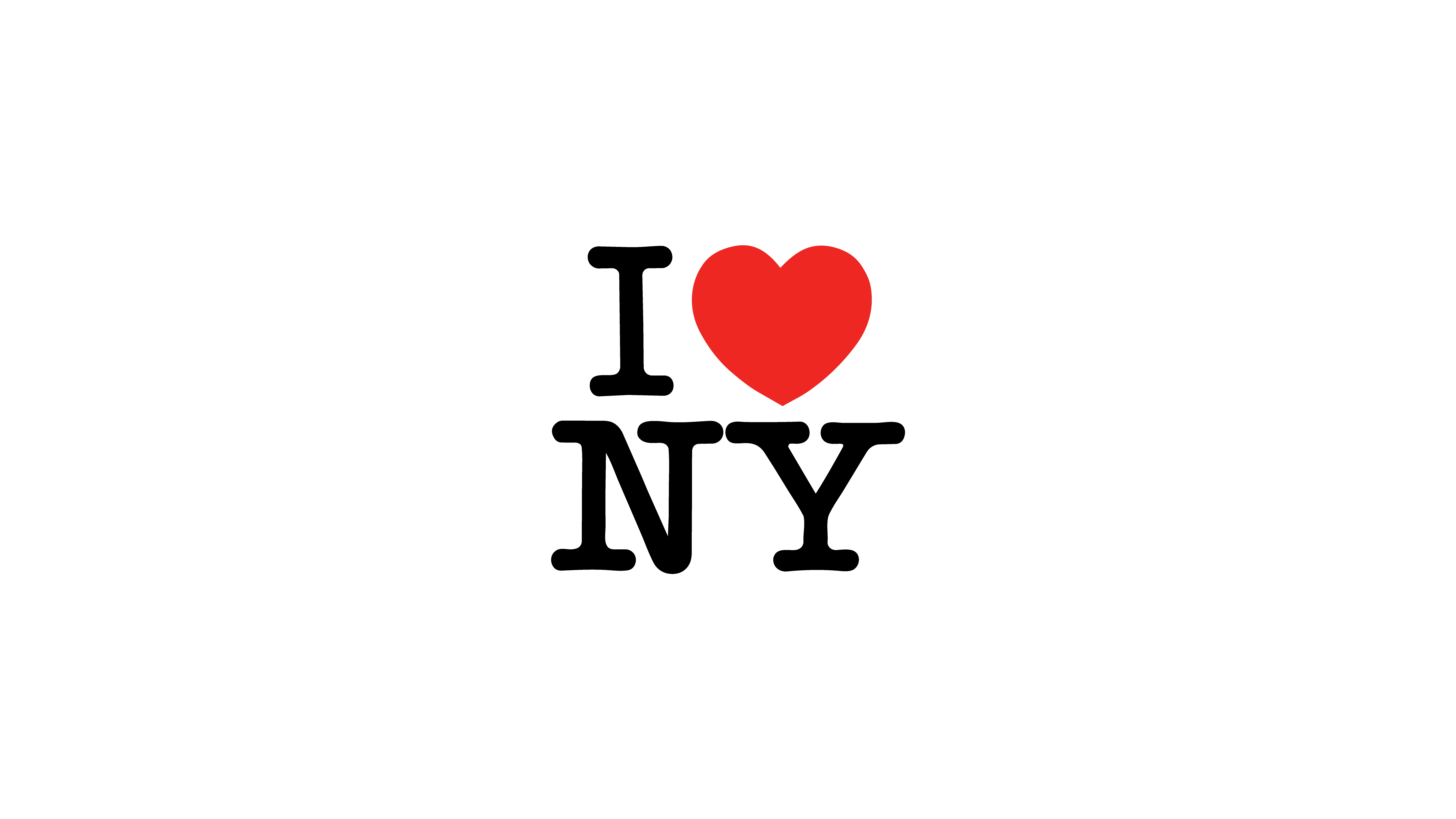
From a typographic perspective, this places American Typewriter in a specific historical moment: post‑industrial, pre‑digital, when typography was increasingly shaped by everyday machines rather than signage or advertising alone. It carries associations of documentation, correspondence, and civic communication.
This historical context explains why the typeface works so effectively for the I ❤ NY logo. It is structured enough to reproduce reliably at any scale, yet informal enough to avoid institutional distance. Rather than projecting authority or neutrality, it communicates accessibility and recognition.
In design terms, American Typewriter succeeds here because it aligns its origin, form, and function with the role the logo needs to play.
The logo works because it scales effortlessly — from a tiny keychain to a massive billboard — and because its tone matches its purpose. Tourism needs affection, not authority. Memorability, not neutrality.
This typeface doesn’t describe New York — it lets people fall in love with it.
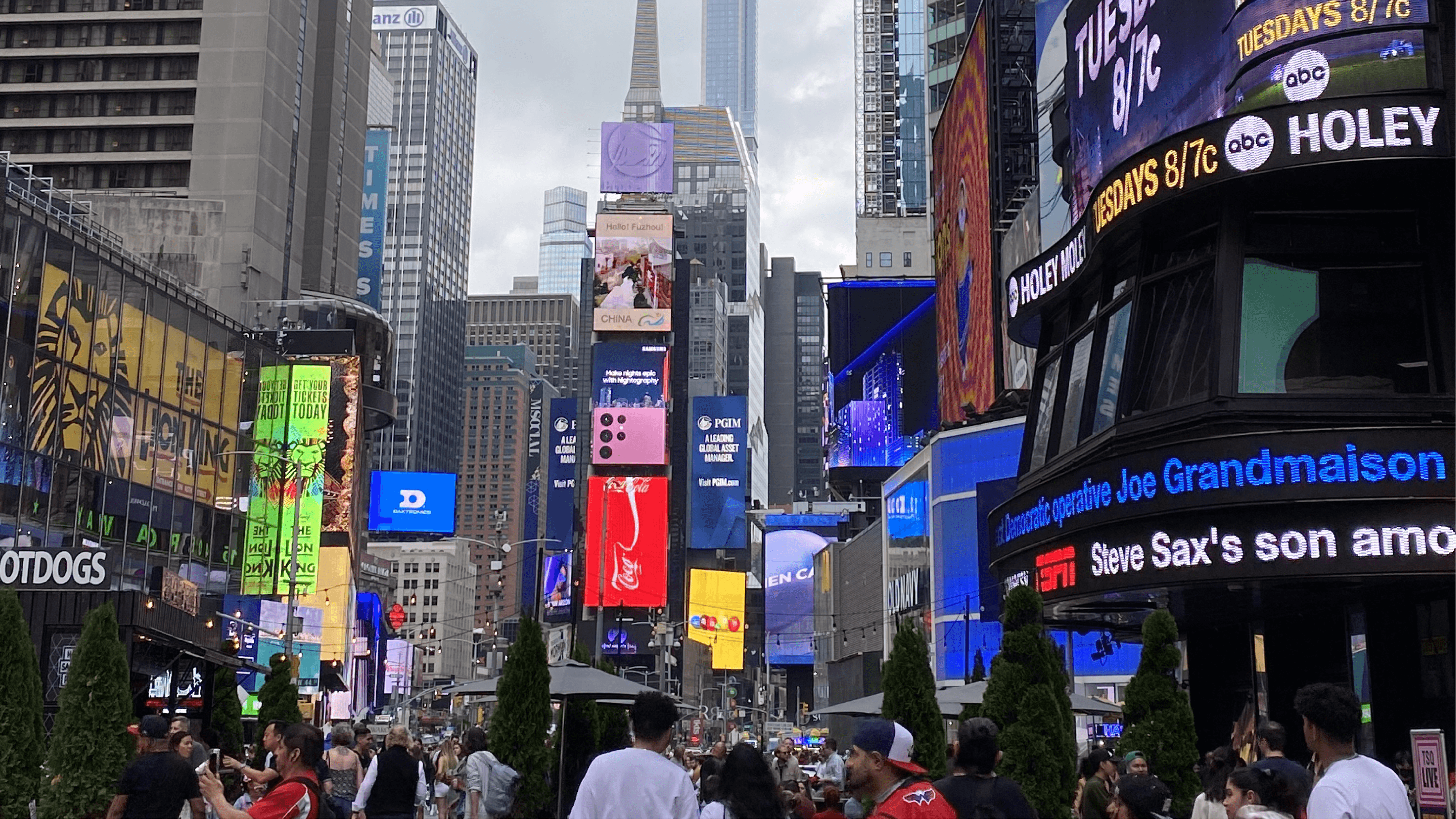
The New York City Subway: when typography becomes infrastructure
If “I ❤ NY” is about feeling, the subway is about survival.
The New York City Subway is one of the most extreme typography environments in the world. Millions of people, moving fast, often distracted, often tired, need to make decisions in seconds. Here, typography isn’t decoration. It’s infrastructure.
In the 1970s, the subway system was standardised under a modernist logic that prioritised consistency and legibility. The type used in early standards was closely related to Akzidenz-Grotesk, via a system known as Standard. The goal was simple: reduce confusion through uniformity.
Later, Helvetica became the official signage typeface. And while designers still debate the nuances, its adoption makes historical and practical sense.
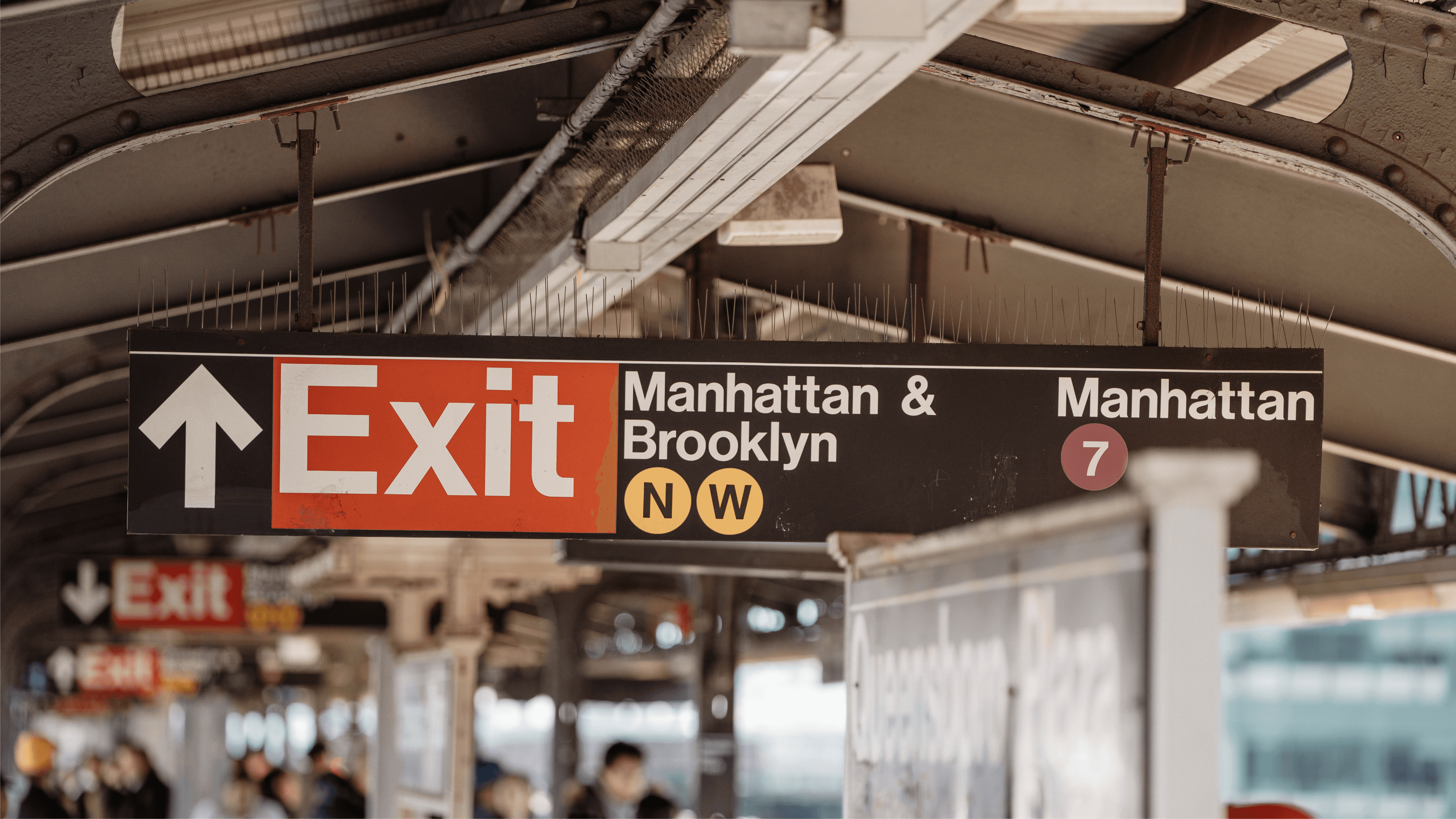
Designed in 1957 by Max Miedinger and Eduard Hoffmann, Helvetica was conceived as a neutral, highly legible grotesk for a modern, international world. By the time it reached New York’s transit system, it already carried associations of efficiency, order, and institutional clarity.
In a subway context, those qualities translate directly into performance:
large x-height that holds up at a distance
open letterforms that resist visual noise
a neutral tone that doesn’t compete with information
consistent readability across sizes and conditions
In other words, Helvetica doesn’t try to be memorable — it tries to be reliable. And in a city that never stops moving, that’s kind of the point.
In the subway, typography isn’t about personality — it’s about getting millions of people where they need to go.
Over time, repetition turned function into identity. What started as a rational system became part of how New York looks.
The New York Times: authority, history, and the power of a masthead
The New York Times masthead feels untouchable. That’s the point.
The blackletter “New York Times” logo — often casually called Gothic — is not a font choice you could make in a layout program. It’s a custom wordmark, redrawn in the late 1960s and carefully maintained ever since.
Historically, blackletter was the dominant style of printing in Europe from the late Middle Ages through the early days of the press. In newspapers, it became shorthand for credibility and institutional weight — a visual signal that what you were reading carried authority.

Blackletter’s dense texture, sharp angles, and distinctive rhythm make it immediately recognisable, even at small sizes. It doesn’t aim for speed or neutrality; it aims for presence. In a city obsessed with change, the Times uses this style to anchor itself in continuity.
Inside the newspaper, other typefaces do the day-to-day work of readability and hierarchy. But the masthead doesn’t need to adapt.
The Times doesn’t change its masthead because it doesn’t need to explain itself.
New York Magazine: typography as personality and cultural confidence
Where the Times projects authority, New York Magazine projects attitude.
The magazine’s iconic “New York” masthead is custom calligraphic lettering. High contrast. Elegant curves. Expressive swashes. It’s confident, slightly theatrical, and unmistakably editorial. This kind of lettering sits closer to illustration than to neutral typography — it’s designed to carry character as much as information.
This isn’t typography trying to disappear. It wants to be seen. It wants to signal that this publication has a point of view before you even glance at the cover lines.
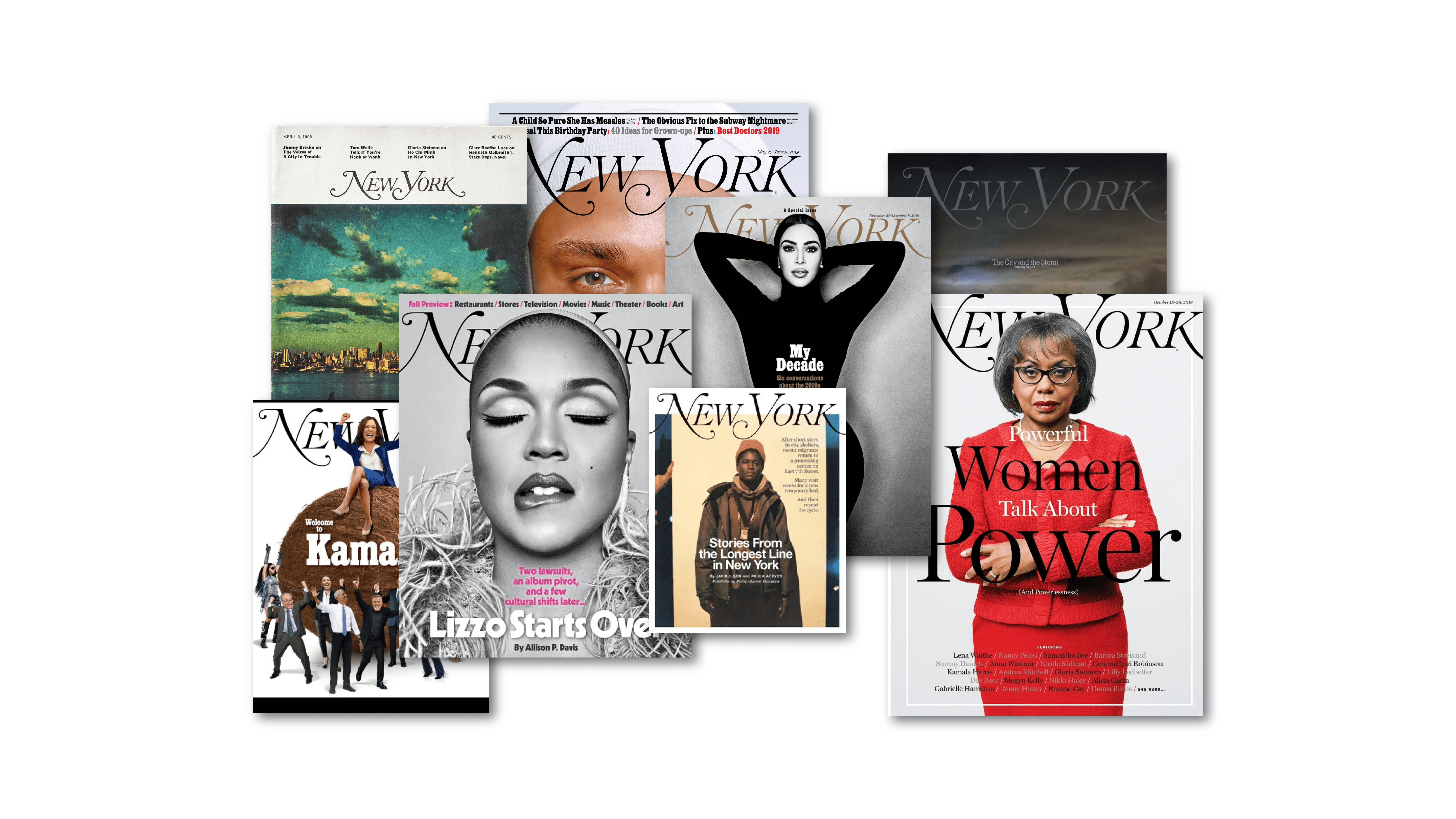
That makes sense for a magazine rooted in culture, fashion, and opinion. New York Magazine doesn’t just report on the city — it reacts to it, interprets it, and often provokes it. Its masthead reflects that role: expressive without being chaotic, elegant without being distant.
Historically, expressive magazine mastheads have served as anchors in visually busy environments. On a crowded newsstand — or today, in an endless digital feed — the masthead acts as a stabilising signature. You recognise it instantly, even when everything around it changes.
Where newspapers aim for trust, magazines aim for voice.
The masthead has evolved subtly over time, but its function hasn’t changed. It sets a cultural tone before you read a single headline.
What these type choices tell us about New York
Taken together, these examples reveal something important.
New York doesn’t have one typographic identity. It has many — each shaped by context, industry, and need.
Tourism uses warmth and affection.
Infrastructure demands clarity and neutrality.
News relies on authority and continuity.
Culture thrives on personality and expression.
And yet, all of them feel unmistakably New York.
That’s the real lesson here. Typography doesn’t just reflect design trends — it reflects what a city values, and what it needs to function. In New York, that means speed and density, but also authority, confidence, and cultural self‑awareness.
What’s striking is how consistently these values translate across industries. Public infrastructure demands neutrality and clarity. Media institutions lean on continuity and credibility. Cultural platforms embrace expression and attitude. Tourism favours warmth and immediacy. Different goals, different typographic solutions — yet all recognisably shaped by the same city.
This is why New York typography feels less like a style and more like a system of responses. Each type choice answers a specific problem: how to guide, how to persuade, how to reassure, how to stand out in visual noise. Over time, those answers accumulate into a shared visual language.
Once you start noticing this, New York becomes readable in a new way. Not just as a place you move through, but as a city that reveals its priorities through letters — quietly, constantly, and with remarkable consistency.
Cover Collage: Attlas
Photos: NYC Subway (Josip Ivankovic via unsplash); New York Magazine Collage (Attlas); Times Square (Attlas)


