Articles
Do I Need a Rebrand? How to Know When It’s Time (and When It’s Not)
Jan 20th 2026
You don’t wake up wanting a rebrand — you feel something’s off. This guide helps you understand what rebranding really means, the visual signs to look for, and how to tell if it’s actually time to rethink your brand.
Do You Need a Rebrand? How to Know When It’s Time (and When It’s Not)
At some point, almost every growing company hits the same uncomfortable moment.
Sales are fine, the product works, the team is moving — yet the brand feels… off. It doesn’t reflect where the business is going. It doesn’t attract the right clients anymore. Internally, no one can quite agree on how to explain what the company does.
That’s usually when the word rebranding enters the room.
But here’s the problem: rebranding is often treated as either a magic fix or a dangerous, expensive gamble. And because of that, many teams either jump into it too fast — or avoid it far too long.
So let’s slow this down and answer the real question: how do you know if you actually need a rebrand, and what does that decision really imply?
What Rebranding Really Means (and Why Companies Start Considering It)
A rebrand is not a new logo.
It’s not a color tweak. And it’s definitely not a reaction to a competitor launching something shinier.
At its core, rebranding is a strategic realignment. It’s the process of revisiting how a company positions itself, communicates its value, and visually expresses who it is — so that all of those layers support the reality of the business today.
That’s why companies don’t wake up one morning randomly wanting a rebrand. They start considering it when something fundamental shifts.

Common triggers include:
The business has grown, but the brand is still stuck in its early-stage mindset
The offering has evolved, but the messaging hasn’t
The audience has changed, but the brand still speaks to the old one
Internal teams interpret the brand differently, creating inconsistency
Rebranding usually isn’t about ambition — it’s about misalignment.
When the brand no longer reflects the company’s scale, strategy, or direction, friction starts to appear everywhere: marketing, sales, hiring, even culture.
The Real Signs You Might Need a Rebrand
Sometimes the clearest signals aren’t strategic decks or KPIs — they’re visual. They show up in layouts, typography, imagery, and how awkward it feels to apply the brand day to day.
Here are some of the most common design-led signs that something deeper is off.
1. Your visual identity feels generic or dated in your category
If your brand could belong to five different industries without changing a thing, it’s probably lost its edge. This often looks like safe typography, predictable color palettes, and visual language that blends into the background.
2. The logo works… but nothing else does
A classic symptom: the logo is fine, but every application feels improvised. Social posts, decks, landing pages, and ads all look slightly different because there’s no real system holding them together.
3. Design decisions spark constant debate
When teams endlessly argue about fonts, colors, or layouts, it’s usually because the brand hasn’t defined clear visual principles. Taste replaces criteria — and everything slows down.

4. The brand looks one way, but sounds another
Visual identity and brand voice drifting apart is a subtle but powerful signal. If the tone of copy doesn’t match the look and feel, the brand starts to feel incoherent.
5. The brand feels hard to scale or adapt
If every new format, channel, or campaign feels like a workaround, the brand system may be too rigid, too shallow, or simply outdated.
When the brand becomes hard to use, it’s often because it no longer reflects who the company really is.
A Quick Reality Check (Before You Jump to Rebranding)
It’s worth pausing here.
Not every brand problem needs a full reset, and not every discomfort means “rebrand now.” Sometimes the issue isn’t the identity itself, but how it’s being used.
In practice, many teams discover that what they really need is:
clearer visual rules,
stronger brand guidelines,
or more disciplined application across touchpoints.
Rebranding should be a response to structural brand issues — not a shortcut for fixing inconsistency.
Two Famous Rebrands, Two Very Different Outcomes
Looking at well-known rebrands is useful — not to judge taste, but to understand decision-making.
The GAP rebrand is often cited as a failure because it introduced a major visual change without a clear strategic reason behind it. The shift felt abrupt, unexplained, and disconnected from what the brand actually needed. The backlash wasn’t about the logo — it was about the lack of meaning.
Burberry’s rebranding, on the other hand, came from a clear diagnosis. The brand had lost focus, diluted its image, and drifted away from its core audience. The rebrand wasn’t just visual; it was about regaining relevance, clarity, and cultural position. The design followed the strategy — not the other way around. We wrote a full article on Burberry's rebrand, check it out here!!
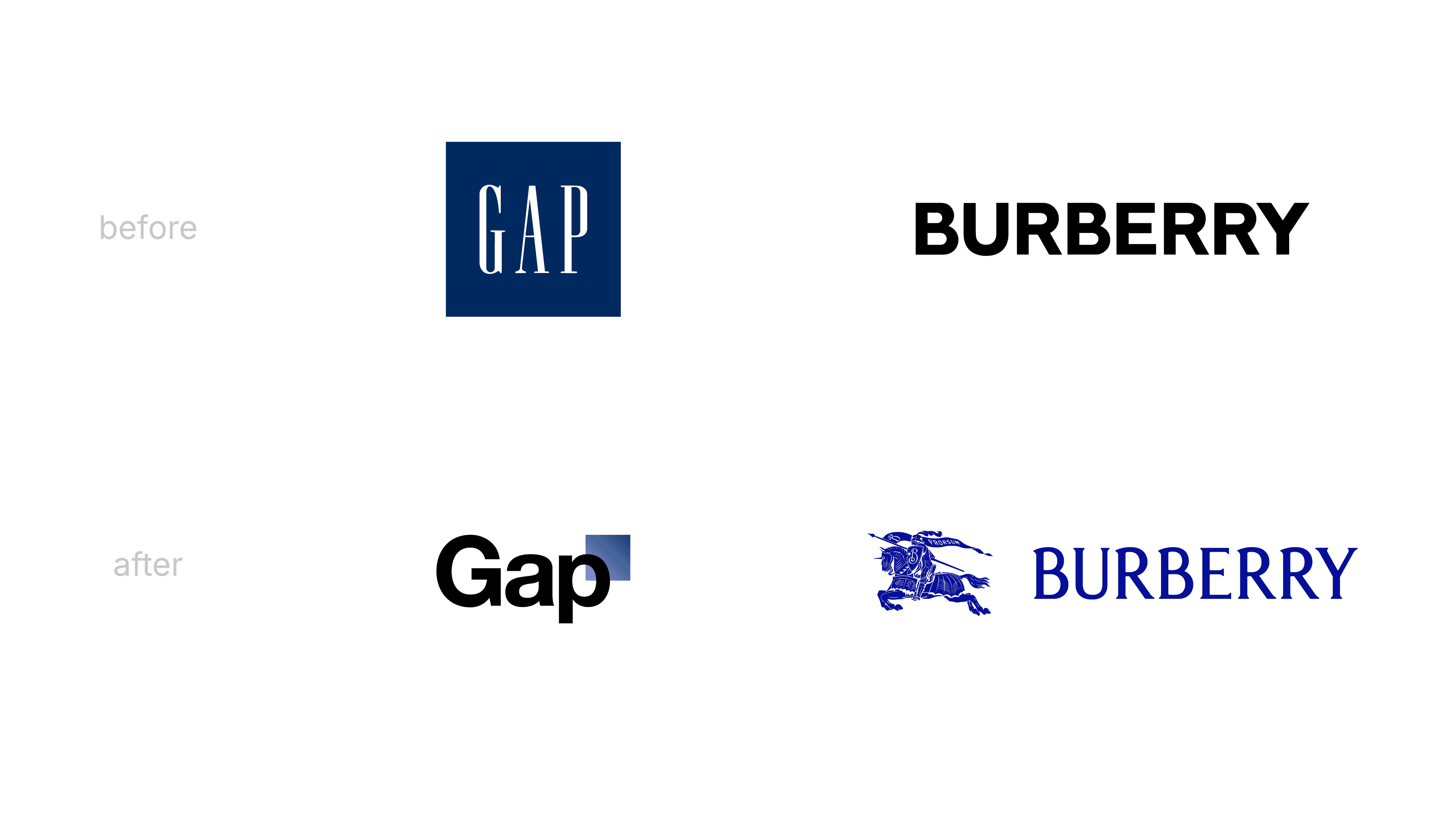
Same word, very different outcomes.
So… Do You Actually Need a Rebrand?
Before answering yes or no, it’s worth being honest about what a rebrand implies.
It takes time. It requires internal alignment. And it forces decisions about who you are — and who you’re not.
Here’s a more concrete way to pressure-test the decision — focusing on how the brand shows up:
Does our visual identity still represent the company we are today?
Is the brand system flexible enough to work across all current channels?
Do typography, color, and layout choices feel intentional or accidental?
Is our brand voice consistent with our visual language?
Do people outside the company perceive us the way we intend?
Are teams confident applying the brand without constant approval?
If most of these raise doubts, a rebrand may be worth exploring.
If not, the smarter move might be to strengthen what already exists.
Rebranding isn’t a default step in growth. It’s a strategic tool — powerful when used well, expensive when used blindly. And if you’re stuck in the grey area between “something’s off” and “we need to act,” an external perspective often helps cut through the noise.
All visual collages made by Attlas


