Articles
Loewe’s New Logo, Explained: Not a Rebrand, a Precise Edit
Jan 16th 2026
At first glance, nothing seems different. Look again, and Loewe’s new logo starts to tell a much bigger story about evolution, authorship, and restraint.

This is one of those logo changes you can almost miss. At first glance, Loewe’s new logo looks… the same. No dramatic reveal, no manifesto, no shock factor. And yet, the more time you spend with it, the clearer it becomes that this is not an accidental tweak or a purely cosmetic clean‑up. It’s a deliberate, restrained move that says a lot about where the house is heading.
In an industry that tends to oscillate between loud reinvention and nostalgic retreat, Loewe has chosen something far rarer: a controlled evolution. Not a rebrand, not a rollback — a precise edit. And in luxury, edits are often more revealing than declarations.
Before the Cut: Why Loewe’s Original Anagram Was Never Just Decorative
To understand why this change works, you have to understand what was already there.
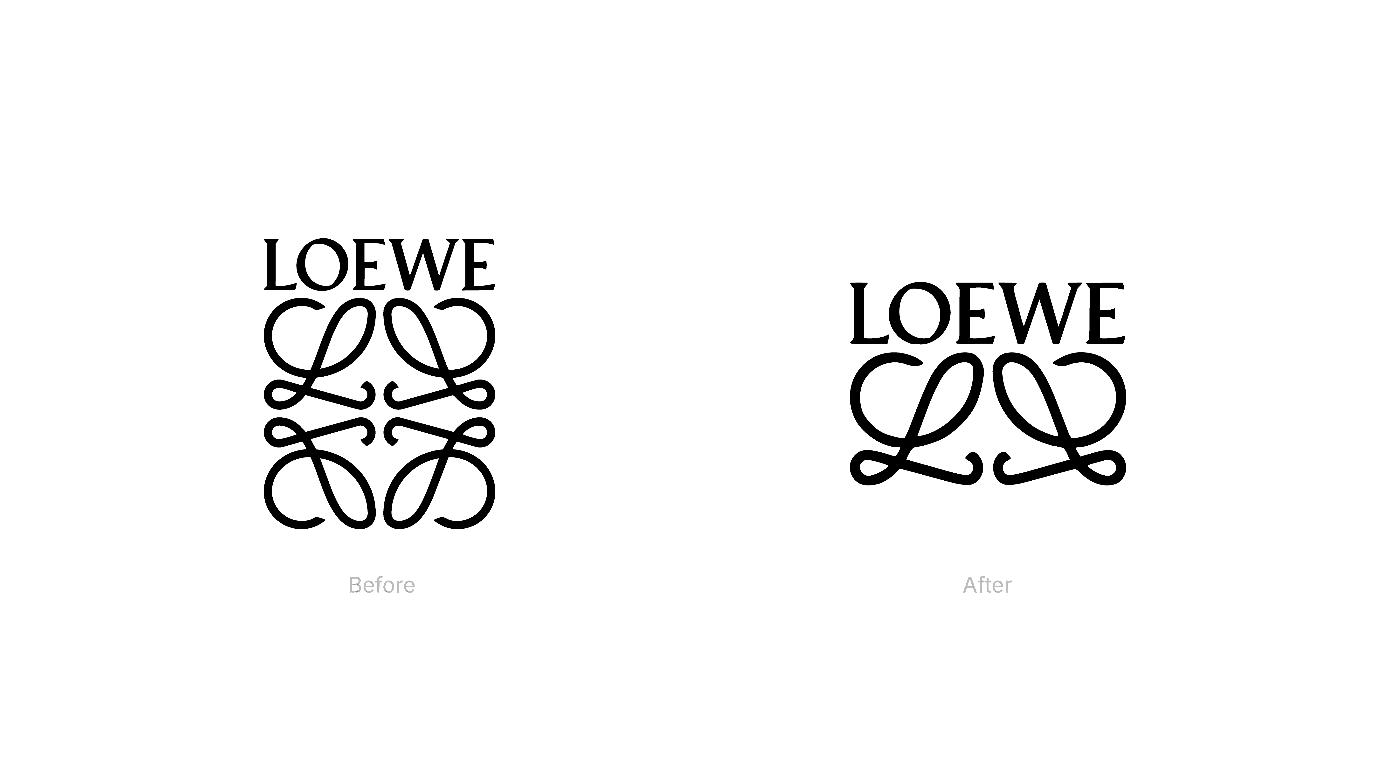
Loewe’s anagram, created in 1970 by Spanish artist Vicente Vela, was never just a graphic flourish. Its interlocking forms echoed the branding irons used in leather ateliers, translating utilitarian craft tools into a refined visual language. It carried ornament, yes — but also intention. This wasn’t decoration for decoration’s sake; it was a system designed to embody Spanish craft while remaining flexible enough to evolve.
That distinction matters. When a logo already holds cultural, historical, and material meaning, redesigning it isn’t about fixing something broken. It’s about exercising judgment. Most brands don’t fail because they change too little — they fail because they underestimate what their symbols are already doing.
Loewe’s original mark had weight, memory, and structure. Which is precisely why it could afford to lose something — and still remain unmistakably itself.
A Subtle Cut, Not a Reset: What Actually Changed (and Why That Matters)
What Loewe has done is deceptively simple. By removing the lower half of the original four-L anagram, the brand leaves behind a lighter, more open form — one that feels calmer, more legible, and more balanced within rectangular applications.
This is not a stylistic reset. The logic of the symbol remains intact. What changes is how it behaves. The mark now breathes more easily across digital environments, small-scale applications, and product surfaces, where dense ornamental logos often struggle.
What makes the move especially sharp is what it avoids. At a time when many luxury houses flattened their identities into interchangeable sans-serif wordmarks — only to later retreat back toward heritage — Loewe takes a more disciplined route. It neither erases its past nor freezes it. It edits.
That restraint signals confidence. The brand isn’t trying to perform contemporaneity through visual shortcuts; it already understands its place in the cultural landscape. When a house knows its relevance, it doesn’t need to chase signals of modernity — it focuses on clarity, longevity, and correct behaviour across contexts. In branding terms, this is a shift from expressive change to functional refinement, where the question isn’t “does this look new?” but “does this work better, everywhere?”
New Directors, New Signals: Branding as a First Creative Sentence
This adjustment doesn’t exist in a vacuum. Loewe enters this moment under new creative leadership, with Lazaro Hernandez and Jack McCollough stepping in after Jonathan Anderson’s influential tenure. And while the brand hasn’t framed the logo update as a manifesto, its timing alone makes it meaningful.
Instead of announcing a new era with a visual overhaul, the house begins with something quieter — a subtle decision that signals continuity rather than rupture. It’s a first sentence, not a headline.
Some viewers have noted that what once read as four mirrored Ls now visually collapses into a paired form — almost inevitably reading as an L and a J. Whether that resemblance is intentional or purely coincidental is, in a way, beside the point. What matters more is that the logo now invites interpretation rather than closing it down.
That ambiguity creates space — and in branding, space is rarely accidental. It’s often where authorship, intent, and creative ownership begin to surface. By allowing multiple readings to coexist, the mark shifts from a fixed symbol to a conversation, subtly reinforcing the sense that a new chapter is being written without spelling it out.
From Emblem to Signature: Why the New Logo Feels More Human
Beyond structure and proportion, there’s an emotional shift at play.
The updated mark feels less like an institutional stamp and more like a signature — something authored rather than imposed. It doesn’t dominate surfaces; it integrates into them. The logo becomes part of the object, not a declaration sitting on top of it.
This aligns closely with how contemporary luxury communicates value. Status today isn’t about visual noise or exaggerated heritage cues. It’s about assurance. About knowing when not to explain yourself.
In that sense, Loewe’s logo doesn’t try to convince. It assumes recognition. And that assumption is a form of confidence many brands never reach.
A Controlled Evolution: What Loewe’s Logo Change Really Signals
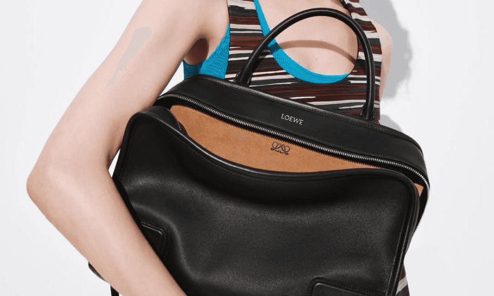
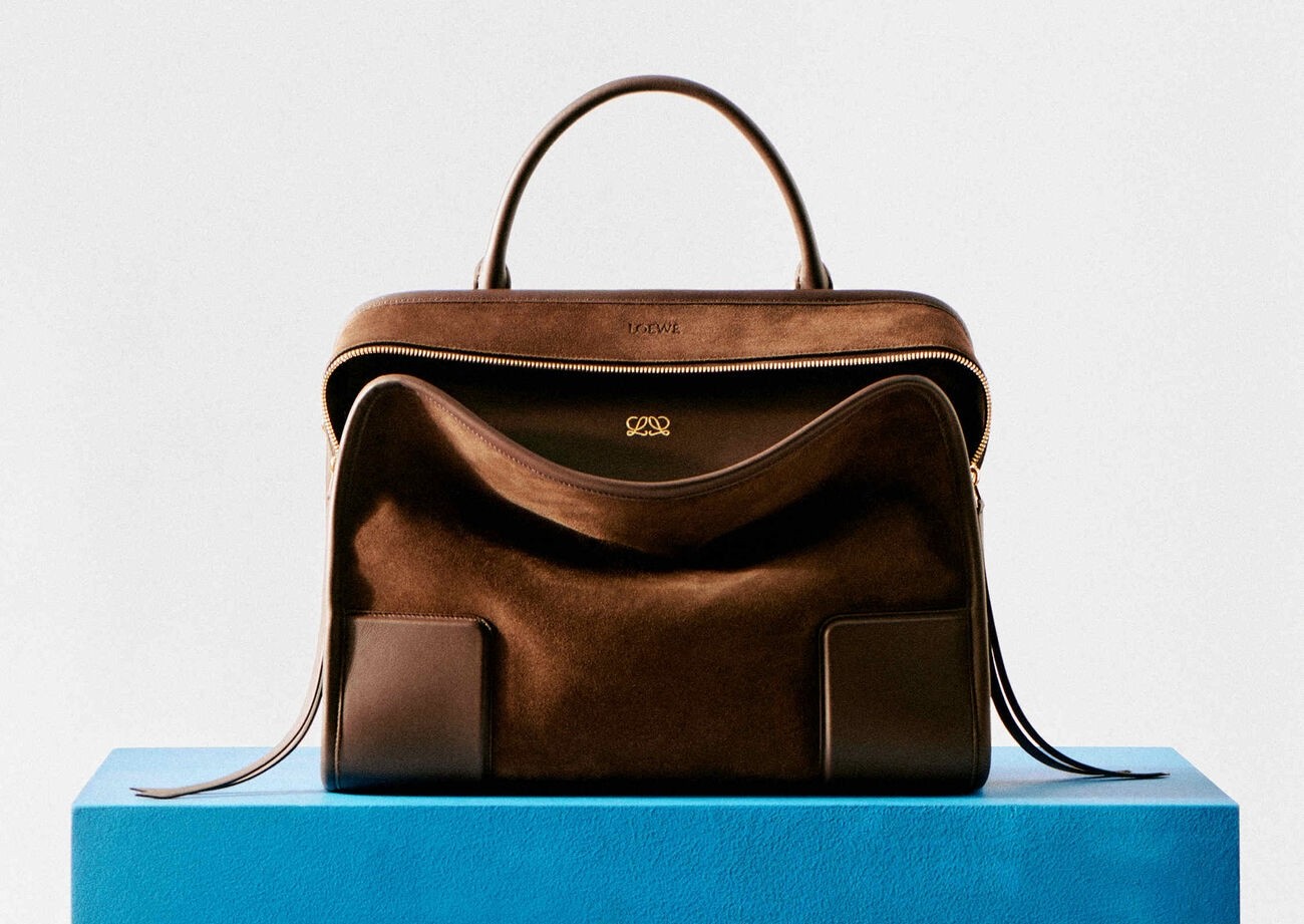
The new logo has already begun appearing on products like the Amazona 180 and on select recent releases — and that choice is far from incidental.
Rather than staging a campaign around the mark itself, Loewe allows the update to live where it matters most: on the product. It becomes something you encounter through use, not announcement. A presence rather than a proclamation.
That approach confirms what this move really represents. Not a rebrand moment, but a lived transition. One that respects accumulated brand equity while subtly adjusting the lens through which the house presents itself.
In an industry prone to overcorrection — swinging between aggressive trend adoption and sudden heritage revivals — Loewe demonstrates another path. Evolution without theatrics. Change without erasure.
It’s a reminder that the most intelligent brand decisions often look uneventful on the surface. And that, in luxury especially, restraint is rarely accidental.
Cover: Attlas
Photos (in order of appearance): Buro buro247.me; Attlas; Loewe loewe.com; Loewe loewe.com; Loewe loewe.com;


