June 18, 2026
SERIF VS. SANS-SERIF: WHAT ACTUALLY SEPARATES THEM
Two type families walk into a brief. One has little feet. The other doesn't. What happens next is basically all of typography.
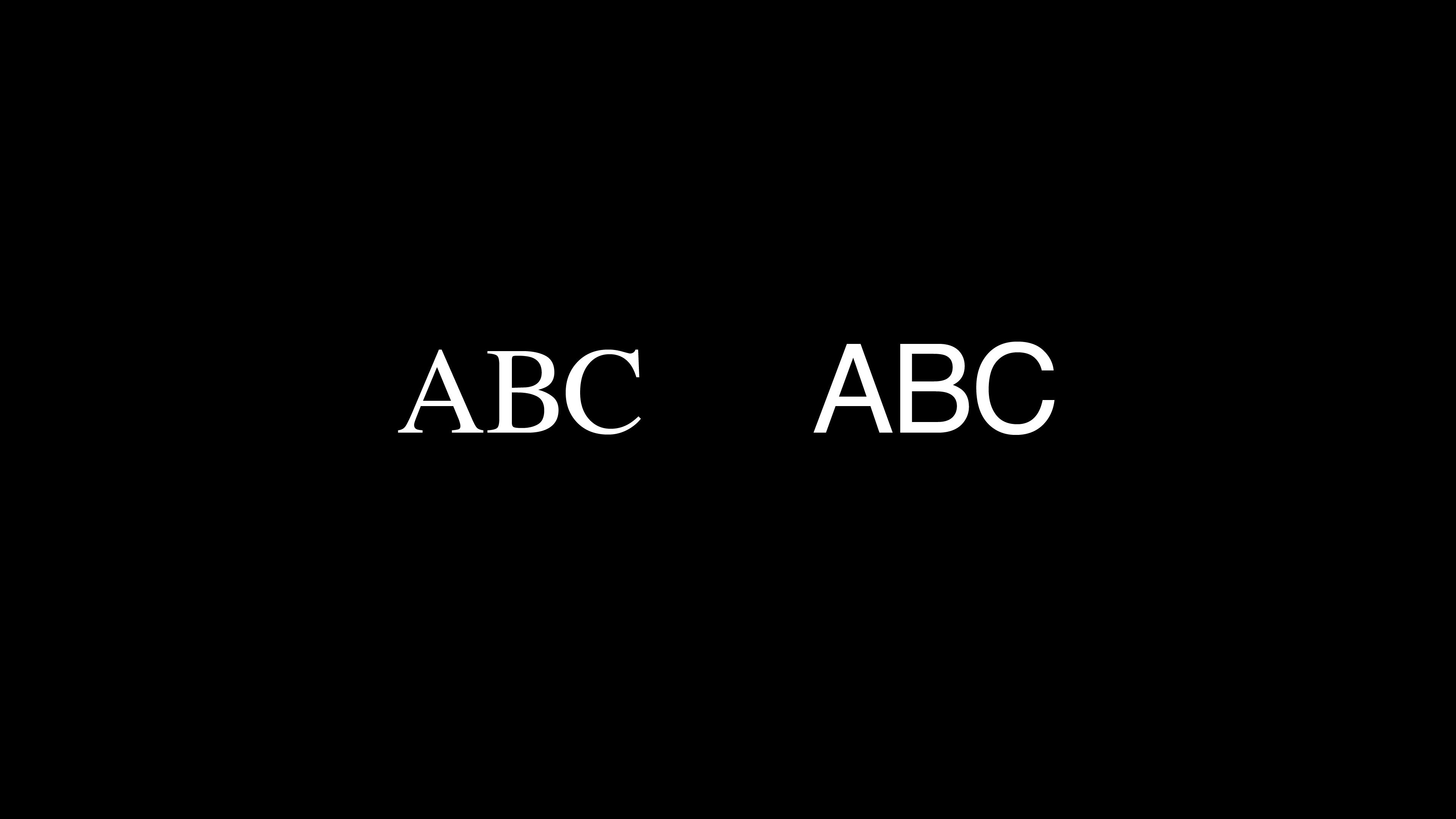
It all starts with a little stroke
If you've ever looked closely at a letter in a book — like, really closely — you've probably noticed those small horizontal strokes at the base and top of each letterform. Those are serifs. The tiny feet that finish off a stem, an arm, or a leg of a character.
The word itself comes from Dutch (schreef, meaning line or stroke), and the forms go back even further — to inscriptions carved in stone, where the chisel naturally created those finishing marks at the end of each cut. Whether that origin is the "real" reason serifs exist or just a happy coincidence is still debated, but what matters is that they stuck around for centuries.
Sans-serif, then, is exactly what it sounds like: without those strokes. Clean endings. No feet. The letterform stops where the stroke stops.
That one structural difference — present or absent — is what splits typography into two massive families. But the real story is in what follows from that difference.
The anatomy behind the difference
Once you start looking at serif vs. sans-serif typography through an anatomical lens, the contrast goes deeper than just the presence or absence of a foot.
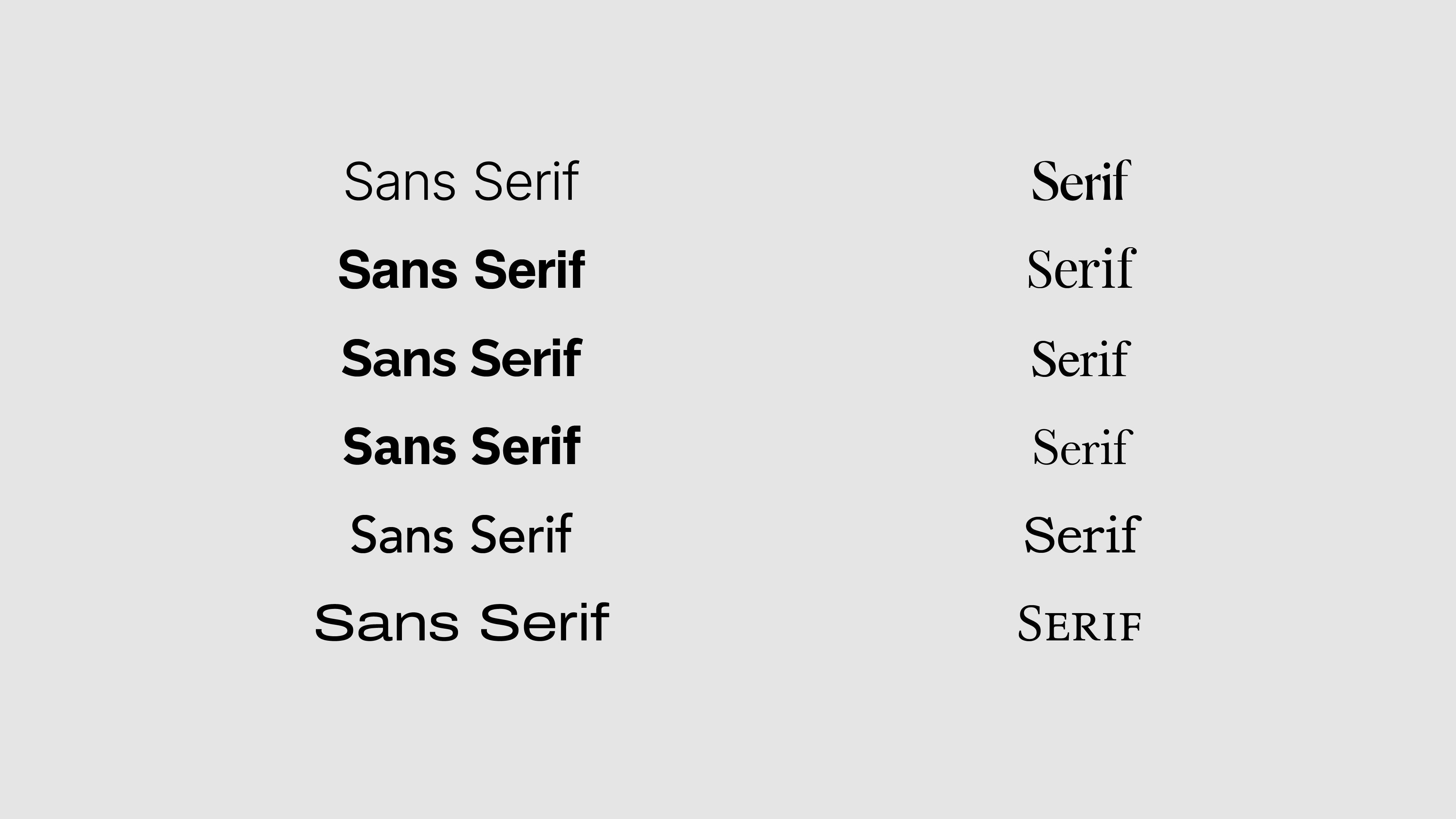
Stroke contrast
Serif typefaces typically have higher stroke contrast — meaning the thick and thin parts of a letterform vary noticeably. Look at the letter "O" in a classic serif: the left and right sides are thinner than the top and bottom. That modulation comes directly from calligraphic tradition, where a broad-nibbed pen naturally creates variation depending on the angle of the stroke.
Sans-serif typefaces, especially geometric ones, tend toward monolinear strokes — more uniform thickness throughout. Some humanist sans-serifs retain a subtle contrast, but it's much less pronounced.
Axis and stress
Related to stroke contrast is the concept of stress axis — the imaginary line you'd draw through the thinnest points of a rounded letterform like "O" or "C." In old-style serifs, that axis is diagonal, echoing the angle of a calligrapher's pen. In transitional and modern serifs, it becomes more vertical. In most sans-serifs, stress is minimal or symmetrical.
This is a small thing to notice, but it's the kind of detail that separates a typographer from someone who just picks fonts.
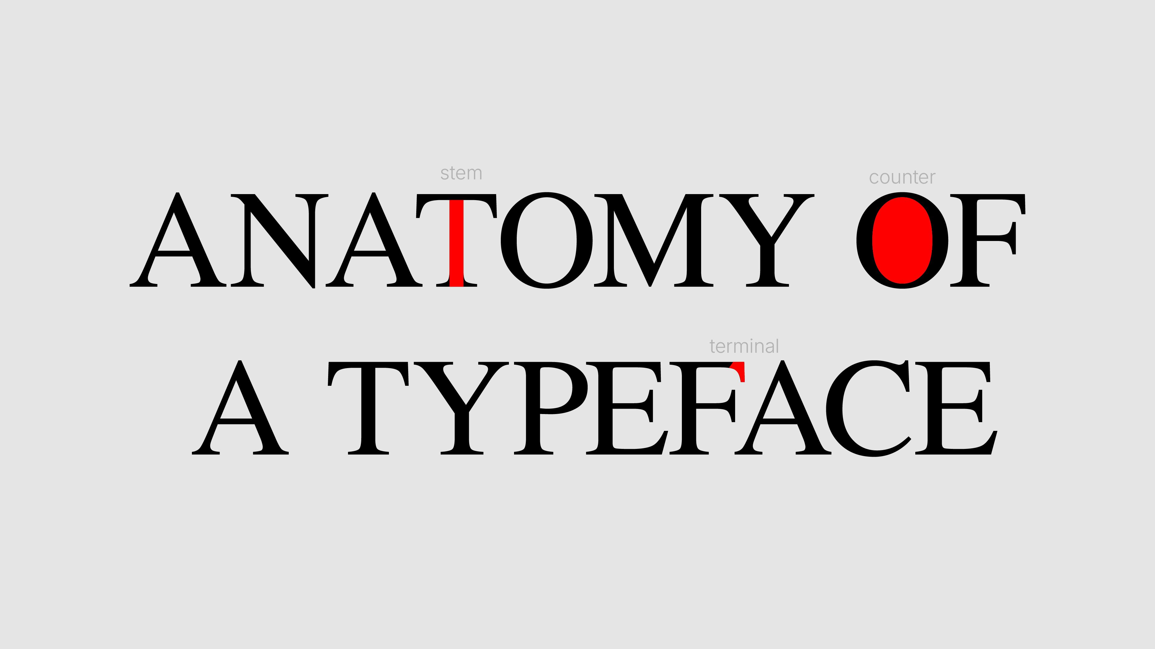
Quick glossary
- Terminal: the endpoint of an open stroke (like the top of a "f" or the end of a "c"). Can be flat, rounded, or diagonal.
- Stem: the main vertical stroke of a letterform.
- Counter: the enclosed or partially enclosed space inside a letter (the hole in "o", the bowl in "b").
These elements behave differently across serif and sans-serif families — and they're what give each typeface its actual personality.
How serif vs. sans-serif actually feel — and why
There's a tendency to talk about type personality like it's fixed. Serifs = traditional, trustworthy, editorial. Sans-serifs = modern, clean, digital. And honestly, that's not wrong — it's just incomplete.
Those associations exist because of decades of usage patterns. Serifs dominated books, newspapers, and legal documents for centuries. Sans-serifs came to define modernist design movements, UI systems, and tech branding. We absorbed those contexts. The feelings followed.
But context rewrites the rules constantly. A serif like Canela feels contemporary and fashion-forward. A sans-serif like Helvetica can feel bureaucratic and cold. The typeface doesn't carry the meaning alone — the weight, size, spacing, color, and surrounding design all participate.
What you can say with more confidence is that serifs tend to carry a sense of narrative weight — they feel like they have something to say, something that's been around. Sans-serifs tend toward functional clarity — they get out of the way, which is exactly what you want in interfaces, signage, or anything where reading needs to happen fast.
Neither is better. They're calibrated for different jobs.
The readability debate (it's more complicated than you think)
You've probably heard this one: serifs are more readable in print, sans-serifs are better on screen. It's been repeated so many times it feels like law.
It isn't.
The idea came from early screen resolution research, when pixels were large and serifs rendered poorly at small sizes on low-DPI displays. That was a real constraint. But screens have changed dramatically — high-DPI displays now render fine serif detail cleanly, and plenty of long-form reading happens in serif type on digital surfaces every day.
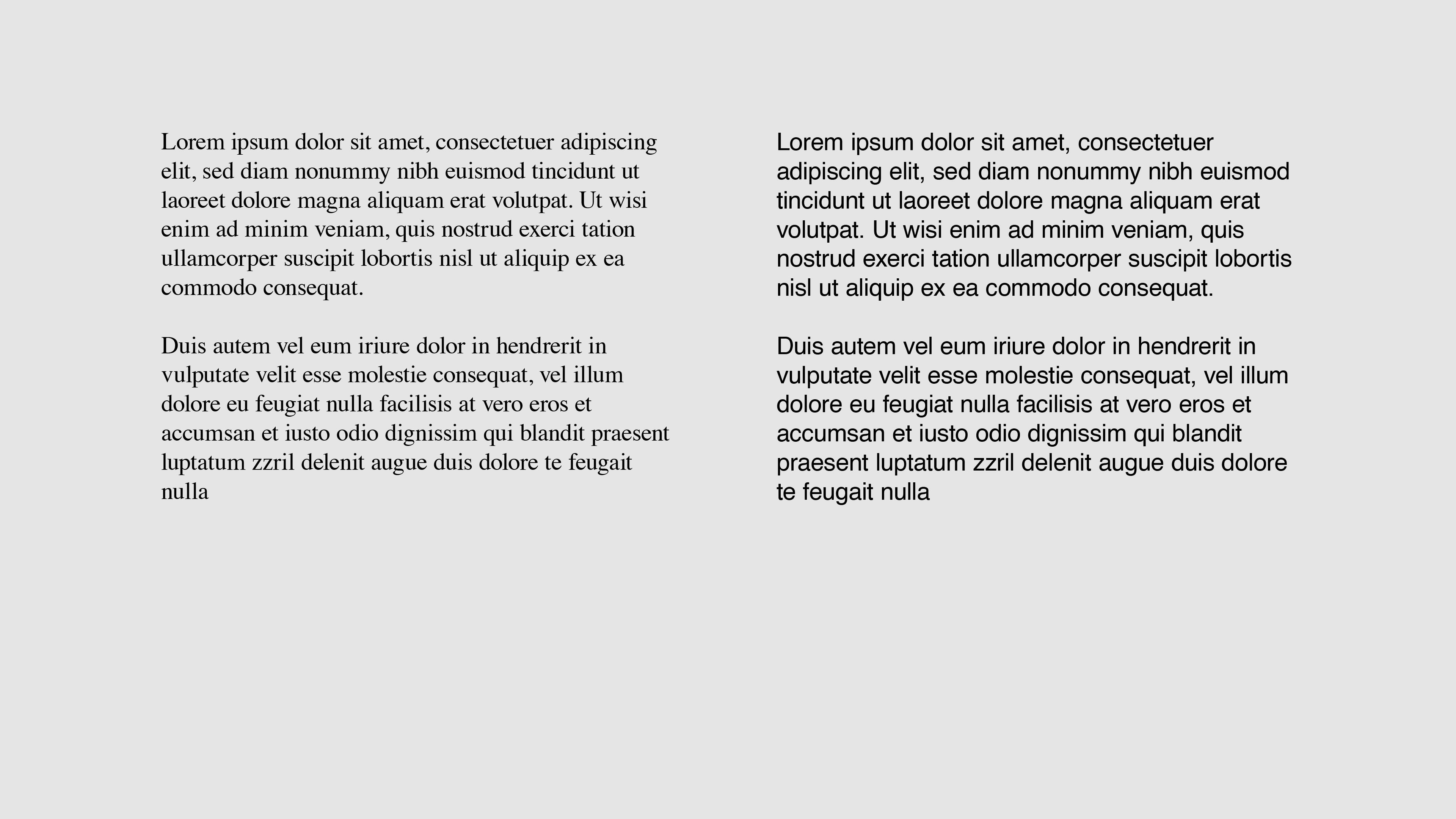
On the print side, the research is murkier than the rule implies. Studies on readability in body text have found that familiarity and typesetting quality matter far more than whether there's a serif present.
What actually drives readability:
- Size — is it large enough for the context and the audience?
- Line length — too wide or too narrow breaks reading rhythm
- Leading — the space between lines needs room to breathe
- Contrast — text against background, always
- Weight — regular weight reads better in long passages than light or bold
Serif vs. sans-serif is a factor. It's just rarely the decisive one.
How to actually choose between them
When you're in front of a blank brief and you need to pick a direction, three questions tend to cut through the noise:
1. What's the tone of this piece?
Does it need to feel authoritative, literary, or classic? Serif is worth exploring. Does it need to feel precise, functional, or neutral? Sans-serif probably leads.
2. What's the context and medium?
Long-form editorial, books, or high-end print? Serifs have history here. UI, apps, wayfinding, or screen-first content? Sans-serifs have been doing this work for decades.
3. What else is in the system?
If you're pairing typefaces, the contrast between a serif and a sans-serif is one of the most reliable combinations in typography. One carries the narrative, the other handles the utility.
Our honest take: the serif vs. sans-serif decision is rarely about which one is "better." It's about which one fits the job, the brand, and the medium — and then executing it well. A poorly set sans-serif will always lose to a well-set serif, and vice versa.
The skill isn't in picking the right family. It's in knowing why you picked it.
Serif or sans-serif: where they each belong
To put it plainly:
Serifs tend to work well when the content is long-form, the brand leans traditional or editorial, the medium is print or high-resolution, and you want the type to feel like it has history behind it.
Sans-serifs tend to work well when clarity and speed matter most, the brand is modern or functional, the medium is screen or small sizes, and you want the type to step back and let the content lead.
The overlap is real, the exceptions are constant, and the best typographers break these patterns intentionally — not randomly. That's the difference.