June 25, 2026
THE BRANDS THAT GET IT RIGHT BUILT THEIR WEBSITE AND IDENTITY AS ONE THING
A brand that lives on a great product and dies on a mediocre website is a brand that's working twice as hard for half the result. Here's why your visual identity and your digital experience need to be designed as one thing — not two.
There's a version of this story we've all seen. A brand with a genuinely sharp identity — strong logo, clear personality, maybe even beautiful packaging — that lives on a website that looks like it was built on a free template in 2019. The disconnect is immediate. You land on the site and something feels off, even if you can't name exactly what. That feeling? That's the cost of treating branding and web design as two separate problems.
They're not. They never were.
Two Things That Are Usually Built Separately (And Shouldn't Be)
The typical business trajectory goes something like this: hire a designer (or an agency) to build the brand, get the logo, the colors, the fonts, maybe a brand guide. Then, a few months later — sometimes years later — hire someone else to build the website. Different vendor, different moment, different creative logic.
The result is predictable. A beautiful mark sitting on top of a site that has no idea what the brand is actually about. Generic stock photography. A typeface that almost matches. A tone of voice that's trying to sound like the brand but landing somewhere between corporate and forgettable.
This isn't just an aesthetic problem. When a potential customer encounters your brand in one place — social media, a physical product, a referral — and then lands on your website, they're completing a mental handshake. Is this the same brand I just saw? If the answer feels like "sort of," you've already lost some of the trust you worked to build. Consistency is not a nice-to-have. It's the mechanism through which brands become believable.
What Happens When Brand and Web Are Actually One Thing
When a brand identity and a website are designed as a single system, something shifts. The site stops being a place where the brand is displayed and starts being a place where the brand exists. There's a difference, and it's a significant one.
A design system — when it's built properly — means that every decision has a shared source: the color palette isn't just applied to the homepage hero, it defines hover states and button behaviors. The typeface hierarchy isn't just for headings, it shapes how information is revealed as you scroll. The illustration style isn't decoration slapped on a page, it's the visual language the entire interface speaks.
This is what separates brands that feel complete from brands that feel assembled. Completeness is a systemic quality. You can't fake it by making the website "match" the logo. It has to be designed from the same set of principles, with the same intentionality, by people who understand both disciplines.
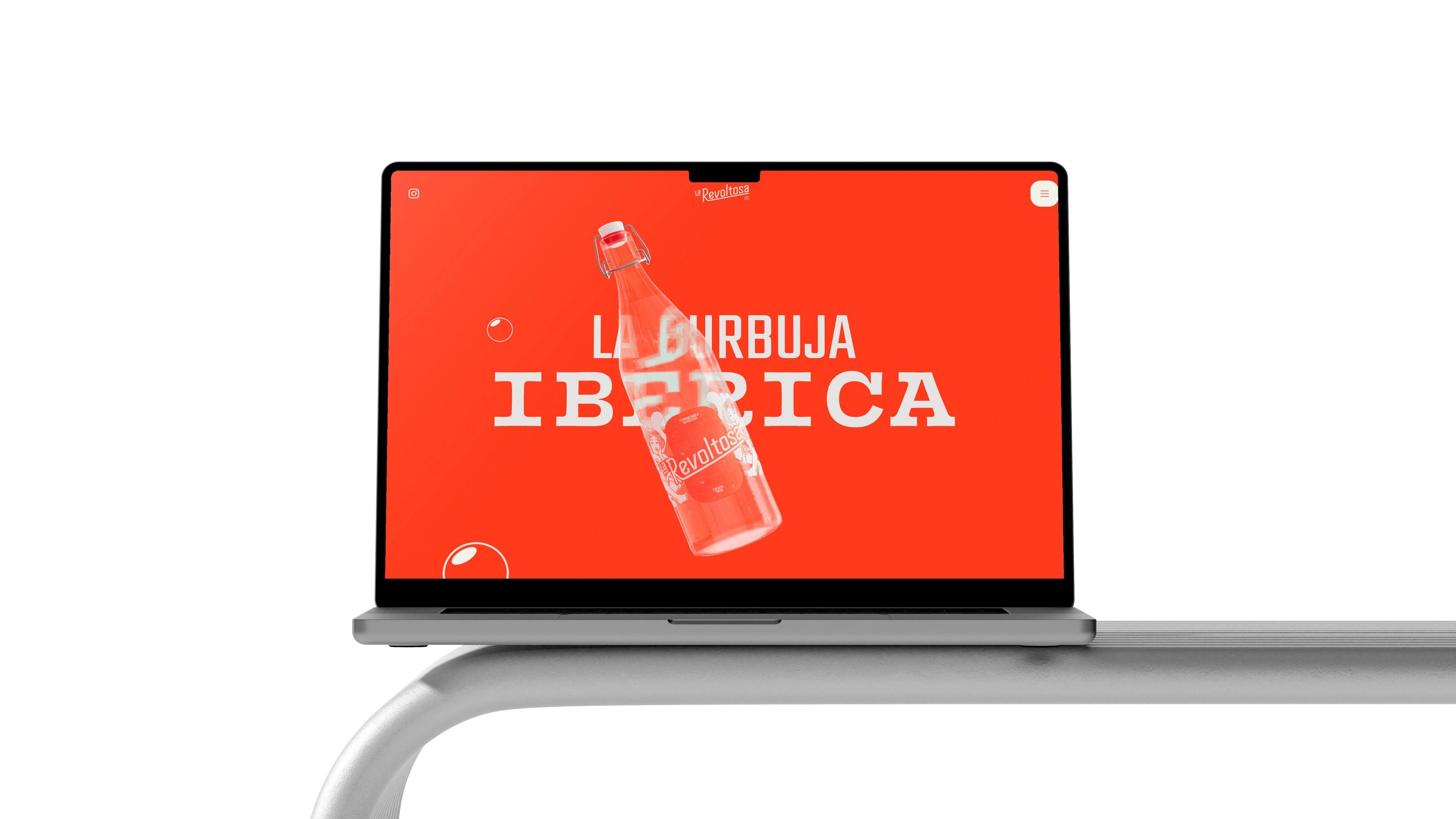
La Revoltosa — When a Brand Becomes an Experience
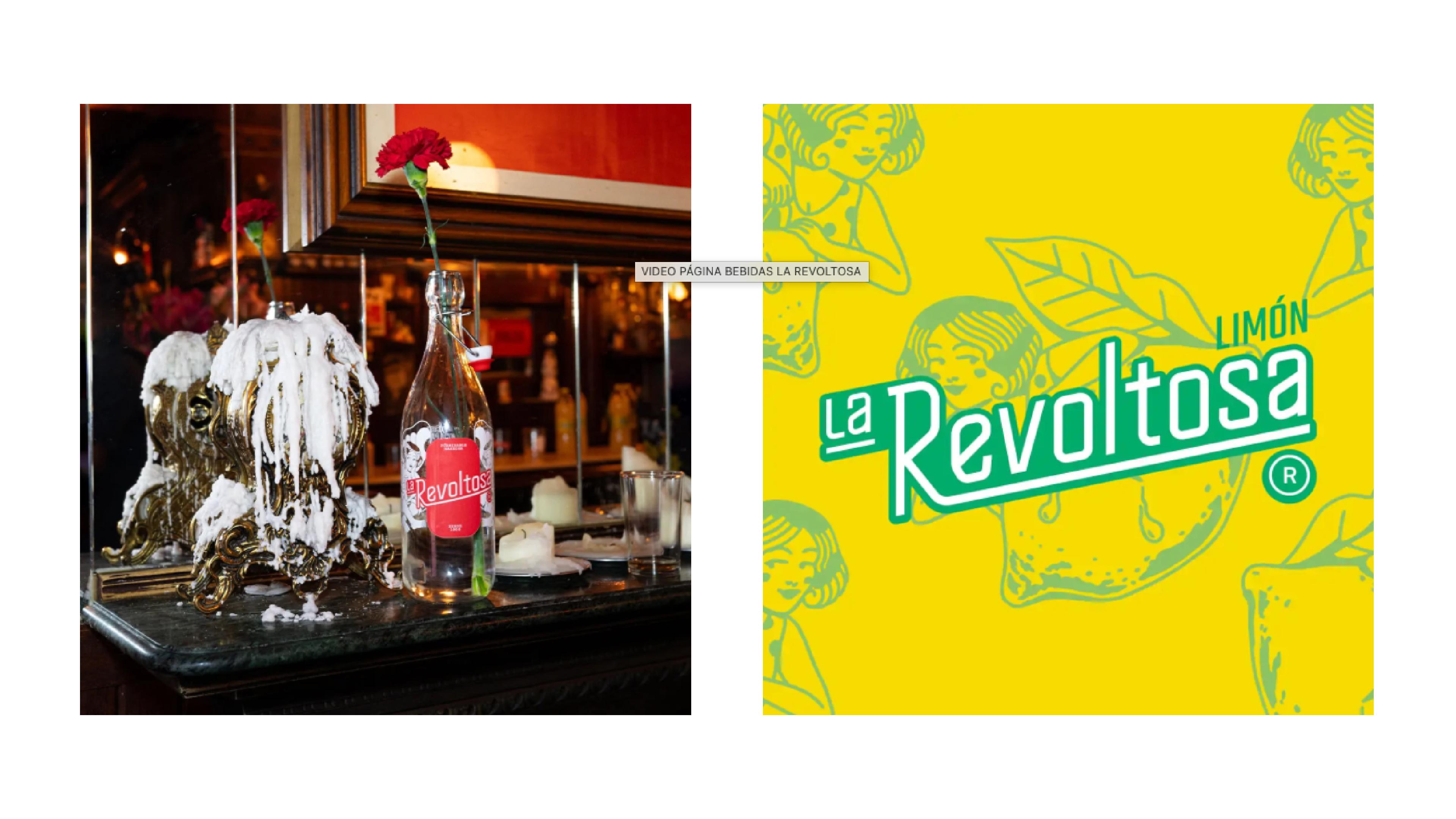
La Revoltosa is a Spanish sparkling water brand, and it's one of the cleaner examples we've seen recently of a brand and a website operating as one coherent thing.
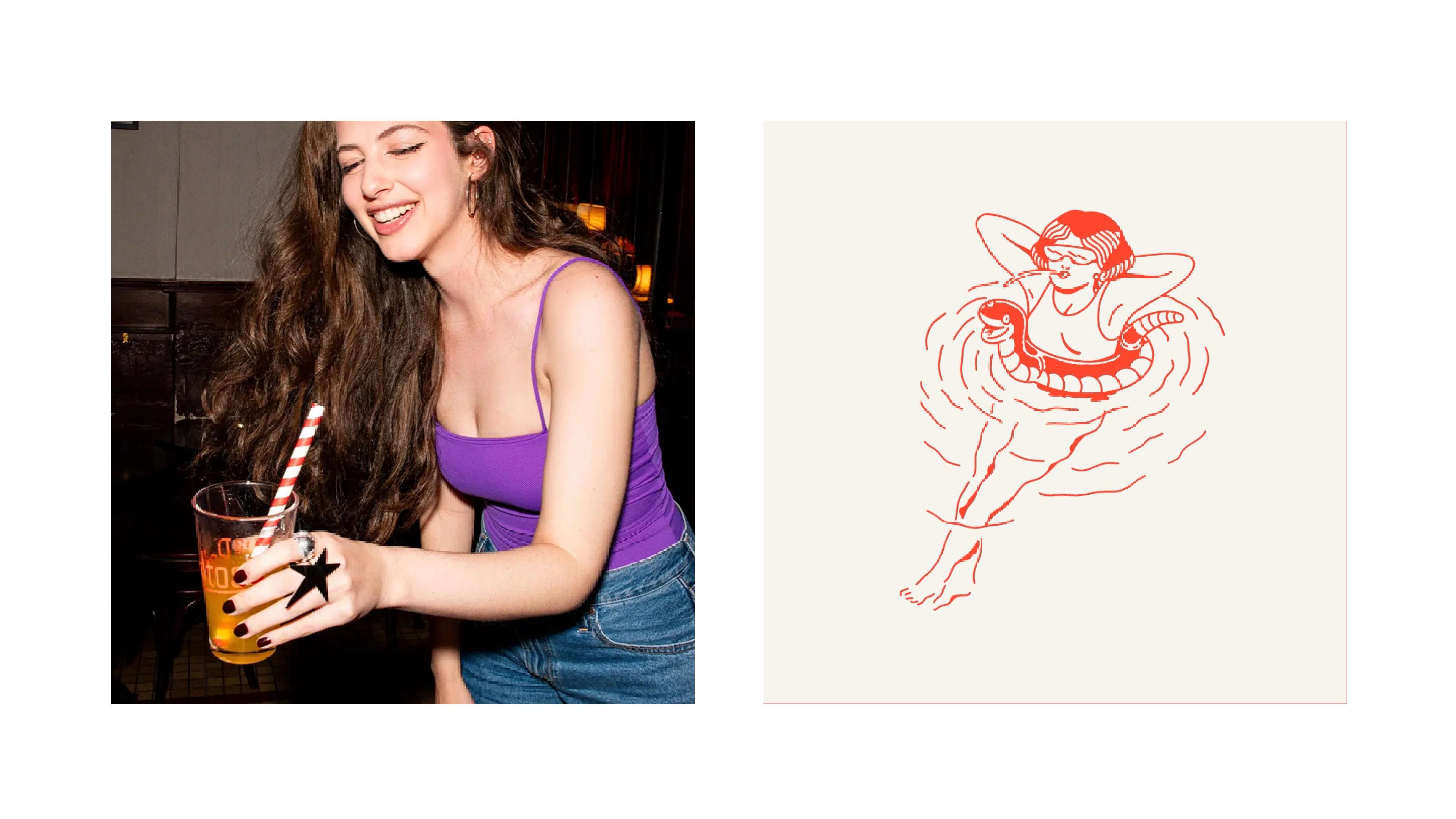
The identity is bold and immediately legible: a dominant red, a hand-drawn illustrative character with real personality, a logotype that mixes script and structure in a way that feels vintage without being nostalgic. The physical product — the bottle, the label, the whole object — carries this language with confidence. You pick it up and you know exactly what kind of brand this is.
Then you go to the website, and the world doesn't change. It expands.
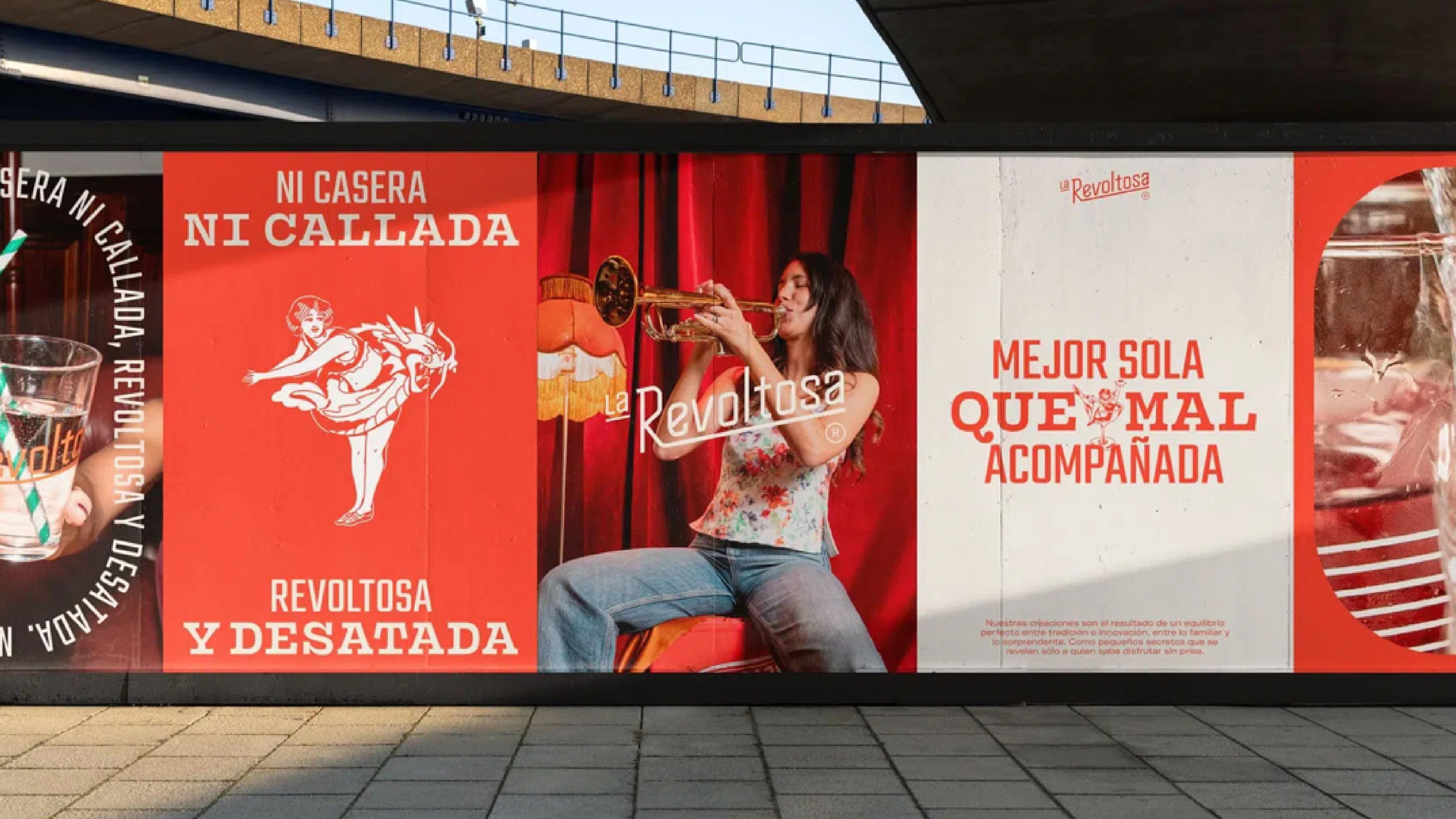
The same red. The same illustration system — now animated, now scroll-driven, now interacting with you. The character from the label becomes a figure on the screen, moving through the narrative of the brand as you scroll. The copy speaks in the same voice the packaging implied: direct, warm, a little irreverent. "Dime qué necesitas, cariño." That's not a UX copywriting decision made in isolation. That's a brand voice applied consistently across every touchpoint, physical and digital.
What La Revoltosa does well is treat the website as a continuation of the brand experience rather than a summary of it. You're not reading about the product. You're inside it.
A Website Is Not a Brochure — It's a Living Brand
Here's where most conversations about branding and web design stop short: they treat the website as a canvas for the brand rather than as a medium with its own expressive vocabulary. And that vocabulary is just as rich and just as demanding as anything in visual identity.
Interaction design, scroll behavior, microinteractions, animation timing, loading sequences — these are not technical details. They are personality. A brand can be bold or quiet, fast or deliberate, playful or serious. A well-built website expresses all of those qualities through how it moves, not just how it looks. The easing curve on an animation is a brand decision. The way a page reveals content as you scroll is a brand decision. Whether buttons bounce or fade or do nothing at all — brand decision.
Think about it the same way you think about typography. A typeface communicates tone before a single word is read. An interaction communicates personality before a single click is made. Both require craft. Both require intention. And both go completely unnoticed when they're done right — which is exactly the point.
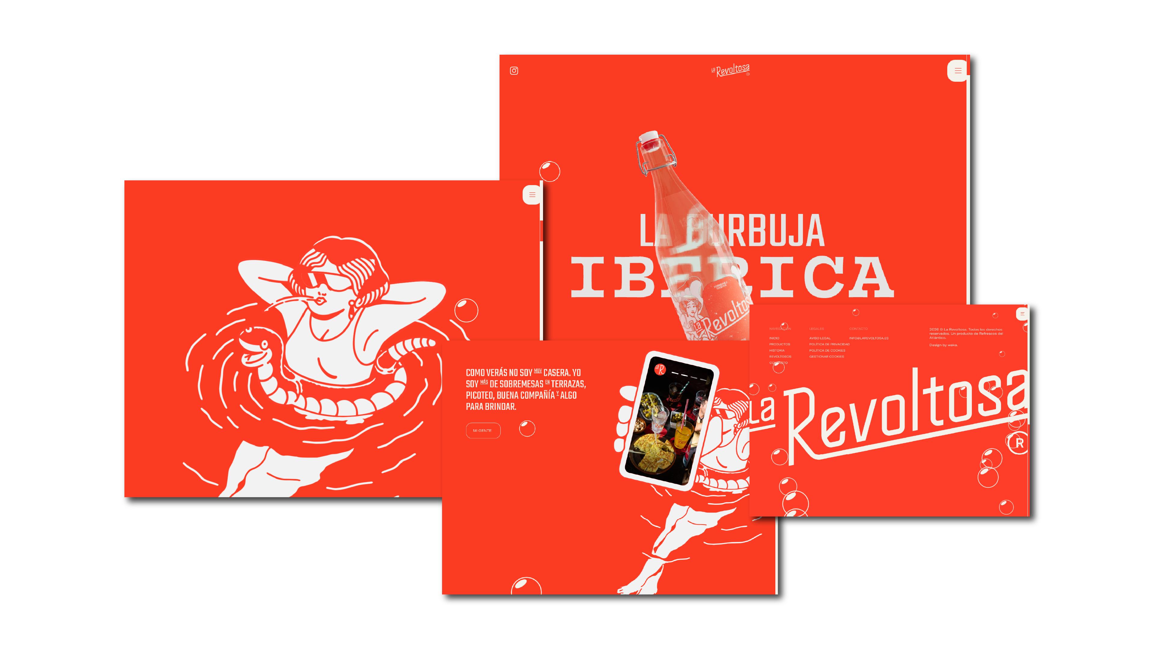
La Revoltosa's scroll experience isn't impressive because it's technically complex. It's impressive because every interaction feels in character. The animations have the same energy as the illustrations. The pacing of the narrative matches the brand's personality. Nothing is there because it looked cool in a reference deck. Everything earns its place by serving the brand's emotional logic.
That level of coherence doesn't happen by accident. It happens when the people building the website understand the brand deeply enough to translate it into motion, time, and behavior — not just color and type.
If Your Site and Brand Don't Feel Like the Same World, Start Here
You don't need to be a beverage brand with a full illustration system to think this way. The principle applies whether you're a hospitality group, a creative studio, a retail brand, or a professional services firm. The question is always the same: does someone who encounters your brand and then visits your website feel like they've stayed in the same world?
If the honest answer is no — or even "kind of" — here are three things worth reviewing tomorrow:
1. Does your website actually use your brand's type and color system, or just approximate it? There's a difference between "we used the right hex code" and "type hierarchy, spacing, and color relationships are consistent across every element." The latter takes more work. It's also what makes a site feel like a brand rather than a website with a logo on it.
2. Does the tone of your website copy match your brand voice? If your brand feels warm and direct but your website copy sounds like a legal document, the brand is breaking. Voice is a system too, and it has to carry across every screen.
3. Is there a visual or interactive element on your website that could only belong to your brand? For La Revoltosa, it's the illustration system and the scroll narrative. For your brand, it might be something else — a photography style, a motion language, a way of revealing information. If the answer is "not really," that's the gap worth closing.
This is the work we care about at Attlas: building brands and websites that were always meant to exist together. Not a logo and a site. One thing, expressed across every surface.