June 20, 2026
PSG BROUGHT ART SCHOOL STUDENTS TO DESIGN THEIR CHAMPIONS LEAGUE POSTERS. IT WORKED.
When a football club hands its Champions League visual identity to art school students, one of two things happens: it's a PR stunt, or it's genuinely good. PSG and Penninghen managed the second one.
Most sports clubs treat visual communication like a logistics problem. Get the badge in. Get the sponsor logo in. Make it feel big. Ship it. PSG did something different — they handed a Champions League brief to students from Penninghen and École Camondo, two of France's most respected design and art direction schools, and got back something that looks nothing like football marketing. It looks like art.
That's worth paying attention to.
Most Sports Design Is Forgettable by Design
There's a reason Champions League matchday graphics all start to look the same after a while. The visual language of elite football is built around a specific set of objectives: hype, reach, brand safety, and sponsor visibility. The result is content that performs well on Instagram for 48 hours and disappears completely from memory by the next fixture.
This isn't incompetence — it's optimization. Club marketing teams are working against real constraints: tight timelines, approval layers, brand guidelines that can't be touched, and a content calendar that never stops. Under those conditions, creative risk is genuinely expensive. So the default becomes: bold typography, dramatic player photography, gradient overlays, and a color palette locked to the club's identity system. It works. It just doesn't stick.
The Champions League amplifies this. The tournament has its own visual ecosystem — the anthem, the starball, the typeface — and clubs tend to operate within it rather than against it. Which makes what PSG did with Penninghen feel like a genuine break from pattern.
What PSG and Penninghen Actually Did
Penninghen is a Parisian school with a serious pedigree in communication design, art direction, and interior architecture. École Camondo, affiliated with the Musée des Arts Décoratifs, sits in a similar space — rigorous, fine-arts-adjacent, with a design culture that leans toward concept over execution speed.
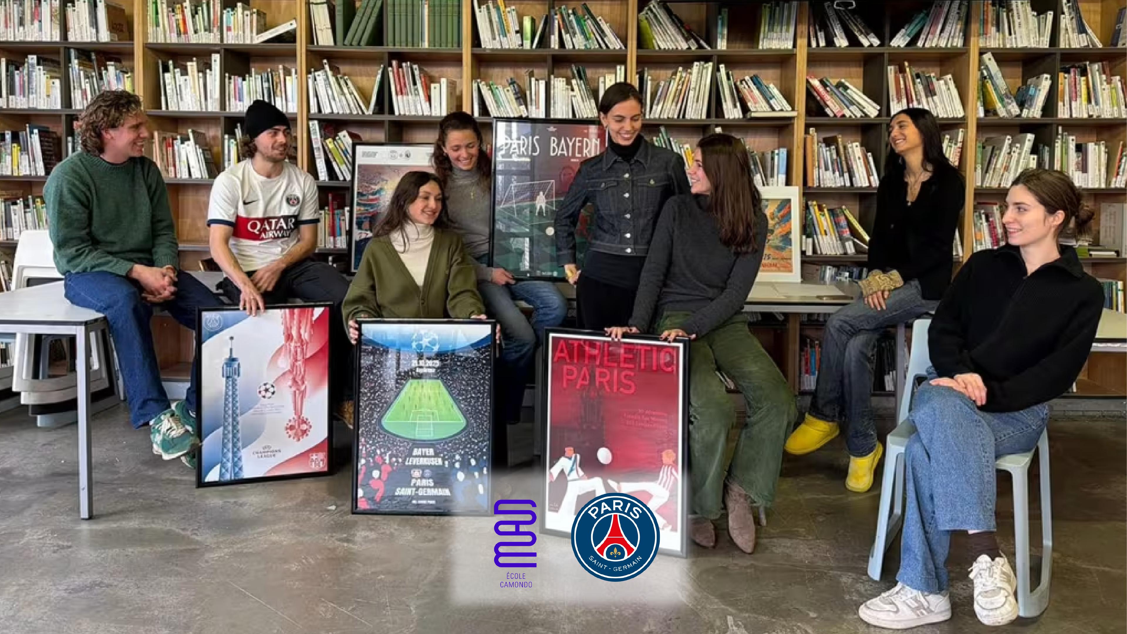
The partnership put Champions League match posters in the hands of students from these programs. Not interns. Not junior designers at an agency with PSG on retainer. Students, working with the kind of creative freedom that professional environments rarely allow, handed a brief that presumably said: this is PSG, this is the Champions League, now make something.
What came back wasn't a content package. It was a poster series — the kind of work where you can feel a point of view in every compositional decision.
Why Student Work Hit Different
There's something specific that happens when you give a high-profile brief to people who don't yet have professional scar tissue. No fear of the client. No memory of the last time a bold idea got killed in review. No instinct to self-censor toward safety.
Student designers — especially ones trained in environments like Penninghen or Camondo — are working from a different set of references. Art history, editorial design, photography, architecture. The influences bleed into the work in ways that agency output, optimized for brand consistency, tends to smooth out.
The result is a series of posters that feel authored. Each one has a specific visual argument: a choice about hierarchy, about negative space, about what the image is actually doing versus what it's supposed to illustrate. That's the difference between design as decoration and design as communication.
It's also, frankly, a smarter credibility move than most clubs realize. When PSG's visual identity sits next to work produced in collaboration with established French design institutions, it signals something about what kind of cultural entity the club wants to be. Not just a football team. A Parisian institution.
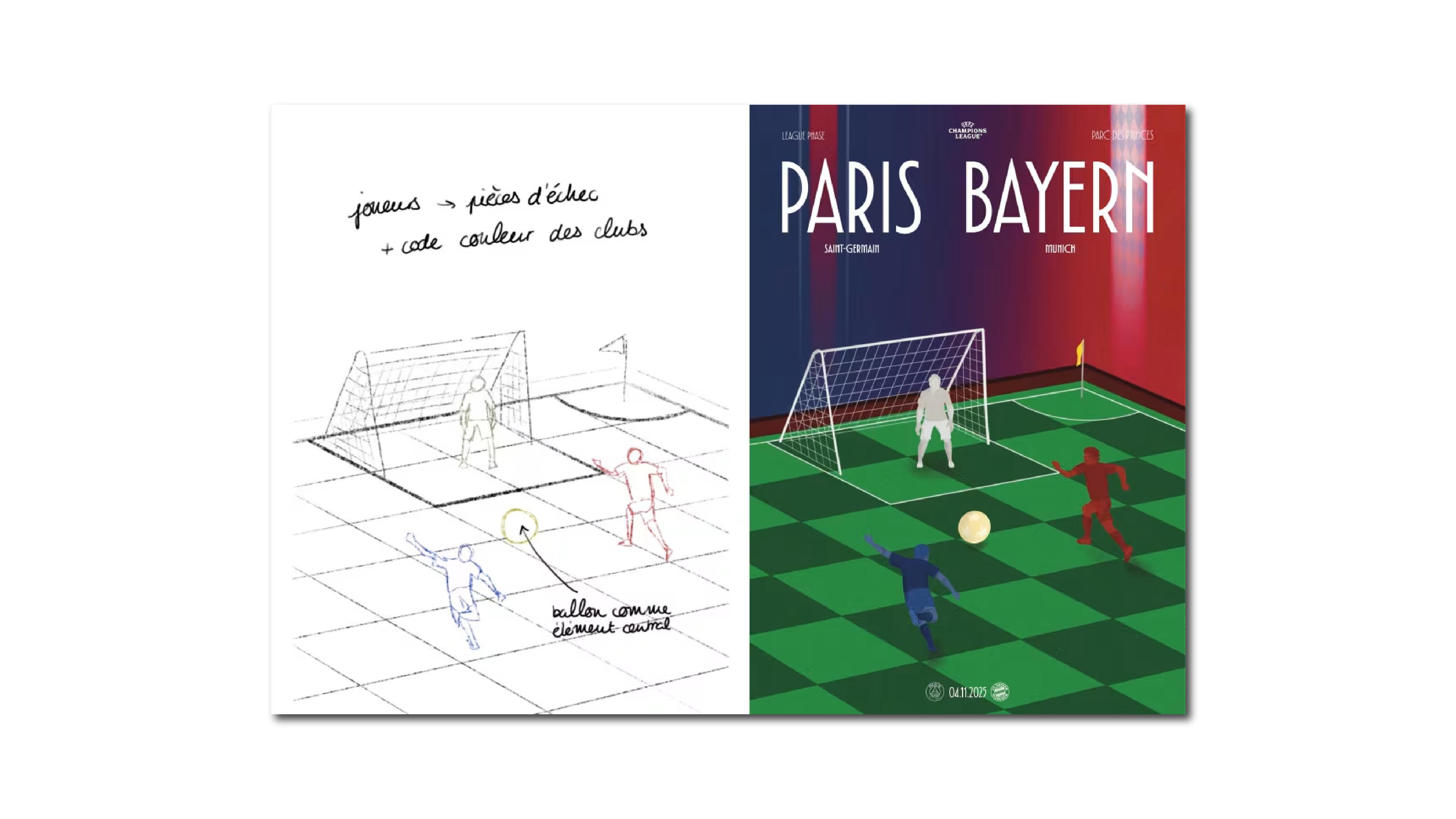
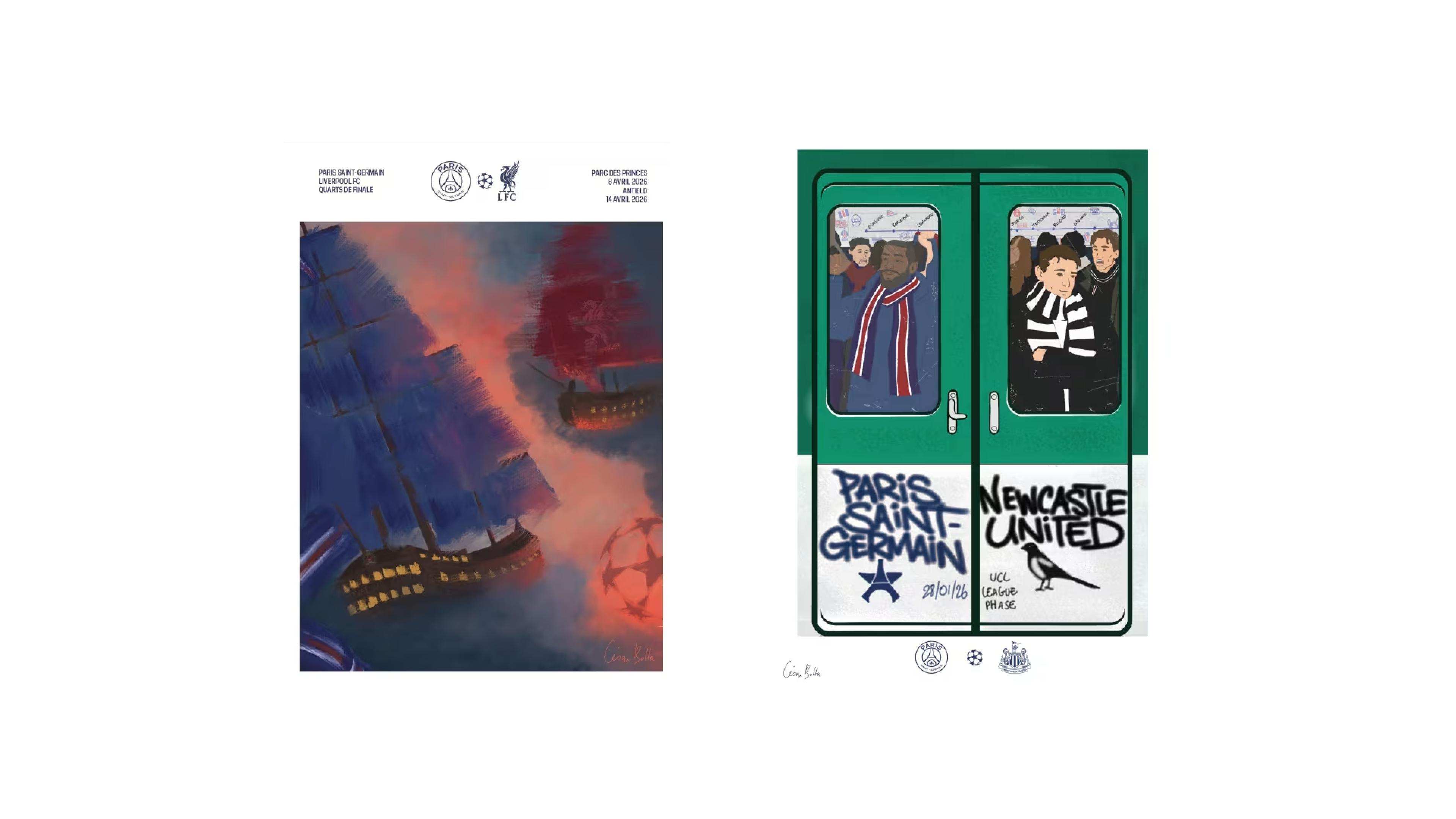
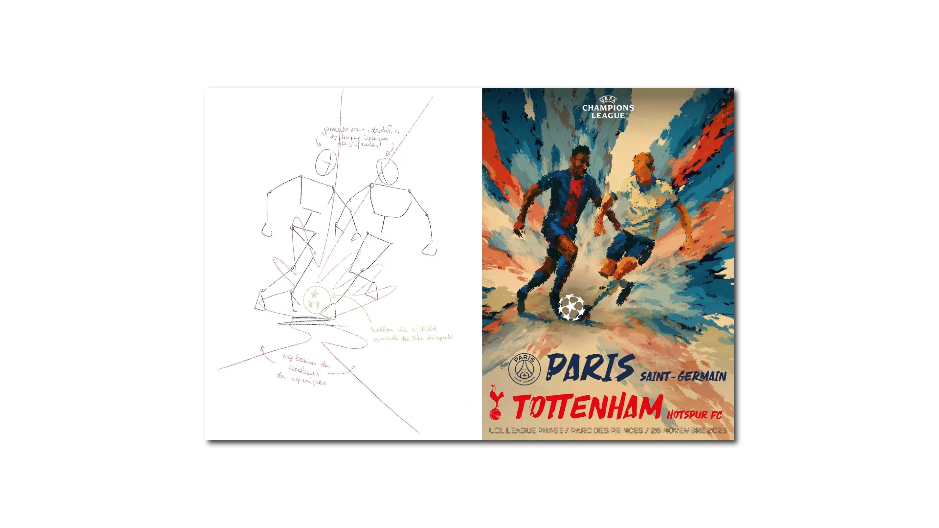
The Posters, Up Close
Looking at them as a set, a few things stand out compositionally. The restraint. The willingness to leave space. The sense that each poster was built around a single idea rather than a checklist of elements that needed to fit in frame. Typography is treated as image, not label. Player photography, when it appears, is cropped and placed with intention — not just dropped into a template.
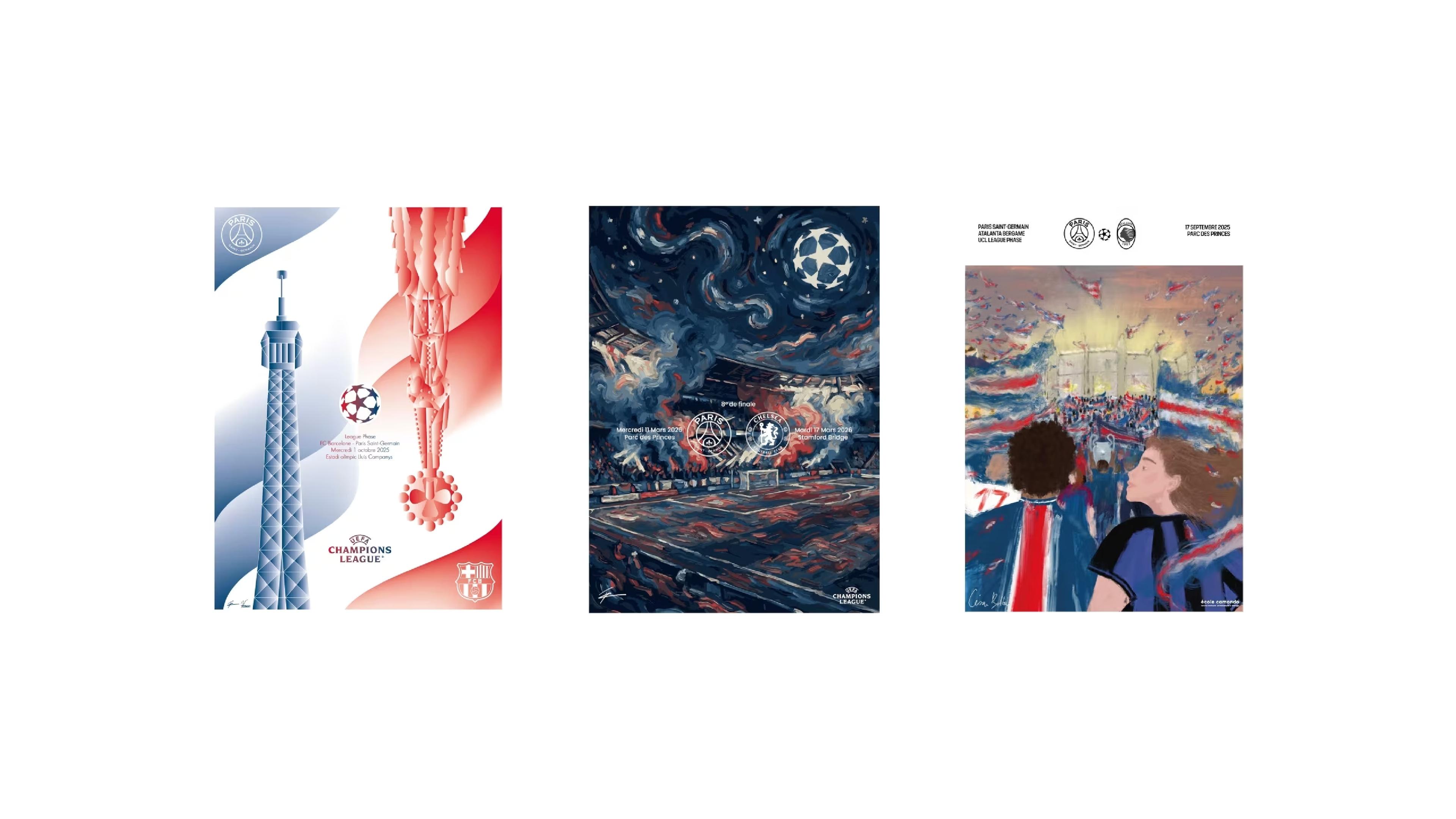
These aren't posters that announce a game. They're posters that make an argument about what the game means.
What This Tells Us About Sports Branding Right Now
The most interesting thing about the PSG-Penninghen project isn't the posters themselves — it's the decision behind them. Someone inside PSG's organization looked at their Champions League communications and thought: what if we approached this like a cultural institution instead of a marketing department?
That framing shift is significant. Museums commission artists. Festivals commission designers. Fashion houses collaborate with fine arts programs. Sports clubs, historically, have not thought of themselves as operating in that space — but the ones building long-term cultural relevance are starting to.
The lesson isn't "hire art students." It's more precise than that: when you give real creative authority to people with real creative training, you get work that doesn't look like everything else. And in a visual landscape where most sports content is indistinguishable from the next club's feed, looking different is a competitive advantage.
A few clubs have understood this for years — Juventus's rebrand, Ajax's long history of design consciousness, Athletic Club Bilbao's visual identity. PSG just added a strong entry to that list. Not with a rebrand. With a poster series produced by students who weren't trying to play it safe.
That's the move worth stealing.
*All images retrieved from: https://www.psg.fr/psg-x-ecole-camondo-ldc-25-26