June 18, 2026
FORTY YEARS OF GRAPHIC DESIGN, PRINTED ON A BALL
The World Cup ball is released every four years and forgotten four years later. But line them up and you have an accidental archive of graphic design trends — one per era.
Every four years, Adidas drops a ball. Everyone has an opinion about it for about two weeks, and then the games start and nobody thinks about the graphic design anymore. But here's what's interesting: if you line up every World Cup ball from 1970 to 2026 and look at them purely as designed objects — the patterns, the color choices, the visual language — you get a remarkably honest timeline of how graphic design has moved across five decades. No client briefs, no brand committees. Just the aesthetic sensibility of each era, printed on a sphere.
The Accidental Icon — 1970s
The Telstar, introduced at the 1970 Mexico World Cup, wasn't designed to be beautiful. The black pentagons and white hexagons were chosen for one practical reason: contrast on black-and-white television. That's it. There was no visual identity brief, no brand strategy, no attempt to make the ball "feel premium."
And yet, the Telstar became the most visually durable sports object ever designed. Ask anyone to draw a soccer ball and they will draw a Telstar. It became the mental model — the Platonic form of the object — entirely by accident. This is worth sitting with: the most iconic graphic design decision in soccer history was a functional call, not a creative one.The lesson for designers isn't that you should avoid intention — it's that visual systems with a clear, logical reason tend to outlast visual systems designed purely for aesthetics.
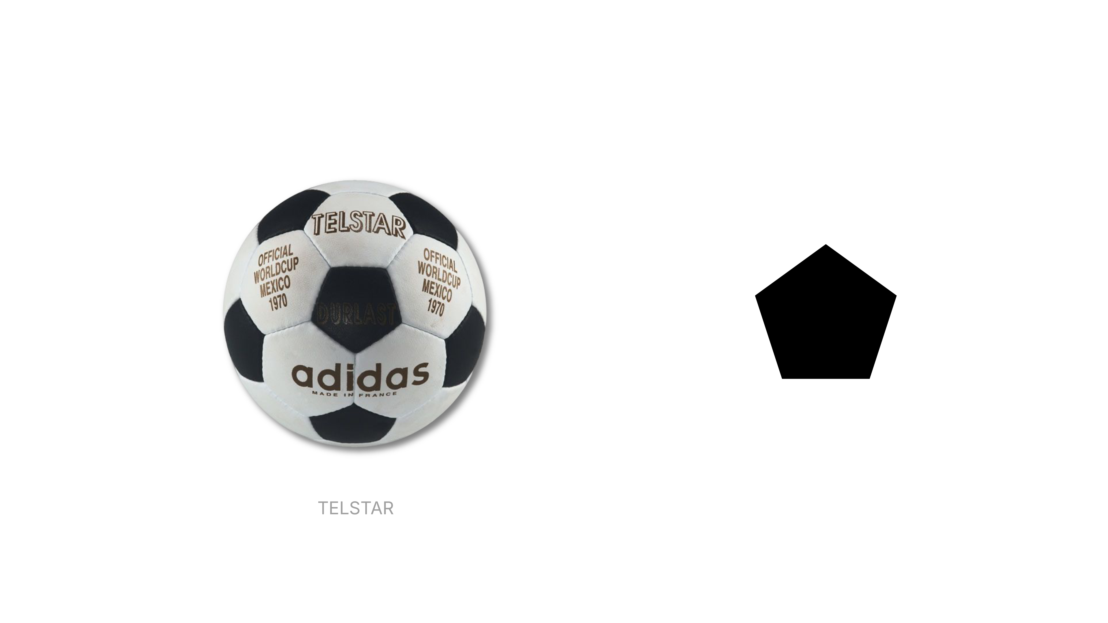
The Telstar's geometry is also, in retrospect, genuinely elegant. The truncated icosahedron pattern has a mathematical coherence that gives it a timeless quality. It doesn't belong to any era. It just is.
The Illustration Era — 1980s and 1990s
This is where things get interesting. Once the Telstar had established the structural logic of the ball, subsequent designers started treating those panels as a canvas for cultural storytelling.
The Azteca (Mexico 1986) was the first real departure. Its graphic motifs referenced Mesoamerican visual language — angular, geometric illustrations that echoed pre-Columbian design systems. Whether or not it was executed with deep cultural rigor is debatable, but the intent was there: the ball should say something about where the tournament was happening.
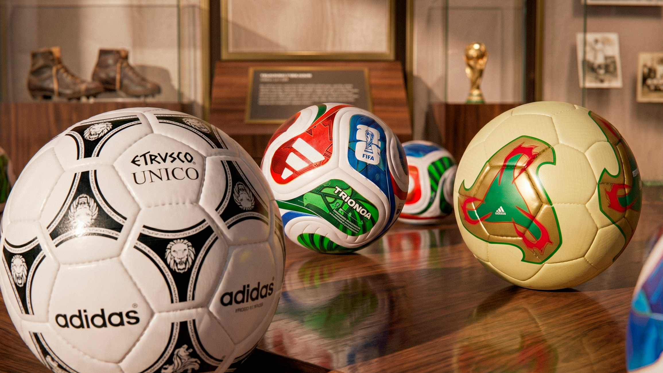
The Etrusco Unico (Italy 1990) pushed this further. Its surface featured a repeating motif of stylized Etruscan lion heads interlocked in a geometric pattern — a sophisticated piece of illustrative design that held up at small scale and at full size. It's probably the most graphically accomplished ball of the era, and it looks as good today as it did then.
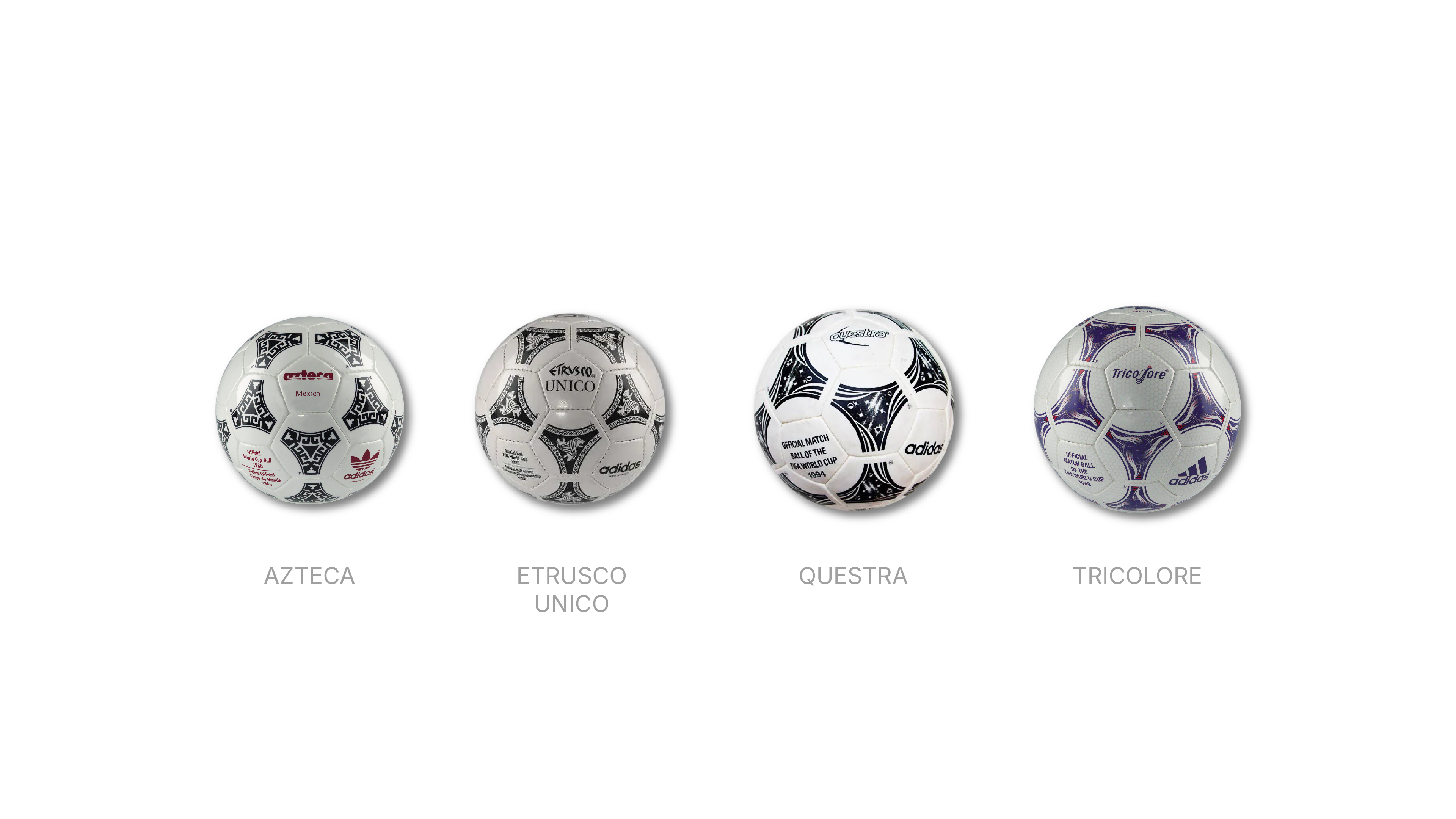
The Questra (USA 1994) and Tricolore (France 1998) continued the pattern, each carrying graphic marks tied loosely to the host nation. The Tricolore was the first World Cup ball to use color beyond black and white — the red and blue against a white base, with a graphic pattern that gestured toward the French flag. It felt slightly safer than its predecessors, but it still had a clear visual concept: color as identity, pattern as culture.
What unified this era was craft. The illustrations had weight and intentionality. You could feel that someone had made a decision about each line.
The Loud Years — Early 2000s
The Fevernova (Japan/South Korea 2002) is the ball that broke the formula — and not in a good way. Gone were the structured geometric patterns and culturally grounded illustration. In came asymmetric flame motifs, aggressive orange and red tones, and a graphic language that felt borrowed directly from early-2000s extreme sports branding.
It wasn't a bad idea in theory — try something expressive, break from the black-and-white convention — but the execution landed it squarely in the aesthetic of its moment. If you wanted to date the Fevernova without reading the year, you could do it in seconds. It has "2002" written all over it, in the same way that certain fonts, certain gradients, and certain logo treatments are immediately traceable to a specific cultural window.
The Teamgeist (Germany 2006) pulled back slightly. Fewer colors, more geometric, a pinwheel-like panel structure that read as modern without going loud. It was cleaner. But there was something slightly generic about it — the graphic logic felt more like product design than visual identity.
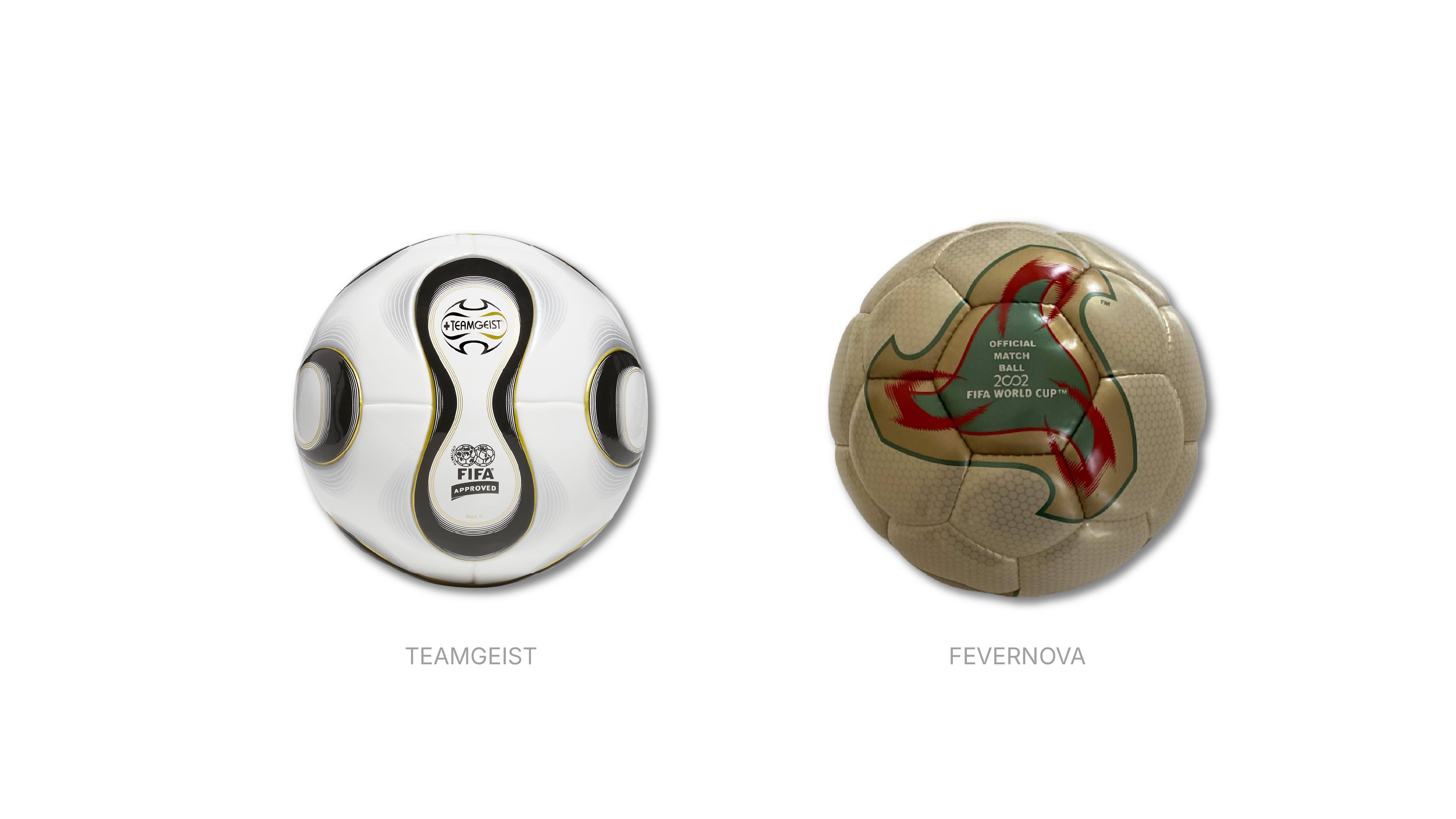
This era taught us something about the relationship between expressiveness and longevity. When a design chases the aesthetic energy of its moment too directly, it ages faster than designs with more internal logic.
The System Era — 2010s
The Jabulani (South Africa 2010) is infamous primarily for its aerodynamics, but graphically it was also a significant departure. Eight thermally bonded panels replaced the traditional 32-panel structure, and the graphic design followed the new geometry — abstract, angular, color-blocked in teal, gold, and black. The patterns were clearly tied to the South African context in terms of color palette, but the overall feel was more product system than cultural narrative.
The Brazuca (Brazil 2014) doubled down on this direction. Six interlocking panels, a graphic surface that functioned as a repeating modular system rather than an illustration. The colors — green, blue, gold, black, red — referenced Brazil, but the design language was abstract and geometric in a way that prioritized the system over the story. It looked like a well-designed tech product. It did not look particularly Brazilian.
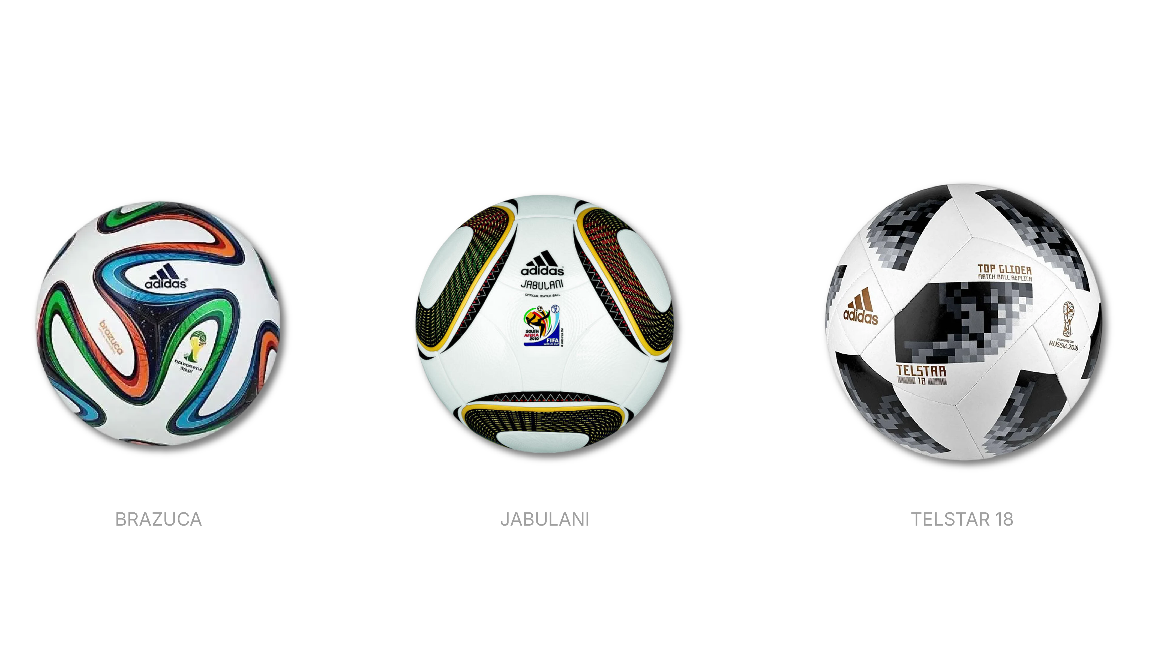
The Telstar 18 (Russia 2018) made this trend explicit by referencing the original Telstar, but rendering it in a pixelated, digital-noise graphic treatment. Flat black panels on white, with digital grain texture. It was clearly trying to connect legacy with contemporary graphic language — a respectable concept — but the execution felt like a design brief that read "retro meets digital" and went exactly where you'd expect.
The pattern across this era: graphic design retreating from cultural specificity toward abstract visual systems. The balls got cleaner. They also got less memorable.
2022 and 2026 — Where Does the Graphic Language Land?
The Al Rihla (Qatar 2022) was a genuine course correction. The name means "the journey" in Arabic, and the design drew directly from Qatari visual culture: the boat-like graphic forms, the bold geometric shapes in deep blue, red, black, and metallic, the architectural references. It had a point of view. It felt like it was made for a specific place and a specific moment without being reducible to a logo or a tourism poster.
More importantly, the graphic system on the Al Rihla had a sophistication that the system-era balls lacked. The shapes interlocked, the color palette was restrained and confident, and the overall composition worked at every angle — which matters on a spherical object in a way it doesn't on a flat surface. Designing for a sphere means your graphic has no fixed orientation. The Al Rihla handled this well.
The Trionda (2026) takes a different approach. The name means three (Tri) waves (Onda), and the ball features red, blue, and green designs paying homage to the three host countries: Mexico, the United States, and Canada. Graphically, each panel features the country colors which connect in the form of a triangle in the center, symbolizing three nations coming together, with iconography significant to each country — a star for the USA, a maple leaf for Canada, and an eagle for Mexico — featured as bold graphics on the panel designs, as well as being subtly embossed onto the matte base.
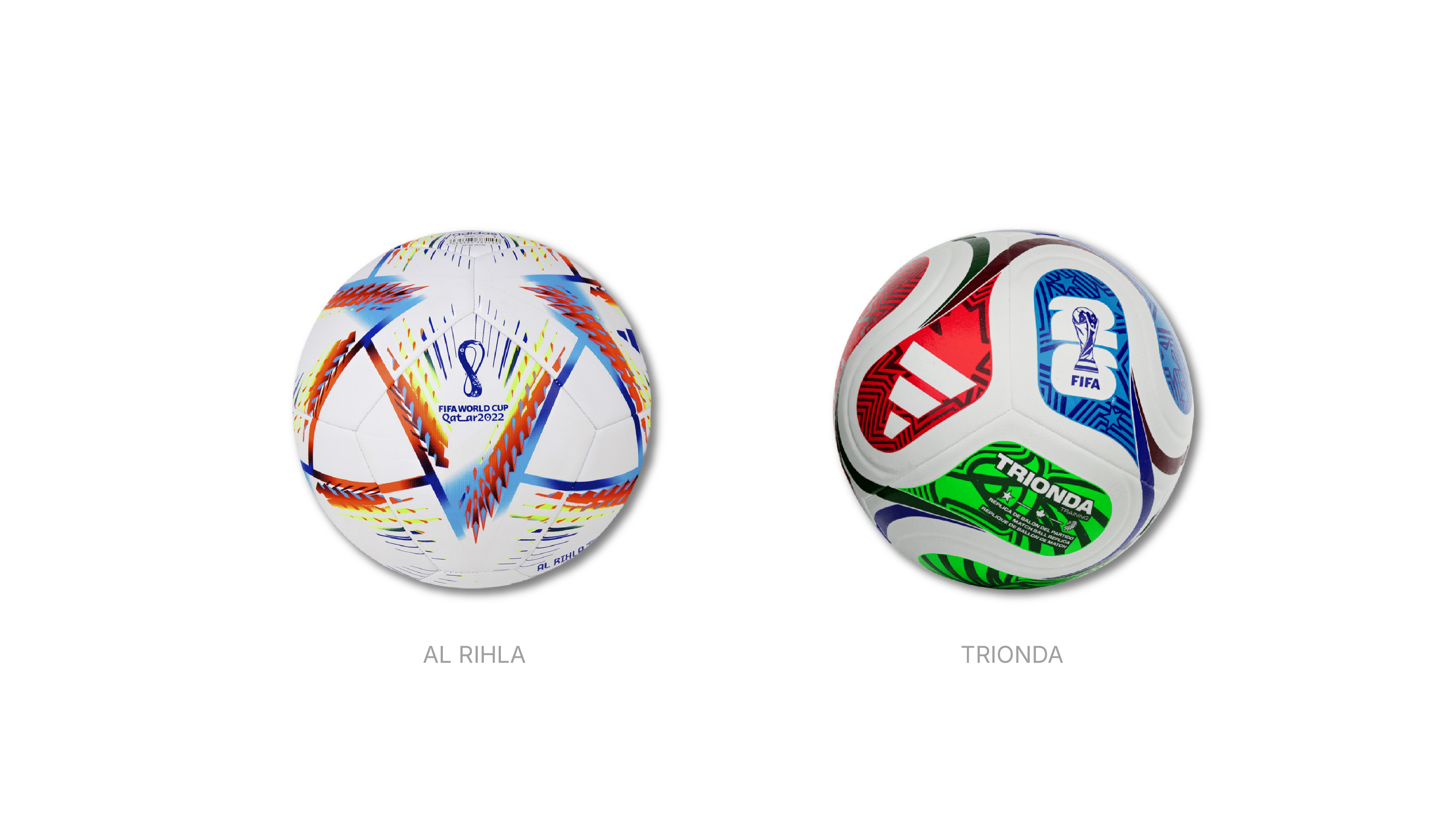
It's an ambitious brief: three countries, three color systems, one coherent visual object. The risk with this kind of multi-stakeholder design is that you end up with a composition that reads more like a committee decision than a creative one. Whether the Trionda avoids that trap is a matter of how its graphic logic holds up when the ball is in motion — which is, ultimately, the only context that counts.
What's notable is the return to iconography as graphic language — the eagle, the maple leaf, the star — after a decade of abstraction. That's a meaningful design choice, even if the execution is more maximalist than elegant.
What We Can Learn From This
Line up all fifty-plus years of World Cup balls and a few things become clear:
The most durable designs have internal logic. The Telstar works because the geometry is mathematically coherent. The Etrusco works because the illustration system is consistent and well-executed. The Al Rihla works because the graphic language has a source — Qatari visual culture — that gives it specificity. When a design is built on a clear concept rather than on trend-chasing, it holds.
Cultural reference is not the same as cultural decoration. The Azteca and Etrusco used cultural motifs with some graphic seriousness. The Fevernova used expressive energy borrowed from a commercial trend. The difference shows. Referencing a culture in a designed object requires understanding the visual grammar of that culture, not just borrowing a shape or a color.
Abstract systems age better than trend-driven expressiveness — but they risk being forgettable. The Brazuca is a well-designed ball. It is also completely impossible to place emotionally. The Fevernova is a badly dated ball. It is also absolutely memorable. There's a real tension there that every graphic designer navigates.
Designing for three dimensions forces rigor. A ball has no front. No fixed composition. The graphic has to work from every angle, in motion, under stadium lights and in close-up photography. The balls that succeed graphically are the ones whose designers clearly thought about this — where the pattern is a system, not a poster applied to a sphere.
Every four years, one of the world's most-watched objects gets a new graphic identity. Most people forget it by the quarterfinals. But for anyone who cares about how visual language moves through time, the World Cup ball is a surprisingly honest document — one that shows exactly where design thinking was, and what it was borrowing from, in any given moment.