June 16, 2026
THE NATIONAL TEAMS WITH THE STRONGEST VISUAL IDENTITY AT THE 2026 WORLD CUP
Forty-eight teams, one tournament, and a massive gap between the ones that showed up with a real brand story and the ones that just showed up. Here's our take on who's doing it right — and what we can learn from it.
Every four years, the World Cup becomes one of the most concentrated branding events on the planet. Forty-eight national identities — crests, color systems, kits, campaign videos, squad announcement productions — all competing for attention simultaneously, across every screen, every city, every time zone.
Most teams treat it like a logistics exercise. Show up, wear the colors, post the content. A handful treat it like what it actually is: a rare moment to define what your brand means to the world.
The 2026 edition is the biggest World Cup in history — expanded to 48 teams for the first time. More national identities in the conversation than ever before. And with that expansion comes a sharper divide: the federations that have a real visual system, and the ones that have a crest, some colors, and a kit supplier doing the heavy lifting.
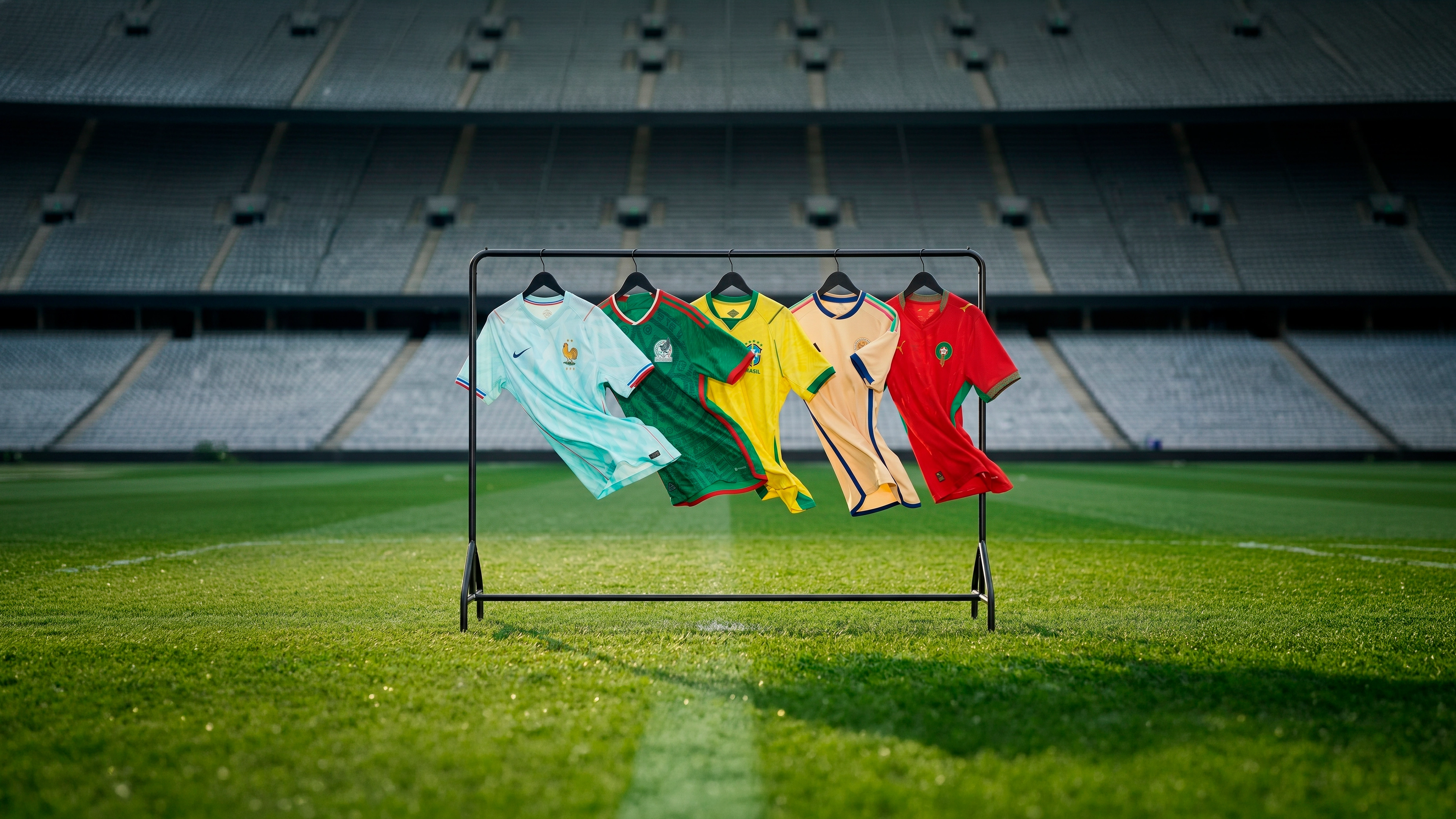
We went through the field looking for the teams whose identity work is worth studying — not just the favorites, and not just the kits. Crests, palettes, campaigns, communication tone, the whole thing. These are the five that stood out.
Brazil — The Brand Its Own Fans Had to Protect
Let's start with the most instructive story of this entire World Cup cycle.
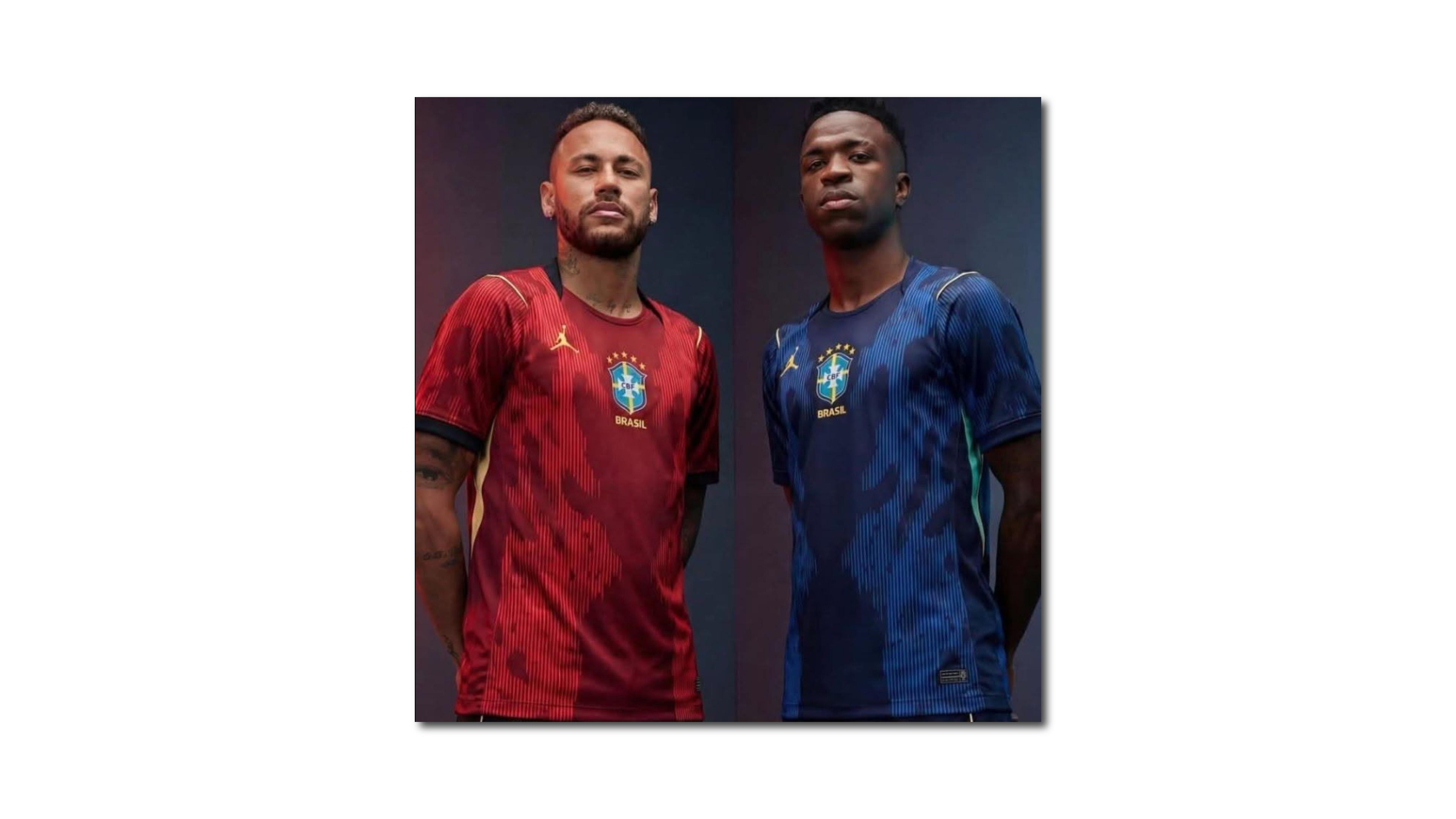
Earlier in the process, Nike proposed a Jordan Brand-led kit for the Seleção: predominantly red, built around the Jumpman, a deliberate departure from the classic Amarelinha. The response from Brazilian fans was immediate and loud. The design was pulled. Brazil went back to yellow.
That's not just a kit anecdote. That's brand equity doing exactly what brand equity is supposed to do — a community defending the core of an identity when the institution tries to move away from it. You only get that reaction when the association between a visual element and an emotional meaning is deep enough that people feel ownership over it.
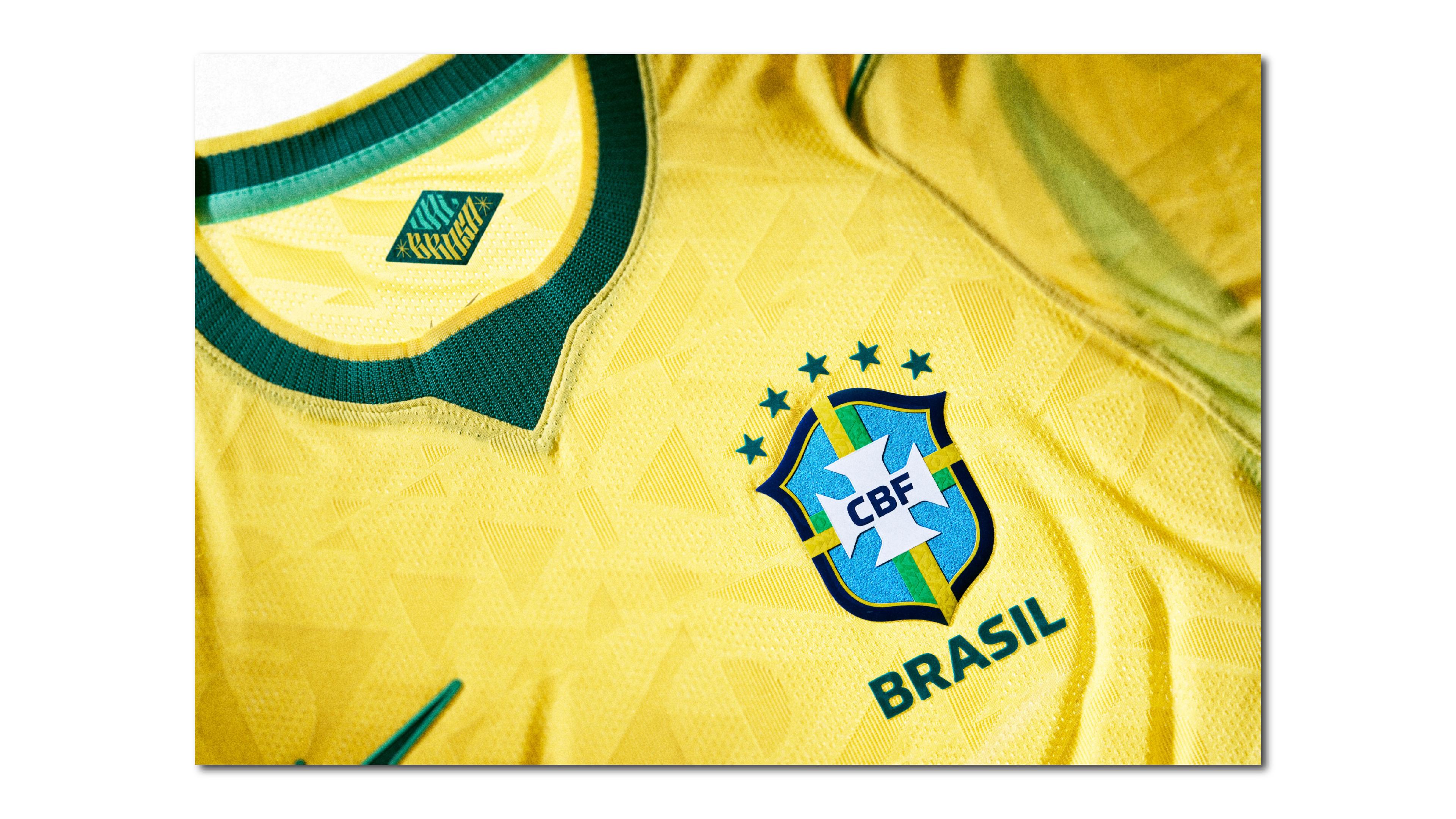
The final home kit earned it. Inspired by the iconic 1970 shirt — the one worn in Mexico, widely considered the greatest football team ever assembled — it uses two shades of blue for detailing (Light Mint and Geode Teal) and a distorted geometric interpretation of the Brazilian flag woven directly into the fabric's construction. Heritage reading as production decision, not decoration.
The away kit went a completely different direction. Brazil became the first national federation to feature the Jordan Brand Jumpman on a World Cup kit, with a design drawing from Amazon fauna and the Elephant Print from the Air Jordan 3 (1988). The collision of sneaker culture with football culture worked precisely because Brazil is one of the few national brands with enough weight to hold both without losing coherence.
The squad announcement reinforced the production ambition: held at the Museu do Amanhã in Rio, it broke streaming records on TikTok and YouTube simultaneously. The venue wasn't incidental — the Museum of Tomorrow as backdrop for a squad that carries five World Cup stars is legible as brand communication even without a caption.
The CBF crest itself is one of the most stable in football: clean shield, gold stars for each title, nothing that dates it. Its value is precisely in not trying to be contemporary. When your color is the brand — and for Brazil, that yellow-green is untouchable — the logo's job is just to stay out of the way.
France — Two Kits That Tell the Same Story From Different Angles
France's 2026 visual identity is the most conceptually coherent of this entire World Cup cycle, and it deserves to be explained properly because it doesn't communicate itself fully at first glance.
Both kits are built around a single reference: the Statue of Liberty, gifted by France to the United States in 1886. The home kit uses deep Game Royal blue with metallic copper accents on the FFF rooster crest and the Nike Swoosh. The copper references the statue's original material — what it looked like before oxidation. An all-over tonal FFF pattern runs through the fabric; a white polo collar with tricolor detailing adds what Nike calls a "haute couture" touch. Inside the collar: "Nos Différences Nous Unissent" — Our Differences Unite Us.
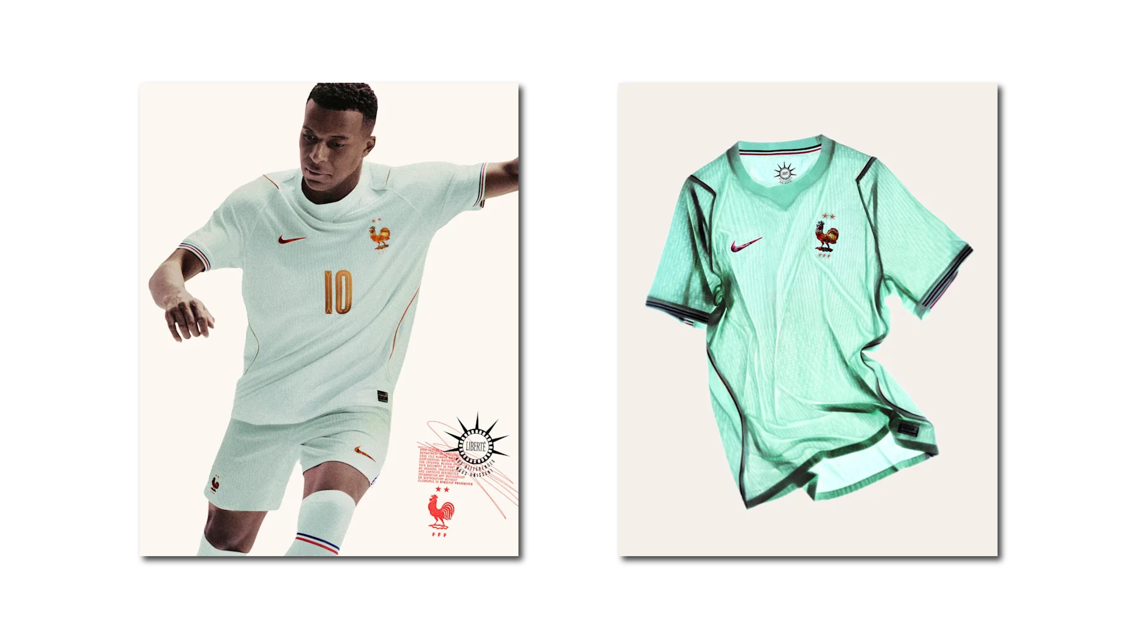
The away kit, officially named Liberté, takes the concept to its logical conclusion. The base is mint green — verdigris, the color the copper turns after oxidation. The same statue, two states, two kits. The Swoosh and crest maintain their copper finish, connecting both garments into a single design language.
This is what we mean by narrative coherence in a visual system: when two pieces of a brand toolkit explain each other without needing copy to do it. The best identity systems work this way — the elements have internal logic, not just aesthetic proximity.
The FFF crest itself carries two stars (1998 and 2018 titles) and the Le Coq Gaulois — the Gallic rooster, present on the badge since 1907. One of the most historically stable symbols in international football. For 2026, a retro icon inspired by the 1995-98 federation badge appears as a detail element, in a move that rewards the fan who looks close without demanding it from the fan who doesn't.
One honest critique: the Statue of Liberty concept is brilliant on paper but communicates far better in an article than at the point of sale. Most fans wearing the green away kit have no idea they're wearing oxidized copper. That gap between conceptual depth and actual reception is a real tension in high-concept brand work — and worth noting.
Mexico — Craft as Identity Strategy
Mexico's 2026 branding cycle is notable because it happened across multiple layers simultaneously, and each layer was doing real work.
The FMF rebranded in 2025, ahead of the tournament. The federation's logo updated its lettering from black to dark green, incorporated flag-colored stripes and a ball element, and dropped the tagline "Por Nuestro Futbol" in favor of the full institutional name. Adidas was involved in the redesign process, and the federation ran a national testing phase with fans before launch. This is brand alignment work — not a revolution, but a deliberate exercise in making the institutional identity coherent with the national team's visual direction heading into a host World Cup.
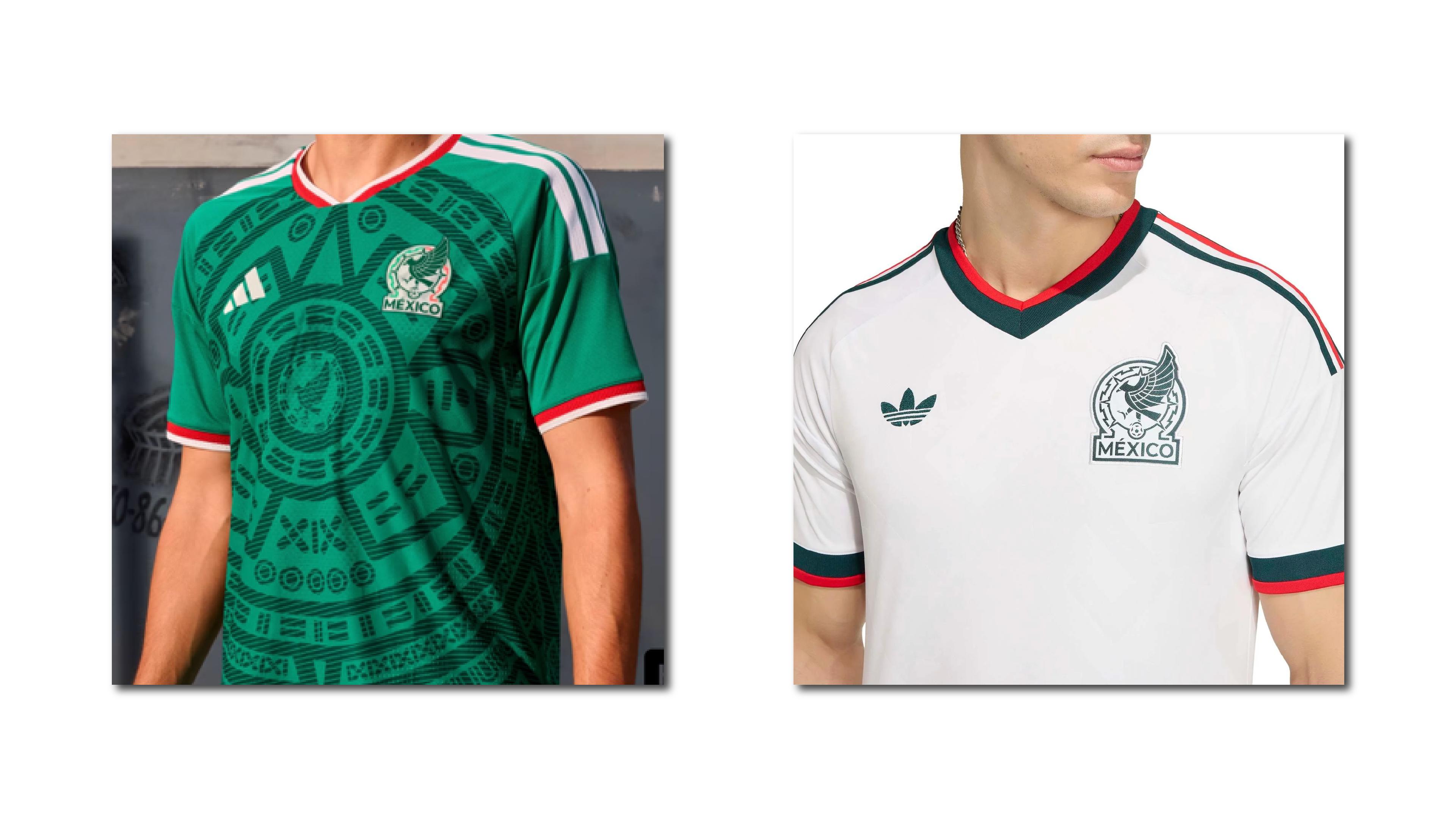
The home and away kits — classic green and white Adidas with pre-Hispanic graphic references — are solid, expected, and appropriately grounded. But the third kit is the one worth studying.
Built under the concept "Mexican Wa(y)ve", the shirt is predominantly black with a tonal "MX" pattern woven across the entire surface. The Adidas Trefoil on the right chest is rendered in the three colors of the Mexican flag. "Somos México" is embroidered on the inner collar. The graphics — Aztec-style letterforms and patterns — were created by rural artisans from Naupan, Puebla, in collaboration with Someone Somewhere, a Mexican lifestyle brand whose entire model is built around supporting and employing artisan communities.
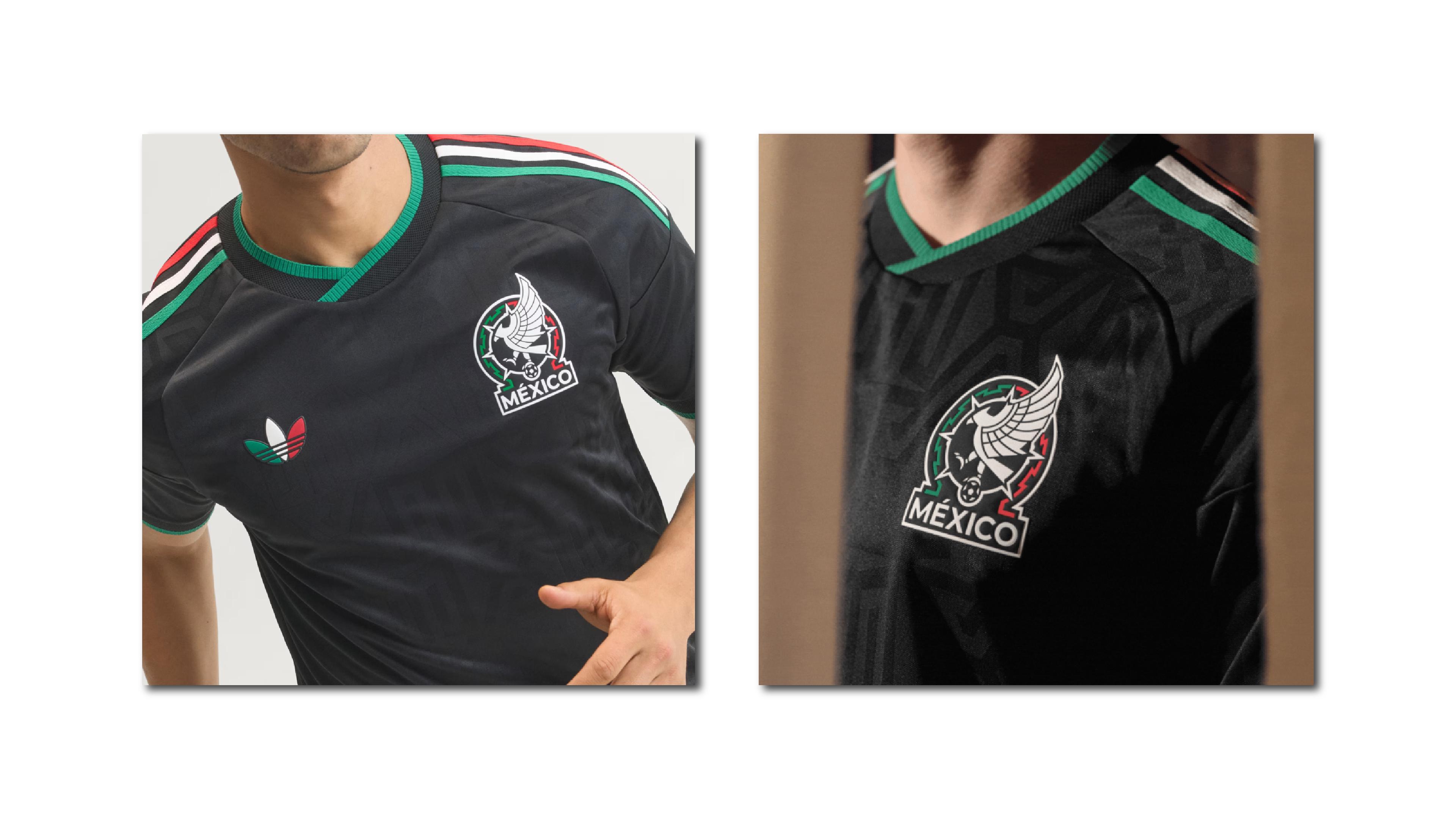
The significance: Mexico becomes the first country to host three World Cups, and the kit marks it. But more importantly, it does so with verifiable craft, not decorative culture. There is a meaningful difference between putting a pre-Hispanic pattern on a jersey as a texture decision and involving the specific hands and communities that carry that tradition. The first is decoration. The second is authenticity with a source — which is the only kind that holds up.
Morocco — Designing From Culture, Not With Culture
Morocco arrives at the 2026 World Cup as something they weren't four years ago: a genuine global brand.
The 2022 Qatar semifinal run — first African and Arab nation to reach that stage — transformed the Atlas Lions from a respected African football power into an international story. That moment built brand equity you can't buy. The 2026 cycle is about stewarding it.
The FRMF crest is one of the more visually complex badges in the tournament: circular format, text in both Arabic and French, a royal crown, a green star on red, a tricolor ribbon descending from the bottom. Analysts have described it as "chaos that somehow coheres." That's actually a fair reading — it's a lot of information in a small space, and it survives because the circular frame contains the complexity rather than letting it spill. The green-red palette is unmistakably Moroccan in a way few national color systems achieve distinctiveness.
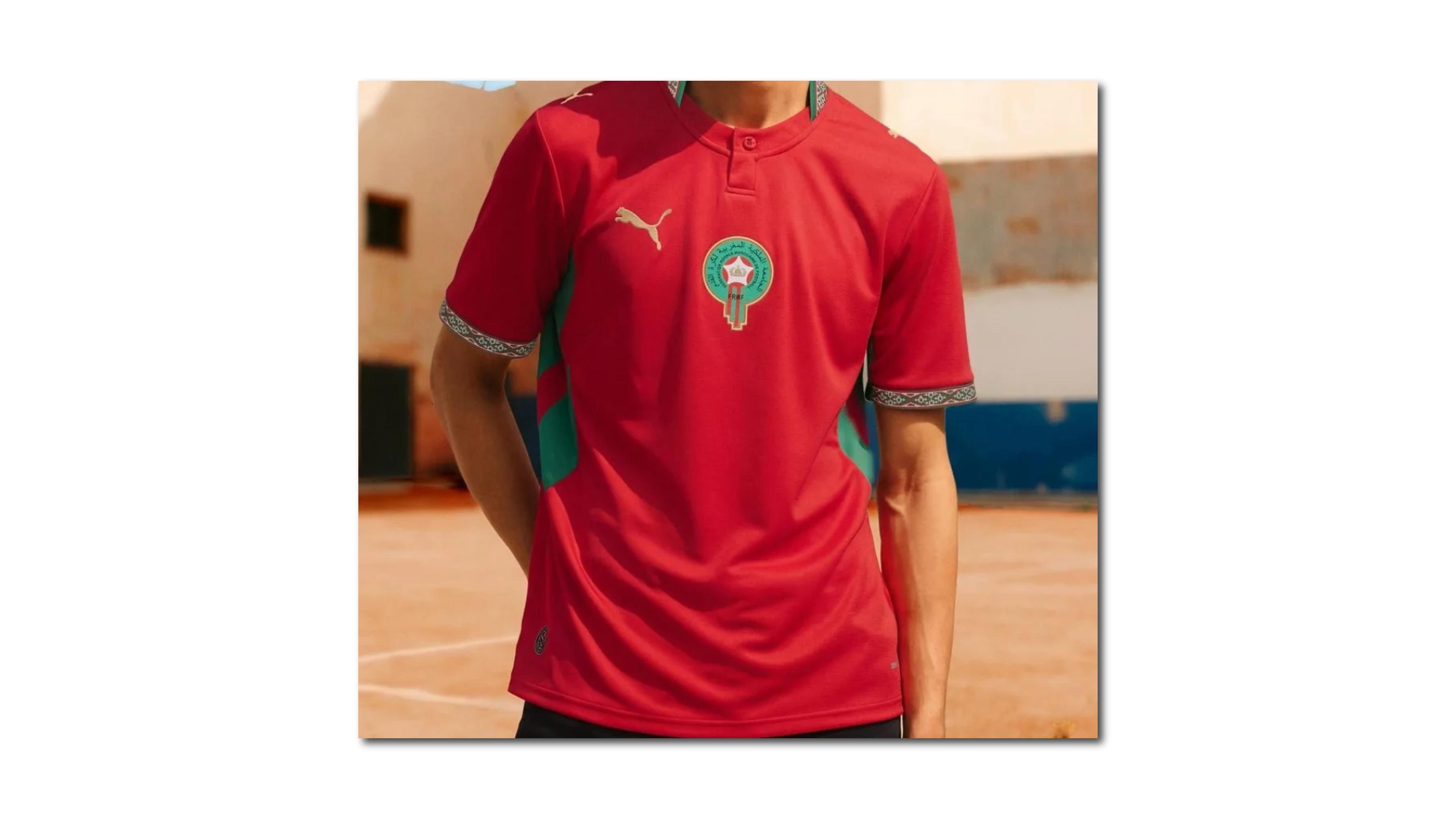
The PUMA kits for 2026 extend the identity with more restraint than the crest would suggest. The home shirt anchors in the deep red that has defined the Atlas Lions for decades, with green side panels referencing the star on the Moroccan flag. The detail work on the collar and sleeve cuffs draws from traditional Moroccan embroidery techniques, rendered in a contemporary design language rather than literal reproduction. The away kit brings a clean white base with geometric patterns rooted in Moroccan craft.
The distinction that matters here is between designing with culture and designing from culture. Designing with culture means adding an ethnic pattern as a texture choice — it looks specific without being specific. Designing from culture means understanding what that pattern means, where it comes from, and why it belongs on this object. Morocco's kits read as the latter. The embroidery references aren't generic "African pattern" — they're Moroccan craft tradition translated through a contemporary lens by people who understand both ends of that translation.
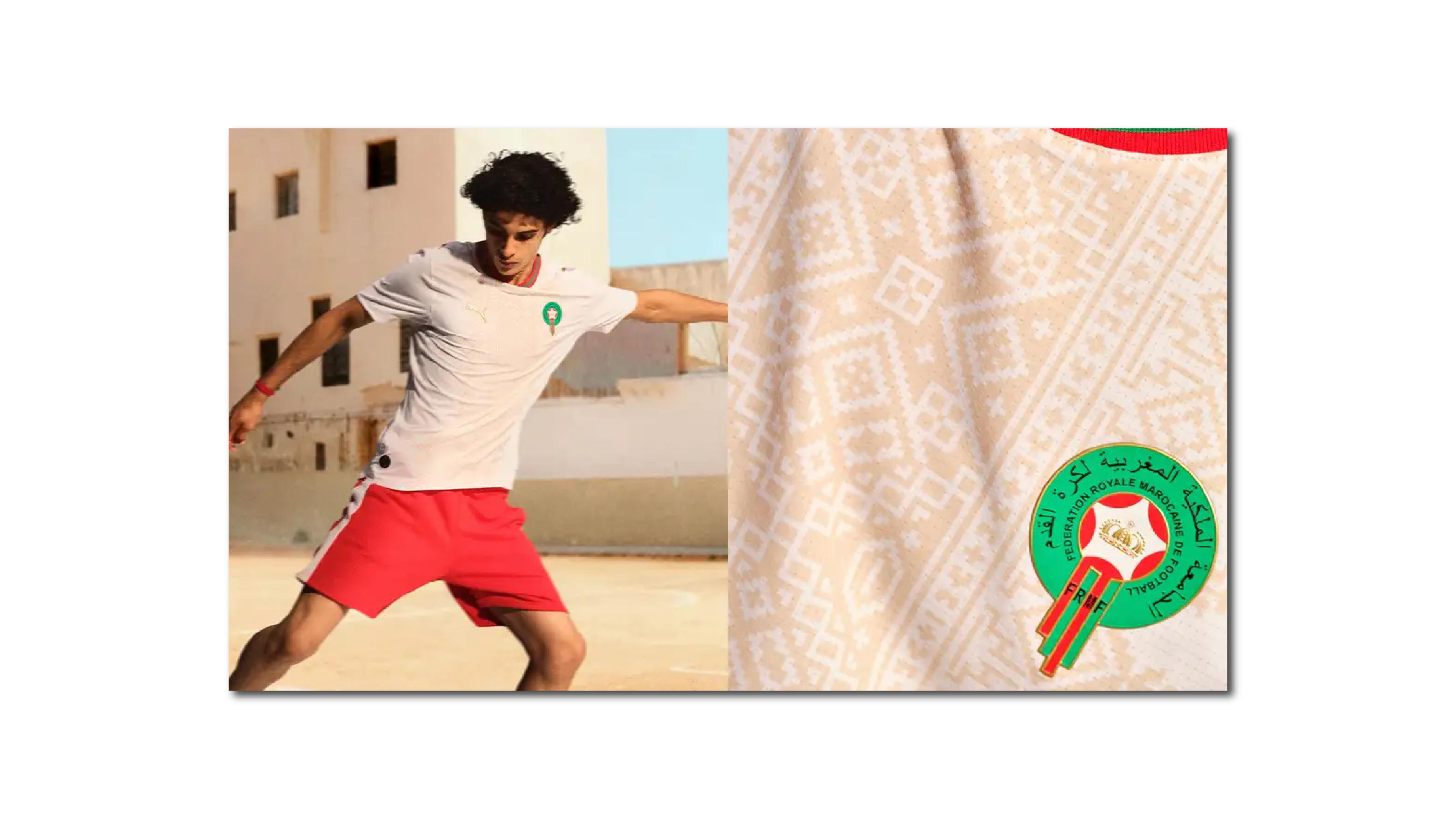
Worth noting: Morocco co-hosts the 2030 World Cup. The identity they're building now has a four-year runway. That forward horizon changes how you should think about every visual decision you make today.
Curaçao — A Brand Built Before the Kit Existed
The smallest nation to ever qualify for a FIFA World Cup. A population of around 150,000 people. A team nicknamed the Blue Wave that, until recently, was wearing standard teamwear while its competitors had bespoke kits.
Curaçao's visual identity story is different from the others on this list, and it's worth telling in full.
The federation spent years deliberately building the "Blue Wave" brand — recruiting from the diaspora, building a competitive squad, and constructing a national football identity around the concept of the island and the sea before they had the kit infrastructure to express it properly. The blue of the Caribbean. The wave as metaphor for a small nation moving with force. This wasn't kit design — it was brand positioning with almost no budget.
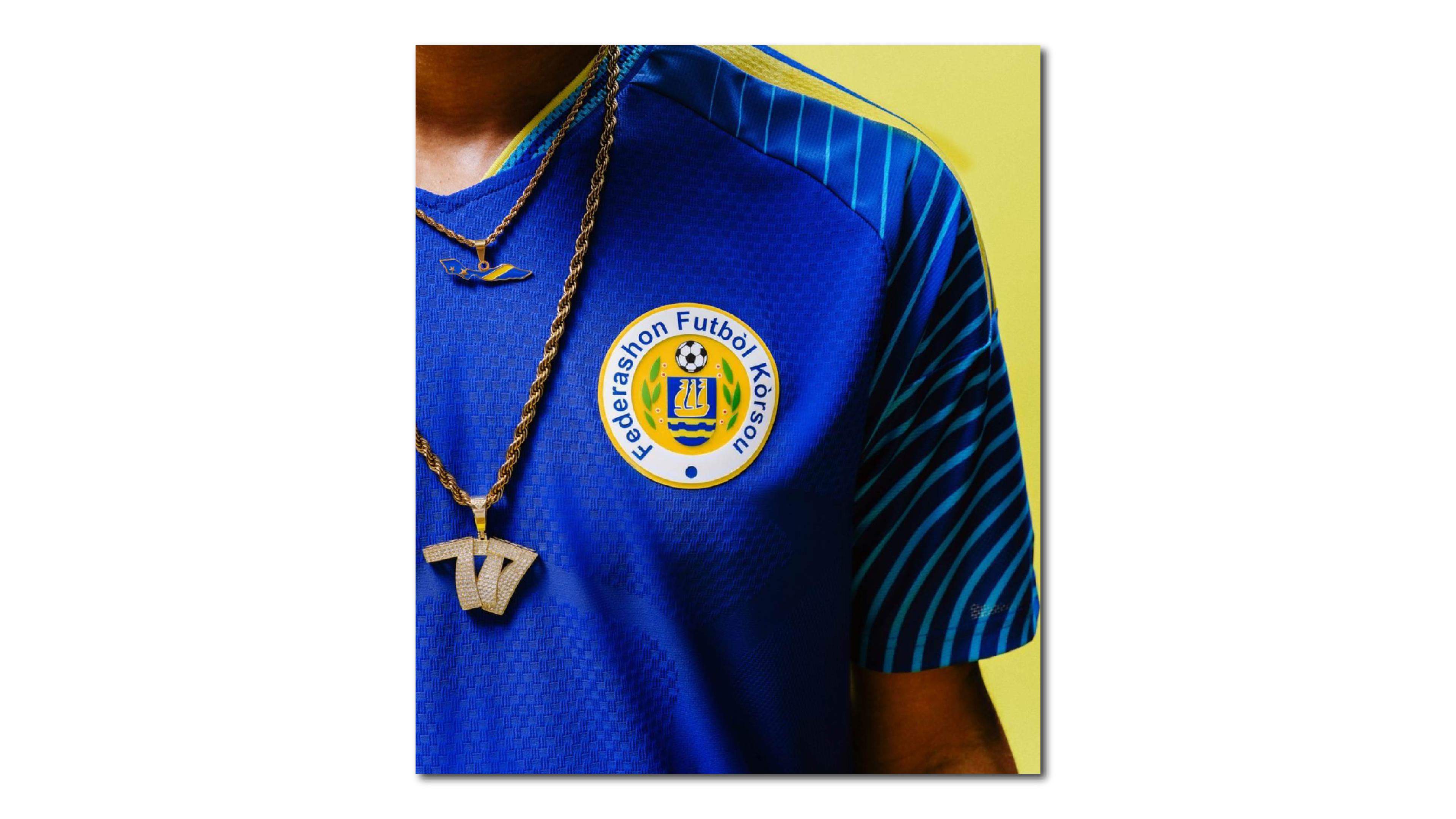
Adidas signed a deal with the FFK ahead of qualification. The agreement was conditional: if Curaçao qualified for the World Cup, they'd receive fully bespoke custom kits. If not, standard teamwear. They qualified in November 2025.
What Adidas delivered is genuinely worth looking at. The home kit — deep lucid blue with wavy circular lines on the sleeves — translates the Caribbean Sea directly into the fabric's graphic language. The wave pattern isn't decorative; it's the visual core of the brand expressed at the sleeve level. Yellow accents from the Curaçao flag give it color contrast without complexity.
The away kit is where it gets really interesting. The base is almost yellow — the color of the island's sunlit architecture — with Adidas stripes in orange, turquoise, and pink. The inspiration is explicit: the painted buildings of Willemstad, Curaçao's capital, specifically the neighborhoods of Punda and Otrobanda, famous for their brightly colored Dutch colonial facades overlooking the harbor. The kit is a wearable portrait of a city.
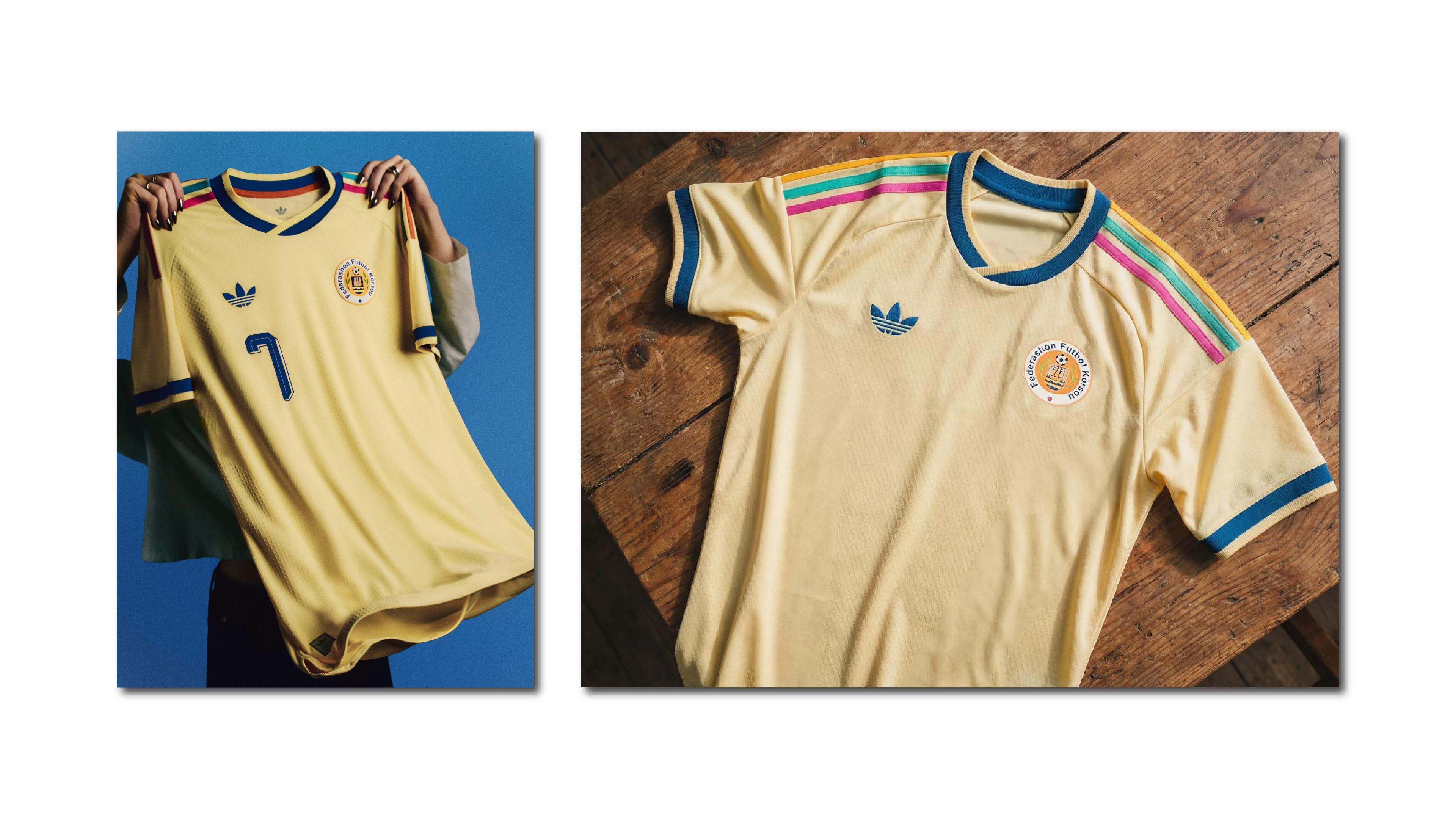
The FFK crest itself carries a stylized sailing ship above blue wavy lines — maritime history and island geography encoded in heraldry. "Federashon Futbòl Kòrsou" in Papiamento, the island's Creole language, rings the outer circle. The name isn't in Dutch or English — it's in the language of Curaçao, which is itself a brand decision. A small one, but a deliberate one.
Two systems. One says: here is the sea, here is where we come from. The other says: here is the city, here is how we live. Together they make a complete identity — which is exactly what a home kit and an away kit are supposed to do.
What the Best-Branded Teams Have in Common
It's not budget. Curaçao doesn't have Brazil's resources.
It's not the supplier. Nike, Adidas, and PUMA all produced excellent and forgettable work in equal measure this cycle.
What connects these five teams is that their visual systems have internal logic. Colors, forms, narrative and tone of communication point in the same direction. The crest and the kit and the campaign feel like they come from the same place, because they do — from a set of decisions about what this team represents and how that should be expressed visually.
That logic also makes the identity scalable. A crest that works at 20 pixels on a broadcast ticker needs to carry the same weight as the same crest embroidered on a training jacket or printed on a 3-meter banner outside a stadium. The identities that fall apart at scale are the ones that were designed as aesthetics without being designed as systems.
One more thing worth naming: several of these federations came under pressure to update or change their visual identity heading into the tournament. Some yielded to that pressure poorly — chasing "modernity" without rooting the update in anything real. The teams on this list, for the most part, resisted cosmetic change and invested in narrative depth instead. That's the actual long game in brand work.
If You Manage a Brand in a High-Identity, High-Emotion Industry — 3 Things Worth Reviewing Tomorrow
1. Does your visual identity have internal narrative logic — or is it a collection of assets? The difference between a brand system and a brand toolkit is whether the pieces explain each other. France's two kits make this obvious. If you removed the copy from your brand materials, would the visuals still tell a coherent story?
2. Would your audience defend your identity if someone tried to change it? Brazil's fans didn't need to be asked. They responded instinctively because the Amarelinha means something beyond football. That depth of brand association doesn't happen by accident — it's built through consistency, repetition, and real emotional stakes over time. Do your customers feel ownership over what you've built?
3. Does your brand work at every scale simultaneously? National team identities live on a stamp, a screen, a sleeve, a scarf, and a stadium banner at the same time. Most brand systems are designed for one of those contexts and hoped into the others. Audit your identity at its smallest and its largest — the gaps tend to appear at the extremes.