Articles
FIFA Built the Biggest World Cup Ever — and Forgot to Give It a Soul
Every great World Cup has had a soul. A color. A face that could only belong to one place. The 2026 edition has three countries and none of that.

The 2026 FIFA World Cup will be the biggest sporting event ever staged. Forty-eight teams. Sixteen host cities. Three countries. One logo.
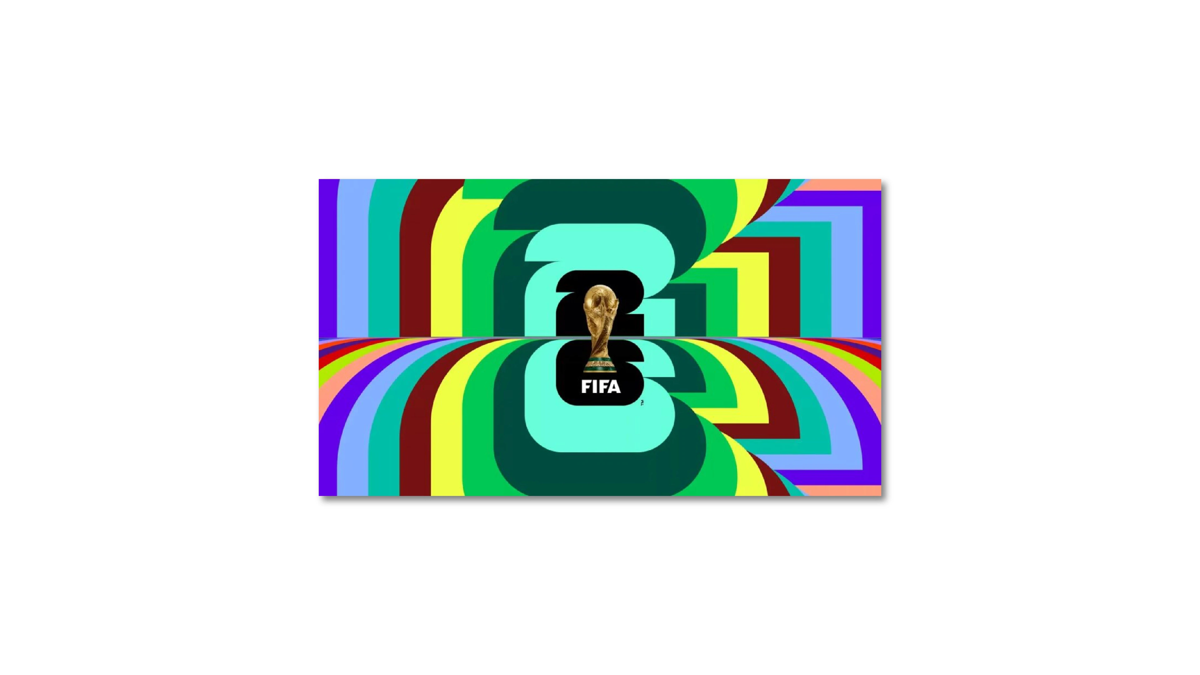
And that logo — a hyper-realistic photo of the trophy sitting inside a bold "26" — is clean, scalable, and completely forgettable. Not because whoever designed it was bad at their job. But because the brief itself made soul impossible.
Here's what happened, and why it matters beyond football.
When a Country IS the Brief
Before we go after 2026, let's establish what great World Cup branding actually looks like — because there's a real benchmark here, and it's not subtle.
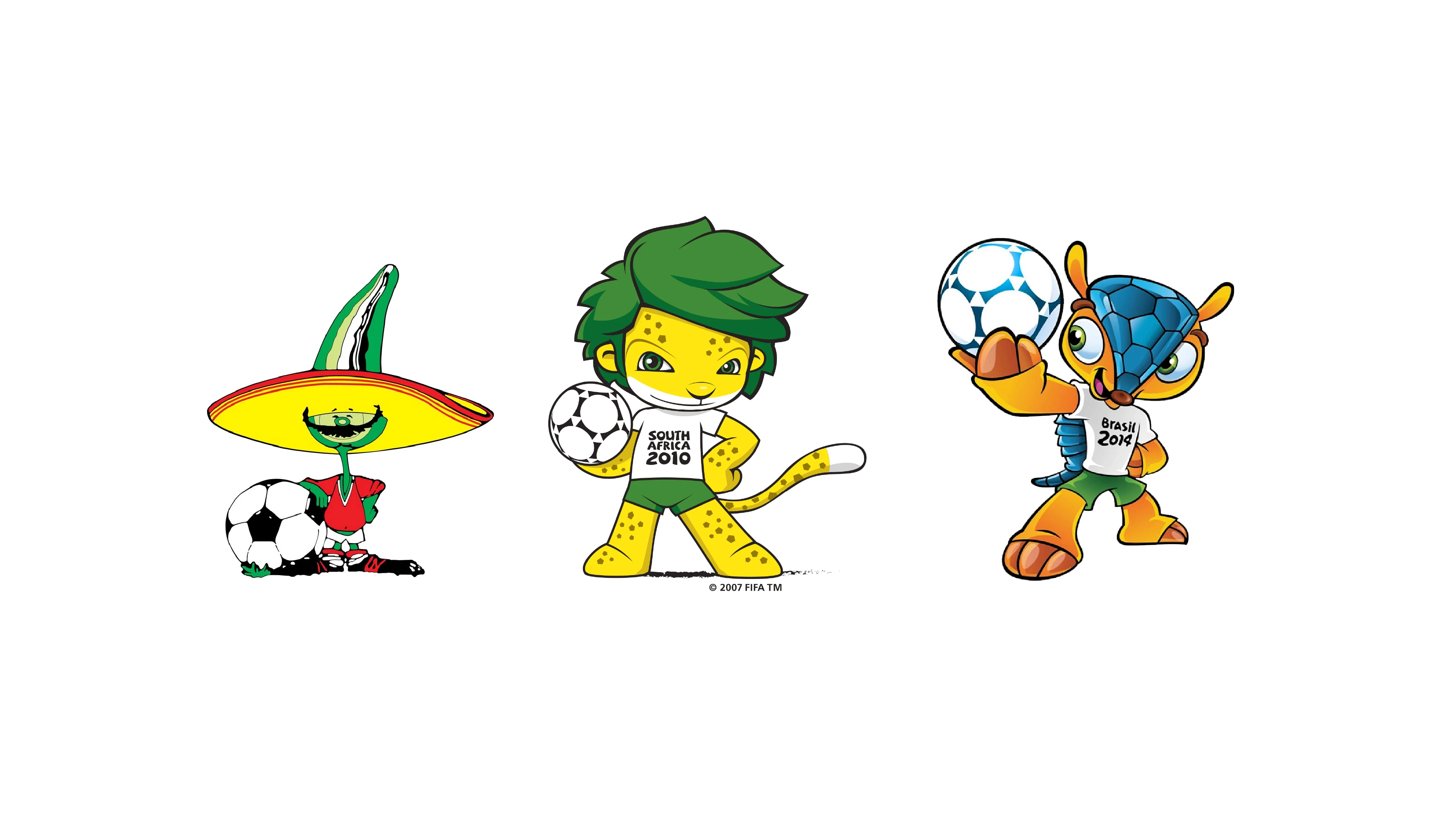
Mexico 1986. The mascot was Piqué: a cheerful jalapeño pepper in a sombrero and a mustache. You didn't need to read a caption. You didn't need context. One character, and you instantly knew: this is Mexico. Spicy, warm, visually loud in the best way. The logo leaned into pre-Columbian geometry. The whole identity had a point of origin — a real cultural address. You could've stripped the FIFA badge off any piece of merchandise and still known exactly where you were.
South Africa 2010. Zakumi was a leopard with green hair, his name combining "ZA" (South Africa's country code) with "kumi," meaning "ten" in several African languages. The color palette — green and gold — mirrored the national sports kit. The slogan, "Ke Nako," came from a local language. Everything pointed to one specific place on earth. You could feel the continent in the design.
Brazil 2014. Three hands interlocked forming the trophy shape, in green and yellow. The mascot, Fuleco, was a three-banded armadillo — an animal native to Brazil, chosen partly to raise awareness about an endangered species. Even the typeface had a looseness that felt Brazilian. The brief was: make it feel like Brazil. And it did.
In each of these cases, the design team had an unfair advantage: one country = one brief. One set of colors to pull from. One cultural archive. One animal, one food, one symbol that could carry the whole thing.
The moment you introduce three countries into that equation, the math breaks — and so does the soul.
Three Countries, One Logo, Zero Address
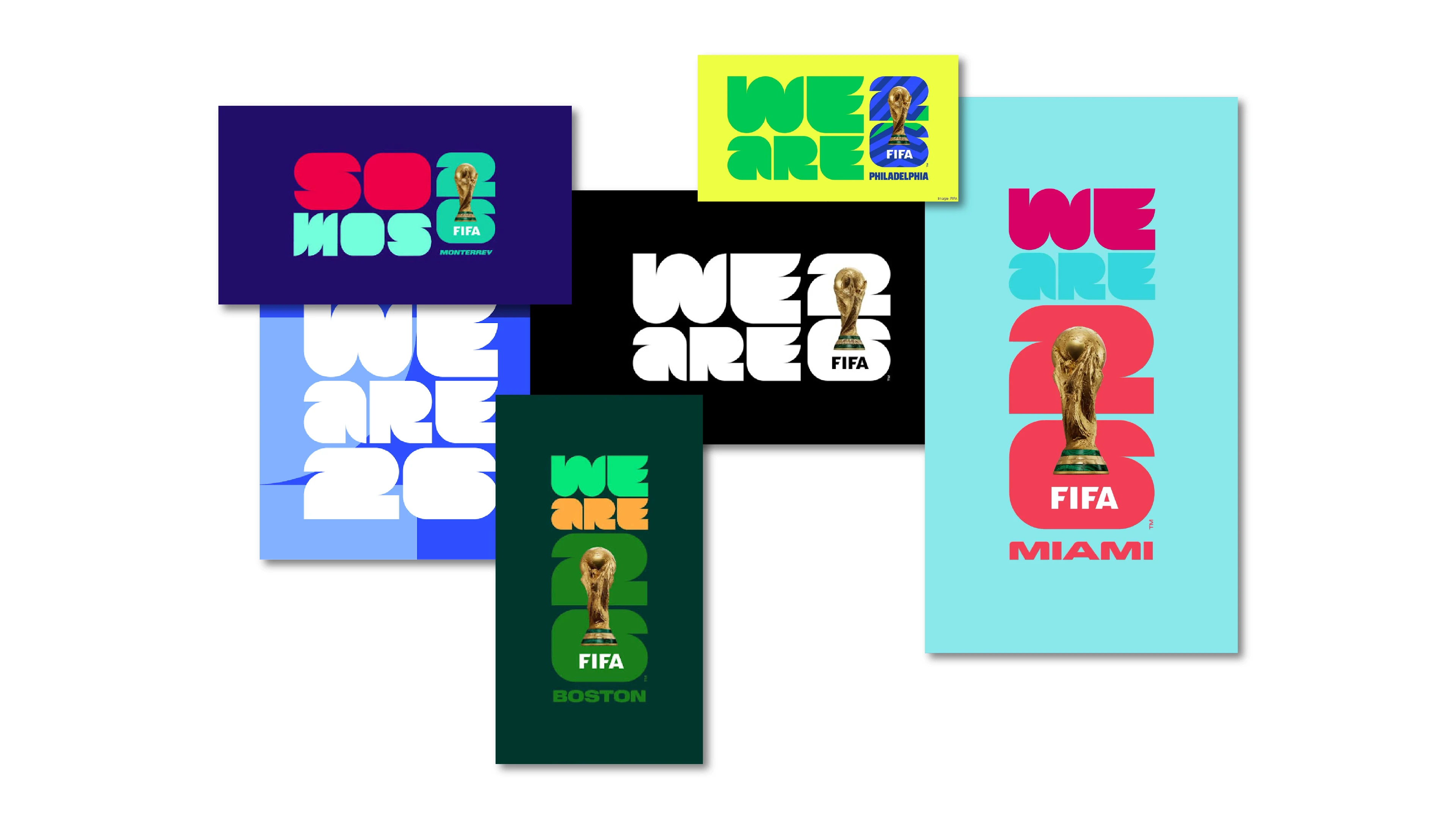
The FIFA World Cup 2026 identity was built around a single concept: the trophy inside the number 26, with the "2" stacked above the "6." It's paired with a campaign called "We Are 26" and a system of 16 host city logos, each using the same base mark with different color treatments per city.
From a design systems standpoint, this is actually smart work. Modular identity architecture — one master mark, infinite local variants — is exactly how you solve the problem of 16 cities across three countries needing their own visual presence. The host city logos derive from the same structural DNA: same mark, same grid, different chromatic expression. That's textbook scalable identity design.
The problem is that "modular" and "cultural" are not the same thing. Not even close.
The "We Are 26" campaign slogan is the same story. Inclusive? Yes. Memorable? Sure. Does it tell you anything about where this World Cup lives? Not really. "We Are 26" could be the tagline for a tech startup, a coalition of NGOs, or a youth volleyball league. There's no cultural texture in it — no borrowed meaning from a place, a language, a people. It's a slogan engineered to offend no one, which means it moves no one either.
The Modular Trap — And Why It Kills Everything Downstream
This is where it gets interesting from a design perspective, because the modular trap isn't just about the logo. It's systemic. And it's the most technically honest critique you can make of this identity.
In brand design, there's a difference between a system and an identity. A system is infrastructure: it defines how elements scale, adapt, and stay consistent across applications. An identity is the emotional core — the thing that makes someone feel something before they've read a single word. The best brand work has both. The 2026 identity has a very good system and a very thin identity.
When your base mark is built for maximum adaptability — designed to stretch across 16 cities, 3 countries, and every piece of merchandise from a stadium banner to a phone case — you're by definition compressing out the specificity that makes design feel alive. Specificity is soul. Flexibility is its trade-off. You can't fully optimize for both at the same time.
And here's where it gets painful: when the base identity has no soul, every single brand extension that grows from it inherits that emptiness. The downstream damage is real.
Think about the Panini sticker album — one of the most beloved pieces of World Cup culture, genuinely one of the great annual design objects in sports. In 2010, those stickers were soaked in African pattern, color, and energy. In 2014, they breathed Brazil. The visual identity gave Panini, kit manufacturers, licensees, and broadcast graphics teams a real cultural language to work with. Designers downstream had a starting point with actual personality — a chromatic world, a set of references, a vibe they could borrow and extend.
In 2026, those same teams are handed a modular system. Clean. Flexible. Technically correct. And creatively limiting as sh*t, because a system built for maximum adaptability is also a system built for minimum personality. Panini isn't entirely off the hook — their execution choices are their own — but when the master brand hands you a trophy on a number instead of a cultural universe, you're already starting with one hand tied.
The three mascots are the clearest symptom of this. Maple the Moose for Canada, Zayu the Jaguar for Mexico, Clutch the Bald Eagle for the US. Each one is well-designed in isolation. Each one maps neatly to its country's national symbolism. And together they feel like three separate airline loyalty programs that got booked on the same flight.
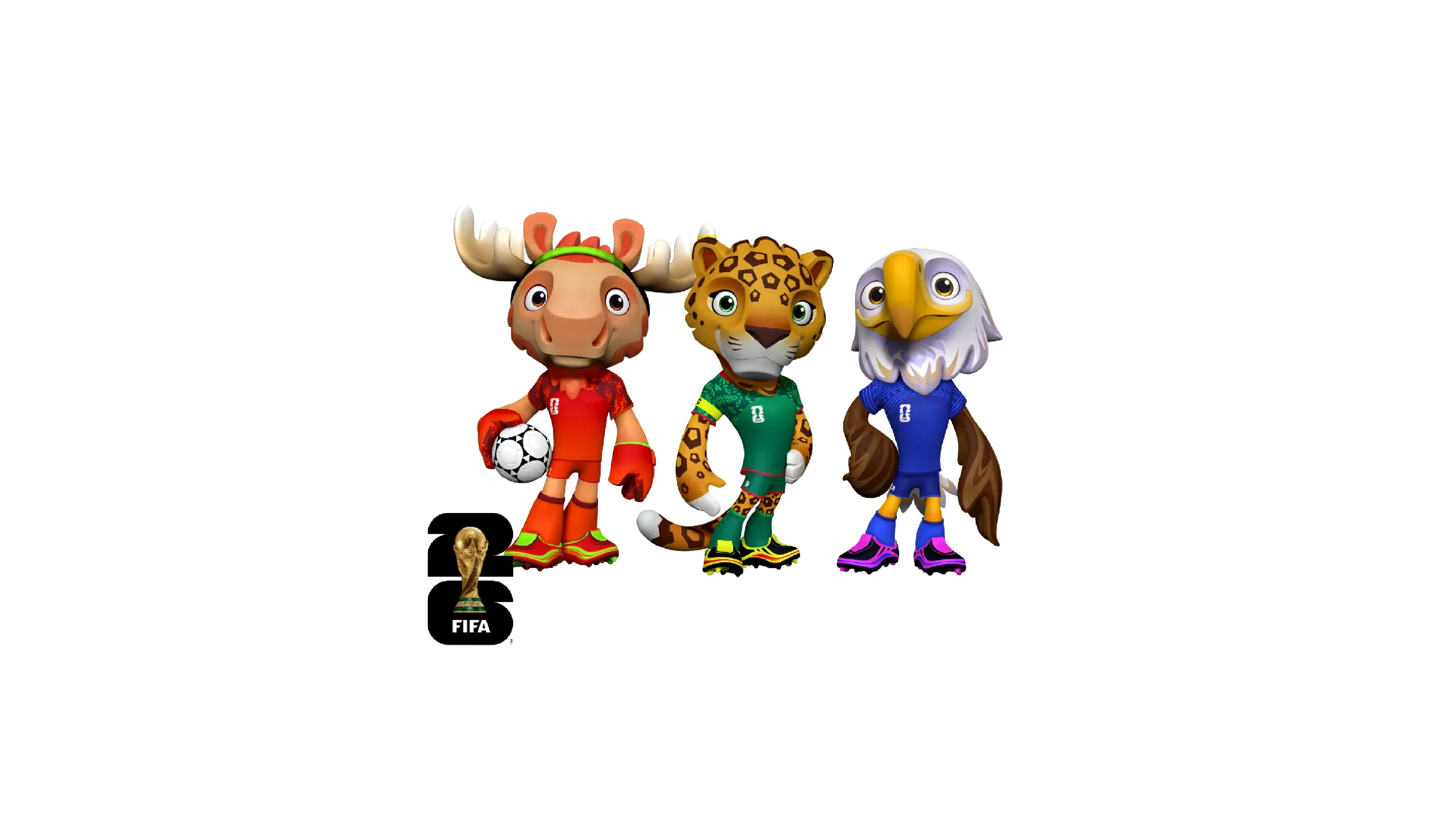
A mascot isn't just a character — it's a single-point brand carrier. Its job is to collapse the entire emotional identity of an event into one face, one silhouette, one thing kids put on their backpacks. Piqué did that. Zakumi did that. One character with the full cultural weight of a nation behind it. Three mascots split that weight three ways, and a mascot that represents "North America" instead of a specific place is a mascot that represents nothing you can actually feel.
What We Can Learn From This
Let's be fair: FIFA made a business decision — the biggest World Cup ever, three countries, 48 teams, maximum reach — and the branding follows that logic faithfully. This isn't a failure of craft. The identity is a product of its brief, not a failure of execution. When the brief is "serve three nations equally," the creative output will always look like a negotiation.
But there's a real lesson here for anyone who works with brands, events, or visual identities at scale:
Flexibility and soul are not the same deliverable. A modular system solves distribution. It doesn't solve meaning. A brand can be both systematic and culturally grounded — but you have to fight for the soul part explicitly, because it won't emerge from a system designed for adaptability. It has to be designed in from the start, at the brief level, not patched in through city color variants.
When the brief is too big to have a cultural address, the design ends up with a corporate one instead. The 2026 identity is a well-built container. What goes inside it — the actual energy of this World Cup — will have to come from somewhere else. From the cities. From the fans. From the football itself.
Which, when you think about it, is a strange thing to say about a brand.


