Articles
What Every Good Portfolio Site Actually Needs
Your portfolio site isn't just a gallery — it's the first sample of your work. Here's what it actually needs to do its job.

There's a version of a portfolio site that looks incredible and tells you almost nothing. Beautiful full-bleed images, a minimal nav, a vague tagline — and zero context about who made what, for whom, or why. You leave impressed by the aesthetics and completely unsure what to do next.
That's not a portfolio. That's a mood board with a domain name.
A portfolio site that actually works — one that converts visitors into inquiries — needs more than good work. It needs structure. It needs context. And it needs to make the person on the other side feel like they've found the right person or studio for the job. Whether you're a designer, a photographer, an architect, or a creative director, the principles are the same.
What Most Portfolio Sites Get Wrong
The default assumption is that if the work is good enough, the site will do the rest. It won't.
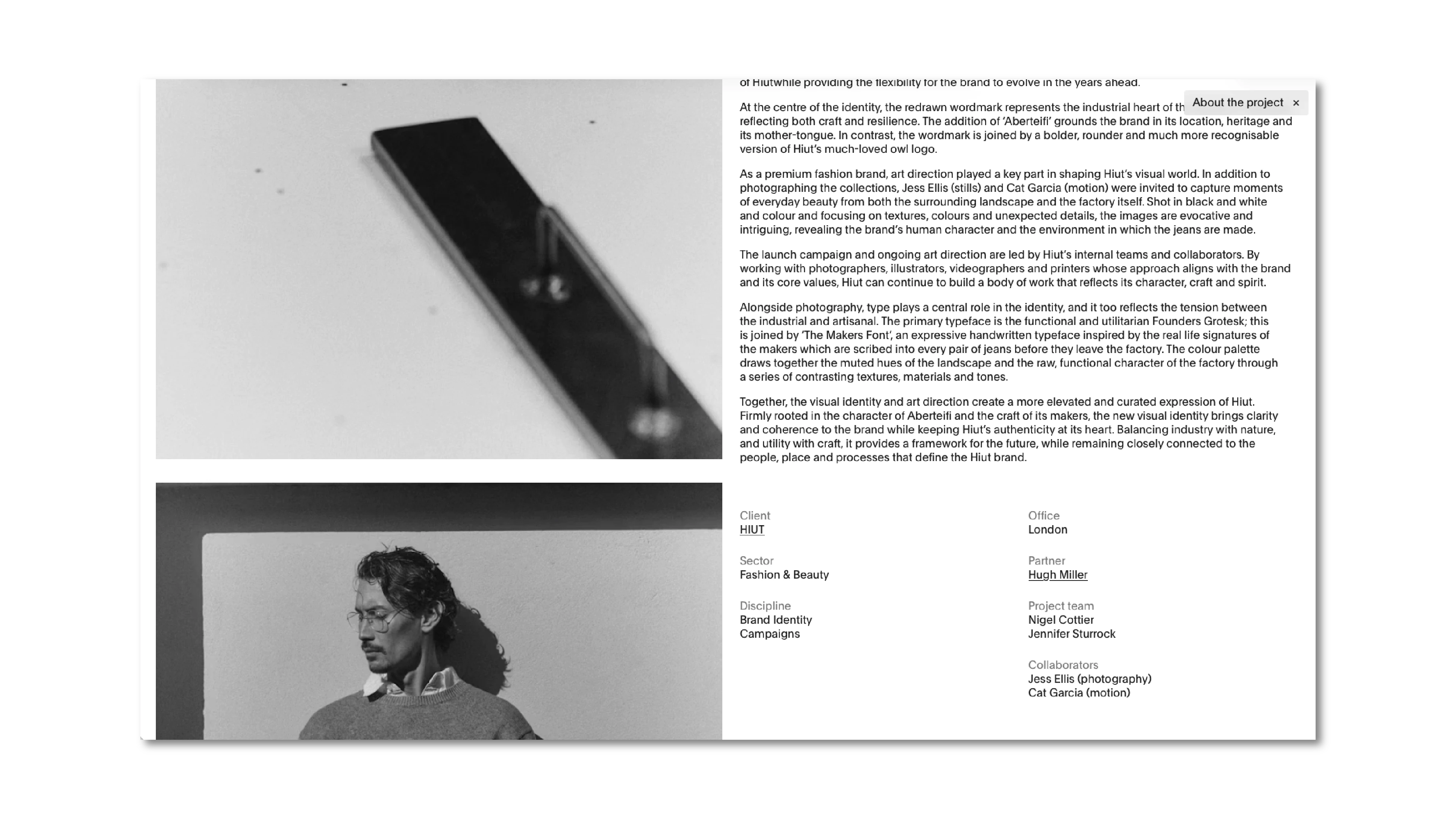
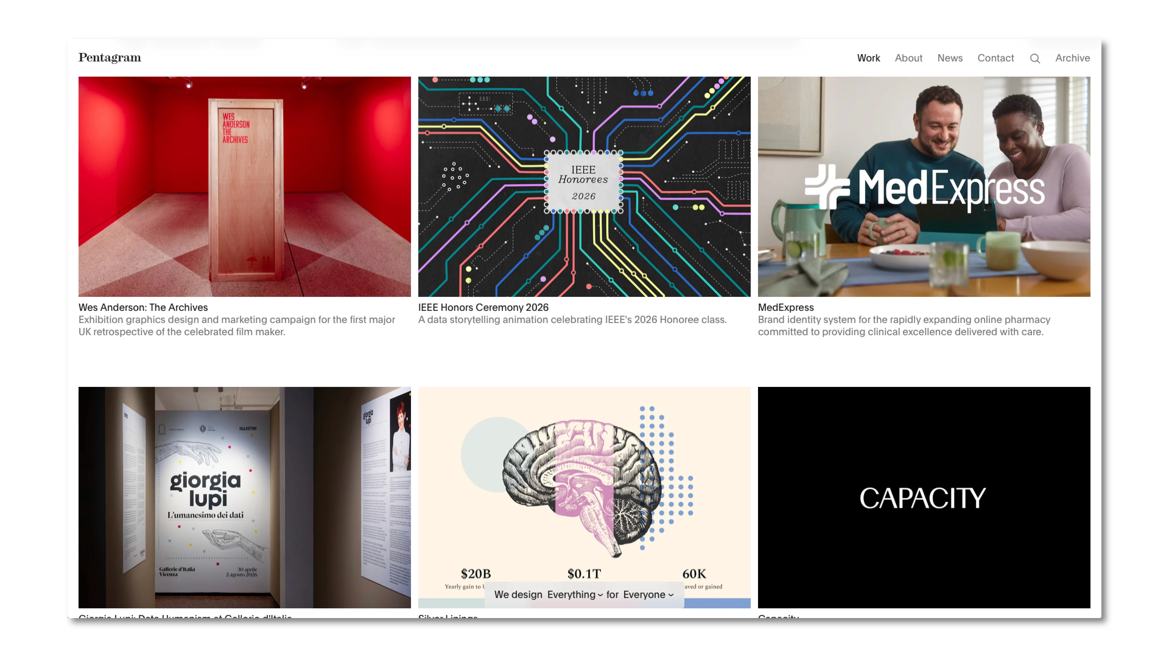
Pentagram — arguably one of the most recognized design studios in the world — doesn't rely on that assumption. Their site is meticulously structured: every project has a title, a client, a clear description of what was done, and enough context to understand the scope. The work speaks, but the site gives it a voice. That combination is what makes it a reference, not just a showcase.
Most portfolio sites skip that layer entirely. They show the output and hide the thinking. And for a potential client trying to evaluate whether you're the right fit, that gap is where decisions get lost.
The Elements That Actually Matter
Case Studies, Not Just Galleries
The single most important upgrade you can make to a portfolio site is turning project entries into case studies. That means: year, client, services rendered — at minimum.
Why does this matter? Because context is what transforms a pretty image into proof of expertise. A brand identity for a hospitality group hits differently than a branding project — unnamed, undated, category unknown. The former tells a story. The latter is just a visual.
You don't need a 2,000-word breakdown for every project. A clear title, a one-paragraph description of the problem and what you did, and the key deliverables is enough. That's the difference between a gallery and a body of work.
A Clear Services Section
What do you actually do? It sounds obvious, but most portfolio sites either bury this or skip it entirely.
Silent House handles this well — their site makes it immediately clear what they offer, who it's for, and what working with them looks like. There's no guesswork. A visitor doesn't have to reverse-engineer your services from your project list.
A dedicated services section — even a lean one — does two things: it tells potential clients exactly what to ask for, and it filters out the wrong ones before they reach you. That's not a small thing.
A CMS That Keeps You Current
A portfolio that hasn't been updated in two years is a liability. It signals — fairly or not — that you're either not working or not paying attention to your own presence.
This is where the technical foundation of your site matters. A well-built portfolio should make adding or updating a project feel effortless — not a reason to call a developer. When a good web team builds your site, part of the job is making sure you can actually maintain it yourself without touching code. If updating your site feels like a chore, the problem is usually how it was built, not your discipline.
Contact That Doesn't Create Friction
A buried email address at the bottom of an about page is not a contact strategy. Every step between "I want to reach out" and "I've sent a message" is an opportunity to lose someone.
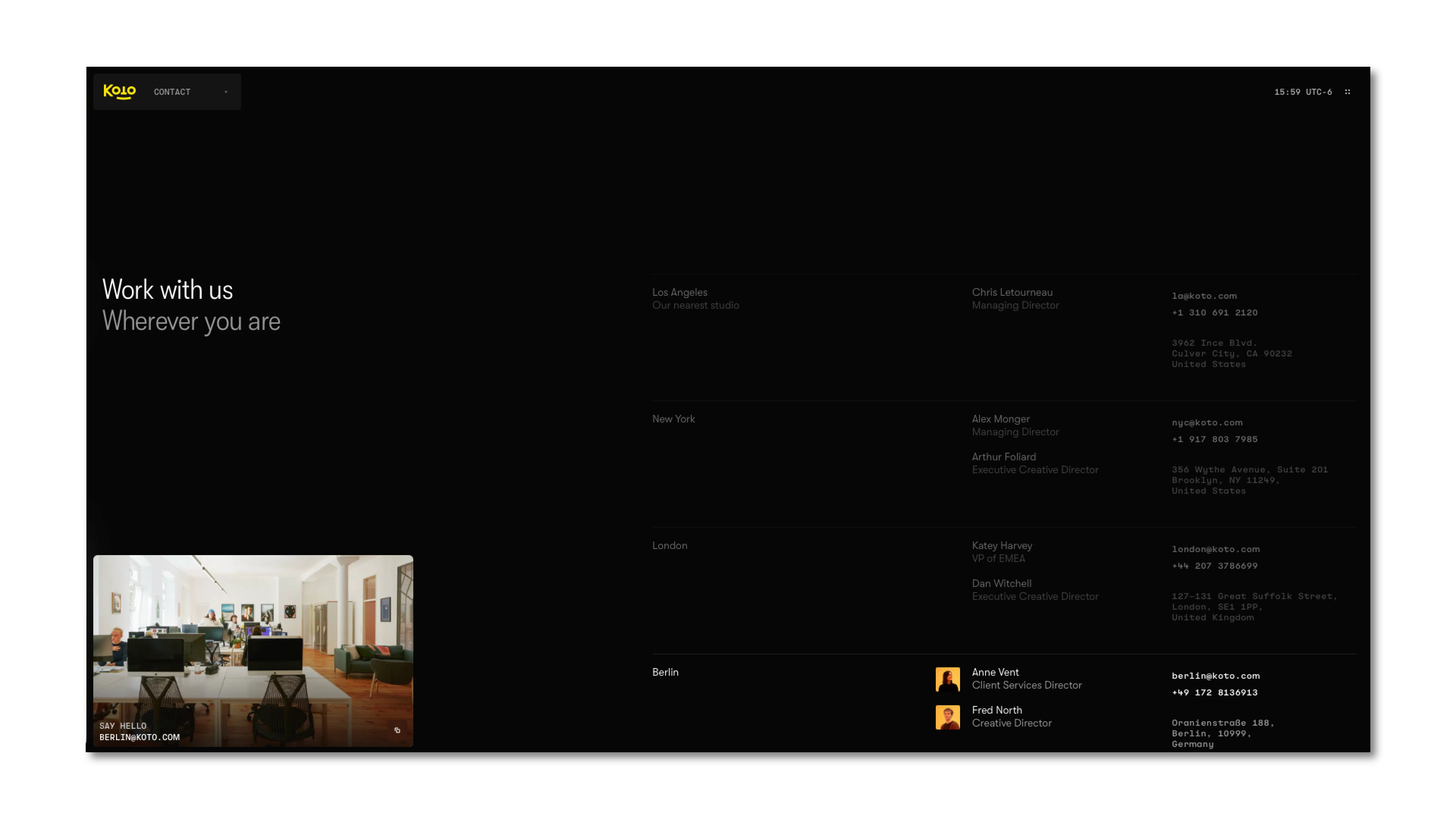
Good contact UX means: a visible contact section in the nav, a clear call to action somewhere on the homepage or case study pages, and a form or direct link that actually works. That's it. No elaborate intake forms, no mandatory phone number fields, no mystery.
The goal is to make the decision to reach out feel easy — because it should be.
Your Site Is Already Doing a Job — Make Sure It's Doing the Right One
Here's the part that often gets skipped in conversations about portfolio structure: your site itself is a sample of your work. The typography, the spacing, the way projects are labeled, the quality of the writing in your case studies — all of it is being evaluated before a client reads a single line of your bio.
This is where design consistency stops being an aesthetic preference and becomes a business argument. If your site feels generic, rushed, or misaligned with the quality of work you're trying to sell, there's a credibility gap — and most clients won't tell you that's why they didn't reach out.
At Attlas, this is exactly what we build. We design and develop portfolio and studio sites that aren't just visually strong — they're structured to communicate clearly, convert visitors into inquiries, and hold up as a genuine representation of the work behind them. If your current site isn't doing that, it's worth a conversation.
A Quick Checklist Before You Launch
Every project has a title, client name, year, and services listed
At least a short description of what the problem was and what you did
A services section that's clear and easy to find
CMS or platform that lets you update projects without friction
Contact is visible in the nav and has a clear CTA somewhere above the fold
The site's own design is consistent with the quality of work you're presenting
Tested on mobile — not just desktop


