Articles
You Can’t Brand a Premium Brand Like a Normal One
Feb 6th 2026
Premium branding isn’t about nicer visuals — it’s about a different mindset altogether. In this piece, we unpack what actually changes when a brand needs to signal trust, confidence, and legitimacy.

Here’s a familiar scene we see again and again. A brand decides it wants to “go premium.” Suddenly everything turns beige. A serif font appears. White space increases. Prices go up. And everyone hopes the brand will magically feel more elevated.
Sometimes it works. Most of the time, it doesn’t.
The problem is simple: many brands try to look premium while still thinking like mass or mid-tier brands. They change the surface, but not the perspective behind it.
In this article, we want to unpack what actually changes when you’re branding a premium brand — not in terms of trends or aesthetics, but in terms of strategy, decision-making, and criteria.
Quick note before we start: when we use comparisons in this article, they’re not meant as criticism or value judgments. This isn’t a branding fight club. Comparing a premium brand to a non‑premium one isn’t about saying one is “good” and the other is “bad” — it’s just a way to make the mechanics of premium branding easier to see in action.
First, What Do We Mean by “Premium” (And What We Don’t)
Before anything else, we need to define our terms.
When we talk about premium, we’re not automatically talking about heritage luxury, century-old maisons, or ultra-elite pricing. Premium is a position, not a price bracket or a visual style.
A premium brand is one that asks for more:
More trust
More money
Or more emotional commitment
What premium is not:
It’s not just “expensive.”
It’s not minimalism by default.
And it’s not a guarantee of quality — it’s a promise of it.
At its core, premium branding is about reducing perceived risk by projecting certainty.
Premium Branding Starts from a Different Strategic Mindset (Not Just Nicer Outputs)
One of the biggest shifts when working on a premium brand happens before any design work begins.
Most mass or mid-tier brands are built around questions like:
How do we stand out quickly?
How do we explain what we do as clearly as possible?
How do we remove friction to get attention?
Premium brands start somewhere else entirely.
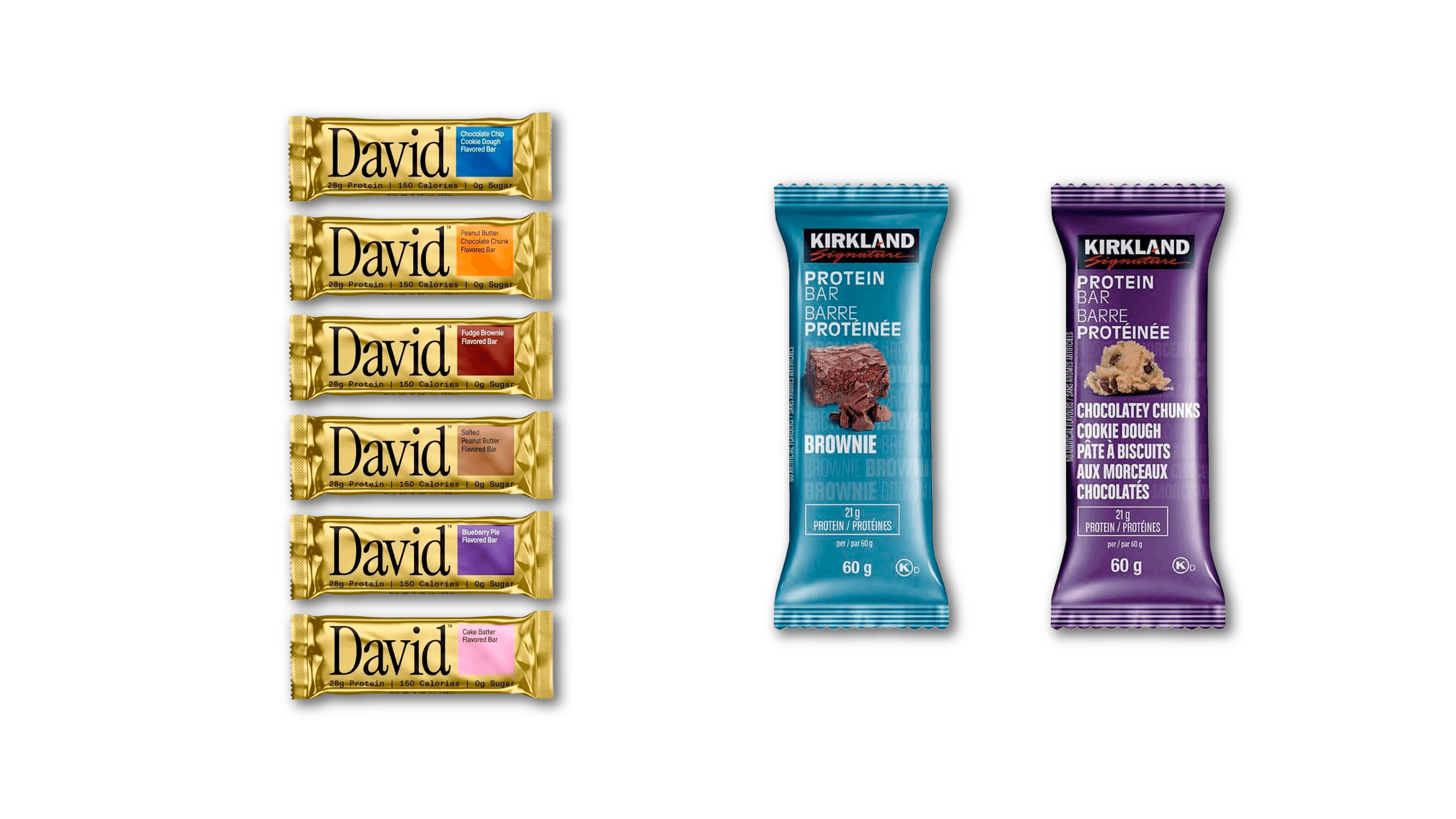
You can see this clearly if you compare something like a premium protein bar brand such as David to a mass‑market equivalent like Kirkland. Kirkland isn’t doing anything wrong — it’s optimized for value, clarity, and scale. But David is built around a different expectation: fewer claims, more restraint, tighter control over how quality is signaled. Same category, same product logic, completely different branding questions.
Their real questions tend to be:
How do we signal credibility without over-explaining?
How do we create confidence instead of persuasion?
How do we feel established, even if we’re new?
This is where many teams get uncomfortable. Premium branding often means saying less, not more — but not because silence is fashionable. It’s because, at a premium level, meaning is carried by systems, signals, and consistency rather than explanation.
From a strategic point of view, restraint is a way of managing perception. The fewer messages you put forward, the more weight each one carries. Every word, visual decision, or interaction becomes intentional rather than compensatory.
Restraint, in this context, isn’t an aesthetic preference — it’s a strategic outcome. When a brand is confident in its position, it doesn’t need to shout, justify every choice, or chase attention. The system does the convincing by behaving predictably, coherently, and with control.
Premium brands optimize for trust and coherence, not for clicks or immediate recognition.
Visual Identity and Touchpoints: Same Tools, Much Higher Stakes
Here’s an uncomfortable truth: premium brands don’t get access to secret branding tools. There’s no hidden drawer of “luxury-only” typefaces or colors.
They use the same raw materials as everyone else — typography, color, layout, hierarchy, tone of voice, systems. The difference is brutal and simple: the tolerance for mistakes is dramatically lower.
In premium branding, “almost right” doesn’t feel charming or human. It feels careless.
A slightly wrong typographic choice doesn’t read as a creative risk — it reads as amateur hour. Inconsistent spacing doesn’t feel expressive — it suggests nobody was really paying attention. A tone of voice that shifts from page to page doesn’t feel playful — it creates a quiet sense of distrust.
This is where a lot of brands get tripped up. They obsess over the logo, polish the homepage hero, and then quietly drop the ball everywhere else.
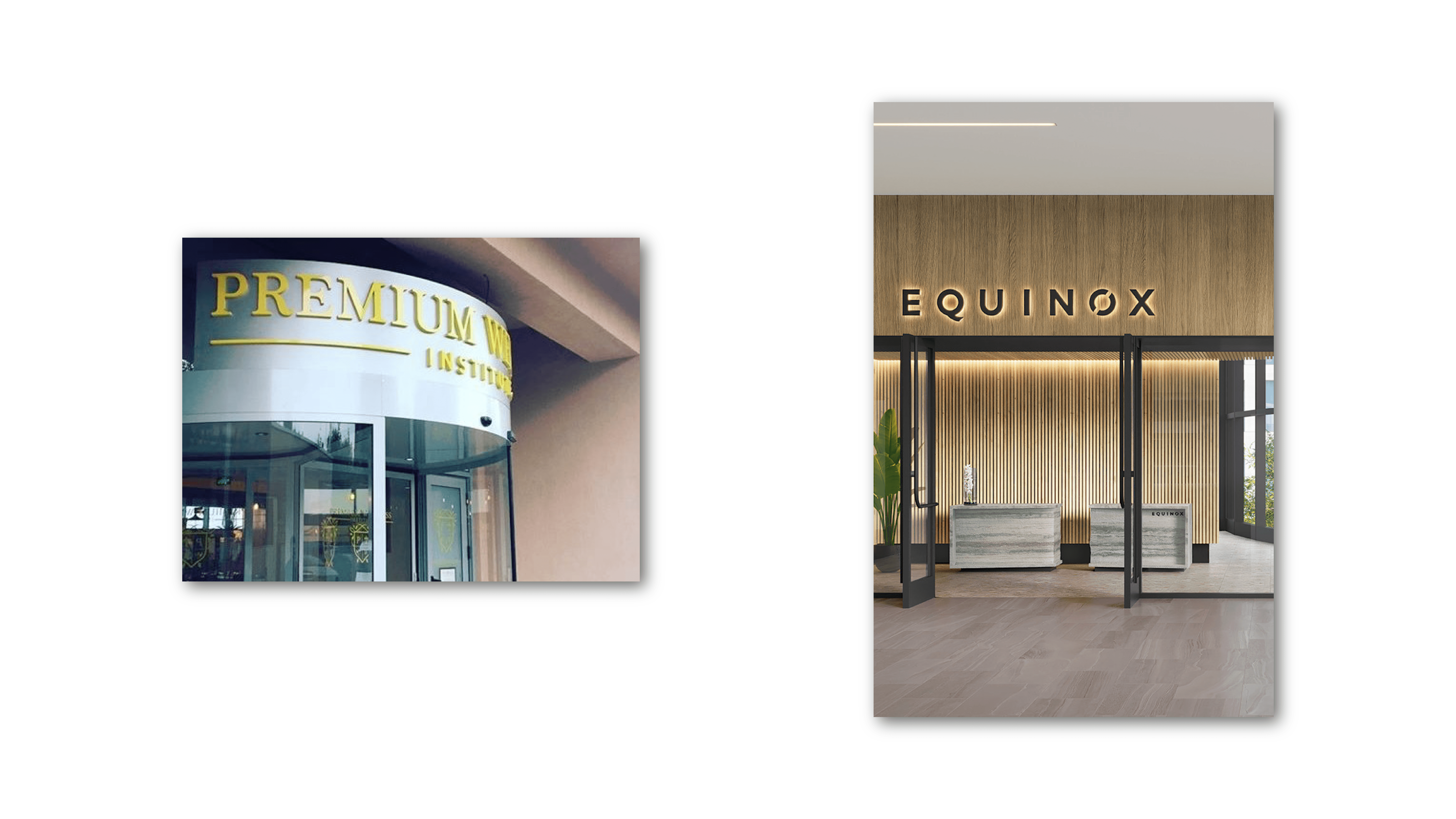
The same pattern shows up outside of tech or startups. Think of a premium spirits brand versus a supermarket private‑label bottle. Both sell alcohol. Both may even be comparable in quality. But the premium brand invests obsessively in pacing, tone, materials, and presentation, because the brand experience is part of what the customer is paying for.

Premium perception isn’t built in the logo reveal. It’s built (or destroyed) across touchpoints like:
Website structure and navigation
Packaging and physical materials
Copywriting, microcopy, and labels
UI states, confirmations, and error messages
Even what the brand chooses not to say
In premium branding, every touchpoint is a credibility test — and the brand is always sitting the exam.
This is why logos alone almost never make a brand feel premium. Premium lives in repetition, consistency, and the quiet alignment of hundreds of small decisions — across the website and its visual design, the packaging, the menus, the interactions, the details people actually live with. Miss a few of them, and no amount of white space will save you.
Where Brands Go Wrong When They Try to “Look Premium” (And What to Check Instead)
Most premium branding failures don’t come from bad taste. They come from the wrong mindset.
Common mistakes we see include:
Copying luxury aesthetics without adopting luxury-level discipline
Raising prices without upgrading brand signals
Adding layers of design instead of editing
Over-explaining because of internal insecurity
Confusing “exclusive” with “cold” or unwelcoming
Instead of asking “does this look premium?”, more useful questions are:
Where are we being loud instead of clear?
Where are we compensating instead of committing?
Are we adding elements because they help, or because we’re unsure?
Do all our touchpoints reflect the same level of care?
This isn’t a checklist to blindly follow. It’s an evaluation mindset — one that forces honesty about whether the brand is behaving with confidence or anxiety.
Final Thought: Premium Is a Perspective, Not a Look
Premium branding isn’t a filter you apply at the end of a project. It’s a point of view that shapes decisions from the very beginning — from how the brand is positioned, to what it chooses to emphasize, to what it deliberately leaves out.
When done well, the premium “feel” doesn’t come from trends or surface-level polish. It emerges from coherence across strategy, identity, and execution, from restraint that’s applied consistently, and from a clarity of intent that makes decisions easier, not harder.
That’s often the hardest part. From the inside, teams tend to respond to uncertainty by adding: more messages, more features, more explanations, more design. Premium brands do the opposite. They reduce noise to increase meaning.
They edit because focus creates authority. They commit because hesitation reads as doubt. And they let the system speak, because at a premium level, consistency is more persuasive than any claim.


