January 28, 2026
WHY GRAZA’S WEBSITE IS A MASTERCLASS IN GOOD WEBSITE DESIGN AND UX
Why does Graza’s website work so well when so many others don’t? We unpack the design and UX choices behind it — and what they can teach any brand building online.
Everyone says they want a “good website.” What they usually mean is something that looks nice: strong colors, cool typography, maybe a bit of motion. And sure — visuals matter. But we’ve all seen beautiful websites that feel confusing, slow, or strangely hard to buy from.
A good website is something else entirely. It’s a system. One where visual design, structure, and UX decisions work together so smoothly that the experience feels obvious. Natural. Almost invisible.
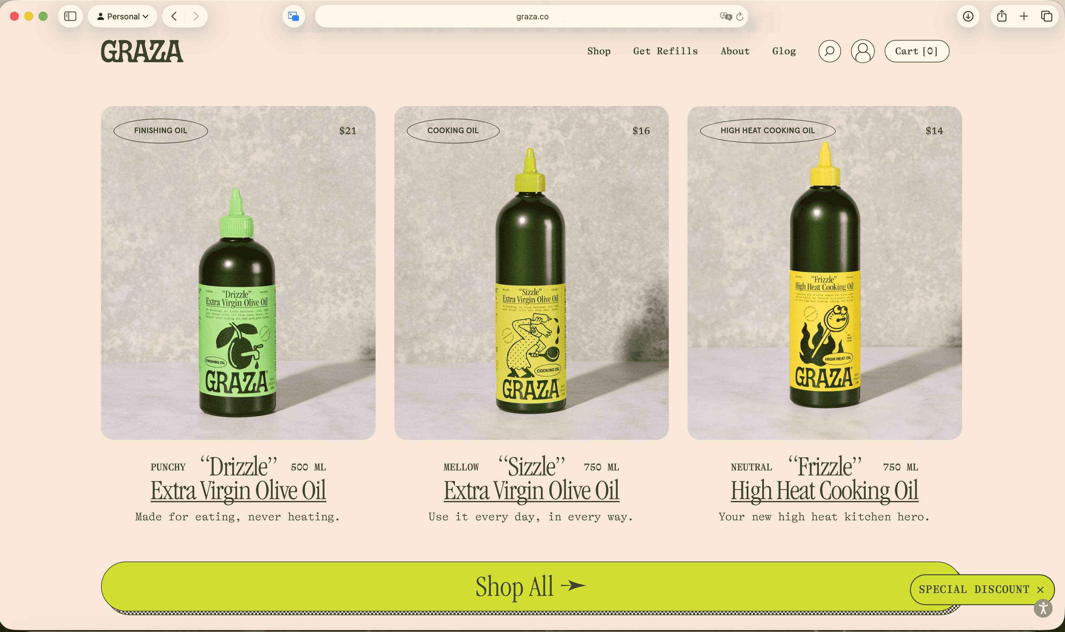
Graza’s website is a great example of this. On paper, it’s a simple product: olive oil. Two main SKUs. No complex tech, no massive catalog. And yet, the site consistently manages to educate, convince, upsell, and retain — without ever feeling pushy or exhausting.
That’s not an accident. It’s design and UX doing the work together.
What a “good website” really is (and why visuals alone aren’t enough)
A good website isn’t defined by taste alone. It’s defined by how well it helps users move forward.
At its core, good website design and UX comes down to a few things:
Visual design plays a huge role here — but not as decoration. Color, typography, illustration, and motion are doing structural work. They highlight differences, guide attention, and create emotional cues that support the UX logic underneath.
Graza’s site gets this balance right. The brand is loud, playful, and opinionated, but the experience itself is surprisingly calm. You’re never wondering what to do next. You’re never overwhelmed with options. The visuals pull you in, and the UX quietly keeps you moving.
This becomes clear the moment you land on the site.
First impressions that already steer behavior
Most pop-ups fail for the same reason: they ask too much, too fast.
They interrupt without context, push discounts with no framing, and force users into a binary choice — give us your email or get out of the way. Even when the visual design is decent, the UX logic is usually clumsy.
Graza’s first interaction works because it does the opposite.
Instead of leading with a form, the site opens with a question: what do you actually use olive oil for? Frying and baking. Cooking and roasting. Dressing and dipping. Or all of the above.
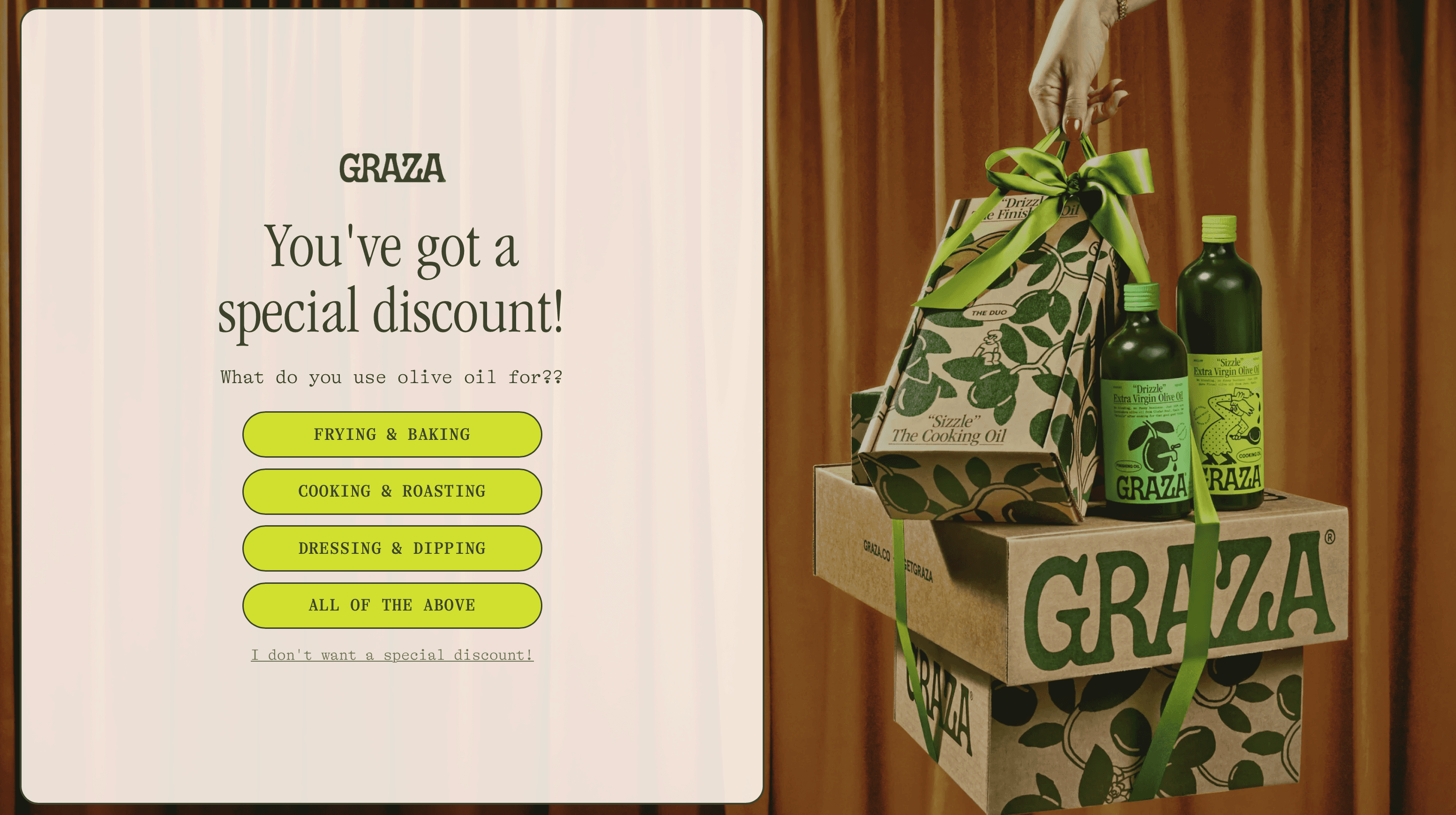
From a UX perspective, this is a smart piece of progressive engagement. You’re not being asked to commit yet — you’re being asked to recognize yourself. The interaction lowers friction by turning a conversion moment into a classification moment.
Visually, the design reinforces that softness. The pop-up is generous in scale, calm in color, and clearly part of the brand world. Nothing flashes. Nothing feels urgent. Even the buttons feel more like choices than CTAs.
There’s also an important psychological shift happening here. By the time the email field appears, you’ve already invested a small action. You’ve told the site how you cook. The discount now feels contextual, almost earned — not like a bribe.
This is a subtle but powerful UX move. The pop-up doesn’t block the experience; it starts it. And because it aligns visual tone with behavioral logic, it feels intentional instead of intrusive.
That’s why it works.
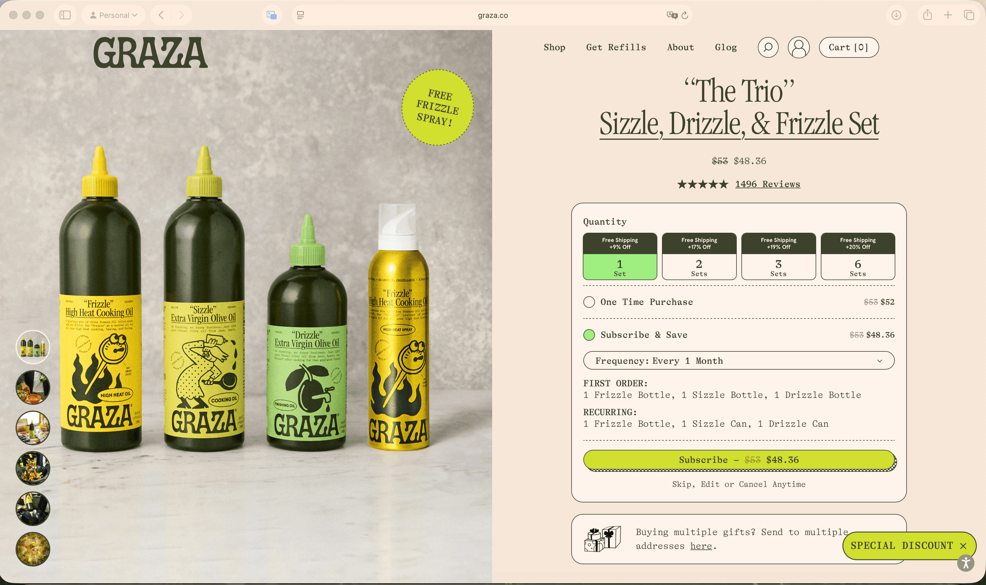
Bundles, subscriptions, and the art of spending more than planned
Most people don’t land on Graza’s website planning to build a long-term olive oil strategy. They’re curious. They want to try something new. Maybe they’re thinking of spending twenty bucks.
And yet, many of them end up spending much more.
That’s not because the site is manipulative. It’s because the UX is designed to expand intent gradually, not all at once.
Bundling is the first lever. Instead of presenting single products as the obvious default, Graza frames bundles as the most sensible starting point. Visually, these bundles feel complete and purposeful — not like a pile of add-ons, but like a smart decision someone already made for you.
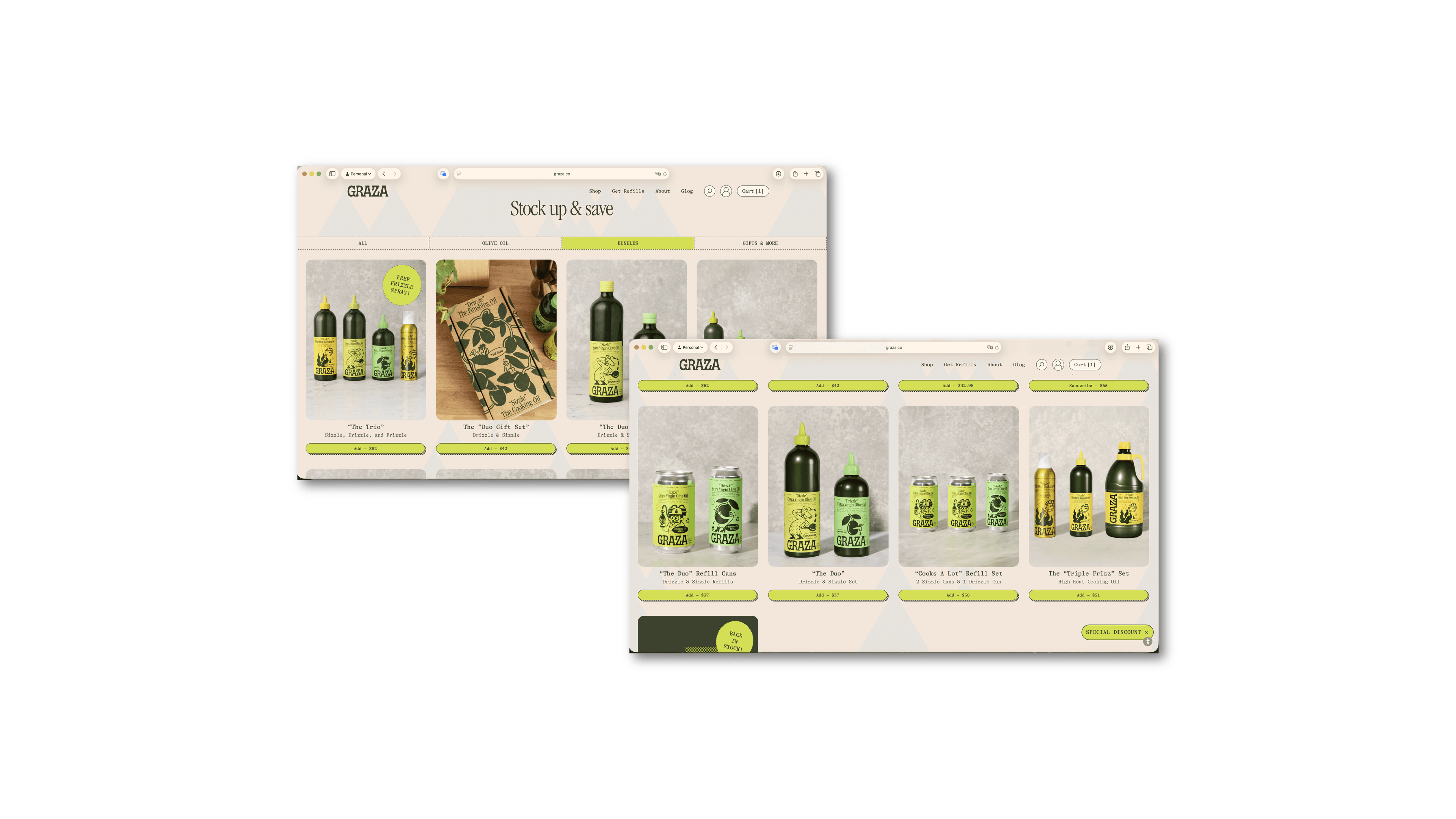
From a UX standpoint, this reduces decision fatigue. You don’t have to wonder whether you’re missing something. The bundle answers that question upfront.
Subscriptions layer on top of this logic. They’re introduced early, but softly. Not as a hard sell, not as a pop-up trap — just as a natural extension of the product’s role in your kitchen. The framing is about convenience and continuity, not savings hacks or lock-in.
Then comes the checkout.
This is where many brands ruin the experience with aggressive upsells. Graza does the opposite. The upselling at checkout is restrained, relevant, and visually consistent with the rest of the site. Suggestions feel adjacent to what you’ve already chosen, not like a sudden attempt to squeeze more value out of you.
From a UX perspective, this works because:
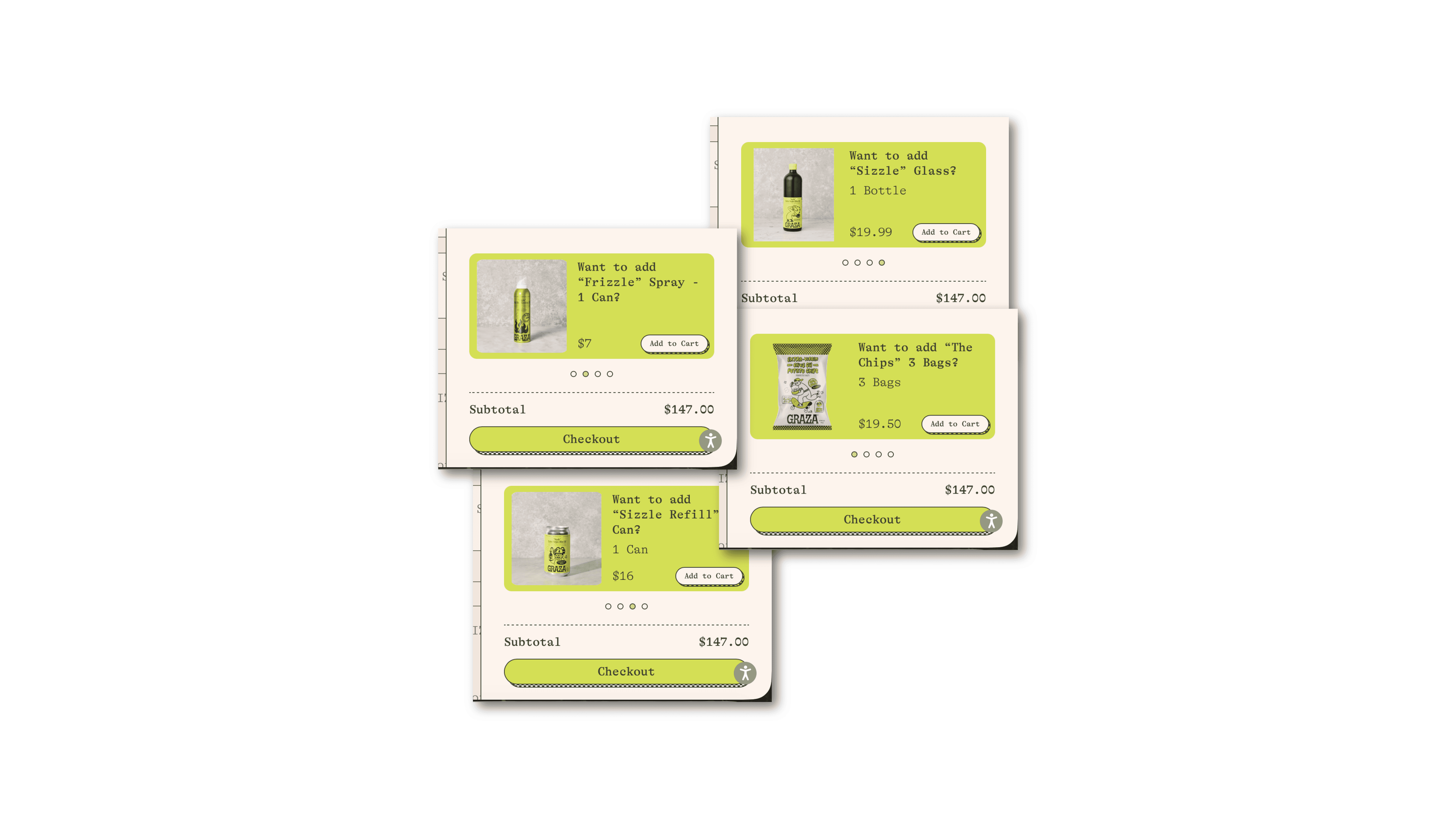
Psychologically, the user has already crossed the biggest threshold: deciding to buy. At this point, adding something extra feels incremental, not risky. The site respects that moment instead of overwhelming it.
The cumulative effect is subtle but powerful. Each step widens the basket just a little — bundle instead of single, subscription instead of one-off, relevant add-on instead of noise.
By the time you reach the final total, it doesn’t feel like you were pushed. It feels like you simply built the right setup for yourself.
Turning olive oil into a brand ecosystem
Zoom out from individual pages, and something else becomes clear.
Graza isn’t just selling olive oil. It’s building a system.
What’s interesting is that this ecosystem isn’t driven by flashy campaigns or constant novelty. It’s embedded directly into the website experience itself — through how products relate to each other, how reordering is encouraged, and how the site reinforces habitual use.
From a UX perspective, the ecosystem shows up in repetition and reinforcement. The same logic appears across product pages, bundles, subscriptions, and checkout. You’re consistently reminded that this isn’t a one-off purchase — it’s something that belongs in your kitchen, used daily, replaced automatically.
Visually, that consistency matters. The tone, layout, and interactions never reset or surprise you in the wrong way. The brand personality stays present, but it never competes with usability or clarity.
This is where many brands go wrong. They try to build “brand worlds” through add-ons that sit outside the core journey. Graza does it inside the journey. The ecosystem is the flow itself.
The payoff is loyalty that feels practical rather than performative. You’re not coming back because you’re entertained — you’re coming back because the experience makes staying easy.
Why this works — and what to take from it
When you strip away the colors, illustrations, and jokes, Graza’s website is built on very solid fundamentals.
A few principles show up again and again:
None of this is flashy. And that’s the point.
The biggest mistake brands make when looking at sites like this is trying to copy the surface. The real lesson isn’t the aesthetic — it’s the thinking behind it.
A good website doesn’t shout. It doesn’t rely on tricks. It quietly aligns design and UX so that the right choice feels like the obvious one.
If you’re evaluating your own site, this is a useful gut check: are your visuals and your UX working toward the same goal, or are they fighting for attention?
When those two finally align, conversion stops feeling like a battle. And that’s usually the moment a website starts doing its real job.